
Information Architecture in UX: A Practical Guide
Learn how to create information architecture for digital products: content inventory, taxonomy, navigation, card sorting, tree testing and iteration.
Design a learning platform around the three people who use it — the learner looking for the next lesson, the instructor building and grading courses, and the administrator who enrols, tracks and reports.

A learning platform where every role knows the next step, from the first lesson to the last report.
Trials, plans, seats and recurring use in any subscription product.
LMS & Learning Platform Design
How people learn, teach and run learning in one platform.
Not included
A learner, an instructor and an administrator meet in the same course and want opposite things from it. The design starts from how each of them moves through it.
Learner, instructor and admin journeys end to end, and where they meet.
Programmes, modules, lessons and prerequisites a learner can find their way through.
Quizzes, assignments, submissions, feedback and grades, for both sides of the desk.
Where each learner is and what comes next, and the class view instructors act on.
You receive
Most learners do not leave at sign-up. They drift away somewhere in the middle, when the next step is unclear or a grade never arrives. Every screen answers where they are and what happens next.
A training platform redesigned for the people already using it, and a learning product designed from a blank canvas.
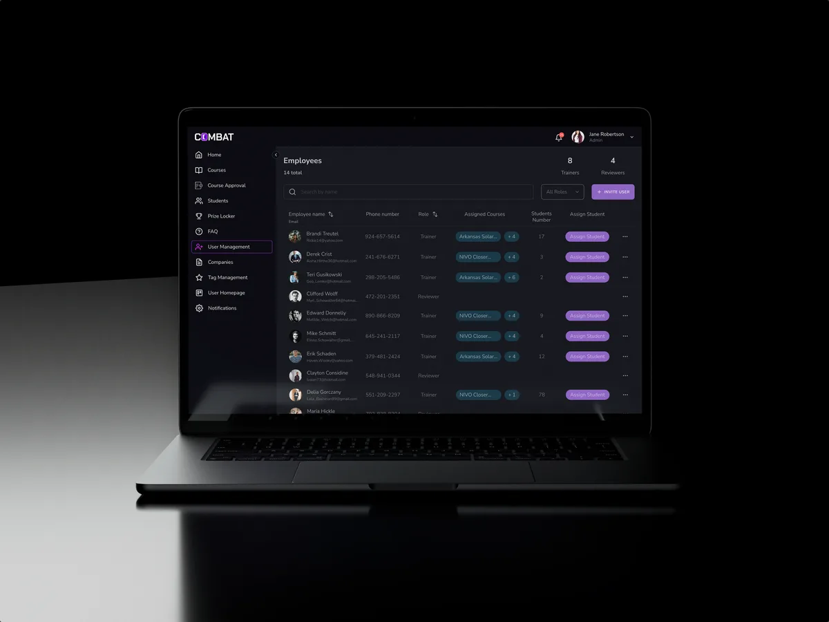
Sales training · Desktop web platform
Redesigned selected areas of a desktop sales training platform for five roles — course approval, a trainer's daily work, recorded practice and student learning — in the look its users already knew.
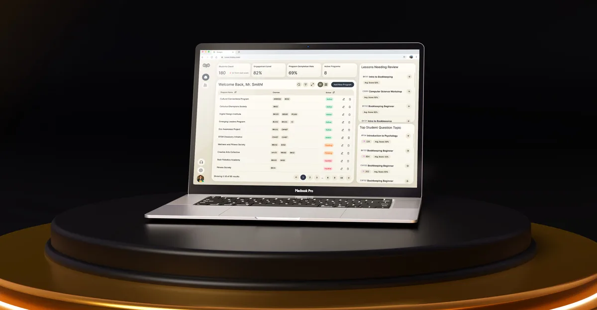
EdTech · SaaS
Designed an AI-powered learning platform from a blank canvas — student help, educator dashboards, analytics and student administration — as one product for four roles.
It fits when learning happens inside the product, and several roles depend on the same courses.
Learners, instructors and admins need their own view of the same material.
Enrolments look healthy, but progress stalls between modules.
Building courses, grading and reporting take longer than teaching.
Your team or partner will develop the platform from the design.

Tell us who learns, who teaches and who runs the platform. We will come back with the service that fits and a realistic next step.
An LMS is often redesigned role by role or module by module, as one of our services. Its proposal sets the terms.
Tell us what the platform teaches, who uses it, and where learners, instructors or admins get stuck.
Message received.
Within 15 minutes, we’ll email you initial feedback and follow-up questions.
Learn how to create information architecture for digital products: content inventory, taxonomy, navigation, card sorting, tree testing and iteration.
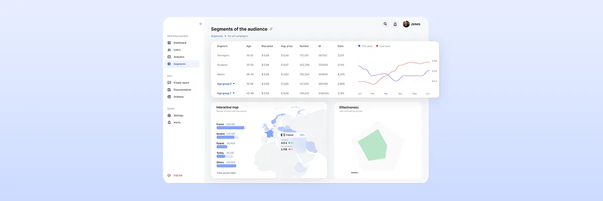
Learn the best dashboard UI design practices to enhance user experience. Improve data visualization and usability. Get expert insights at ANODA UX Agency today!
Look for a team offering LMS UX design services that can show one platform designed for several roles, not a single learner app. Ask to see a course from both sides — how a learner finds the next lesson and how an instructor builds and grades it — and how the admin enrols people and reports on them. Ask which platforms were live and what was redesigned, and look at the instructor's side as closely as the learner's. Our Combat Sales and Moka cases cover that range.
Progress should answer one question before any chart: what do I do now? A learner opening the platform sees the next lesson or task, the deadline that matters and what is already done. Progress bars follow the course structure, not a raw percentage. Grades and feedback arrive where the work was submitted, and a missed deadline or failed quiz always comes with a way back. For instructors, the same data rolls up into a class view — who is behind, which lesson loses people, which question most learners get wrong — learning analytics they can act on the same day.
Learners enrol, study, submit work, take assessments and track progress. Instructors build courses and lessons, set assessments, grade and give feedback, and watch a class. Administrators manage users, groups and enrolments, the course catalogue, certifications and reports. Where they apply, we also design for managers who assign training and for guests or parents who only view progress. The design also covers the hand-offs between roles: an enrolment that starts a learner's journey, a submission that lands in an instructor's queue, a grade that updates a report.
It depends on the platform's stage. UI/UX & Product Design takes a new platform from roles and journeys to interface. A UX Audit finds where a live LMS loses learners, and Product Redesign rebuilds it while people keep using it. Web App Design covers course builders and gradebooks, Mobile App Design the learner on a phone, and Design Systems keeps a growing platform consistent.
With the journeys, not after them. Each screen is drawn for an empty course, a lesson locked by a prerequisite, a submission waiting for a grade, a failed quiz with a retake, a missed deadline, a course changed mid-way and a class with no activity yet. Permissions follow who can create, edit, grade, enrol and see which data, and they are set out in a matrix engineering can check the build against.
A test account for each role on the platform or staging, one real course with its assessments and grading rules, the completion data and support themes you have, time with a few instructors and learners, a product owner who can decide, and early contact with engineering so content standards and integrations shape the design.
Combat Sales, a desktop sales training platform shared by five roles, from Superadmin to Student, which we redesigned in selected areas — 80+ final desktop screens and interaction states. Moka, an AI-powered learning platform for students, educators and administrators — 200+ screens designed, 4 experts on the team. In Combat Sales the work covered dashboards, user management, course approval, trainer and reviewer work and student learning; in Moka, the student chat, the educator dashboard, analytics and reports, and student administration.
Yes. Most LMS UI design work starts from a platform people already use. On Combat Sales we reworked selected areas and kept the look its users already knew. Instructors review the course flows with us, while your designers and engineers get every file and component we make. If your LMS runs on a platform with fixed templates, we design within what it lets you change and mark what would need custom work.