
Sales training platform, reworked for five roles
Combat Sales is where companies train their sales reps, from courses to recorded practice.We redesigned it for five roles and designed new features.

- 80+
- final desktop screens and interaction states
- 5
- roles each with its own permissions and daily work
- Redesign
- of a live platform selected areas reworked, new features added
Project summary
Combat Sales is a desktop platform for sales training: companies enrol their reps, trainers teach and review them, reviewers check recorded practice, and a Superadmin runs it across every client company. We did a targeted UI redesign of the existing product and designed new features into it, as multi-role SaaS product design with a baseline UI kit cleanup .
What runs through the platform
One chain, from a client company to a finished course:
-
Companies
- Switching
- Statistics
- Exports
-
People
- Trainers and reviewers
- Students
- Assignments
-
Courses
- Requests
- Approval
- Order
-
Learning
- Lessons
- Discussions
- Progress
-
Practice
- Recorded videos
- Reviews
- Evaluations
-
Messages
- Email rules
- Schedules
- Automated messages
- Familiar and Better
- Selected flows reworked; the look and the places people knew kept.
- Shared and Separate
- Five roles on one platform, each seeing its own work first.
- Numbers and Next task
- Dashboards that point to what needs doing, not only report.
Every client company, read top to bottom
- Found
- The Superadmin looks after every client company, and a home where each figure weighs the same doesn’t say whose numbers these are or where to look first.
- Decided
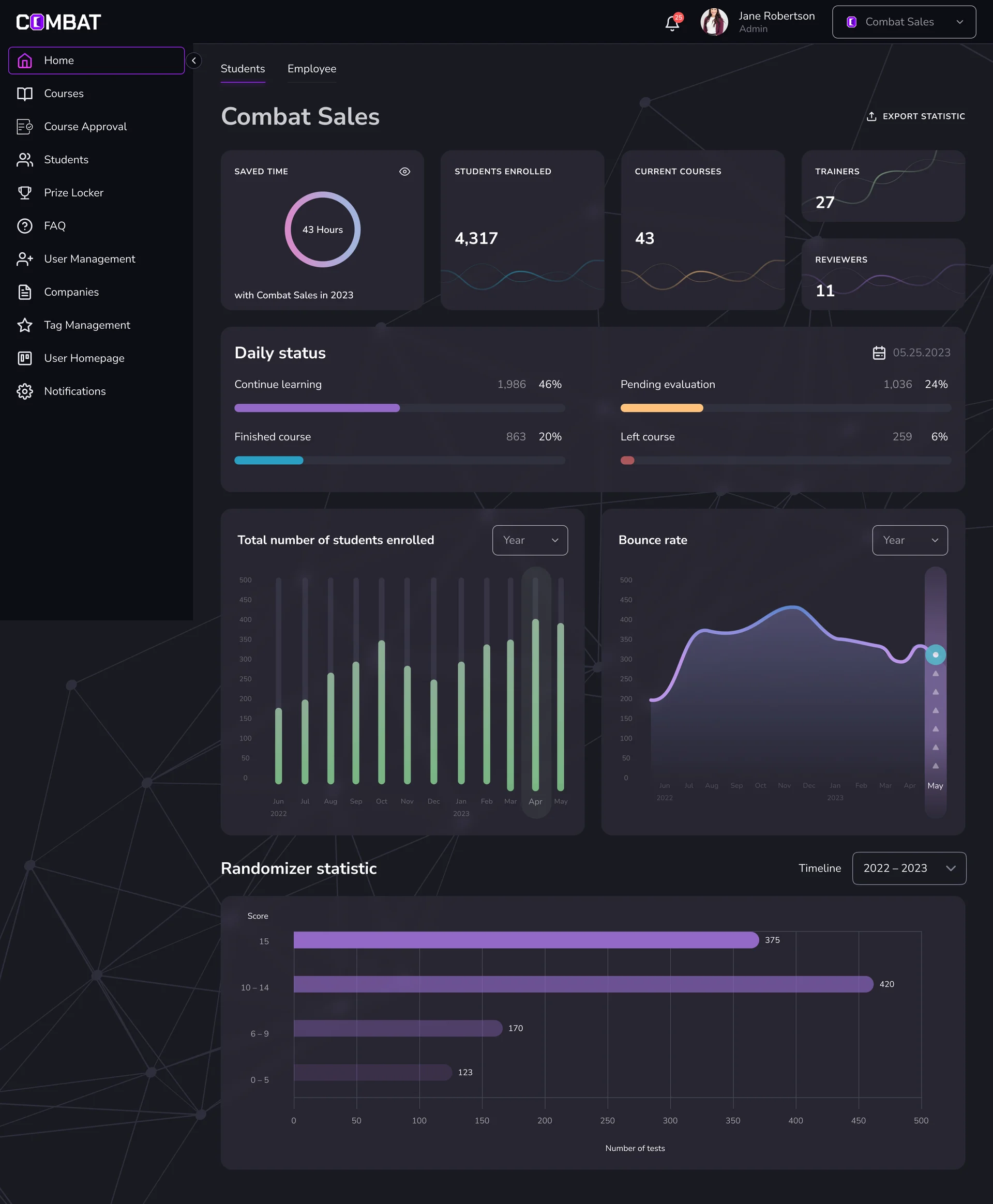
- A home that reads in order: which company is in view, the year in five figures, where students stand today, the trends, then practice scores.
- For the user
- The Superadmin sees which company they’re in, and what needs attention, before opening a single table.
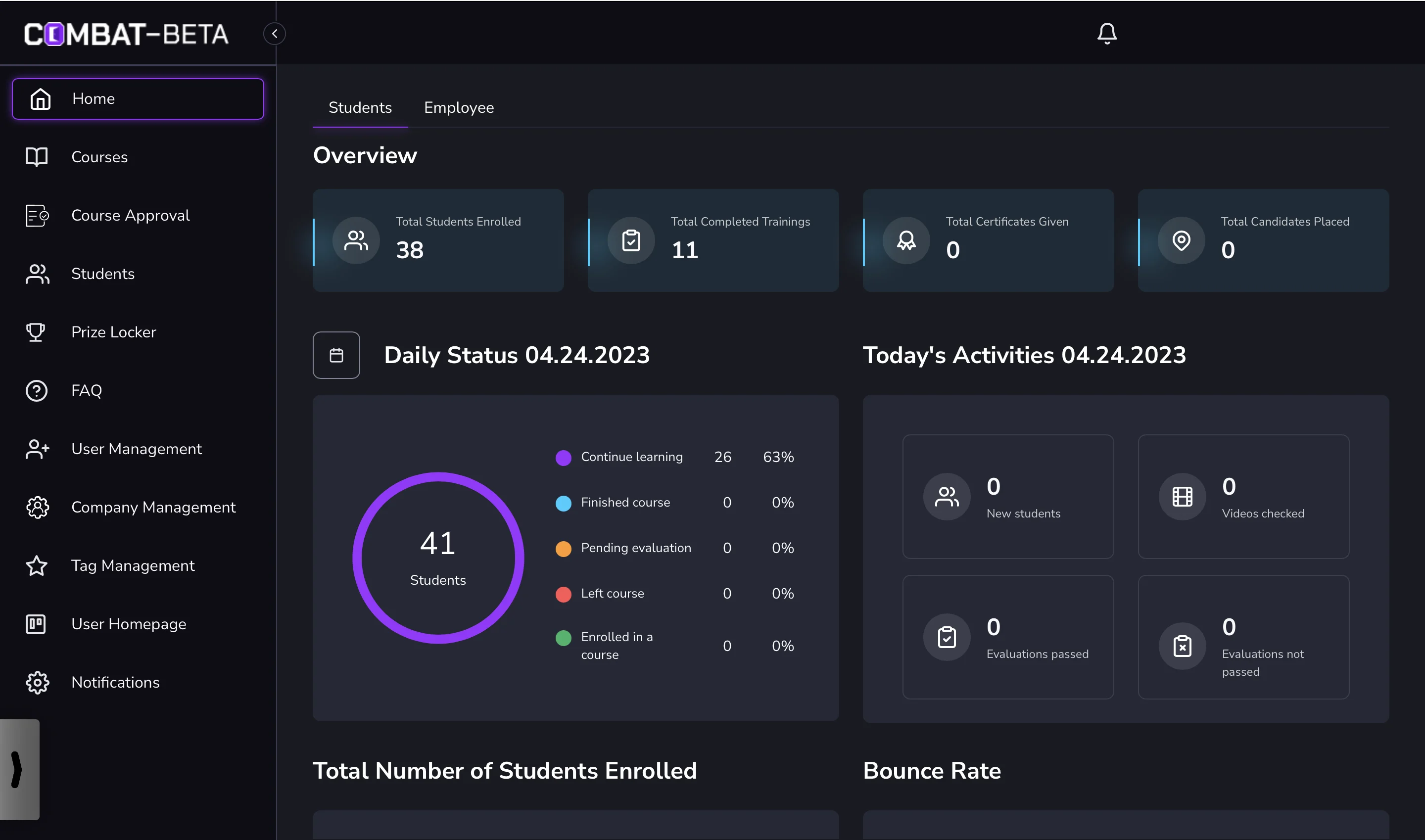
- In the way
- Four totals of equal weight, a daily ring mostly at zero, and nothing that says which company the numbers belong to.
-
Whose numbers
The company switcher, and the company’s name over the page.
-
The year in figures
Saved time, students, courses, trainers and reviewers.
-
Where students are
Learning, waiting for evaluation, finished or gone, today.
-
The trend
Enrolment and bounce rate by month.
-
Practice scores
How randomizer tests scored across the year.
How the work progressed
Roles and workflows first, then the screens in the platform’s own look, then change requests and walkthroughs from the client’s feedback.
-
User Flow
Who does what: five roles, their permissions and the workflows between them
Artifact Role and workflow maps and a screen map
-
UI & Design System
Which areas to rework, which to extend, and how to keep the look people knew
Artifact Final desktop screens and states, and a baseline UI kit cleanup
-
Delivery
What each change request needed, and what new users see first
Artifact A clickable prototype, change requests, and Trainer and Student walkthroughs
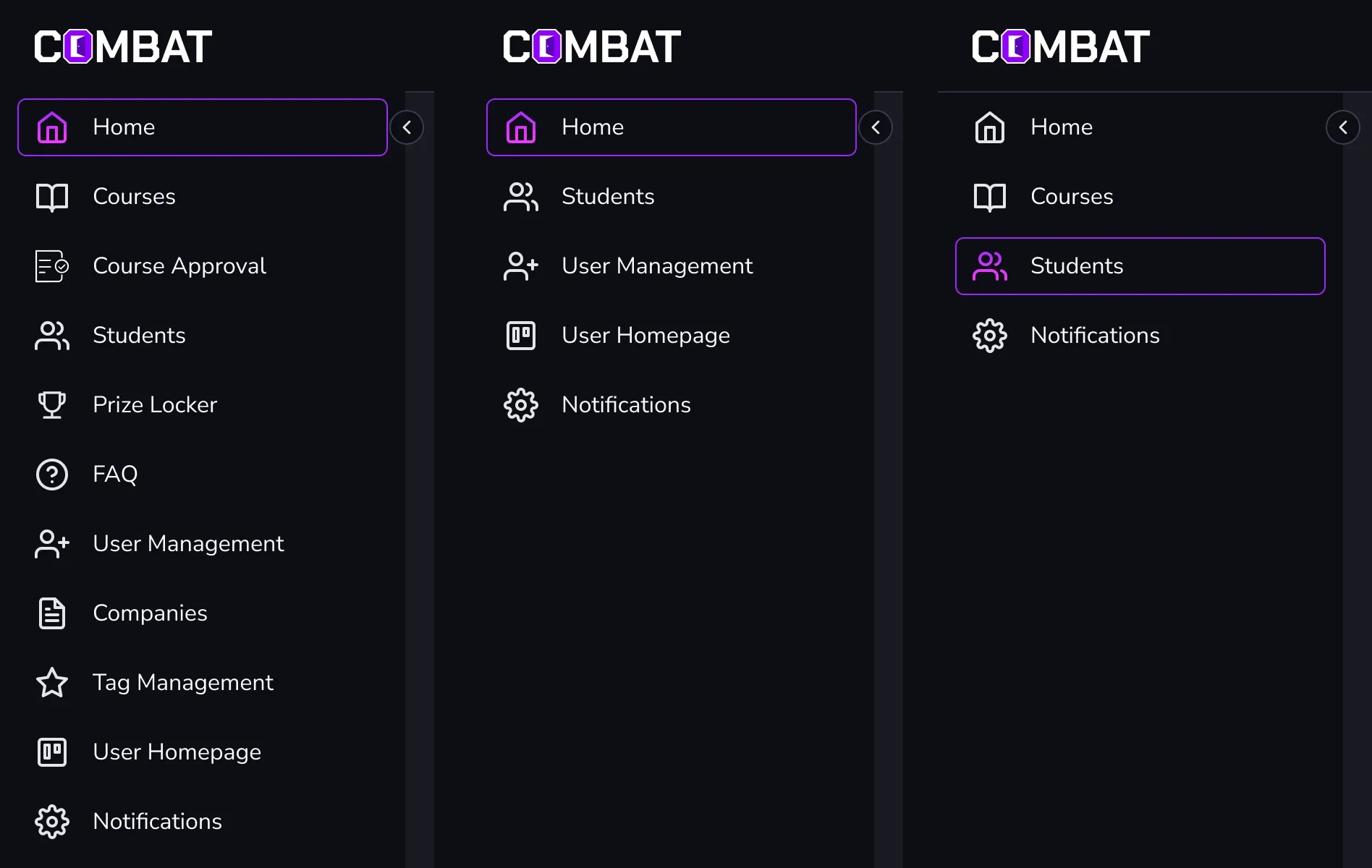
One platform, a menu for each role
- Found
- Five roles share one platform, and a menu built for the Superadmin would bury a trainer’s four daily places under eleven.
- Decided
- Each role’s paths were mapped first; then each got its own menu: the full one for the Superadmin, a shorter one once a company is chosen, four items for a trainer, the course itself for a student.
-
Superadmin: course approval
Approve or reject a request; an approved row turns into Assign Trainer.
Open the full map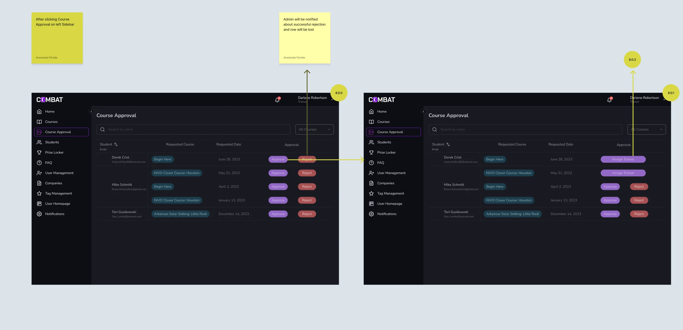
-
Trainer: time on reviews
Asked once on the review screen, then answered or skipped.
Open the full map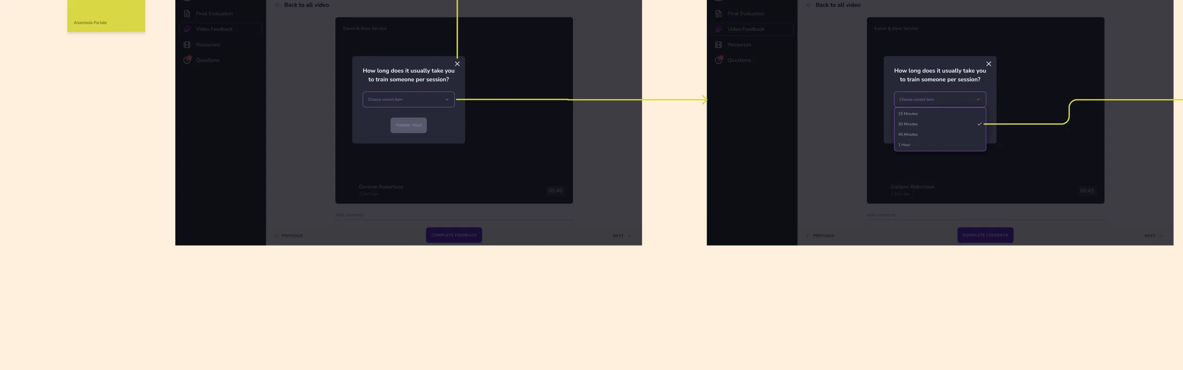
-
Student: from the course to a self-test
The course as weeks, a locked week that says why, then a test built from the weeks reached.
Open the full map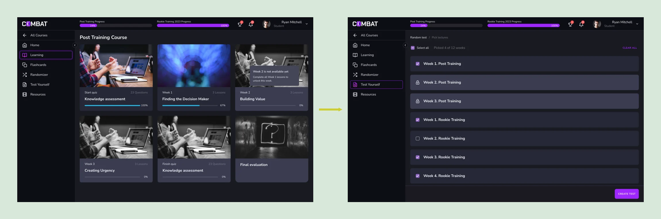
Eight jobs, from the company to the student
The Superadmin’s work first, then the trainer’s, the reviewer’s and the student’s, then the rules around courses and messages. Every figure on these screens is example data.
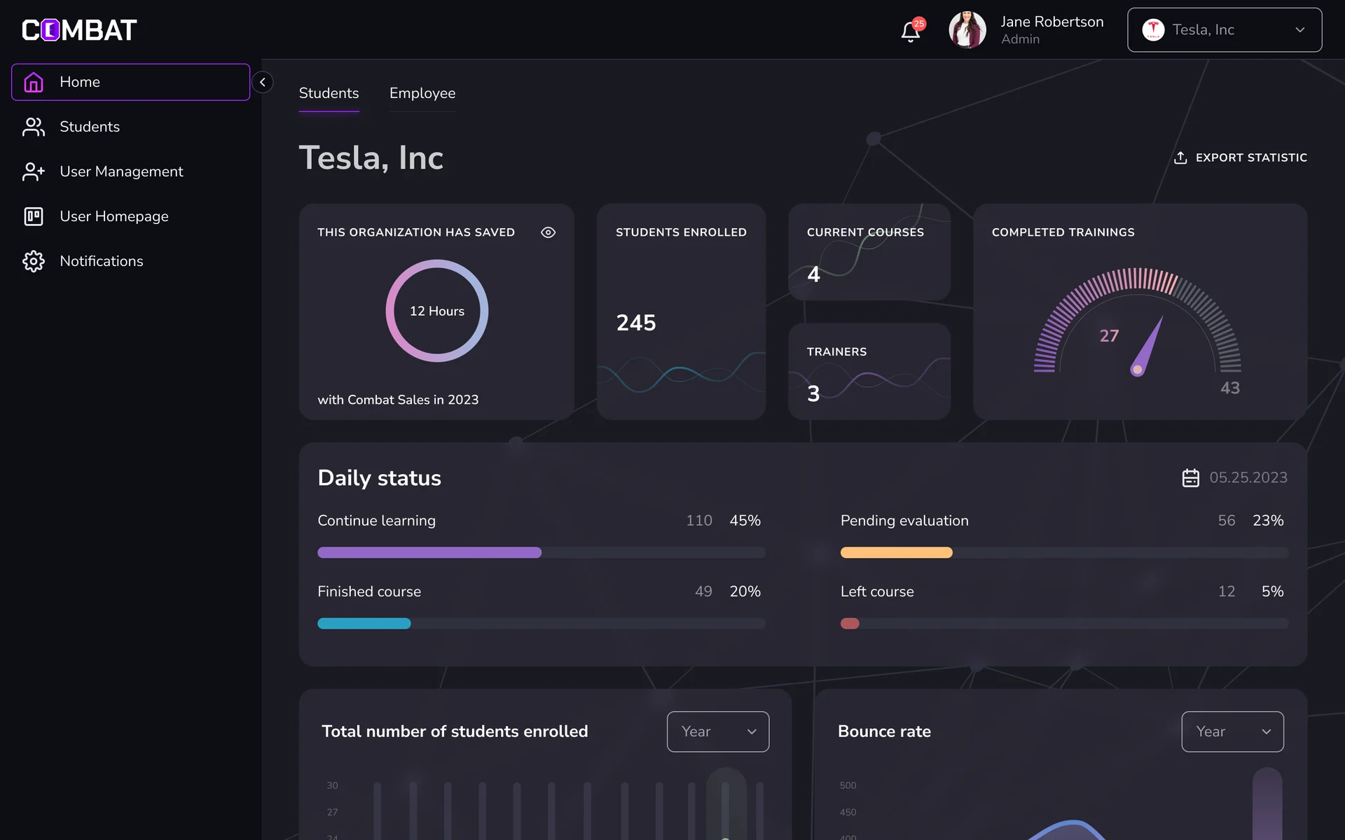
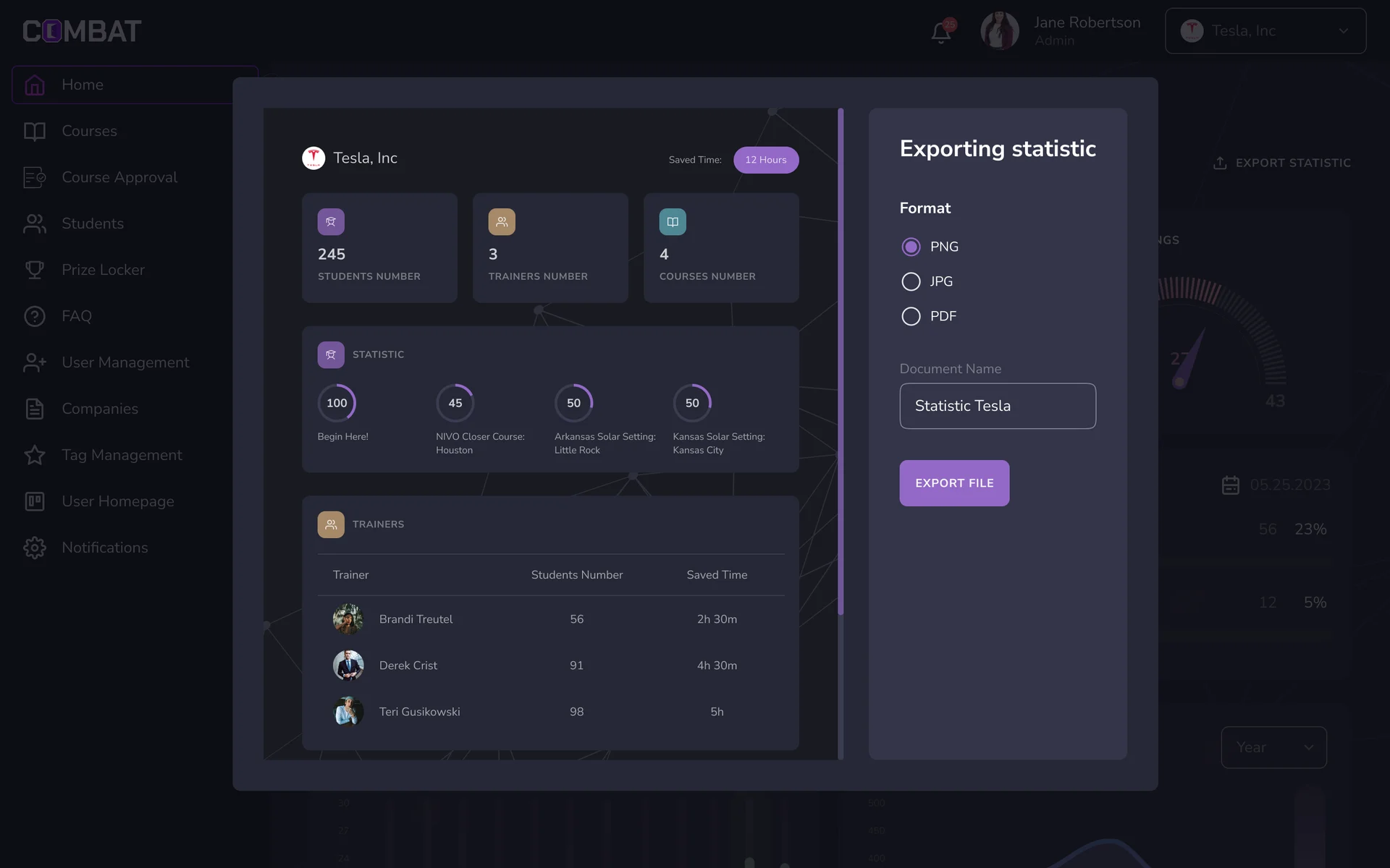
Working inside one company
- Found
- The Superadmin sees every client company, and a figure read, or an action taken, in the wrong one misleads or reaches the wrong people.
- Decided
- A company switcher in the header; once a company is chosen, the menu, the dashboard and the figures narrow to it, and its statistics export as a file.

Trainers and reviewers, each in their role
- Found
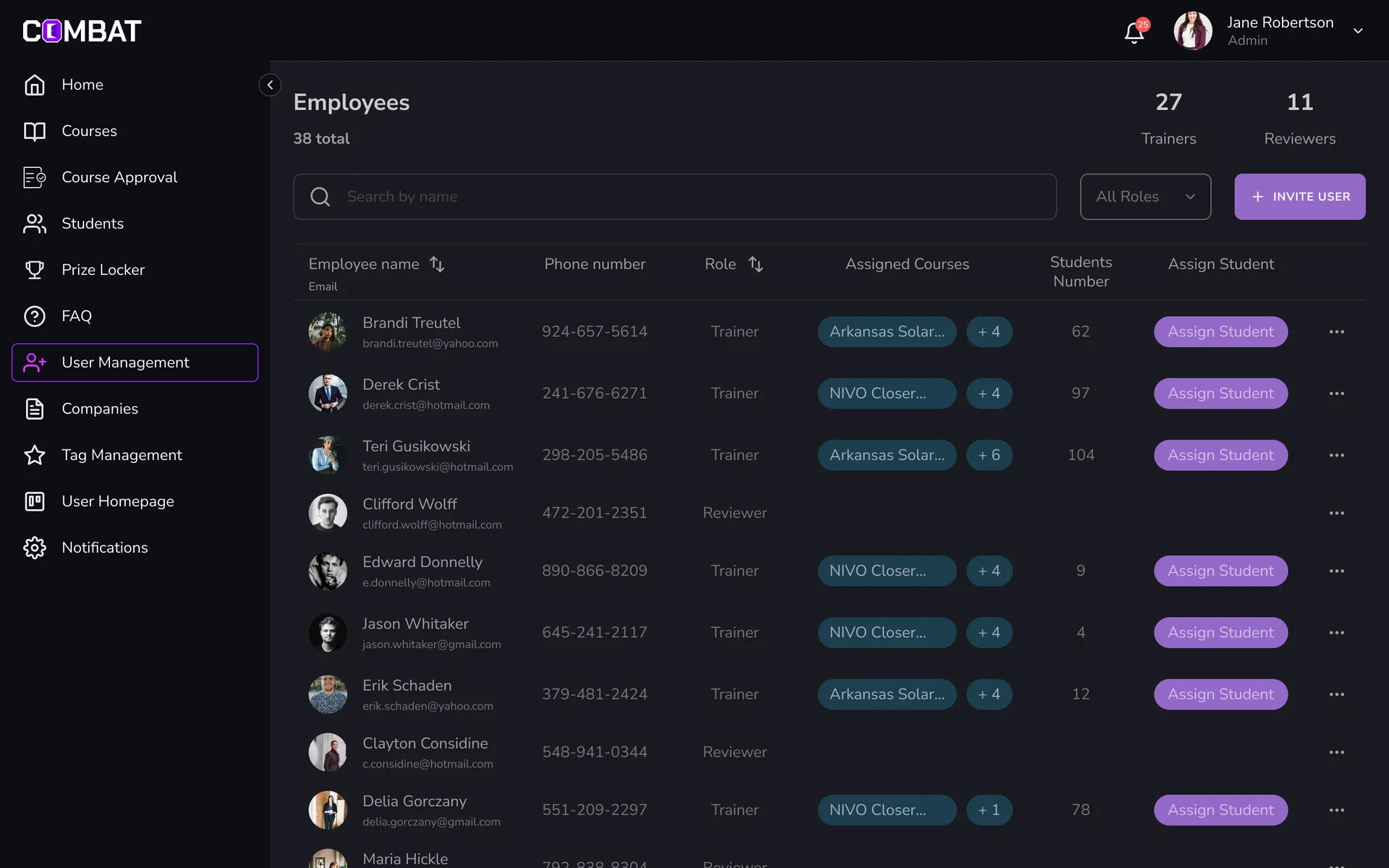
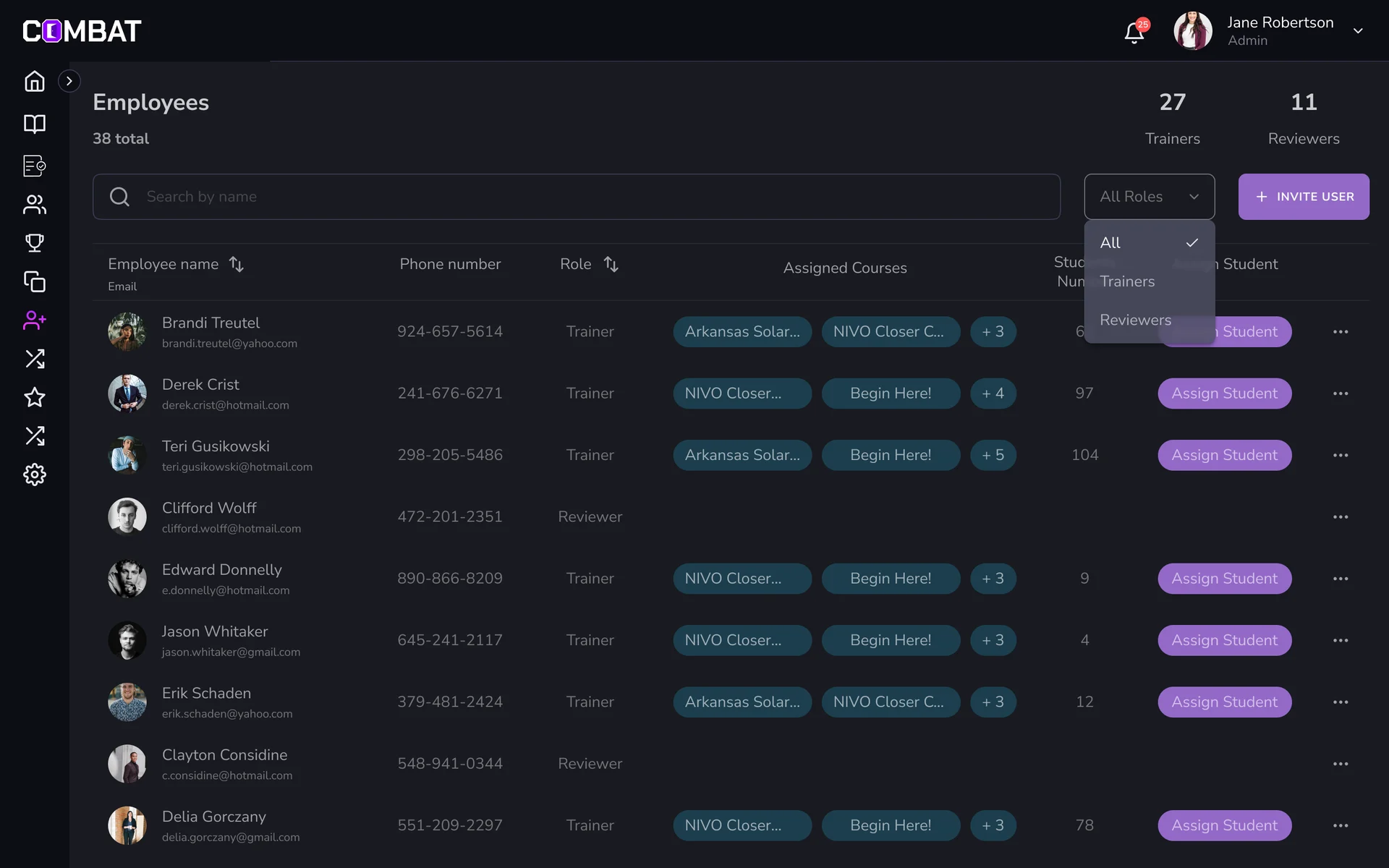
- Trainers and reviewers work side by side but do different jobs, and a reviewer lost among trainers is a quality check nobody runs.
- Decided
- One team table with the role on every row and a filter for it, each person’s courses and students, and a student assigned right from the row.
Every student, and what to do with them
- Found
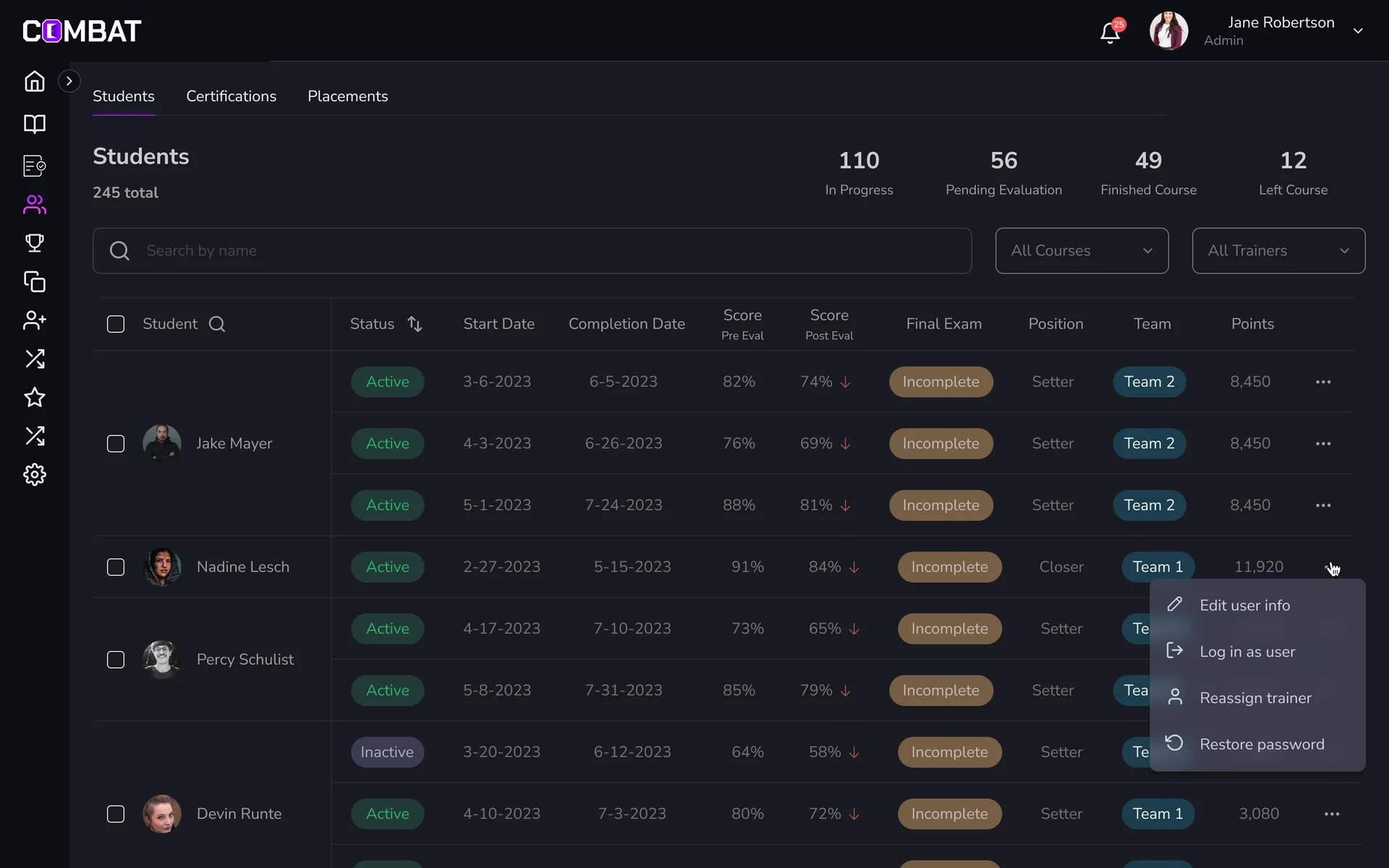
- A student can be on several courses with different trainers, and a list of names says nothing about who is stuck or waiting.
- Decided
- A students table with status, dates, scores before and after, the final exam and the team on each course row, with editing, logging in as the student and reassigning a trainer in the row’s menu.
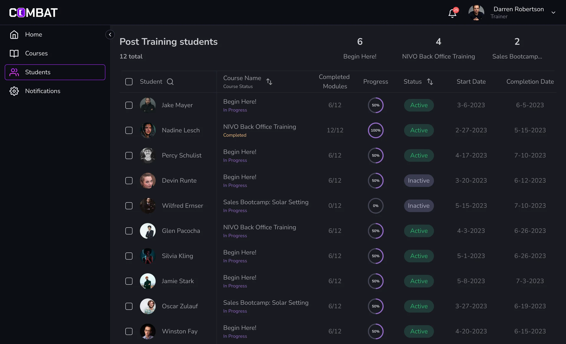
A trainer’s day, in order
- Found
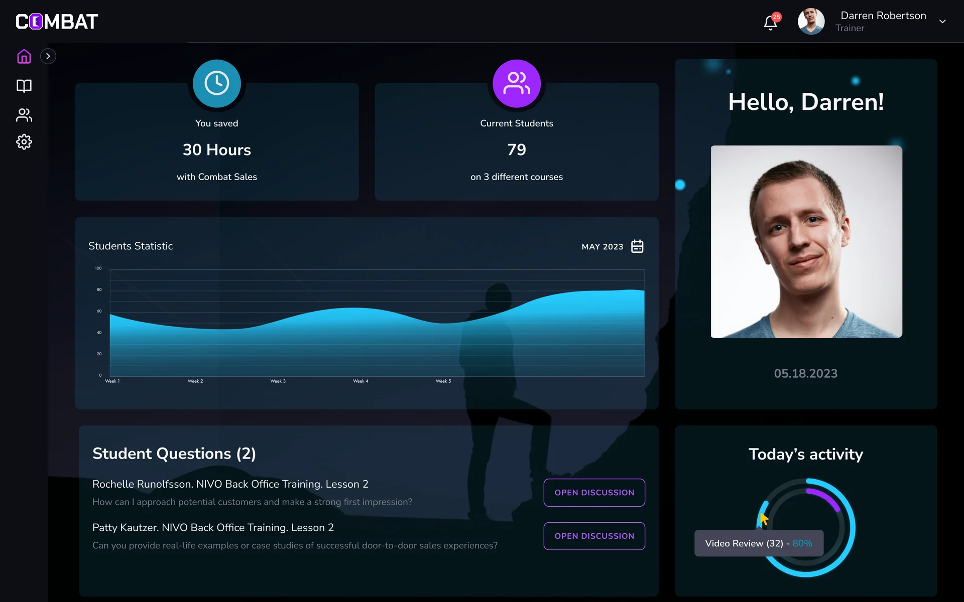
- A trainer has students on several courses, questions waiting and videos to review, and metrics of equal weight don’t say what comes next.
- Decided
- A home that leads with students and open questions, then today’s reviews with the videos inline and the coming final evaluations; and a students tab split by course, with each student’s progress.
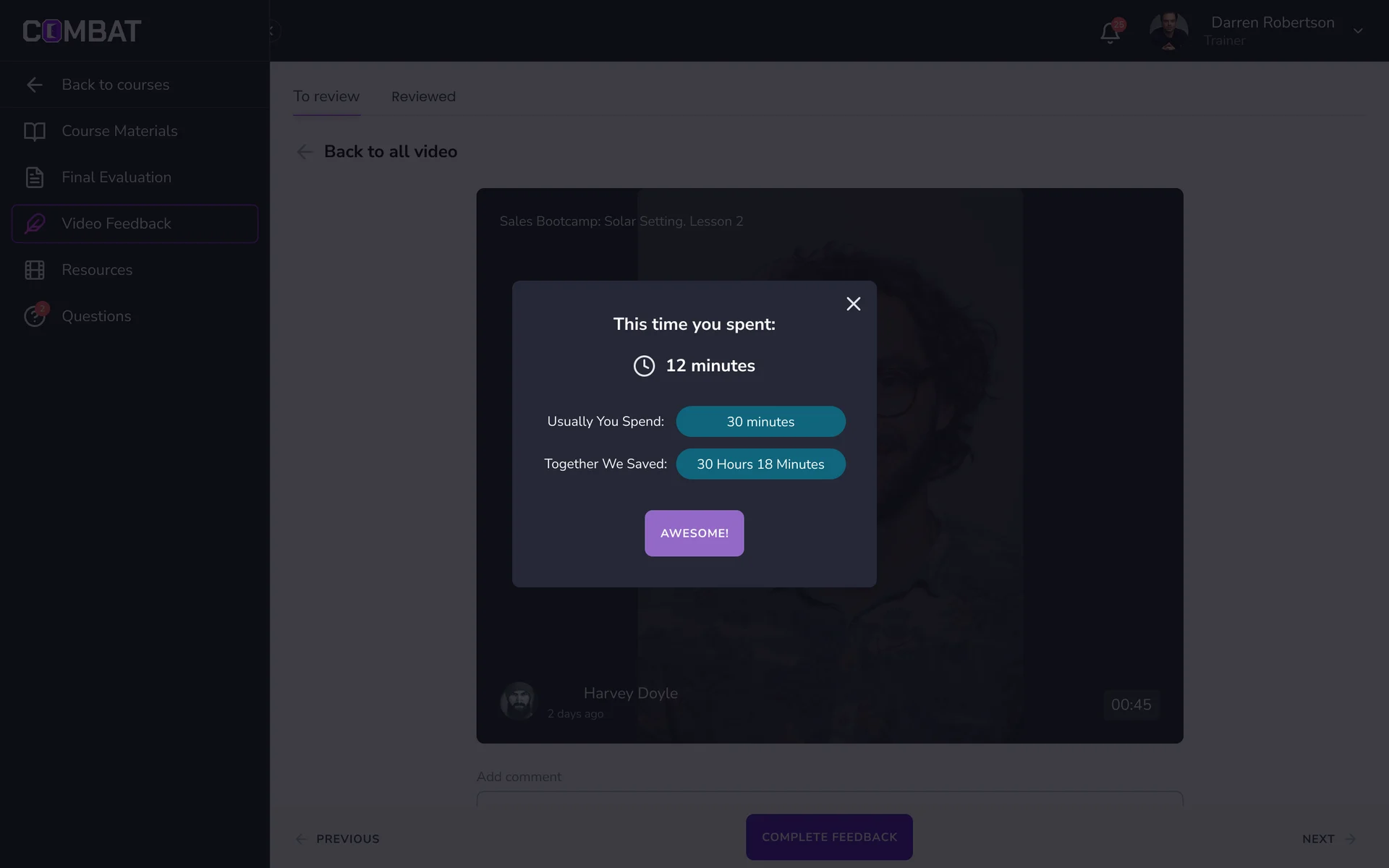
Recorded practice, reviewed in the course
- Found
- Students record practice pitches, and a video with no clear review step is a file in a queue; the time a trainer spends on it is invisible.
- Decided
- Review sits inside the course, next to its materials and final evaluation: the video, a comment and Complete feedback, then the next one. The first time, the platform asks how long a session usually takes; after each review it sets the time spent against that.
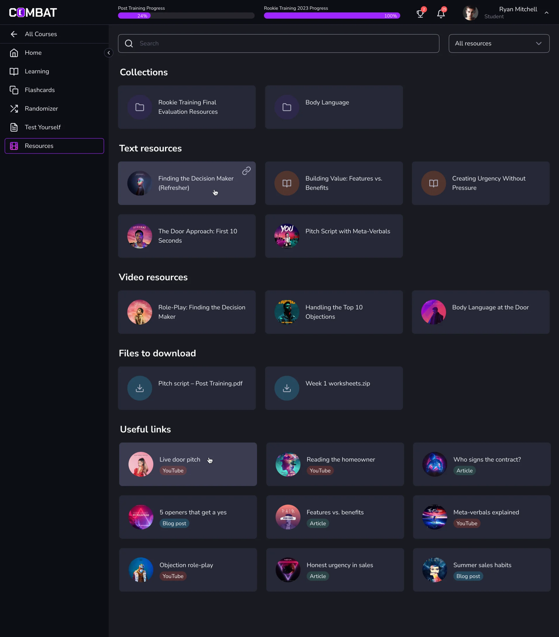
Materials a student can find again
- Found
- Scripts, role-play videos, worksheets and links pile up across two courses, and a student hunting for last week’s video gives up before the next door.
- Decided
- One resources page grouped by kind: collections, text, video, files to download and useful links, each link tagged by source, with search and a filter, and the course progress kept in the header.
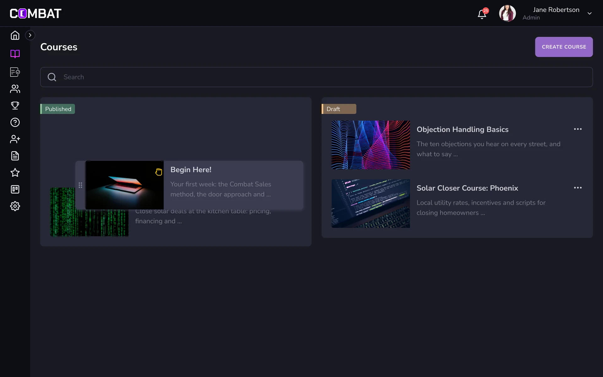
Courses requested, approved and ordered
- Found
- Students ask for courses, and an approval queue without a clear next step becomes the bottleneck of the whole platform.
- Decided
- A Course Approval list with each request’s course and date, approved or rejected on the row, and an approved student then given a trainer; courses in Published and Draft, reordered by dragging.
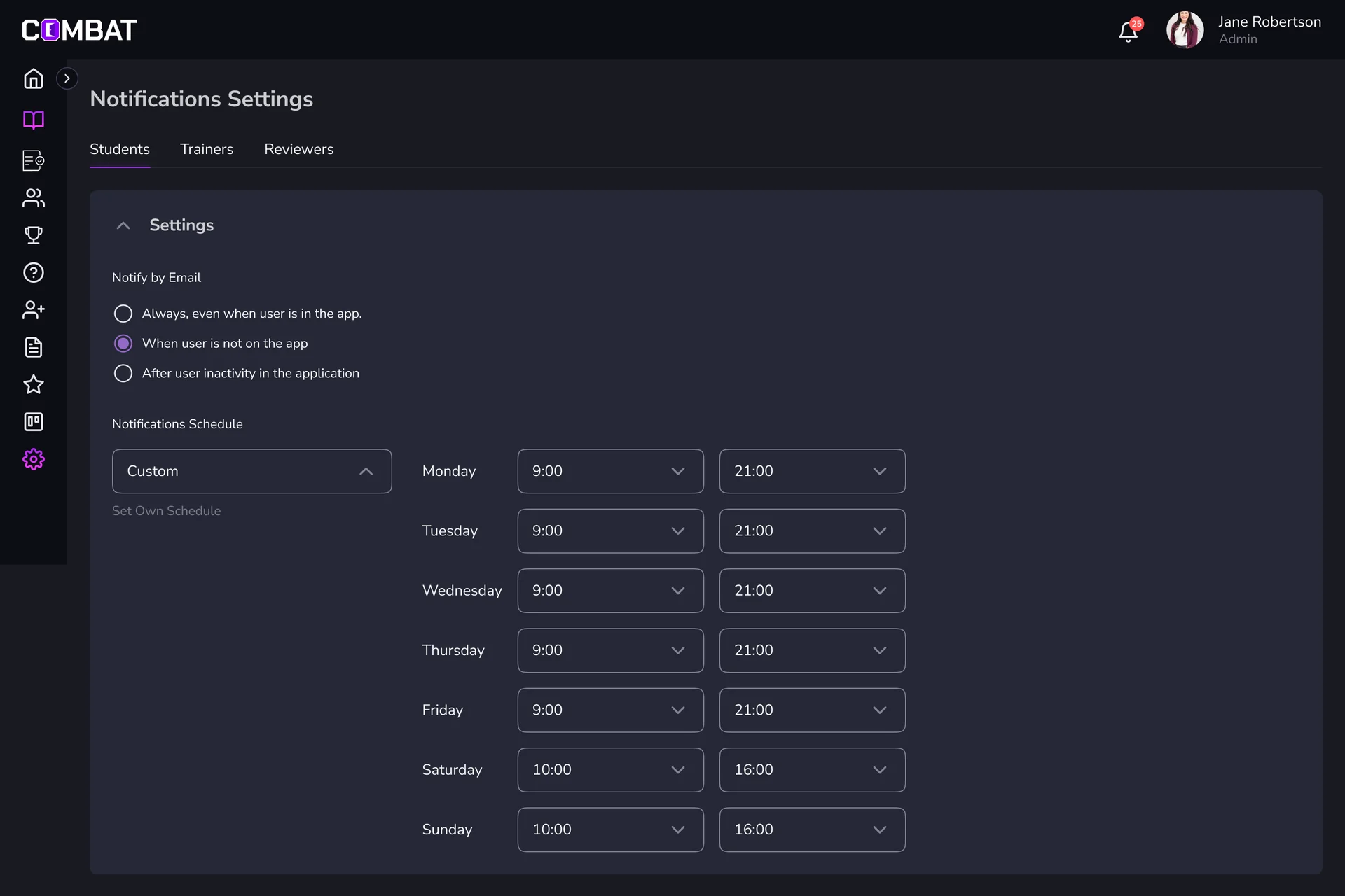
Messages that go out on their own
- Found
- Welcome letters, deadlines, reviewed videos and evaluations each need a message, and nobody can send them all by hand.
- Decided
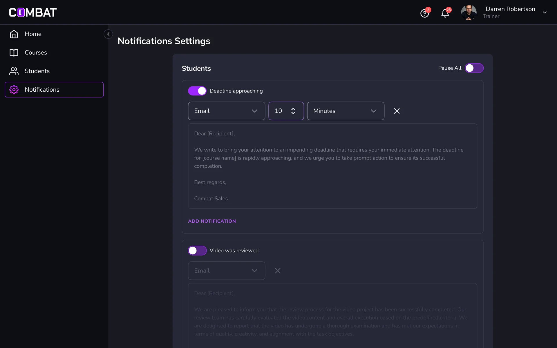
- Notification settings for students, trainers and reviewers: when to notify, a sending schedule by weekday, and for every event a switch, the channel, the timing and an editable template.
A UI kit tidied, not rebuilt
- Found
- New features had to look like the platform people knew, and the kit behind it needed tidying before it could carry them.
- Decided
- A baseline cleanup of the existing kit: components aligned and extended within the platform’s own colours, then reused across roles instead of drawn again.
One trainer picker, two jobs
The same picker moves a student to another trainer and gives an approved student their first one.
-
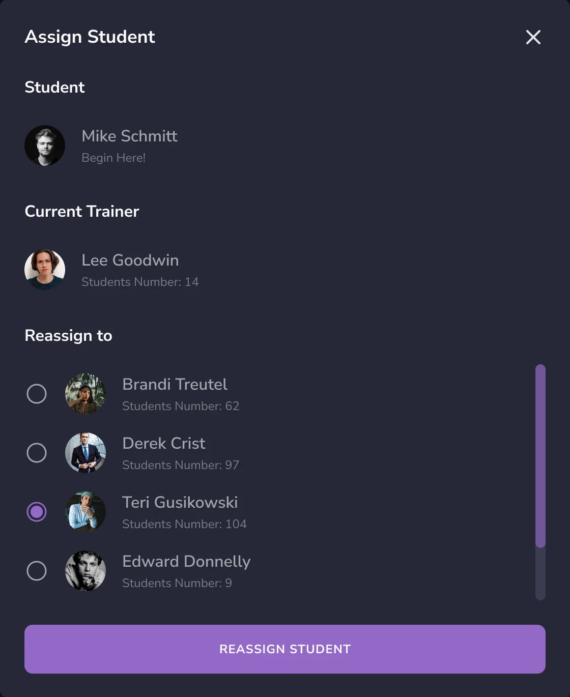
Students: Reassigning a trainer. -
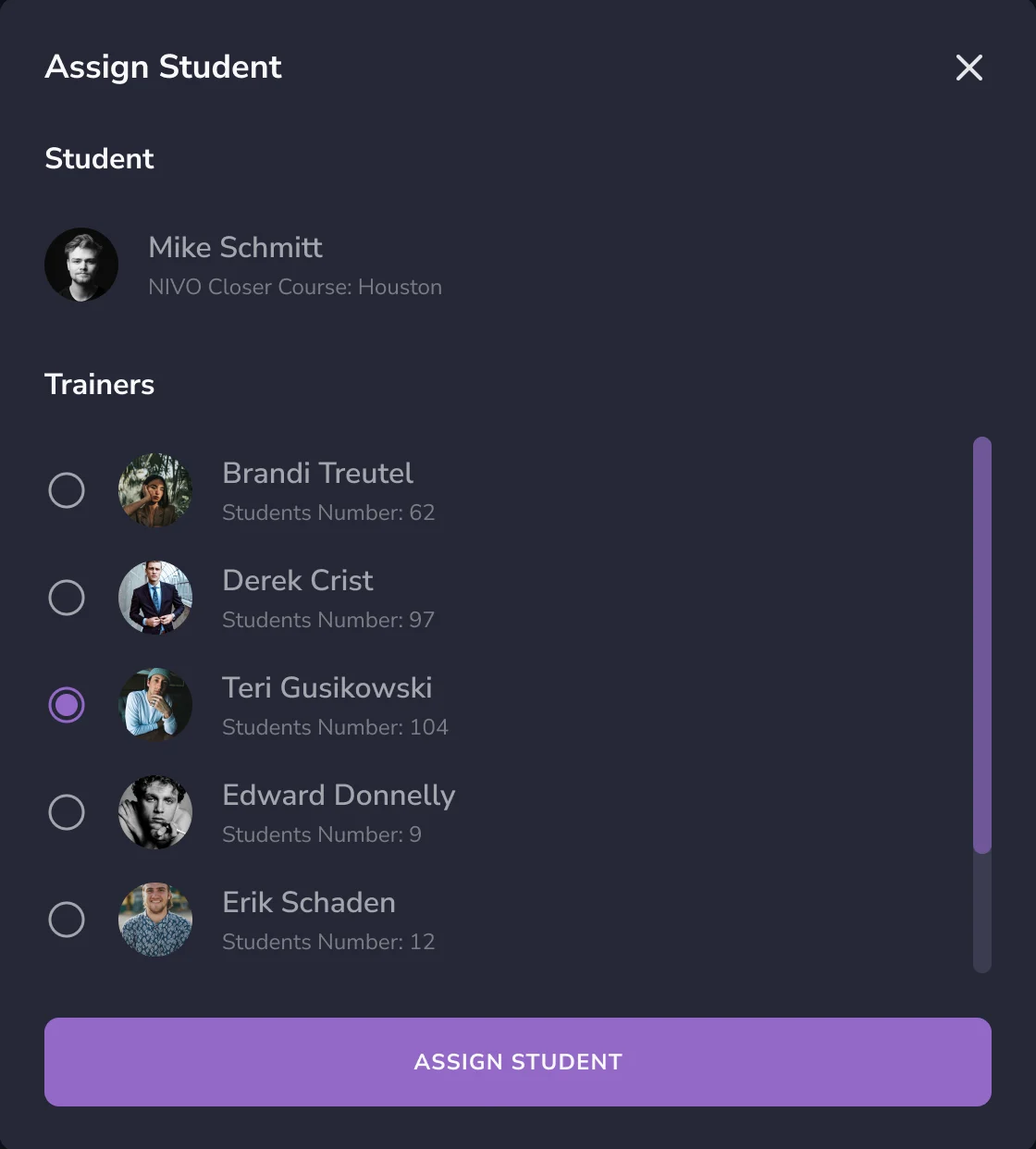
Course Approval: Assigning after approval.
A notification rule, on and off
Switched on, its channel, timing and template are live; switched off, the whole rule dims but keeps its text.
-
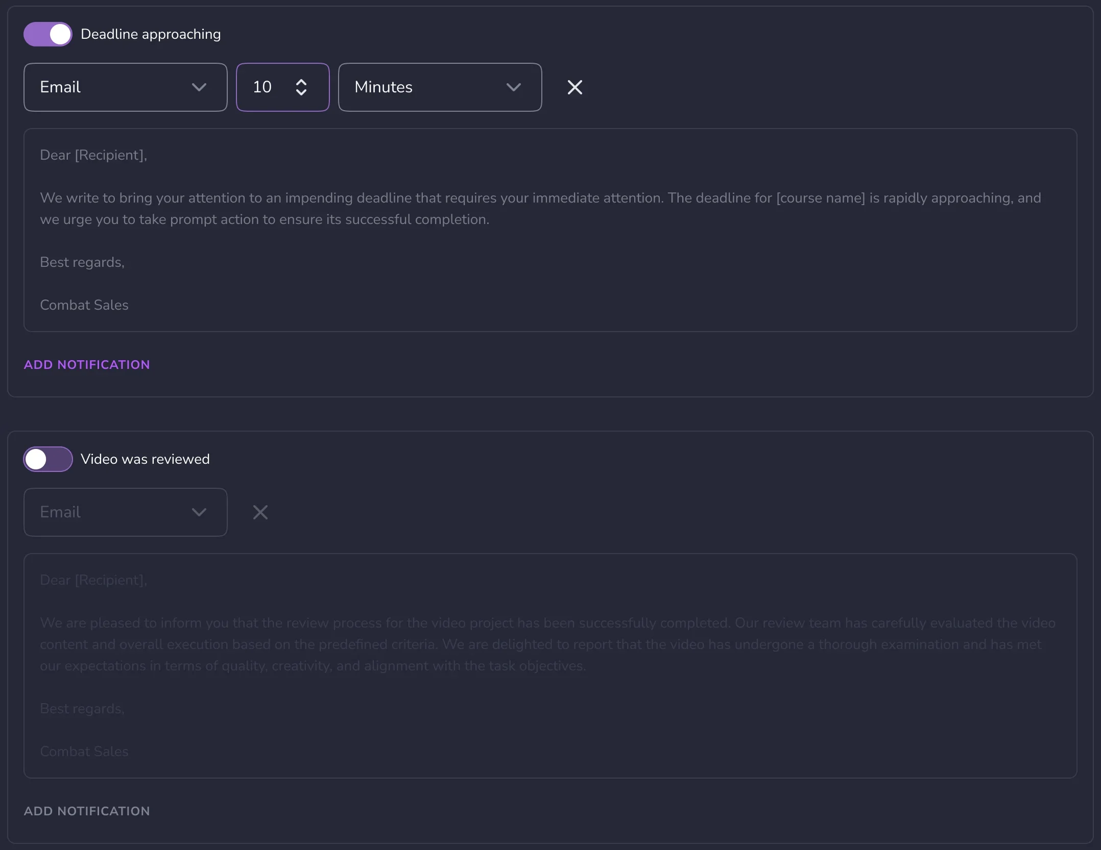
On, then off
Where the product ended up
The parts of Combat Sales that got in the way reworked, and new features designed into it, in the look its users already knew: company context and dashboards for the Superadmin, the team and students to manage, a trainer’s day in order, recorded practice reviewed inside the course, lessons, course approval and automated messages, with Trainer and Student walkthroughs and a tidied UI kit.
Delivered with a screen map and a clickable prototype, then through change requests. The redesign went live; we didn’t write its code or deploy it, and these screens are our design files, not a record of every state that shipped.
- final desktop screens and interaction states
- 80+
- roles in one platform
- 5
In the client's words
ANODA understood how different users rely on our dashboard to follow training progress and decide what to focus on next. They helped us organise that information around each role’s priorities, making the dashboard easier to navigate and the next steps clearer. We also appreciated how carefully they worked within our existing brand guidelines, making small refinements to typography, spacing and visual hierarchy that gave the platform a more polished feel while keeping it recognisably ours.

Afraid every role will get the same dashboard with a new label?
In Combat Sales, the Superadmin starts from every client company, a trainer from today’s students and questions, a student from the course, all in the platform they already knew. Bring us your roles, and we’ll show where each one’s work should start.
More work like this
Three more products with many roles, dense data, or one system to keep consistent.
-
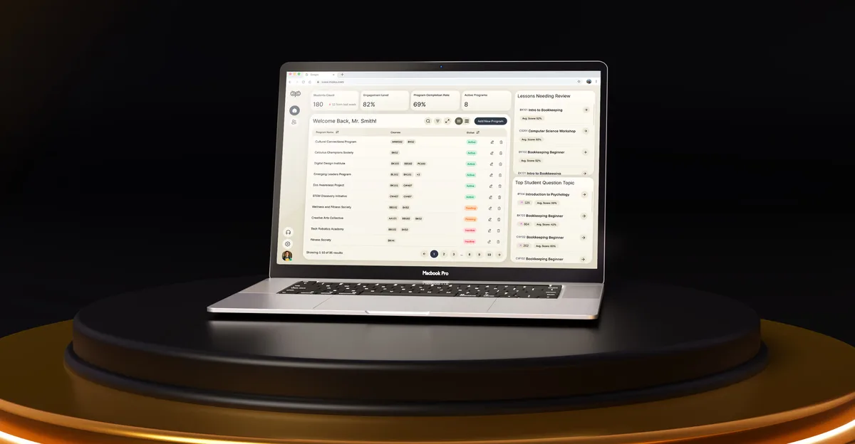
EdTech · SaaS
Moka
Designed an AI study assistant for students and the web tools their instructors, curriculum teams and schools run it from.
- 200+ Screens designed
- 4 Experts on the team
-

AI Hi-Tech · SaaS
Superstream
Turned a Kafka management platform’s dense technical data into one calm, consistent interface for DevOps teams.
- 3000+ Screens designed
- 1500h+ Design hours
-

Chrome extension · Real Estate
LenderPal
Fitted a loan officer’s property, cost and rate checks into a Chrome extension, with an Admin product behind it.
- 150+ Screens designed
- 4 Experts on the pod