
UX Psychology Principles: How People Perceive, Decide, and Act
Learn how UX psychology shapes attention, memory, decisions, motivation, and errors—and how to apply principles ethically in product design.
Design the products behind giving — requests people can make with dignity, donations that go to a named need, and a status every side can see — for donors, beneficiaries, partners and the admins who keep it honest.

Giving that every side can follow, from the request to the moment help arrives.
Payment flows and payouts, whatever is being paid for.
Nonprofit & Social Impact Product Design
The requests, people and trust around each gift.
Not included
Four places where a giving platform loses trust, and the design response to each.

Short, respectful steps to ask for help, with documents saved as you go.
Give to a named request, even as a guest, and see where it went.
Verify, approve and track every request, one role at a time.
Causes find resources and givers find causes in one catalogue.
You receive
Nonprofit software design has to hold trust on every side — the person asking, the person giving, and the admin checking in between. Each of these states gets a screen that keeps every side informed.
A charitable bill-payment platform, designed and built, and a platform that matches charities with free space.
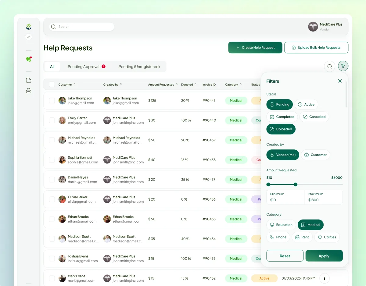
FinTech · Charity · Web platform
A UX audit, a first release on Webflow and Wized, then a full redesign now being built as a second version: a four-role platform that sends donors' money for a family's overdue bill directly to the landlord or utility.
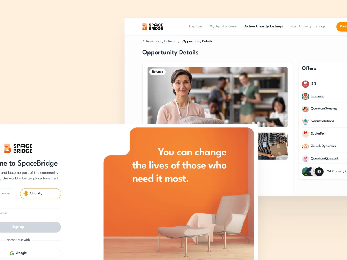
PropTech · Charity · Web SaaS
Designed a two-role marketplace where property owners offer free or discounted space and charities find it, with a refined logo and a UI kit.
It fits when several sides must trust one platform. Donors, applicants and admins each feel one of the signs below.
Donors, beneficiaries, partners and admins each need their own view.
People give or ask only when they can see what happens next.
Verification or moderation stands between asking and receiving.
Who qualifies, and how money or goods move, is already agreed on your side.
A different starting point

Tell us who asks, who gives and who checks in between. We will suggest which side of the platform to start with and the service that suits it.
Nonprofit platforms are designed under one service at a time; its proposal sets the scope and how often your team reviews.
Tell us who uses it — donors, beneficiaries, partners, admins — and where they hesitate, drop off or write to support.
Message received.
Within 15 minutes, we’ll email you initial feedback and follow-up questions.
Learn how UX psychology shapes attention, memory, decisions, motivation, and errors—and how to apply principles ethically in product design.
Learn responsive web design best practices for fluid layouts, breakpoints, images, accessibility, performance, and testing across real devices.
Ask for platforms with more than one side, not a donate button on a website. A team that knows the work can show how a request is made, checked and funded, what a donor sees after giving, what a beneficiary sees while they wait, and how an admin keeps it all honest. Ask whether the platforms launched, how much of the design was built, and who would be working on yours. Our Payyro and SpaceBridge cases show that kind of project.
You get a map of every role and hand-off, the request or application flow, the donation flow, status and receipts, partner and admin dashboards, each state between them, a clickable prototype and the UI. The number of roles, how requests are verified, how money or goods move, the platforms and whether the platform is already live all shape cost and time, which the first service's proposal then fixes.
Donors and supporters, beneficiaries and applicants, partners and vendors such as landlords, utilities or property owners, and the admins and moderators in the middle. The workflows are asking for help or applying, uploading documents, verification, finding a cause or a resource, giving with or without an account, tracking status, messaging between roles, and reporting. A donor wants to give in a minute; an applicant may need to stop halfway and come back tomorrow.
A platform that has not launched goes through UI/UX & Product Design, every side at once. Web App Design covers the browser queues admins and partners work in; donors and applicants on phones are served by Mobile App Design. When the hard part is moving money, Payment Product Design; when two sides search for each other, Marketplace Design. If donors or applicants abandon a live platform, a UX Audit comes first, and the charity's own website goes through Website Design.
Your team and advisers decide; we design how it feels to the person asking. That covers what applicants must share and who may see it, consent and anonymous giving, how a refusal is explained, and where required statements and receipt wording appear. Eligibility, safeguarding policy, tax and charity-law questions stay with your team and advisers, and payment and fraud checks with your provider. Nonprofit product design can make those rules clear and hard to skip; it cannot confirm the platform meets them.
A product owner who can make decisions, test accounts for every role on the platform or staging — no real applicants' data, ever — and the rules for who qualifies and what is checked. Support themes and drop-off points help most. If you can, arrange a short talk with one or two applicants or partners: they show which questions feel intrusive and which steps they give up on.
Payyro lets donors settle a family's overdue bill directly with the landlord or utility company; it has four roles in one platform and 400+ unique screens. Its first release shipped on Webflow and Wized; the redesign is now in development as a second version. SpaceBridge, a platform that matches charities with free or discounted property space: two user roles and 64 unique screens. Both cases describe our design and build work only; neither reports donation results.
Yes. Many nonprofit platforms are run by a small team, sometimes with volunteers and an outside developer. We pick up your design files and system where they exist, work alongside whoever builds the platform, and leave documentation a small team can keep up without us. If requests are already in progress when something changes, we design how donors and applicants see the change, so nobody loses track of a gift or an application.