In short
An education-planning product sells one thing: a plan the family trusts enough to act on. That takes one shared student plan with four different views, programme fit (age, duration, cost, start date) printed on every recommendation, a visible status for each piece of guidance and a route to a real person. We follow one illustrative plan through one change to show where trust is won, and where it quietly leaks out with the renewal.
In this article
- Education planning is not an LMS job
- One plan, four roles: who looks, who adds, who changes
- Programme fit belongs on the recommendation, not three clicks away
- Guidance the family can check
- Following plan P12 through one change
- Interruptions and boundaries: drafts, stale data and the edit you can’t make
- Test the explanation, the next move and the privacy line
- What we designed for AispireMe, and what we didn’t
- Before you design another recommendation screen
EdTech UX for education planning comes down to one shared object: the student’s plan. The student, a parent, a counsellor and the organisation all look at it, and each needs a different view, different things they can add and different things they can change. Every recommendation in that plan has to carry its programme fit (age, duration, cost and start date) and an honest status, so the family can check it before anyone pays a deposit, and reach a person when it doesn’t add up.
Many education-planning products get this backwards. They build a clever recommendation engine, put a friendly chat on top and give everybody the same screen. The student sees a programme. The parent sees the same programme and a question nobody answers: how much, and from when? The counsellor learns the plan changed when the parent emails to ask why. The organisation can see everything, which nobody actually agreed to.
It is a joint bank account where one holder makes the transfers, the other gets the statement a month later, and the branch manager reads both their letters. Nobody is technically doing anything wrong. Everybody is losing trust, and trust is the only thing an education-planning product really sells.
The money part is blunt. A family that cannot check a recommendation may simply not act on it. They phone the counsellor, who spends the call explaining what the screen should have said, or they quietly stop opening the product, and the subscription you paid to win walks out at renewal.
AI has not changed any of this. A model that talks like a counsellor is still a stranger at the kitchen table until the family can see what its advice is based on. The vocabulary is new. The trust problem is not.
Plan P12, its family and every rule, state and value around it below are illustrative. Where we mention AispireMe, we describe only the design work we documented.
Education planning is not an LMS job
An LMS runs the course: enrolment, lessons, assignments, grading, progress through material somebody already chose. Education planning happens before that and around it: which programme, which intake, at what cost, whether it fits the student’s age and goals, and who agreed.
The LMS is the current account: daily transactions, balances, statements. Planning is the meeting with the mortgage adviser where you work out which house you can afford and when you can move in. Nobody wants the mortgage decision buried between coffee purchases, and nobody signs a mortgage at the cash machine.
Blur the two and you pay twice: the planning screens inherit LMS density, the family drowns in data that answers questions they never asked, and the roadmap grows half an LMS inside the planning tool. If your problem really is the course side, our LMS and learning platform design work starts there. This article stays with the plan.
One plan, four roles: who looks, who adds, who changes
Picture chess with four players and no colours: anyone moves any piece, any time. That is not a game. It is a box of pieces and an argument, and multi-role products ship it every time access rules get pushed to a later release.
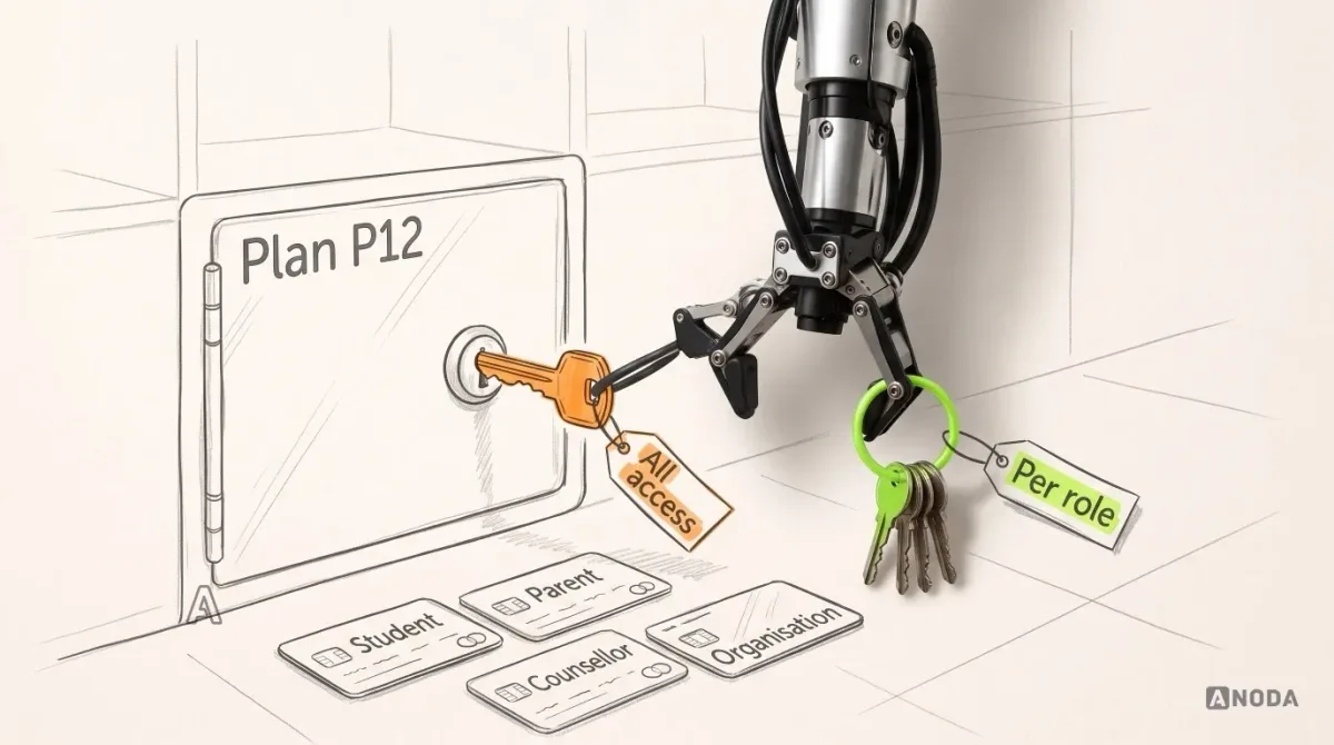
For each role, answer three separate questions: what can they inspect, what can they contribute, and what can they change? Many teams answer only the first, then wonder why a parent’s comment overwrote the student’s preference.
| Role | Inspects | Contributes | Changes |
|---|---|---|---|
| Student | Own plan, recommendations, the reasons behind them, programme details | Preferences, goals, questions for the counsellor | Own preferences and own draft |
| Parent or guardian | Plan status, recommendation reasons, programme cost and dates | Comments, a budget limit, questions | Their own notes, never the student’s preferences |
| Counsellor | Current context, change history, status of each recommendation | Review notes, a confirmation or a request to talk | Recommendation status for their own students |
| Organisation (the school or counselling body) | The plan status it is permitted to see | Organisation-level notes and settings | Its own settings, never the plan |
This is an illustrative split, not a rulebook and not AispireMe’s permission model. The client’s educational policy decides the real rules: who counts as a guardian, what an older student may keep private, what the school or counselling organisation is entitled to see. Design does not invent those rules. Design makes whichever rules the client chooses visible on every screen, so nobody learns them from an awkward phone call.
Banks solved this long ago: joint holders, a card with a spending limit, a power of attorney that lets someone see the account without emptying it. Nobody calls that paranoid. It is why people let a bank hold their money at all.
Every role you don’t define, you define by accident, and the accident is often “everyone sees everything”. You find out from a student asking why their parent read a question meant for the counsellor. That is not a bug report. That is a family deciding whether to trust you with the next five years.
Programme fit belongs on the recommendation, not three clicks away
A recommendation without its fit is a Monopoly property card with the price and the rent left blank. You can land on it. You just can’t decide anything.
Put the four facts a family checks first on the recommendation itself: age range, duration, cost and start date. Not in a details tab or a provider’s PDF. The parent who pays is the one who checks, and the parent will check. Follow the money: if the price lives three clicks away, the decision lives in a spreadsheet at home, and your product just became the place where the shortlist got typed.
Missing and changed data must look missing and changed. A blank field reads as “fine”. A zero reads as “free”. Both are lies the interface tells politely.
| Field on the card | What the card shows | State |
|---|---|---|
| Age range | Range published by the programme | Confirmed |
| Duration | Two terms | Confirmed |
| Cost | Fee per term, with the date it was last checked | Changed since the counsellor’s last review |
| Start date | Spring intake | Not available from the provider yet |
Illustrative recommendation card for plan P12. The values and states are invented for the example.
Each state needs its own look and words: confirmed, changed (with the previous value), missing (with who should provide it). Add a “last updated” date, because programme data goes stale while nobody is watching. Nothing kills trust faster than a parent finding a different price on the provider’s own page the evening before a deadline.
Guidance the family can check
Guidance, from an AI or a human, should never arrive as a verdict. A family has to be able to question it, and the screen has to give them what they need to do that.
Three things make a recommendation checkable:
- The context it used. The preferences, profile and programme data as they were when the recommendation was made, so a family can see that it was based on “autumn start, budget limit set” and not on a profile from last year.
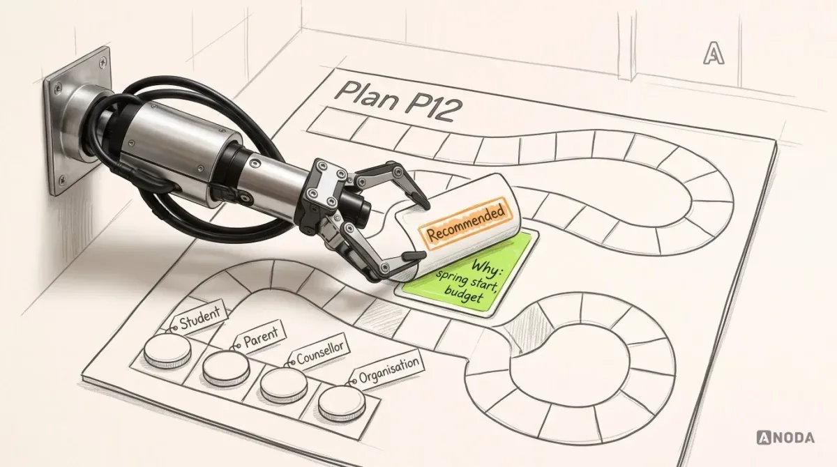
- Its status. For example: suggested, needs review, discussed with the counsellor, unconfirmed because data is missing. A status says how far along the decision is. It does not promise the recommendation is right, and the interface must not pretend otherwise.
- A route to a person. Ask the counsellor, request a discussion, flag a question on this specific recommendation. Not a generic “contact us” at the bottom of the page.
Don’t ask families for trust. Give them something to check. A fluent answer with no visible basis is a confident stranger. The same answer with its context, status and a named person to ask is advice.
A recommendation the family can’t check is a recommendation the family won’t act on.
This matters most when an AI does the talking, because a language model can sound equally sure about everything. How human it sounds is irrelevant. What counts is whether a parent can tell what it knew when it said it.
Following plan P12 through one change
Here is the whole thing in motion. Plan P12 is illustrative: a student who preferred an autumn start now prefers spring. One small change, four roles, and every weak spot in the design shows up within a day.
- The student changes the preference. The change is saved as a draft. Nobody else sees it yet, and the screen says so: “Draft, not shared”.
- The student shares the update. The plan now shows “Preference changed: autumn → spring” with the date. Recommendations that depend on the start date drop to “needs review” automatically, with the reason next to them.
- The parent opens the plan. They see the change, then cost and start date for the affected programmes side by side, autumn against spring. They can comment and ask the counsellor a question. They cannot change the preference back.
- The counsellor reviews. They see the changed preference, the context each recommendation used, and the parent’s question. One programme has no spring start date available from the provider, so that recommendation stays “unconfirmed”, with a note on what is missing and a suggestion to discuss.
- The organisation checks in. It sees “Plan P12: under review”. Not the preference, not the comments, not the budget. Only the status it is permitted to see.
It is a board game played well: one player moves, everyone sees the board change, and nobody can quietly move someone else’s piece.
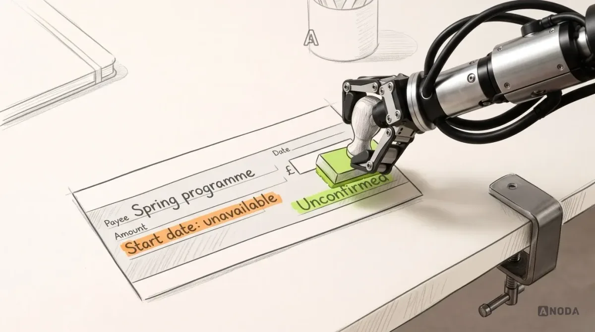
The unconfirmed recommendation is a cheque that hasn’t cleared. The bank shows it as pending and does not let you spend it. Your product should do the same: visible, honest, and not presented as a done deal until the start date exists.
Now run the same change without those states. The parent sees a different programme with no explanation, the counsellor gets an email titled “???”, and the organisation sees a plan it shouldn’t. Three phone calls, one awkward meeting, and a family that now double-checks everything outside your product. Every hour of it is paid for.
Interruptions and boundaries: drafts, stale data and the edit you can’t make
Planning happens in bursts: a change started on the bus, read at midnight, reviewed on Thursday. The design has to survive every gap.
Saved draft versus shared update. In online banking, a transfer saved in drafts and a transfer sent look very different, and nobody confuses them. Your plan needs the same clarity. A student who closes the laptop halfway through a change must come back to “Draft, not shared”, not to a plan that only looks shared. Otherwise the parent reviews a version the student abandoned.
Out-of-date programme information. When a provider changes a start date or a fee, every recommendation that used the old value should say so and drop back to review. Playing with last year’s edition of the rules is fine at home. It is not fine when the rule is the price.
Denied edits. When a parent tries to change the student’s preference, a greyed-out field with no explanation is the worst answer. The parent can’t tell whether the feature is broken or forbidden, so they phone someone. Say who can make the change and what the parent can do instead: “Only the student can change preferences. Leave a comment or ask the counsellor.” In a board game that is “not your turn”, said out loud, before anyone flips the board. The strongest web apps teach a permission at the exact moment you hit it, as we show in our analysis of 15 web app design examples.

Web app design
Four roles, one plan, no surprises
We design multi-role desktop web apps where every screen shows who can see, add and change what.
Test the explanation, the next move and the privacy line
A rulebook only its author understands is not a rulebook, which is why board games get playtested with strangers. Education planning needs the same: a clickable prototype and real people in each role.
Give each role a task, not a tour, and check three things:
- Explanation. Can a parent say, in their own words, why a programme was recommended and what is still unconfirmed? If they read the reason aloud and still shrug, the reason isn’t one.
- Next action. Can each role name what they should do next on this plan? A student unsure whether to wait or share and a counsellor who can’t find what changed are looking at the same missing decision.
- Privacy boundary. Can each role say what the others can see? If a student believes a question is private and it isn’t, you have found a trust problem while it is still cheap to fix.
Turn the answers into acceptance criteria before anyone writes production code. For our illustrative P12, they could read: a preference change cannot be seen by others until shared; a recommendation whose start date is unavailable cannot show as confirmed; the organisation view never shows comments or budgets; a denied edit always names who can make the change.
One boundary is not ours. The client owns its educational policy and guidance rules: what counts as a good fit, when a counsellor must review, what a guardian may see. Design makes those rules visible and testable. It does not decide them, and any agency that offers to is playing your cards for you.
What we designed for AispireMe, and what we didn’t
AispireMe is an AI-assisted education-planning desktop web app. For its MVP, project Rocket, we did education and competitor research, user flows for four roles, the screen architecture and screen map, wireframes, the desktop UI, a clickable prototype and a reusable UI kit.
The AispireMe case documents design problems this article also deals with: students, parents, counsellors and organisations share one student plan, each seeing and doing only its own part, and programme recommendations show age, length, price and start date.
Our contribution was design. We did not build the product or its AI, and we make no claim about admissions or learning outcomes. Plan P12 and its rules come from this article, not from the project.
Before you design another recommendation screen
Run through these in order. The first one you cannot answer is where the work starts:
- Is the planning job separate from the course and LMS job?
- Has the client’s policy owner signed off what each role inspects, contributes and changes?
- Does every recommendation carry its fit, its context, its status and a route to a person?
- Can a draft, a stale programme record and a denied edit each be told apart on screen?
Every unanswered question becomes a phone call, an email chain or a family that stops logging in. You pay for the answers either way: before launch, or one lost renewal at a time.

Education product design
Build the plan a family can check before they act
Show us your roles, your recommendation screen and the change that causes the most phone calls. We will map who sees, adds and changes what, and design the states that keep everyone on the same page.
Written by