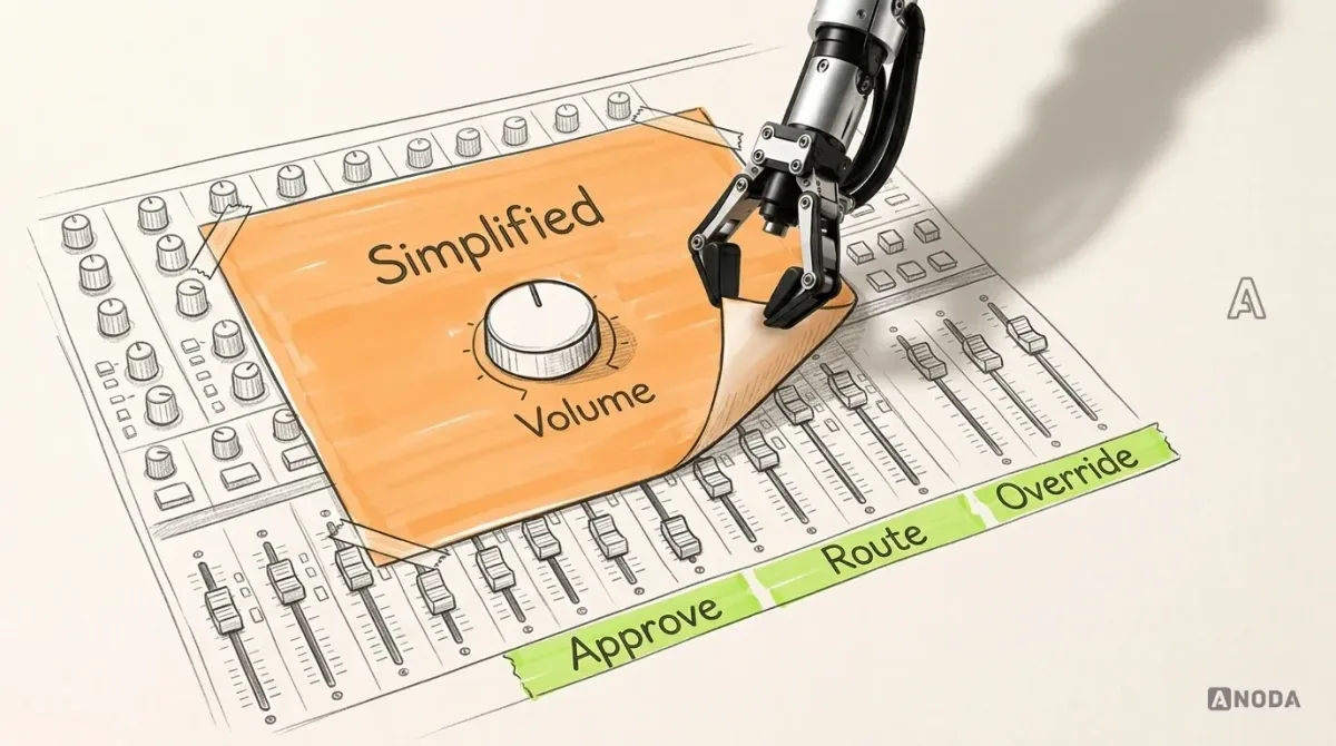
In short
Staff don't struggle with your internal tool because it lacks screens. They struggle because nobody can tell whether the work is saved, submitted or waiting for someone else. Fix one repeated task end to end: roles, states, transitions, exceptions, the working environment, a prototype tested with real tasks, and a handoff engineers can build from. One inspection workflow, followed from draft to approval.
In this article
- Pick one task with a finish line
- Separate who does the work from who decides
- Define states before you draw screens
- The transition that breaks most tools: returning a record
- Design the exceptions your workflow actually has
- Design for where the work happens
- Doing the work and watching the work are different jobs
- Test the prototype with tasks, not opinions
- Prepare a handoff engineers can build from
- Where to start
Internal tool design works best when it starts from one repeated task and follows it from start to finish: who begins it, which states the work passes through, who is responsible at each step, what happens when it goes wrong, and what engineers need to build it. Replacing the ERP or backend is outside this example’s scope; engineering must confirm which capabilities can support the flow and which need changes. What the design addresses is whether the people using it can tell, at any moment, where their work stands and whose move it is.
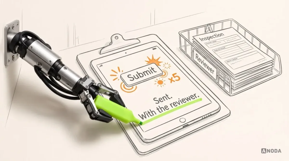
Picture an illustrative but painfully familiar moment. An employee spends twenty minutes filling in a record on a tablet. They press a button. Something spins. The screen changes. And they have no idea whether the record was saved, sent to the reviewer, or quietly lost somewhere between the warehouse and the server.
So they do what any sensible person does. They press it again. Then they message the reviewer to ask whether it arrived. The reviewer checks, finds two copies, deletes one, possibly the wrong one. Multiply that by every employee, every shift, every week, and you are paying full salaries for people to do the software’s job of telling them what happened.
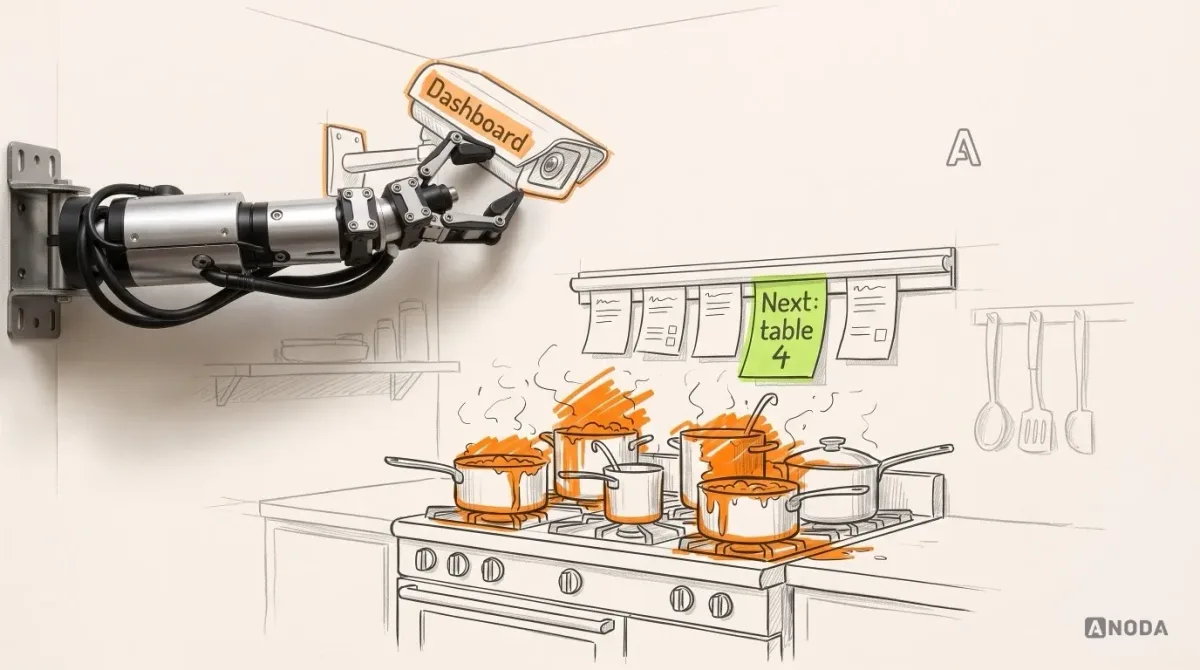
The usual reaction is to add something: a new screen, a status page, a dashboard for the manager. Installing CCTV in a kitchen does not make the chef cook faster. A dashboard shows management the confusion in colour. It doesn’t remove it.
Pick one task with a finish line
Don’t start with “redesign the internal tool”. That is a budget with a start date and no end date. Start with one task people repeat often, or one where mistakes are expensive, and that has a clear completion condition. This example concerns one job over an existing system, rather than its replacement. Engineering still needs to confirm whether the required states can be supported or require changes.
Four questions define it:
- Who starts it? One role, ideally. If three roles can start the same task, you already have a design question.
- What goes in? The information, documents, photos or measurements the task needs.
- What counts as complete? Not “submitted”. Complete means the result is accepted by whoever needs it.
- Who needs the result? The next person, team or system that acts on it.
The example we will follow is illustrative: a composite inspection workflow, not a specific client’s process. An employee starts an inspection, saves a draft, adds information and photos, and submits it for review. A reviewer accepts it or returns it with a reason. The employee corrects it and resubmits, and the record receives its final status.
This example shows how to turn an agreed operation into states, prototype tasks and a handoff. It does not define an inspection standard or prove that a submitted report passes a quality check. Your operations team defines what review acceptance means and who owns the accepted record. Defect identity, evidence versions and quality-decision rules need their own domain specification.
Separate who does the work from who decides
Before any state or screen, write down who holds the work at each moment and what kind of decision each person makes.
In our example:
- The inspector collects evidence and fills in the record. They decide what they observed, not whether it passes.
- The reviewer checks completeness and quality. They decide to accept or return, and if they return, they must say why.
- The manager watches the queue, reassigns work when someone is absent and handles disputes the reviewer can’t resolve.
- The admin manages users, templates and access. They don’t touch the content of inspections.
The point is the handoff. Every time responsibility moves from one person to another, the interface has to say so, to both of them. “Submitted” means nothing to an inspector unless it also means “the ball is in the reviewer’s court, and you will hear back”.
Which decisions belong to which role is a business rule. Your operations team owns it. Design makes the rule visible and hard to break; it doesn’t invent the rule.
Define states before you draw screens
This is the step projects skip most often, and skipping it is expensive. A state is a named condition of the record: what it is, who holds it, what can be done to it now.
Draw screens first and you get a railway with beautifully painted stations and no signalling plan. Trains arrive, nobody knows which one has priority, and the drivers start phoning each other.
Our illustrative states are draft, submitted, returned and approved. Your process may need different ones, and your team names them. For each state, decide four things: which actions are allowed, who can see the record, which role is responsible, and where it can go next.
| State | Responsible role | Available action | What the user sees | Next state |
|---|---|---|---|---|
| Draft | Inspector | Edit, add photos, submit | “Draft, last saved at 10:42” | Submitted |
| Submitted | Reviewer | Accept or return with a reason | Inspector: “With the reviewer. You can’t edit it now.” Reviewer: in their queue | Approved, Returned |
| Returned | Inspector | Read the reason, correct, resubmit | The reason at the top, the fields to fix marked, everything else kept | Submitted |
| Approved | Reviewer or named record owner; no action pending | View | “Approved by J. Smith on 4 March.” No edit buttons | — |
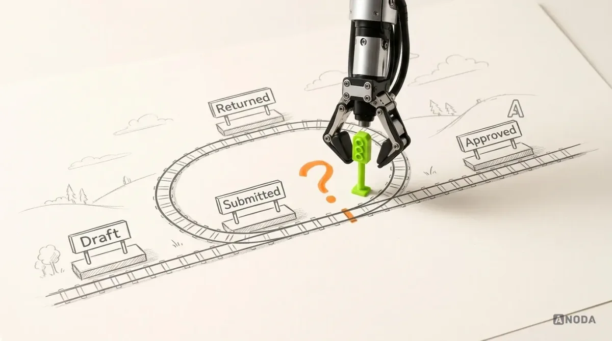
Look at the fourth column. Every row tells the person what happened, where the record is now and whether they have anything left to do. That column is the whole difference between a tool people trust and a tool people double-check by phone.
The transition that breaks most tools: returning a record
Accepting is easy. Returning a record for correction is where internal tools leak hours, so it deserves the most design attention.
When a reviewer returns an inspection, four things need to be right:
- The reason. Required, specific and attached to the record, not sent in a chat message that disappears. A short list of common reasons plus a free-text note works well; your reviewers will know which reasons repeat. A record returned without a reason is a parcel stamped “refused” with no explanation. The sender can only guess, and guesses come back wrong.
- The required action. The inspector should see exactly which fields or photos need attention, not reread the whole form hunting for what upset the reviewer.
- What is kept. Everything the inspector entered stays. Photos stay. Earlier comments stay. Correction means editing the record, never starting again from an empty form.
- The condition for resubmitting. If the reviewer asked for a new photo of a defect, the inspector shouldn’t be able to resubmit without adding one. If the condition is vague (“make it better”), the record will bounce back and forth like a ping-pong ball in a match nobody is allowed to win.
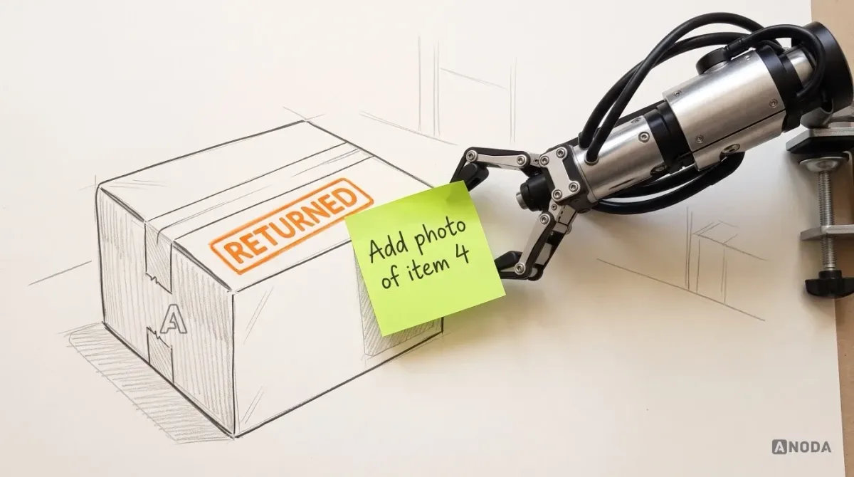
Design the return once, properly, and you remove an entire category of “what did they want from me?” messages. Leave it vague and you will pay for every round trip in somebody’s time.
Design the exceptions your workflow actually has
The normal path is the one people walk in their sleep. The day goes to the exceptions. But don’t import a universal checklist of every possible error state; design the ones your workflow produces.
For our inspection, those are:
- Missing information. The inspector tries to submit without a required photo. Say what is missing and where, before submission, not after a reviewer bounces it.
- Return for correction with a reason. Covered above, and the one people meet most often in a review workflow.
- Conflicting edits. A record is returned, and while the inspector is correcting it, a manager reassigns it to a colleague who starts editing too. Someone has to win, and the other person has to be told. Which one wins is a rule your team decides.
- Connection loss. The inspector is in a basement or a warehouse corner with no signal.
- Uncertain submission. The button was pressed, the connection dropped, and nobody knows whether the server received it.
The last one is the lift button that doesn’t light up. Everyone presses it five times, because nothing told them the first press counted. In software, five presses can mean five records.
Here is the honest boundary. Design can specify what the user should see in each of these cases: “Saved on this device, will send when you’re back online”, “Sending…”, “Sent, and the reviewer has it”. Design cannot promise the system can actually do those things. Saving drafts locally, synchronising when the connection returns and refusing a duplicate submission are engineering capabilities that may require device storage, synchronization and server checks. Whether they exist, and what they cost to build, is an engineering decision made with your team, not a promise drawn in Figma. A good design handoff marks exactly where each interface state depends on one.
Design for where the work happens
Internal tools are rarely used at a desk with coffee and full concentration. Our inspector works on a tablet, standing up, possibly wearing gloves, in poor light, and gets interrupted every few minutes.
That changes real decisions:
- Interruption. The draft must survive the inspector putting the tablet down to answer a question. Coming back should land them where they left off, not on a home screen.
- Poor connection. The status line must say plainly whether work is safe, and the inspector shouldn’t have to understand networking to read it.
- Evidence capture. Taking a photo should happen in context, attached to the item being inspected, not in a separate gallery to sort out later.
- Touch and posture. Large targets, few typed fields, the main action where a thumb can reach it.
One part of this we can point to in our own work. On Qarma, a quality-control platform where ANODA did the product design, inspectors work through structured checklists on mobile and record defects with severity, quantity, comments and photographic evidence. Our takeaway: evidence belongs inside the record, not in a separate gallery. Cabinit, a tablet-first app we designed for kitchen installation in residential buildings, has installation teams completing punch lists with photos and notes on site. Vecna Robotics’ handheld for warehouse associates, which we also designed, keeps repetitive human work in step with robot tasks. Three different products and three different workflows, which we keep apart here on purpose. The documented contributions cited here are design and handoff; these cases do not establish the offline, duplicate-protection or conflict-handling capabilities in the illustrative example.
Doing the work and watching the work are different jobs
A frequent mistake: one interface for everyone. The inspector gets a screen cluttered with queue statistics they don’t need, the manager gets a form view of individual inspections they can’t act on, and both are slower.
Separate them:
- The employee interface supports completing the task. One record at a time, clear state, the next action obvious.
- The manager view supports oversight and decisions. Queues, records stuck in one state too long, returns that keep bouncing, work with no one assigned, reassignment.
The manager view is a decision tool, not a mirror of the employee’s screen. If it grows into a full reporting product, that is a separate piece of work: dashboard design with its own questions about which numbers drive which decisions.
Test the prototype with tasks, not opinions
A connected prototype, one where the states actually change, is cheap compared to discovering the same problems in production. But it only helps if you test it with tasks real people perform, not by asking whether they like it.
For our inspection, the tasks are:
- Start an inspection, get interrupted, come back and find your draft.
- Open a returned record, understand why it came back, fix it and resubmit.
- After submitting, say in your own words where the record is now and who has it.
- As a reviewer, return a record with a reason the inspector will understand.
- As a manager, find the inspections that have been waiting too long and reassign one.
Watch for the moments people hesitate, tap twice or reach for their phone to ask someone. Each one is a state the interface is not explaining. Fix it in the prototype, where a change costs a fraction of what it costs in code. Think of it as a dress rehearsal with the actual cast: forgotten lines are cheap now and very expensive on opening night.
Prepare a handoff engineers can build from
The end of design is not a folder of pretty screens. It is a package that lets your engineering team build the workflow without guessing at the rules. For a single workflow, it includes:
- Workflow map. Roles, steps and handoffs from start to final status, including the return loop.
- Roles and permissions. Who can see and do what, in each state.
- State and transition table. Every state, every allowed move, the conditions for each, and who triggers it.
- Interface states. Empty, loading, saved locally, sending, sent, failed, returned, approved, and any others the workflow needs, each drawn.
- Constraints. Device, connection, environment, accessibility needs.
- Open technical questions. Everything design assumed but engineering must confirm: draft persistence, offline queueing, duplicate protection, conflict handling, integration with the existing ERP or backend.
The last list is the most valuable page in the package, because it is honest about what the design depends on. Engineers can then say “yes, we can do that”, “yes, but it costs this” or “no, here is what we can do instead”, before the build, when the answer still changes the design cheaply.
Enterprise UX
Is the problem bigger than one workflow?
When modules, navigation and access rules are tangled across the whole system, we start from the structure.
Where to start
Choose one task: the one people repeat most, or the one where a mistake costs most. Collect the roles involved, the inputs, the states the work passes through, the review rules and the exceptions you already know about. Then build a connected prototype and test it with the people who do the work.
What you get from us is the workflow map, the state table, the designed interface states, a tested prototype and a handoff that names every open technical question. What stays with you: the business rules, which your operations team owns, and the technical decisions, which your engineering team owns, because they will run the system long after the design is done. If the workflow is about customers and deals rather than inspections or orders, the same thinking applies to CRM design.
Fix one workflow properly and the next one starts with the patterns, states and handoff format already in place. Fix none, and every quarter you choose to keep paying people to press the button twice.

ERP and internal tools design
Bring us the task your team keeps getting wrong
We map the roles, states and exceptions of one repeated workflow over your existing system, test it as a prototype and hand engineers a specification they can build from.
Written by