
In short
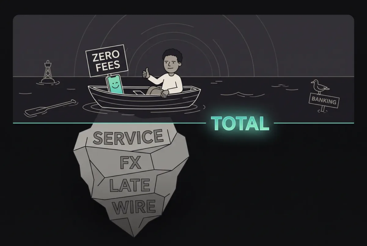
A fintech interface should make the amount, account, costs and commitment clear, then distinguish verified results from pending or uncertain states. Specify recovery, permissions and support context with the same care as the successful screen.
In this article
- Give the money a readable hierarchy
- Make the review screen a decision surface
- Specify pending and uncertain results separately
- Treat errors as part of the screen design
- Keep authentication and permissions understandable
- Use an approved case to ground the design decisions
- Review the interface as a set of states
Fintech UI design turns a financial decision into an interface people can read and verify: what they are doing, which money it affects, what it costs and what happens after confirmation. The screen must distinguish a displayed estimate from a committed action and a pending result from a completed transaction.
This guide focuses on the interface specification. For the wider journey across onboarding, verification, support and recovery, see our fintech UX design guide. Security, financial rules and transaction processing need their own responsible owners; visual reassurance cannot substitute for those controls.
Give the money a readable hierarchy
Keep the amount and currency together. Distinguish available money, a total portfolio value and a pending amount rather than presenting different concepts as one balance. Name the account or wallet when the person can switch between them.
Use consistent number alignment and enough space for long amounts. Check negative values, currency symbols, decimal separators and unusually large numbers with representative content. Colour can reinforce a status, but the label and structure must explain it without colour alone.
A chart should answer a defined question. Make the period, units and context visible, and provide a way to read the underlying values. An attractive rising line is not an explanation of whether the figure includes deposits, fees or a market movement.
Make the review screen a decision surface
A review screen should summarize the actual action, with the information needed to understand its consequence. Agree the values and rules with the product’s responsible specialists, then make their relationships clear.
| Interface element | Question it should answer | Detail to specify |
|---|---|---|
| Source and recipient | Where does the money leave and where does it go? | Account identity, recipient details and an edit route |
| Amount and currency | What am I sending or committing? | Entered amount and the distinct received amount when relevant |
| Fees and conversion | What else changes the total? | Applicable fees, rate, timing and when a displayed quote expires |
| Confirmation action | What does this button commit? | A specific label and the consequences that apply to this operation |
| Result state | What can the system verify now? | The operation reference, known status and next action |
This is a design review framework, not a specification of any particular provider. Do not display a value or promise a delivery time that the underlying system cannot support.
If a fee, recipient or quote changes, show the updated summary before the person commits. Preserve editable inputs where appropriate and explain why another review is needed.
Specify pending and uncertain results separately
A spinner does not say whether the operation reached the service. Work with engineering to define the states the product can verify and the actions allowed in each.
A hypothetical state set could include submitting, received, pending, completed, declined and reversed. The labels and transitions must match the actual service. A reversal is not the same as a request that never arrived, and a completed request does not necessarily mean settlement has finished.
For an interrupted response, specify what the interface knows, where it gets a fresh status and when it can offer another action. Preventing duplicate transactions requires server-side processing rules as well as button behaviour. The interface should not invite a blind retry because a timeout looked like a failure.
Give support a reference the customer can find without exposing unnecessary private data. Keep the same terms in the transaction list, detail page, notification and support view.
Treat errors as part of the screen design
Place a field error beside the relevant input and say how to correct it. At the operation level, explain whether the product knows that money moved, whether a result is still pending and what the person can do next.
Keep a user’s entered information when it is safe and appropriate. Avoid sending them back through the whole flow to fix one detail. For expired quotes or changed limits, explain the new condition and return to a reviewable state.
Specify empty, loading and unavailable data separately. A dashboard with no recorded activity should not look like an account whose history failed to load.
Keep authentication and permissions understandable
Explain why an additional check appears and what will happen afterwards. Give a clear route back from an interrupted check, with the original action still identifiable. Do not reveal account information to someone whose access has not been established.
Interface permissions must follow the actual authorization model. Hiding a control does not enforce access. Product, engineering and security owners need to agree which roles can view, prepare, approve or execute an action before the interface can represent those rights accurately.
Use an approved case to ground the design decisions
In Blackstar’s investment-app design, ANODA designed for first-time and self-directed investors, with Active Invest and Auto Invest entry points, funding choices, wallets and portfolio views in light and dark themes. A shared design system connects those financial choices across screens.
The useful design question is how the information and next action change with the task. Reviewing an investment portfolio, funding a wallet and choosing an investment mode need different priorities. The case documents design work; it does not establish that any specific interface pattern produced a measured financial or engagement result.
Review the interface as a set of states
Test a complete task with representative users and realistic data, including long values, interruptions and changed conditions. Ask what the person believes will happen, then compare that answer with the operation the system will perform.
Before handoff, review:
- Whether account, amount, currency, fees and recipient can be understood together.
- Whether confirmation labels describe the action rather than a generic next step.
- Which states are verified, which remain uncertain and how the view refreshes.
- How keyboard and assistive-technology users read errors, status and actions.
- Which role can take each action and how engineering enforces that access.
- What the customer and support team can see when a result is interrupted.
Bring the core financial flow to ANODA with its rules, roles and processing states. The deliverable should include the surrounding states and a buildable handoff as well as the successful screen.
Frequently asked questions
What should a fintech UI review screen show?
Show the actual source, recipient, amount, currencies, relevant fees and confirmation consequences. Values and timing must reflect the real service, with changes visible before the person commits.
How should an interface represent an uncertain transaction result?
Show what the system can verify, distinguish pending from failed and completed, and provide a fresh-status or support route. Button behaviour alone cannot prevent duplicate processing.
Does hiding a financial action enforce permissions?
No. Interface controls represent the authorization model; engineering must enforce the actual permissions and processing rules.
Written by