
An AI governance product leaders can act on
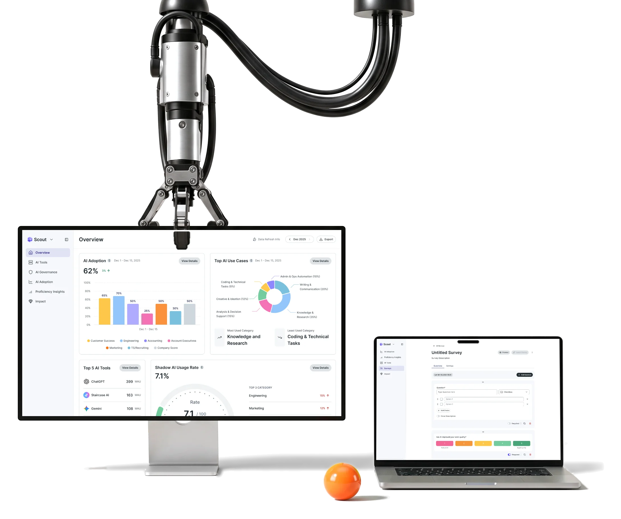
Larridin Scout shows enterprises which AI tools their people use and where policy breaks.We are its embedded design partner, from product to website.

- Embedded
- design partnership long-term, inside the client’s own teams
- One
- system product UI, website, reports, decks, campaigns and motion
- Design
- and handoff contractors and engineers built from our directions
Project summary
We design Scout’s product UX and UI as Larridin’s embedded partner, connecting AI adoption, usage, costs and permissions into views enterprise leaders can act on. Flows, self-serve setup and a complete design system keep that work coherent as the product grows. Website design, reports, decks, campaigns and motion carry the same foundations beyond the product.
How the engagement ran
- Model
- An embedded design partnership with the client’s product, marketing and engineering stakeholders, not a one-off scope.
- Scope
- Product UX and UI first; then the website, self-serve, reports, decks, campaign and event assets and motion.
- Handoff
- Implementation-ready directions for product, website and motion. The client’s contractors built the website; we did not develop or host it.
One product, from a first look to a decision
A leader opens Scout with a question, and each module answers the next one:
-
Overview
- Adoption
- Top tools
- Shadow AI rate
-
Adoption
- Engagement score
- Usage over time
-
AI tools
- Tool inventory
- Approved or not
-
Governance
- Shadow AI
- Enforcement
- Access policies
-
Surveys
- Question bank
- Rating scales
-
Cost and reports
- Cost management
- Reports
- Dense data and A clear next step
- Every number has a place, and the order of the page tells a leader where to look first.
- Many statuses and One glance
- Authorised, unauthorised, in review, warned, blocked and monitored read the same way in every table.
- Many modules and One product
- Adoption, governance and surveys share filters, cards, tables and a menu, so nothing feels bolted on.
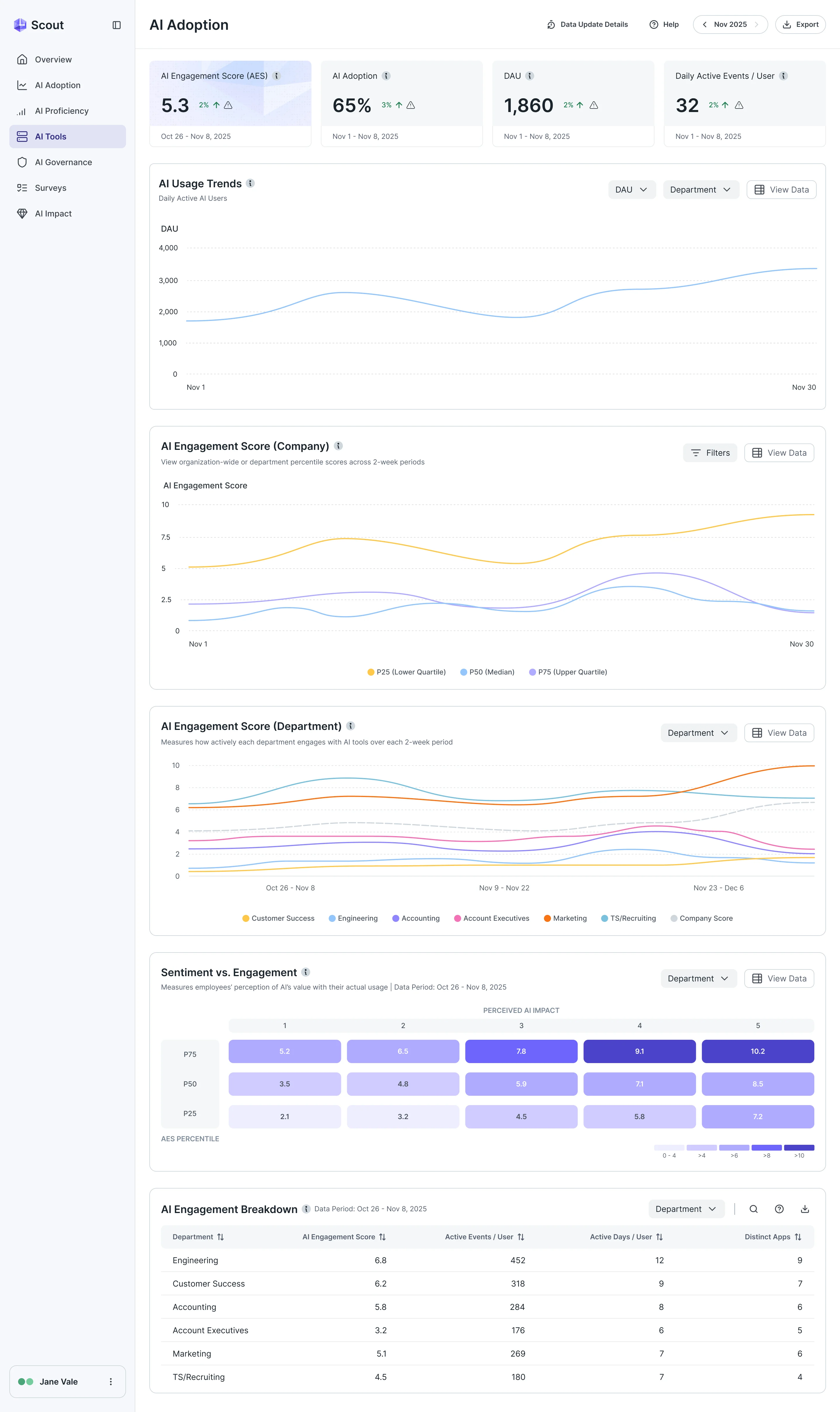
One page, read top to bottom
- Found
- Adoption, engagement, department and sentiment data are all true at once, and at equal weight the page gives a leader no place to start.
- Decided
- One order: the headline numbers, then use over time, then engagement for the company, for each department and against sentiment, and the breakdown last for whoever needs the rows.
- For the user
- A head of AI or a CIO gets the answer to "is it working?" in the first screen and can go down a layer only when they need to.
-
The headline numbers
Engagement, adoption, daily users and events per user, each with its change.
-
Use over time
Daily active users, filtered by department.
-
Engagement, company
The company’s score across two-week periods, in quartiles.
-
Engagement, by department
The same score for each department against the company line.
-
Sentiment against engagement
What people think AI is worth next to how much they use it.
-
The breakdown
The rows behind every chart, for the reader who needs them.
How the work progressed
Not one project but a rhythm: each surface was worked out before it was drawn, on one set of foundations.
-
User Flow
How adoption, tools, governance, surveys and self-serve connect for each kind of reader
Artifact Information architecture, user flows and role-based screen maps
-
Wireframes
Where dense tables, filters and charts sit before any styling
Artifact Wireframes and clickable prototypes for the Scout modules
-
UI & Design system
One set of cards, tables, charts and status styles across the modules
Artifact Final product UI, a complete design system and UI kit extending the client’s foundations
-
Landing Page
How the product is explained on the website and how a visitor signs up alone
Artifact Product page and self-serve screens: sign-up, plan choice, team invitation
-
Animation
How the product shows itself in motion, on the site and at events
Artifact Implementation-ready animation directions and product-demo, website-hero and event-video motion
-
Delivery
What the client’s engineers and contractors needed to build it
Artifact Developer handoff with screen maps and the UI kit
From the first visit to a working account
- Found
- A self-serve product has to take a stranger from an e-mail address to a configured workspace without a sales call, inside a product built for enterprises.
- Decided
- The entry flows drawn screen by screen before the UI, then one side menu that groups the modules a leader moves between.
-
Signing up
An e-mail and an organisation, a code sent to the inbox, then the team invited before the first dashboard.
Open the full map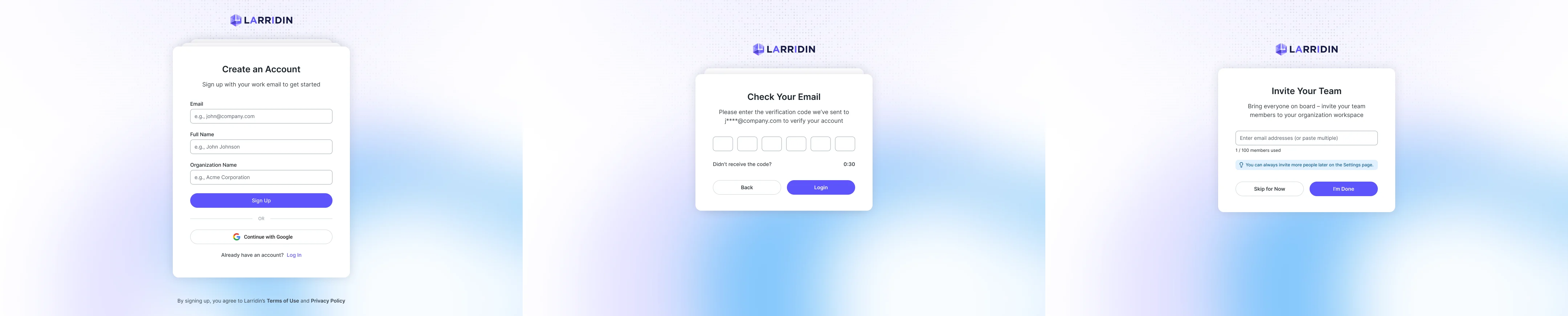
-
Choosing a plan
Plans side by side, a checkout for a paid plan and a short form for a company that needs to talk first.
Open the full map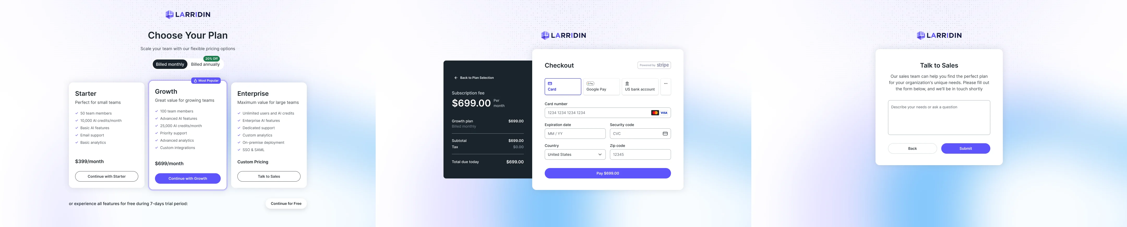
Three jobs Scout does for AI leaders
In the order a head of AI meets them.
Seeing where AI is used
- Found
- Adoption sits in one place, tools in another and departments in a third, so no one could say which AI was used, by whom and how much of it was approved.
- Decided
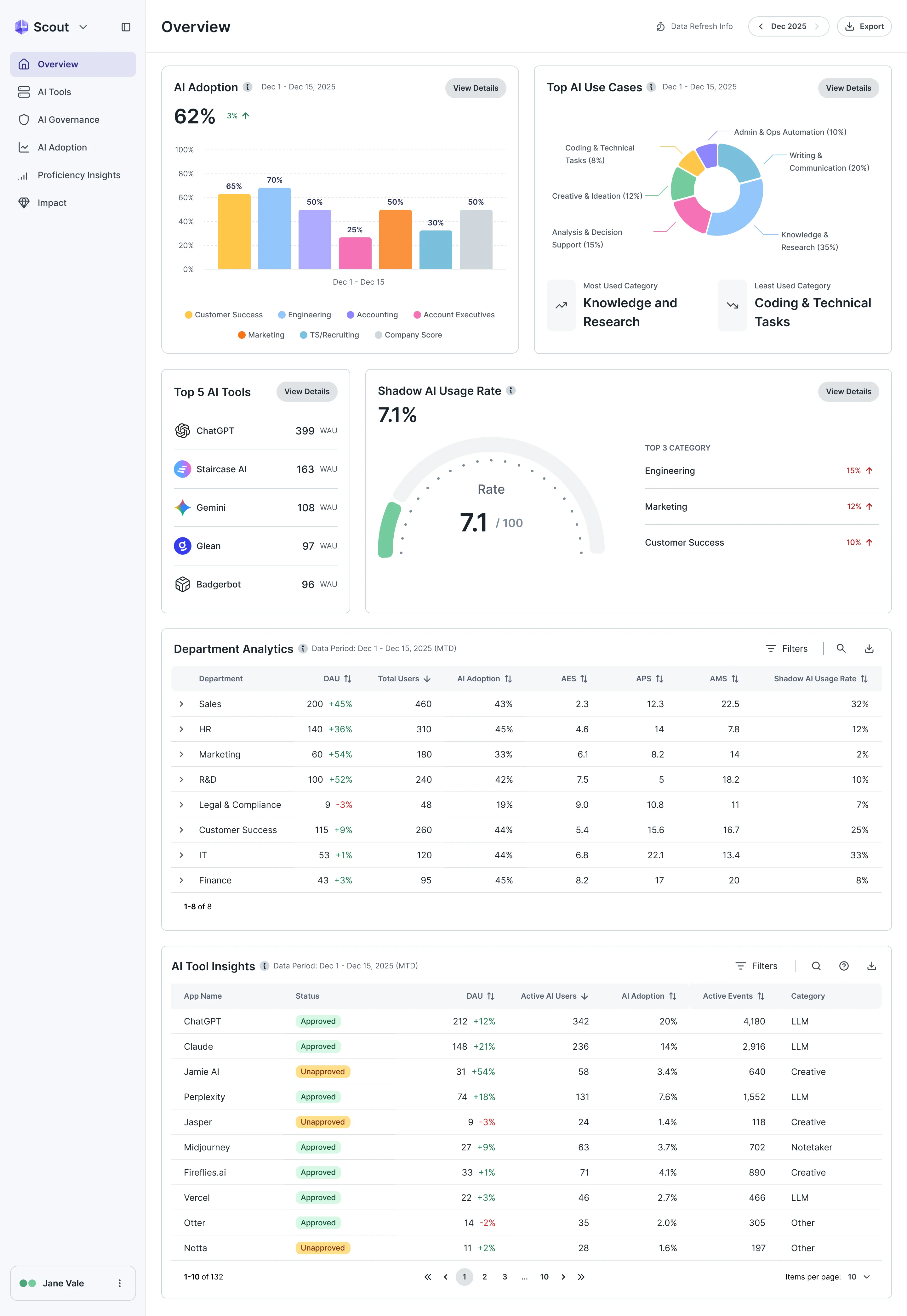
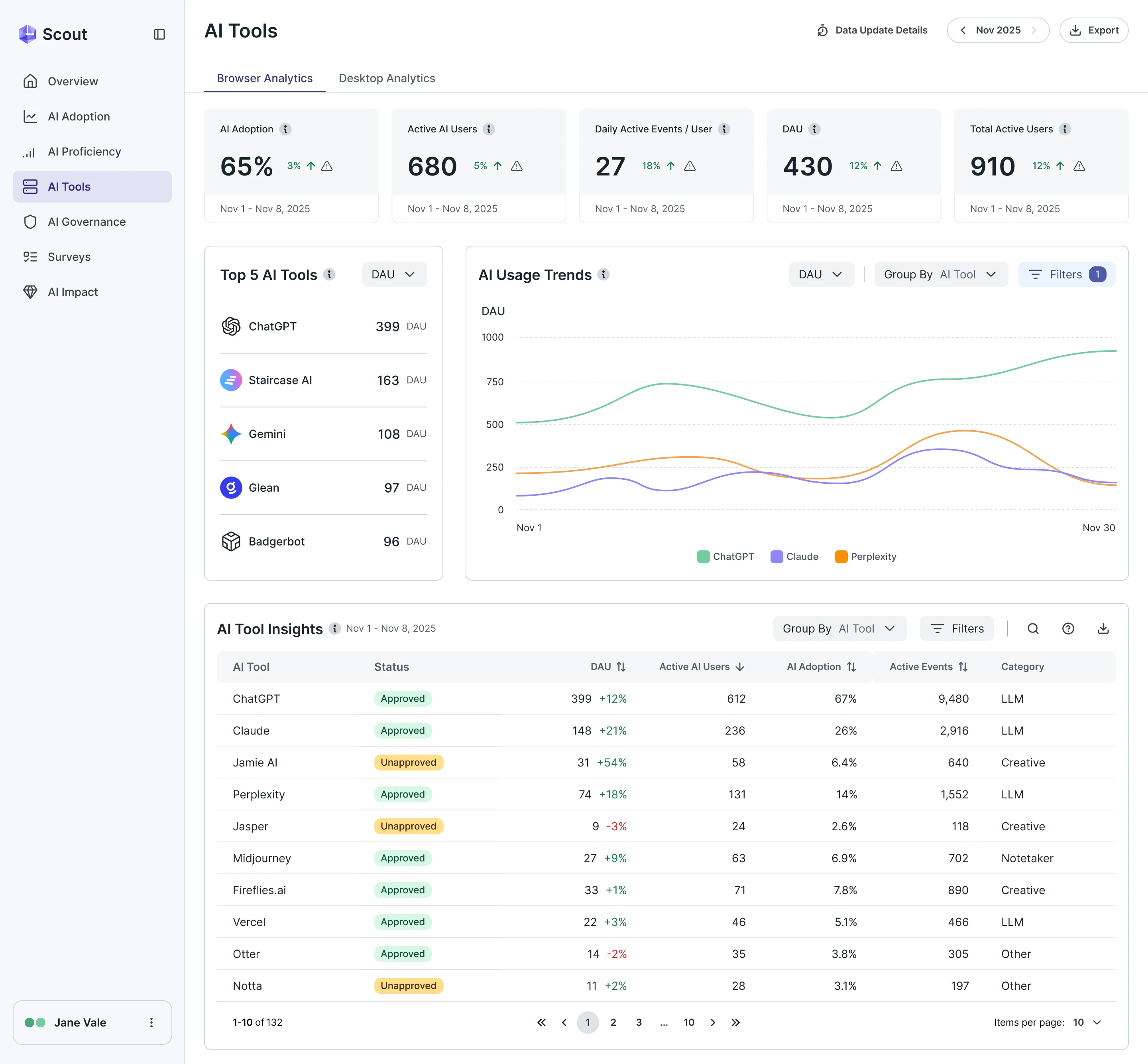
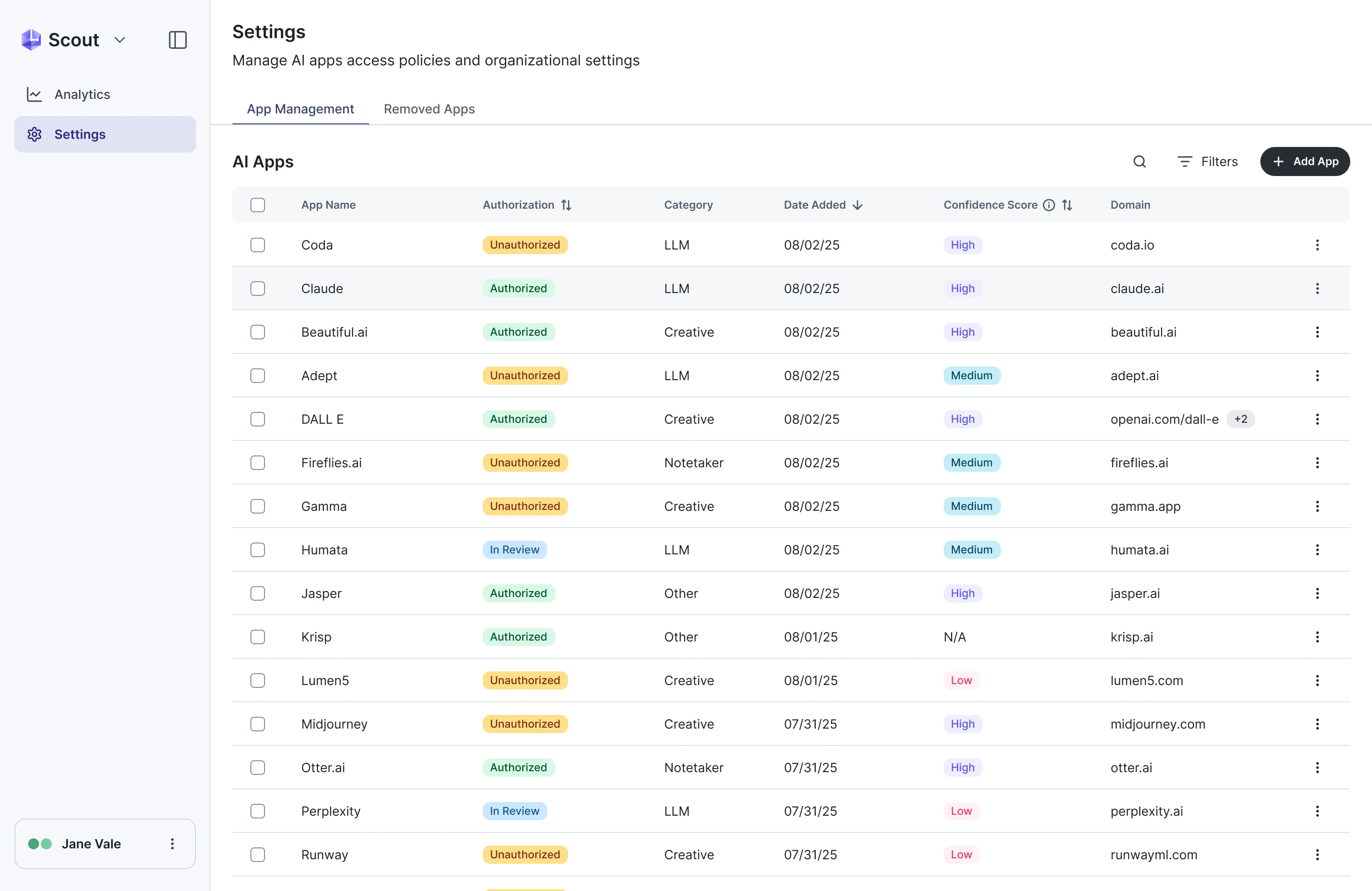
- An overview that answers it in one scroll (adoption, use cases, the top tools, shadow AI and departments), and an AI Tools page that turns every tool into a row with its status.
Governing what people use
- Found
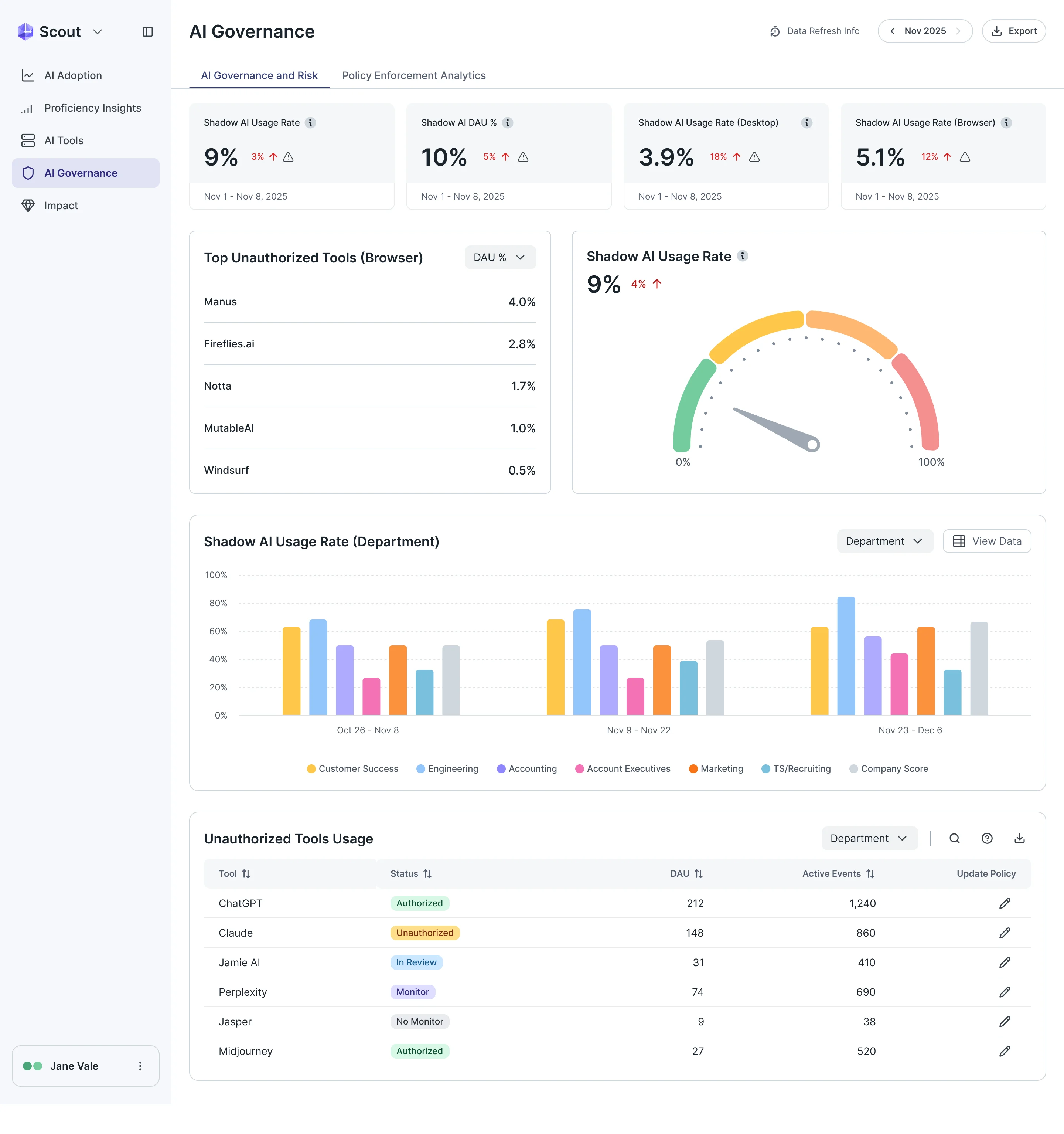
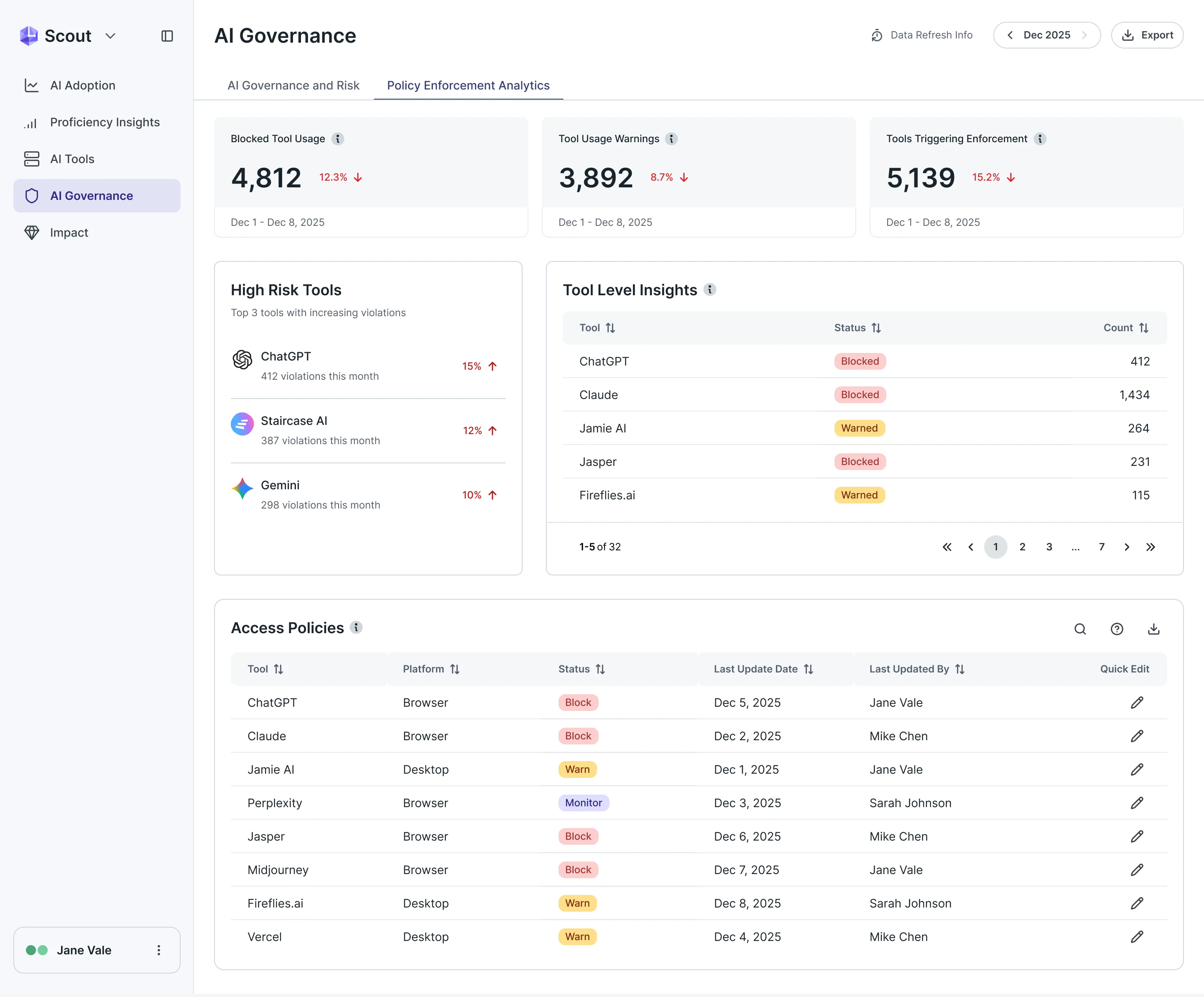
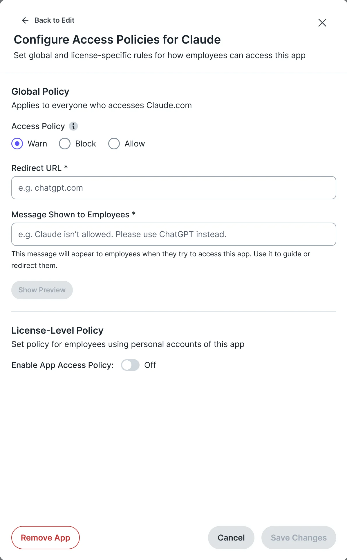
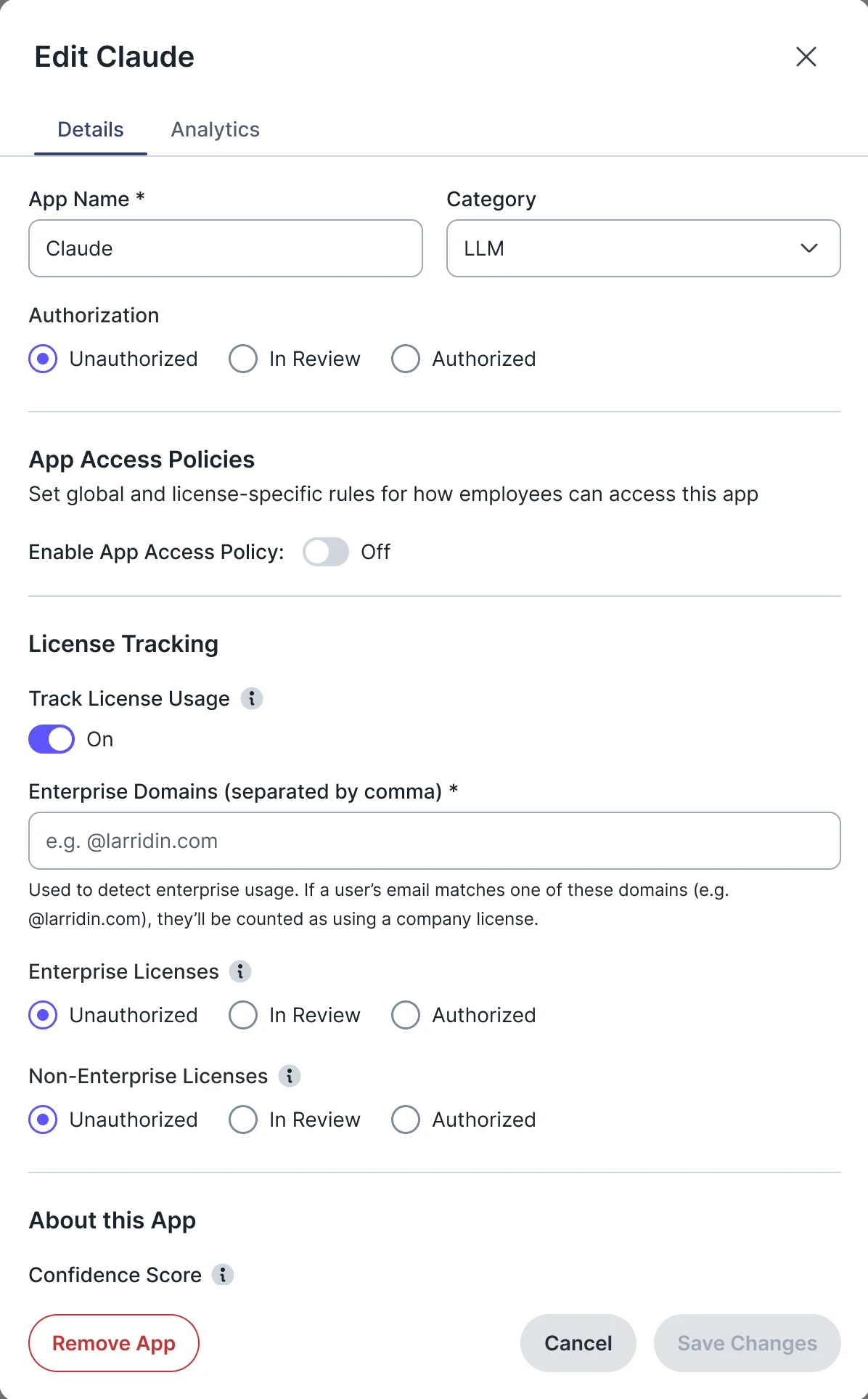
- Knowing that unapproved tools are in use is half the job: a leader also has to see what was blocked or warned, and change a policy without leaving the page.
- Decided
- Governance split in two: the risk view of shadow AI, and enforcement analytics with the access policies beside them. Every status is its own state, and a policy is edited in a side panel.
Asking employees directly
- Found
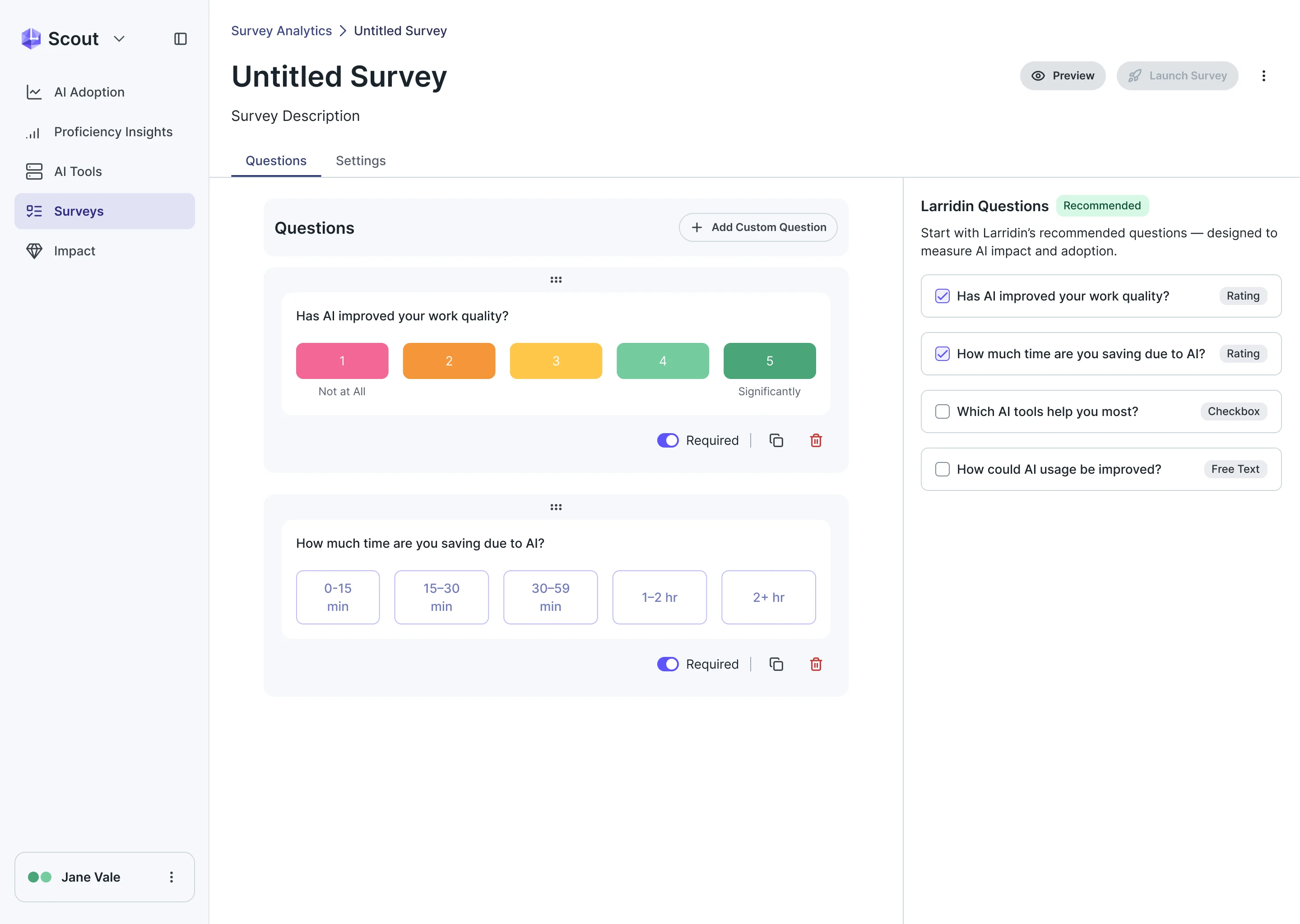
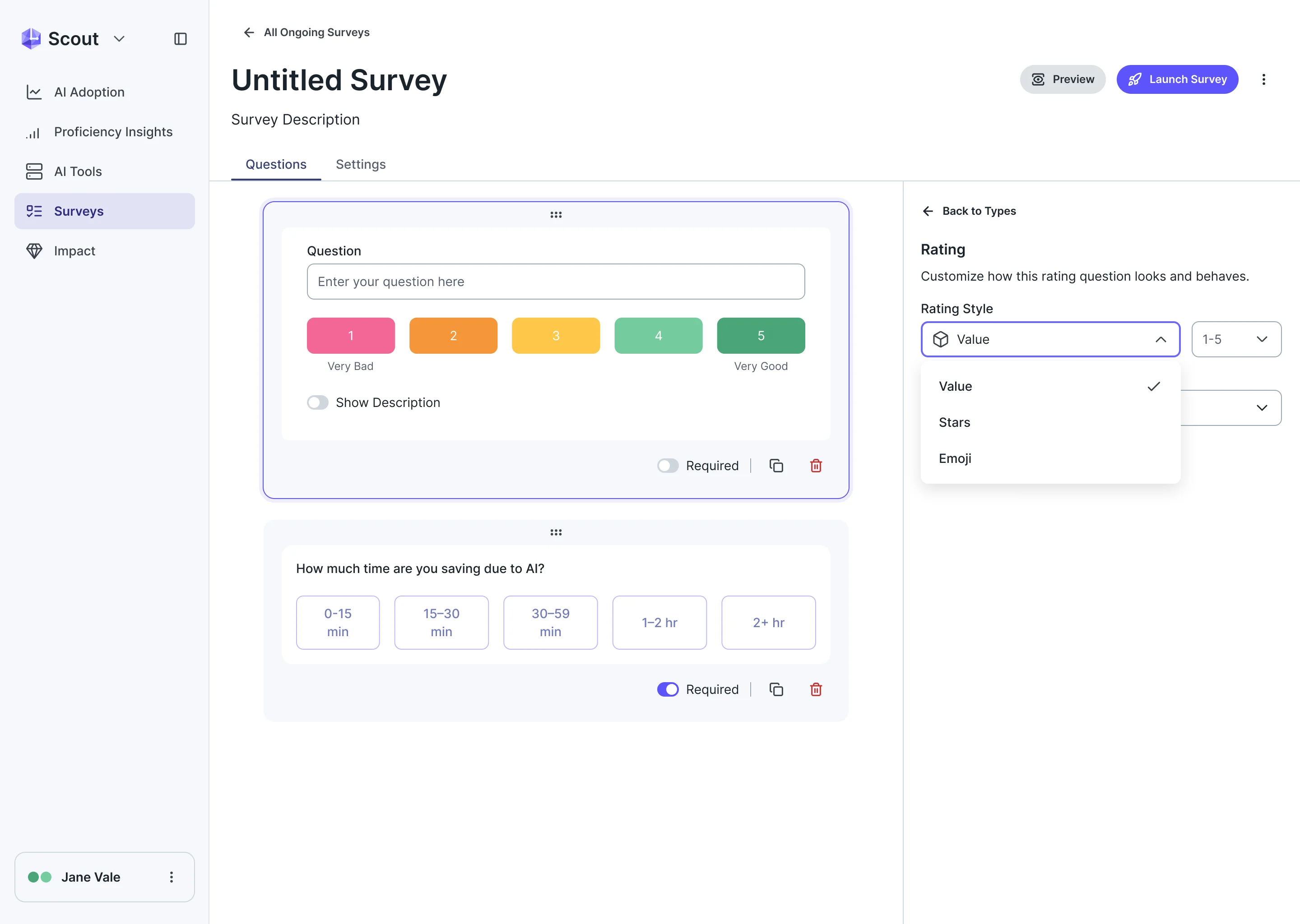
- Usage shows what people do, not what they think it is worth, and a survey tool that starts from a blank page never gets sent.
- Decided
- A survey builder that starts from Larridin’s recommended questions, with rating scales that read at a glance and a panel to tune each question’s type.
One set of parts under every module
- Found
- Adoption, governance, surveys and self-serve are built by different needs at different times, and they still had to look like one product.
- Decided
- A complete design system and UI kit for the Scout scope, extending the client’s foundations: cards, tables, filters, charts and a status language shared by every module.
One status language
The same chips read the same way in a tool inventory and in a policy table.
-
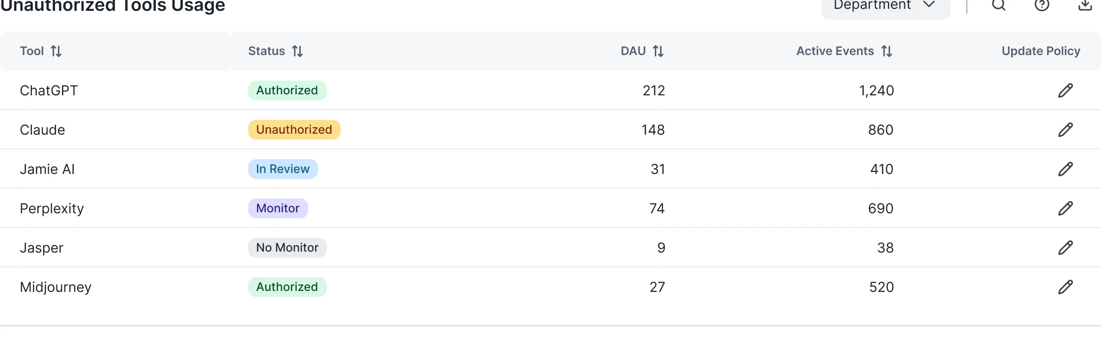
Tool status: Authorised, unauthorised, in review, monitored and not monitored, each a chip of its own. -
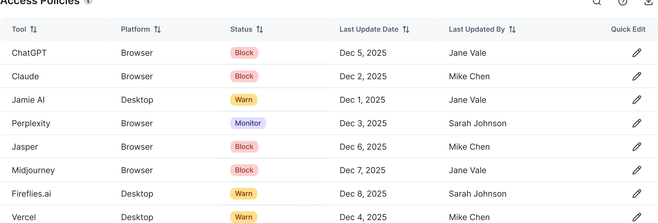
Policy status: Block, warn and monitor, in the colours the reader already knows.
One meter, every level
The risk appetite meter drawn for each level, with and without its label.
-
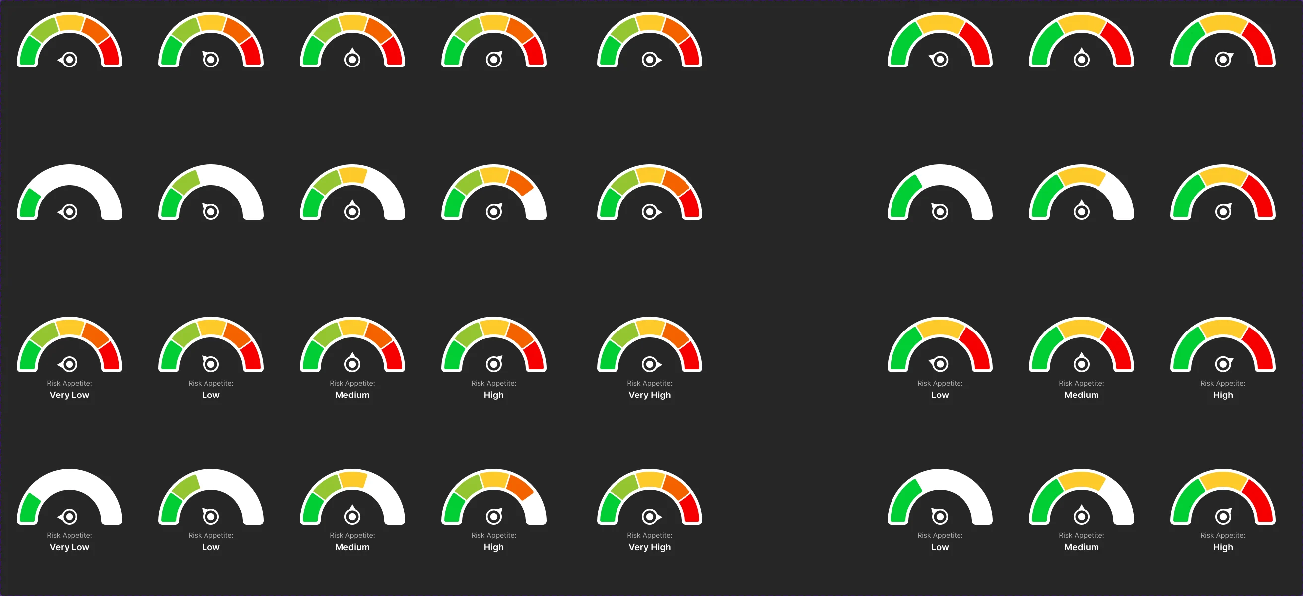
Very low to very high
The same story on the website
- Found
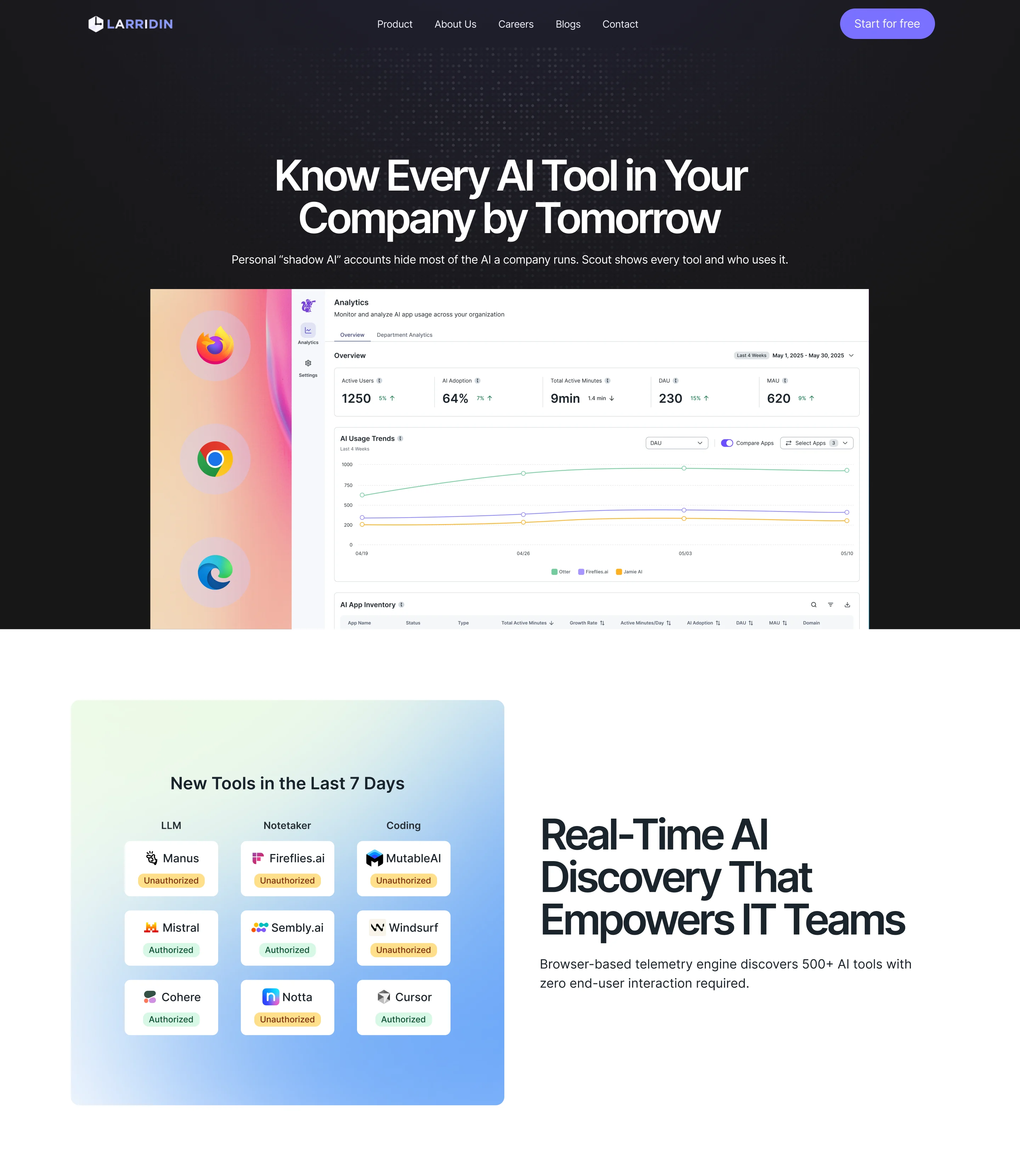
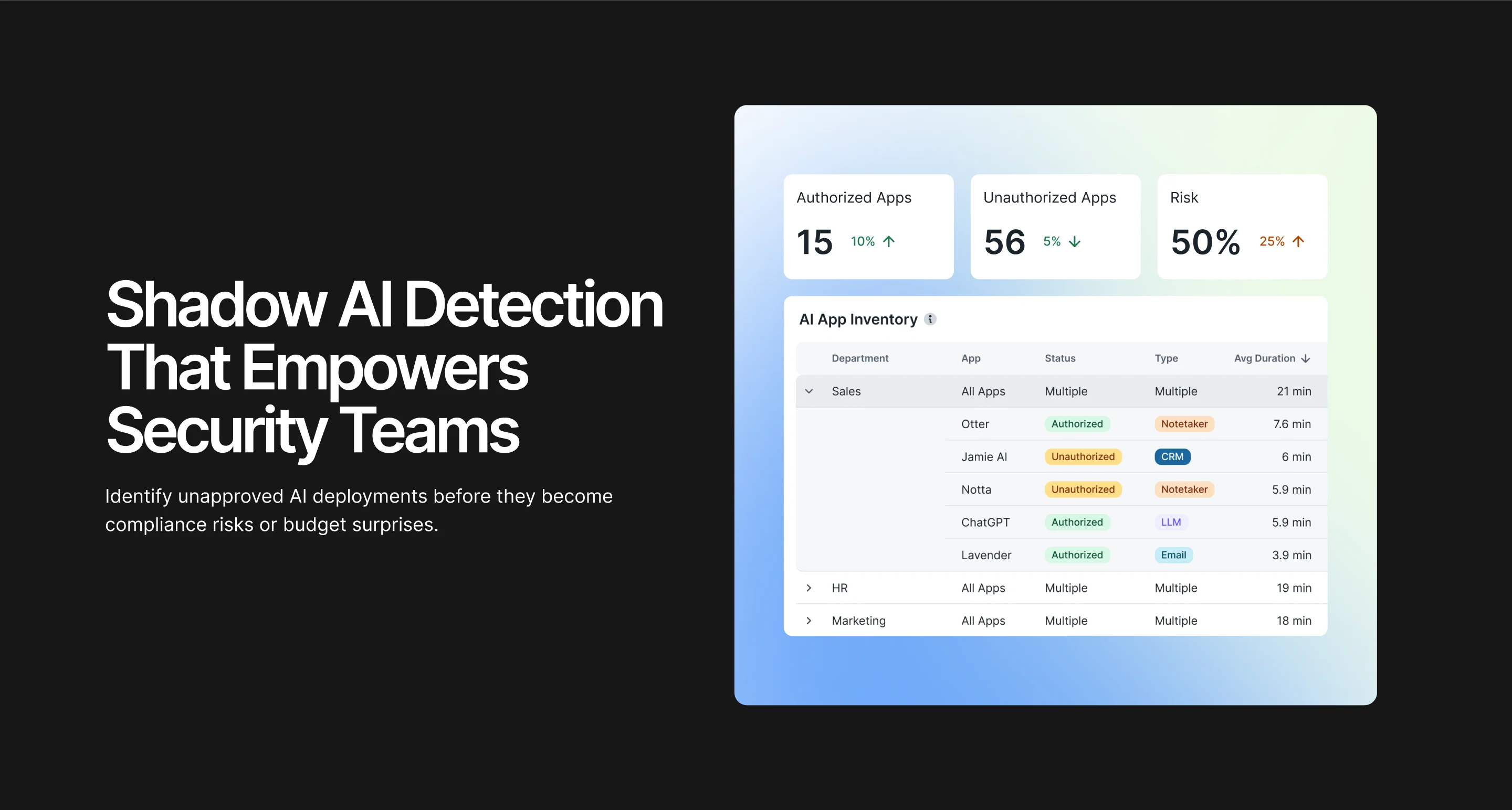
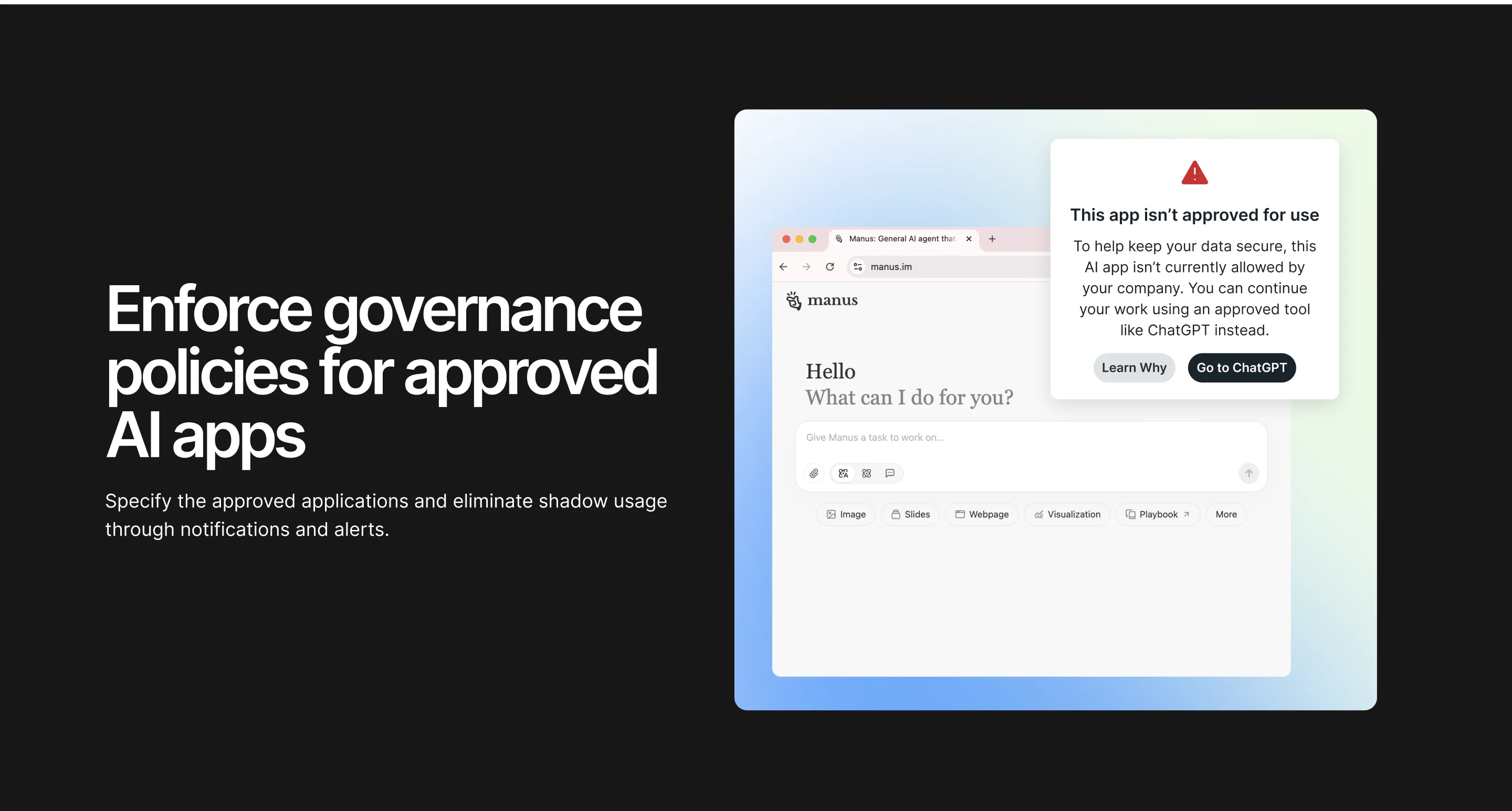
- A product that sells itself to security, IT and business leaders needs a page for each of them, and the page has to look like the product.
- Decided
- A Scout product page in the product’s own visual language: one section per audience, built from real product screens. We delivered the design and the animation directions; the client’s contractors built it.
-
Customer reports and templates
Report designs and reusable templates, with customer names and data removed from every public version.
-
Pitch decks
Editable presentation templates on the same foundations.
-
Campaign and event assets
Social, newsletter, webinar, blog and event materials.
-
Motion
Product-demo, website-hero and event-video animation.
Where Scout’s design stands
Scout’s product design is one system, from the first overview to policy settings and surveys, with a website, self-serve and reports on the same foundations.
We designed and handed off; the client’s engineers and contractors built, and not every designed screen is in the product today.
- long-term design partnership
- Embedded
- adoption, tools, governance and surveys
- Product first
- the same system on every surface
- Website to motion

Does your product hide its hardest states?
Unauthorised, in review, blocked, warned, empty: in Scout each one is drawn as a state a leader can read. Send us the screen where your users squint, and we’ll show how we’d make it legible.
More work like this
Three more dense B2B products we designed.
-
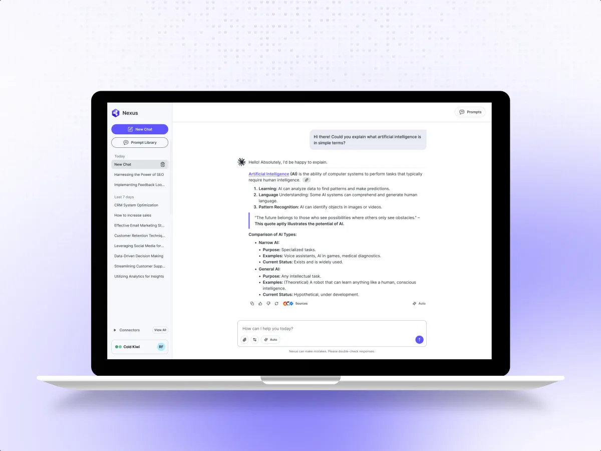
AI · B2B SaaS · Web app
Nexus
Designed Nexus, a separate Larridin product with its own case, inside the same client relationship.
- 200+ Unique screens
- 3 Experts on the team
-
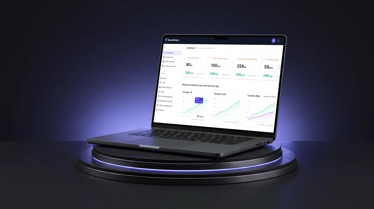
AI Hi-Tech · SaaS
Superstream
Made a Kafka management platform’s technical data readable for DevOps teams, in light and dark.
- 3000+ Screens designed
- 1500h+ Design hours
-
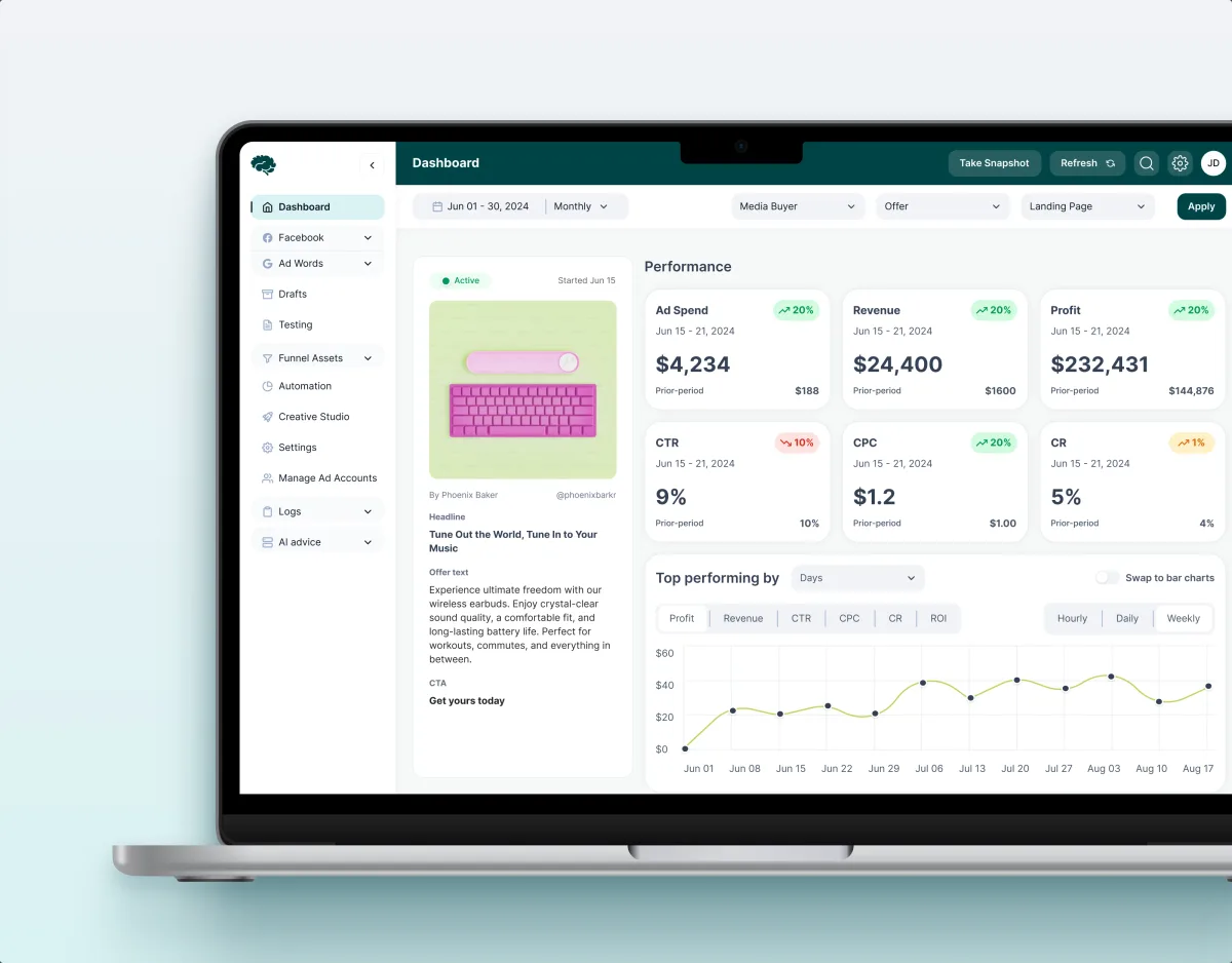
MarTech · Ads analytics · Web SaaS
Concussion Media
Rebuilt a paid-traffic analytics SaaS around the numbers its media buyers act on.
- 400+ Screens and states
- 11 Modules designed and approved by the client