
Car bidding marketplace, sellers compete for you
Autodice is a used-car marketplace where the buyer names the car and sellers send offers.We redesigned its homepage and the entry points behind it.
- 3
- roles buyers, private sellers and dealers, from one homepage
- 2
- ways to search a sentence to the AI search, or make and model
- 3
- screen sizes desktop, tablet and phone, state by state
- Logo
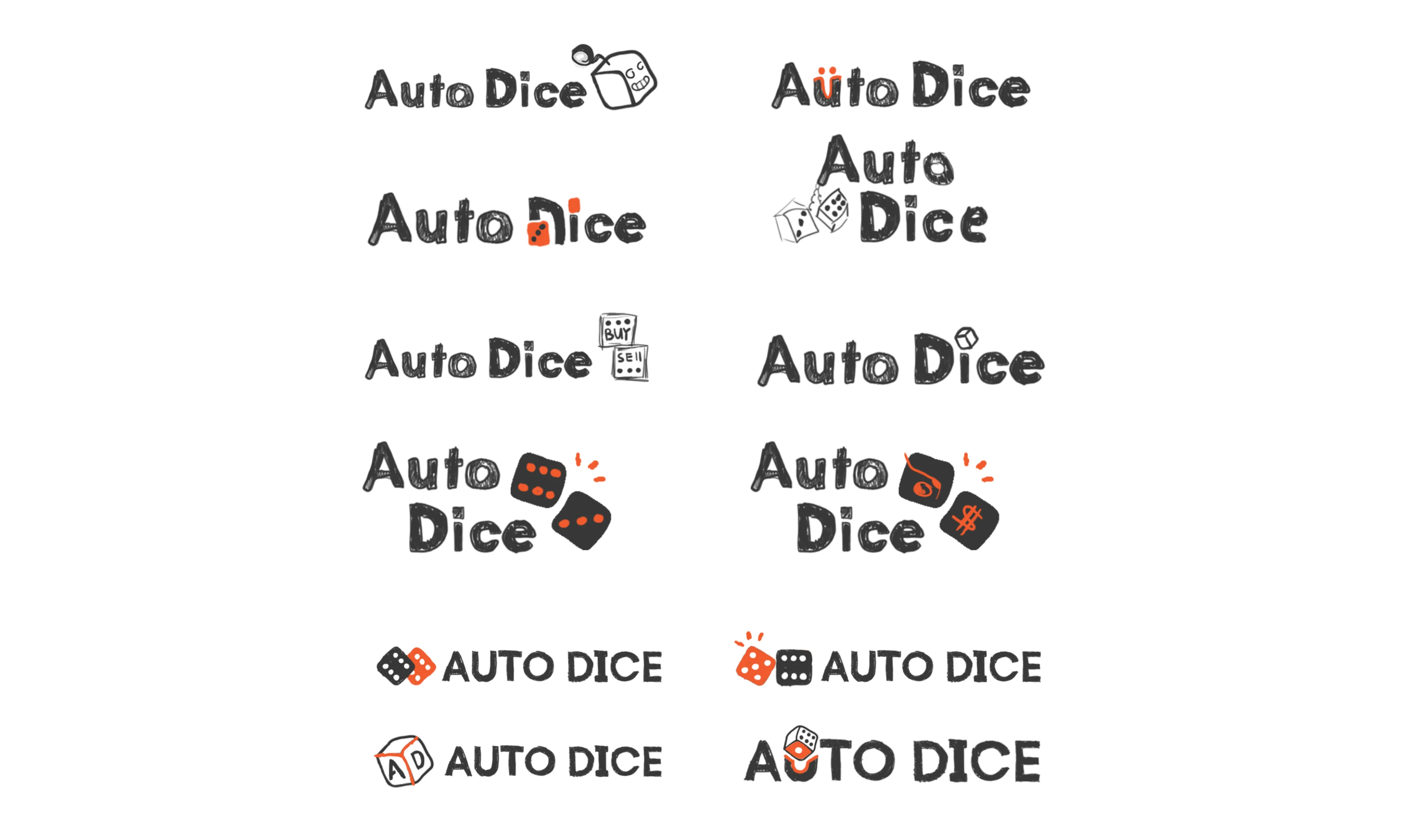
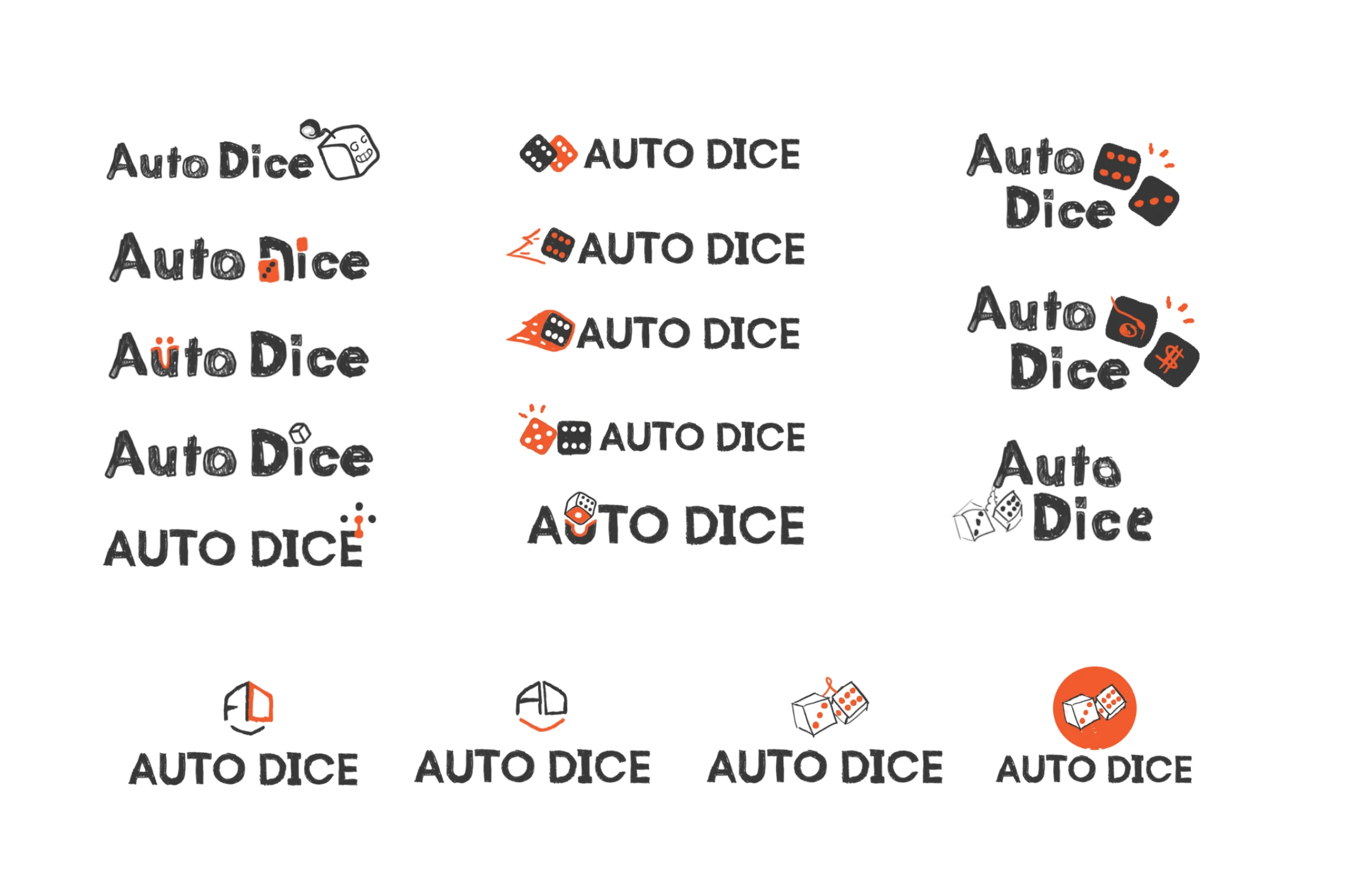
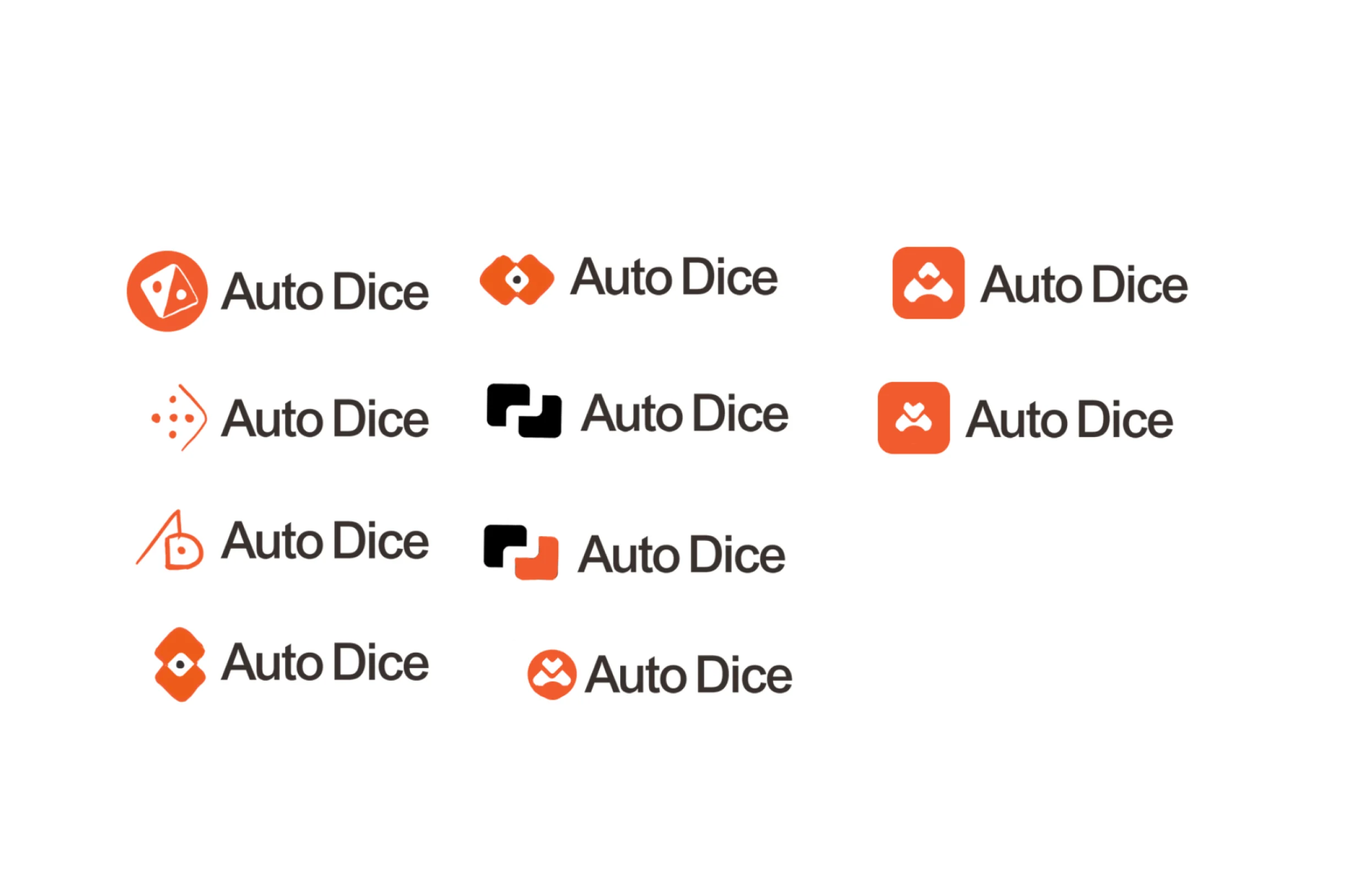
- designed from hand sketches to the mark in the header
Project summary
Autodice is a Canadian used-car marketplace where a buyer says which car they want and sellers compete to offer it. Its homepage asked for registration before it showed anyone a useful result, and tried to talk to buyers and sellers at once. We redesigned the homepage and the marketplace entry points behind it, plus a logo, a design system and a clickable prototype for the client’s developers.
How the work ran
- Our part
- Information architecture, buyer and seller flows, wireframes, screen maps, responsive UI, a clickable prototype, the design system and UI kit, the logo and the developer handoff.
- Not ours
- The garage itself, offer comparison, dealer and admin tools, and building the product.
- The AI
- Early chat-like ideas were explored and dropped; the final design keeps AI to search and model reviews.
- Now
- The design work is finished. Building the product was not part of our engagement.
What a first visit has to explain
One chain, from a wish to an offer:
-
Wish
- A sentence
- Make and model
- Postal code
-
Match
- Results
- Model reviews
- Similar models
-
Garage
- Saved car
- Alternatives
- Sign-up
-
Offers
- From sellers
- Ranked for the buyer
- Rivals hidden
-
Seller
- VIN
- Year, make, model
- Dealer login
- Buyer and Seller
- Opposite goals on one homepage, and one clear action for each.
- AI search and Make and model
- Both ways in, without crowding the first screen.
- Show value and Ask for an account
- Sign-up only once there’s a car worth saving.
One screen from a sentence to a saved car
- Found
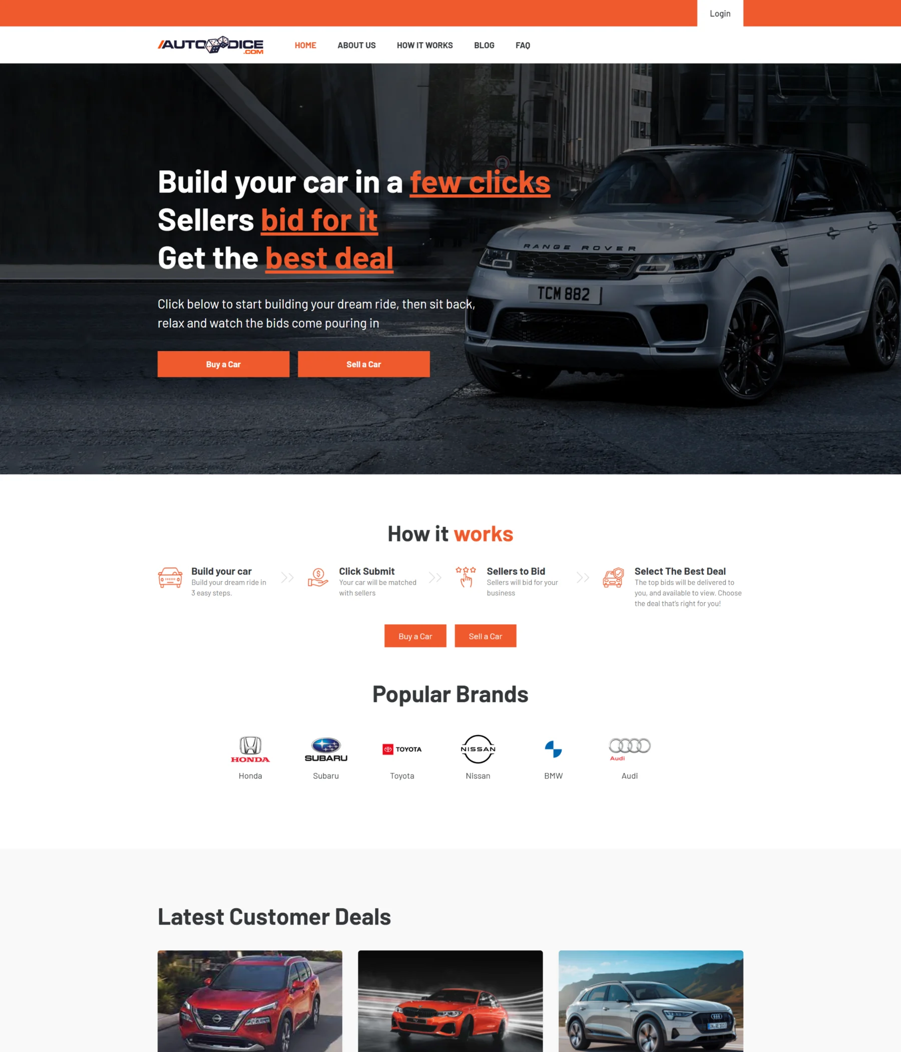
- The homepage Autodice came with opened on a dark banner, a row of brand logos and a feed of deals, and useful offers only came after registration.
- Decided
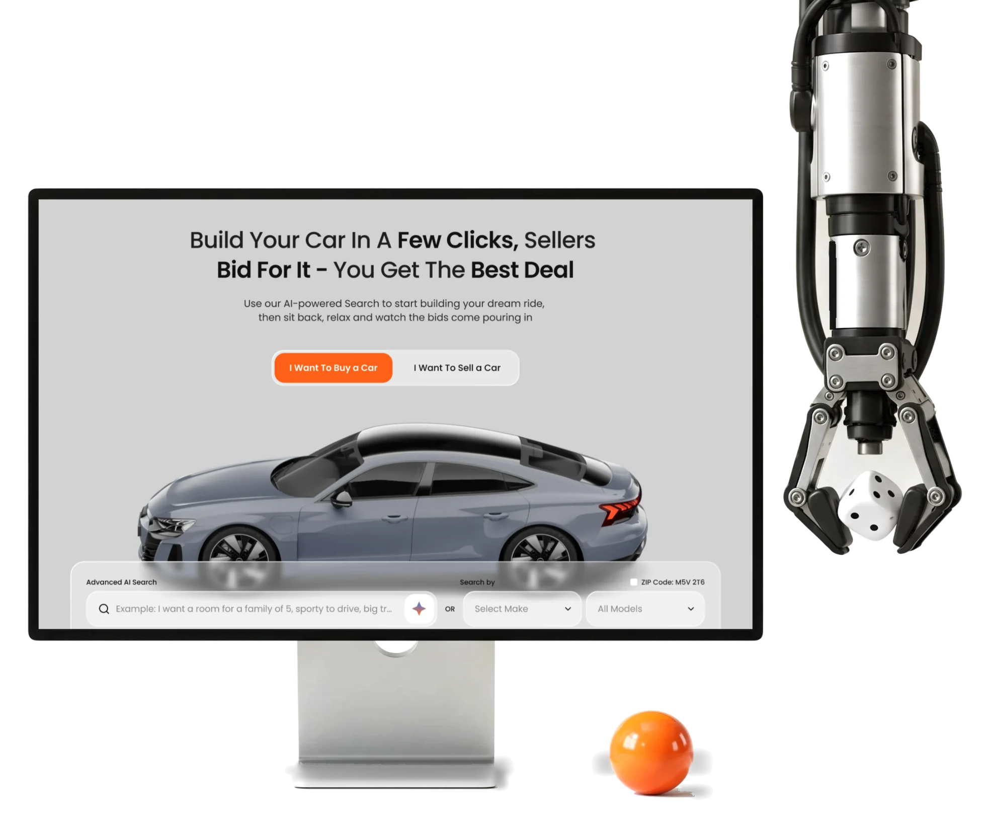
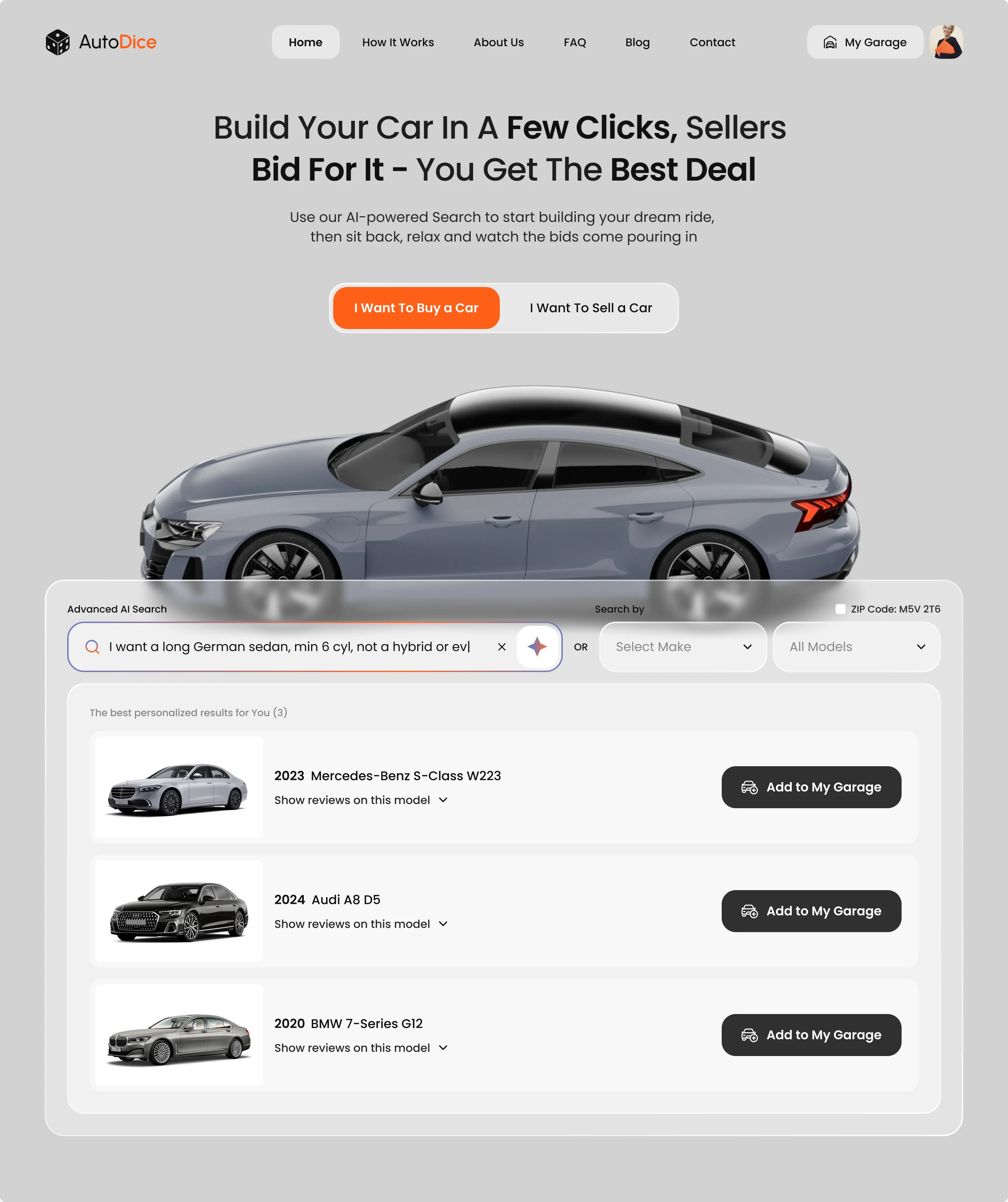
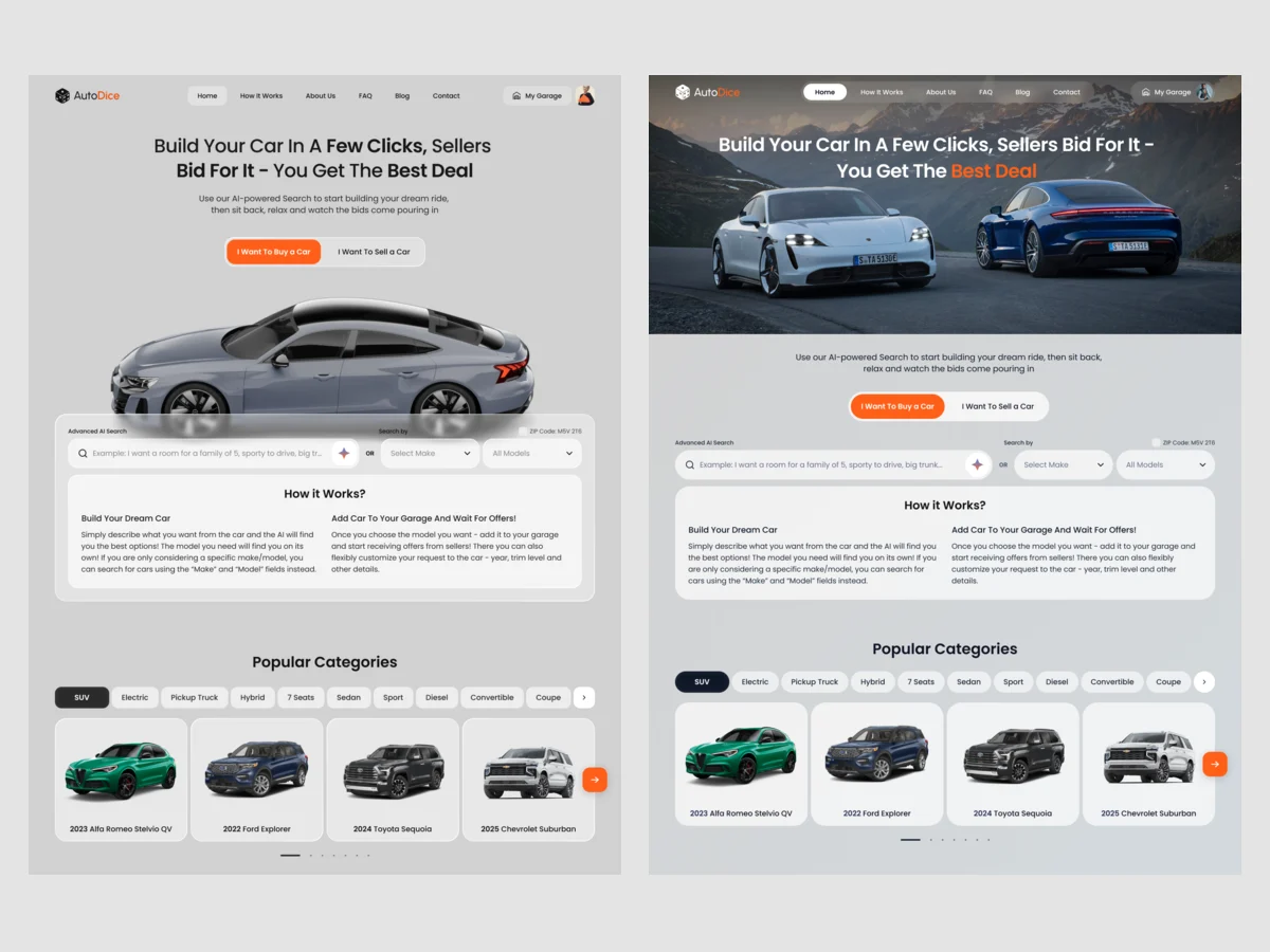
- The search moved to the top: one switch between buying and selling, a sentence for the AI search or make and model, and the matches straight underneath, each with reviews and Add to My Garage.
- For the user
- A buyer sees real matches for their own words before anyone asks for an email.
- In the way
- Buy and sell as two small buttons in a banner, then brands and deals; nothing the buyer typed shaped the page.
-
Buy or sell
The promise, then one switch that turns the page into the buyer’s or the seller’s.
-
Say it or pick it
A sentence for the AI search, or make and model, with the postal code beside them.
-
See the matches
Each car with its year, reviews on the model and Add to My Garage.
How the work progressed
A bounded redesign: the homepage and the entry points behind it, from a map of sections to a system the client’s developers could build from.
-
Wireframes
What the homepage says, in which order, and where search and sign-up branch off
Artifact Information architecture, buyer and seller flows and wireframes, including AI-search alternatives later dropped
-
Logo
A name that jokes about chance, for a purchase nobody wants to gamble on
Artifact Moodboards, hand sketches, vector directions and the approved logo
-
UI & Design System
One look for three audiences, and the states every field and card needs
Artifact Two visual directions for key sections, the final UI, the design system and UI kit
-
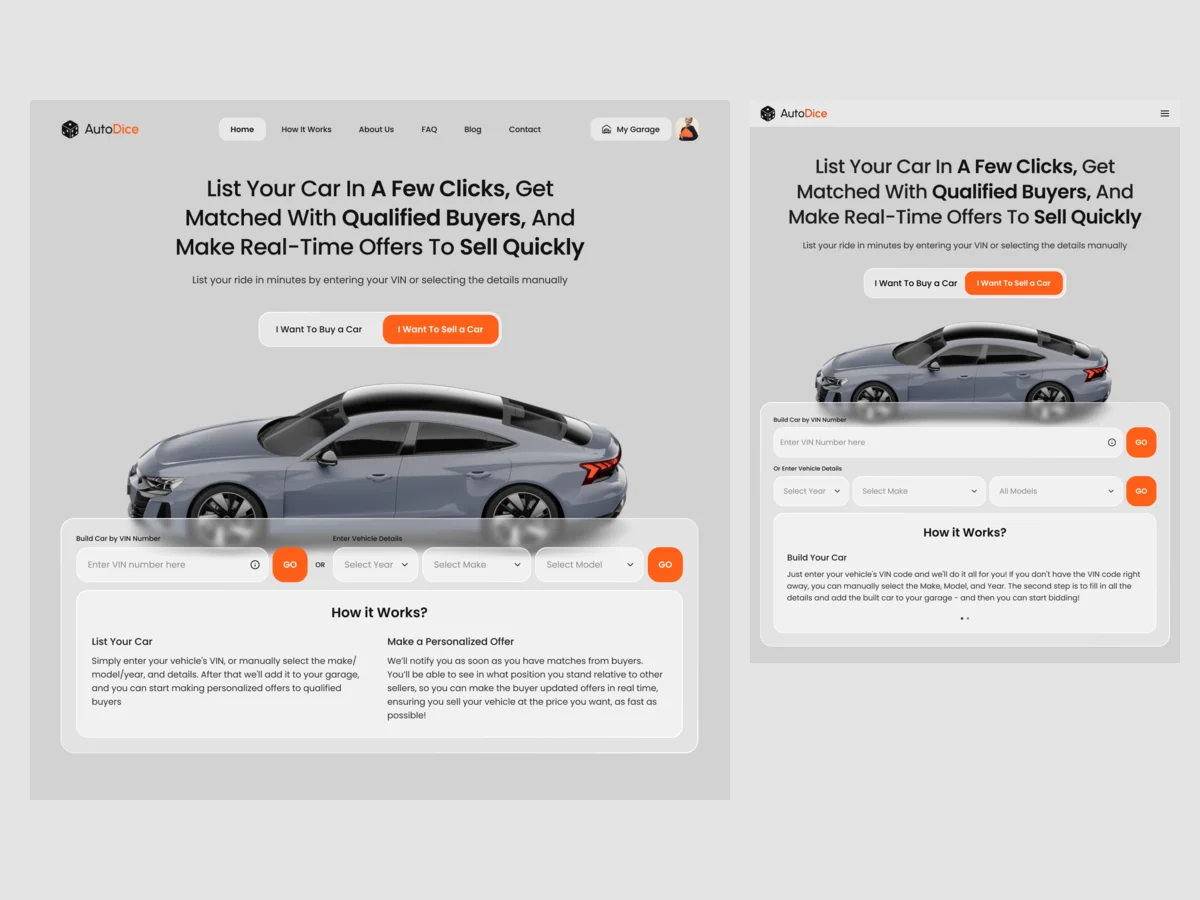
Adaptives
The same switch, search and seller entry on a tablet and a phone
Artifact Tablet and phone layouts for every section and state
-
Delivery
What the developers need to build it without guessing
Artifact Screen maps, a clickable prototype and the handoff file
Every way in ends at the garage
- Found
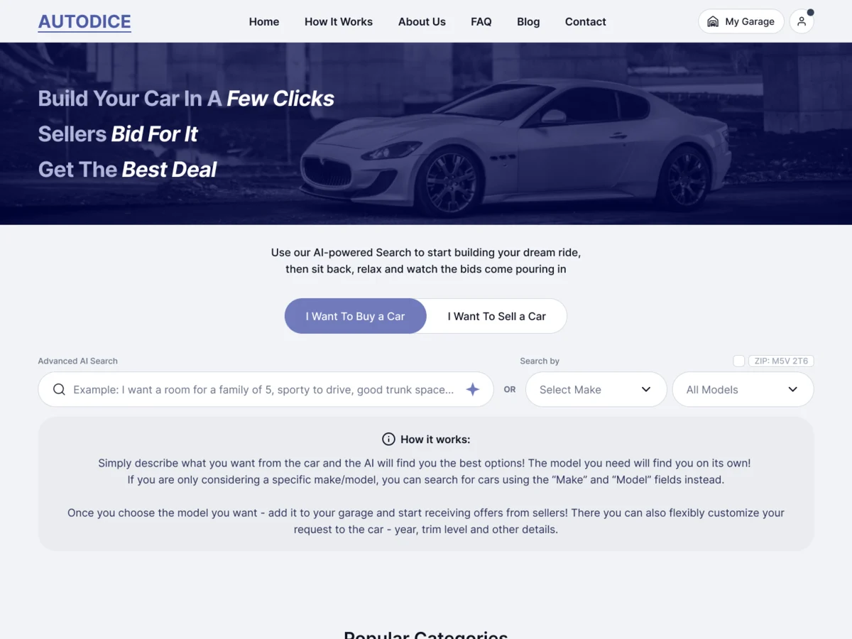
- A visitor might come to buy, to sell or just to look around, and the old homepage mixed all three.
- Decided
- The information architecture set the homepage as a sequence of sections, each with one job, and mapped where search, the garage and sign-up branch off it.
-
Saving a car
Add to garage opens account creation, then a preview of the garage and what signing up gives the buyer.
Open the full map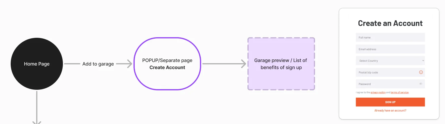
-
Searching
The hero block branches into AI search and filters, and the page continues to the categories.
Open the full map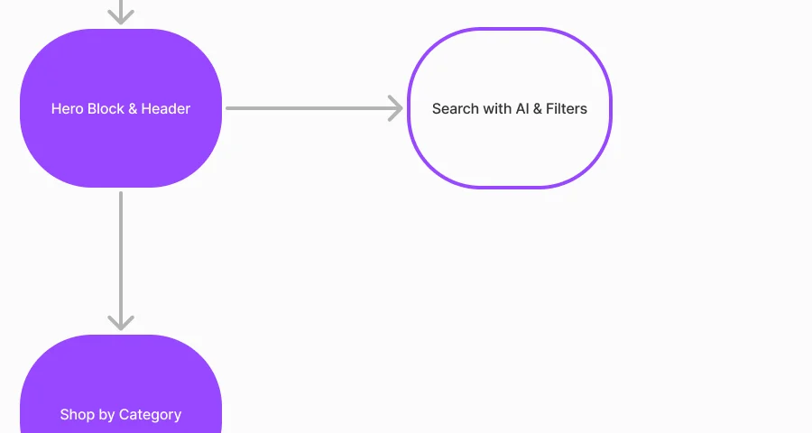
Six jobs, from a sentence to a listed car
Buyers first, where the homepage has to earn a sign-up. Then sellers, where it has to get a car listed.
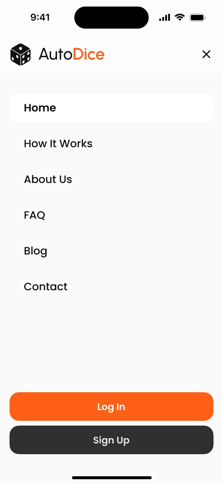
Search in plain words
- Found
- Most buyers don’t start from a trim level; they start from how they’ll use the car.
- Decided
- The AI search takes a sentence and returns matches with Add to My Garage on each, then confirms the save on the spot, on a phone as on a desk.
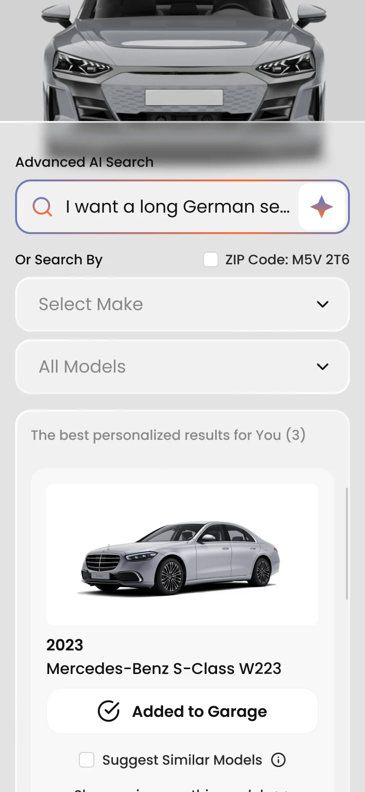
Make and model, with reviews in place
- Found
- Some buyers know exactly which car they want and need a second opinion before committing to it.
- Decided
- Make and model sit beside the AI search; each result opens a short summary with pros and cons and video reviews, without leaving the page.
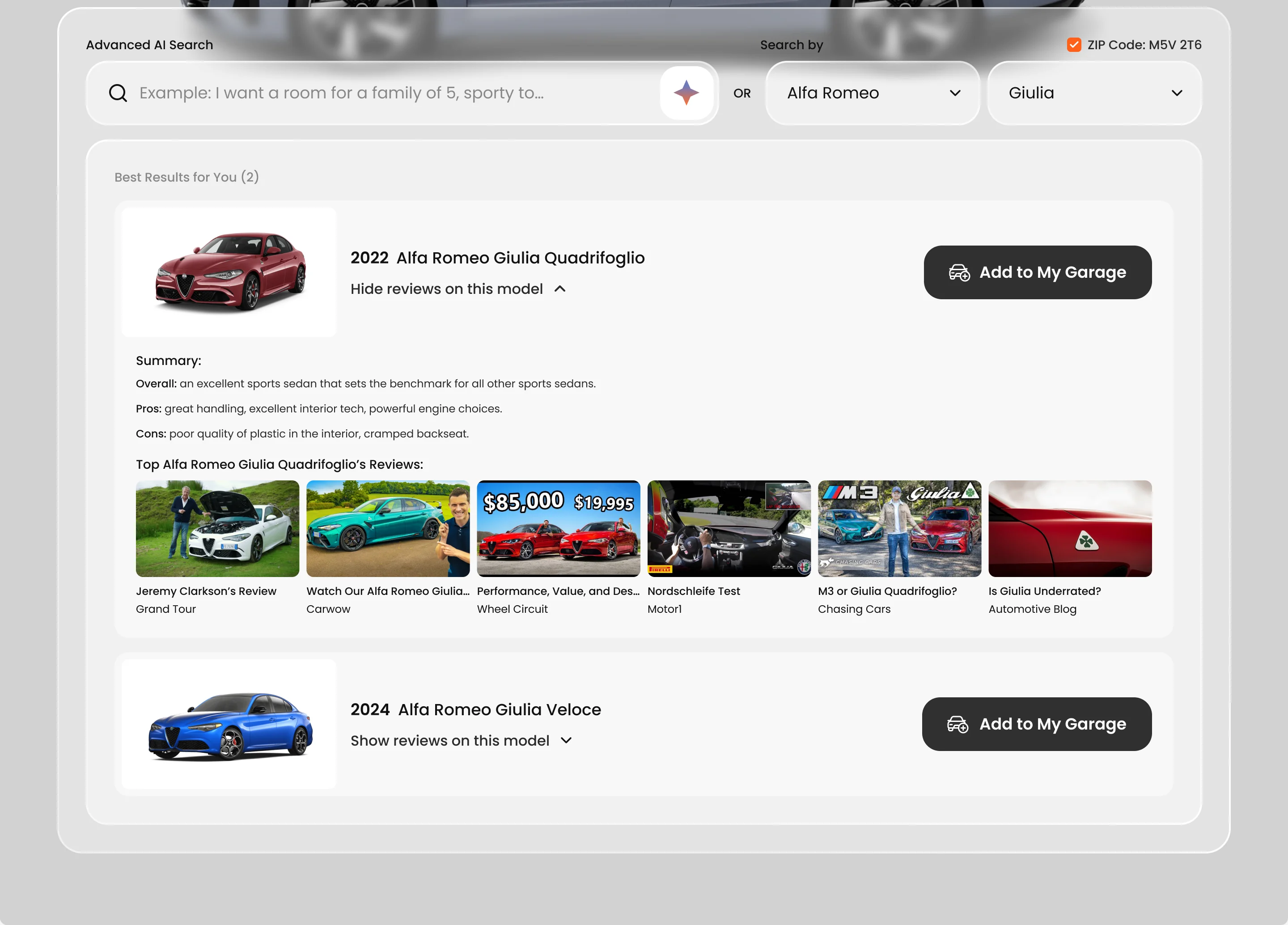
Browse by category
- Found
- Not everyone arrives with a car in mind.
- Decided
- Popular categories from SUV to coupe, each car a card that goes to the garage in one click, with a note that points to the garage.
Sign up when there’s something to save
- Found
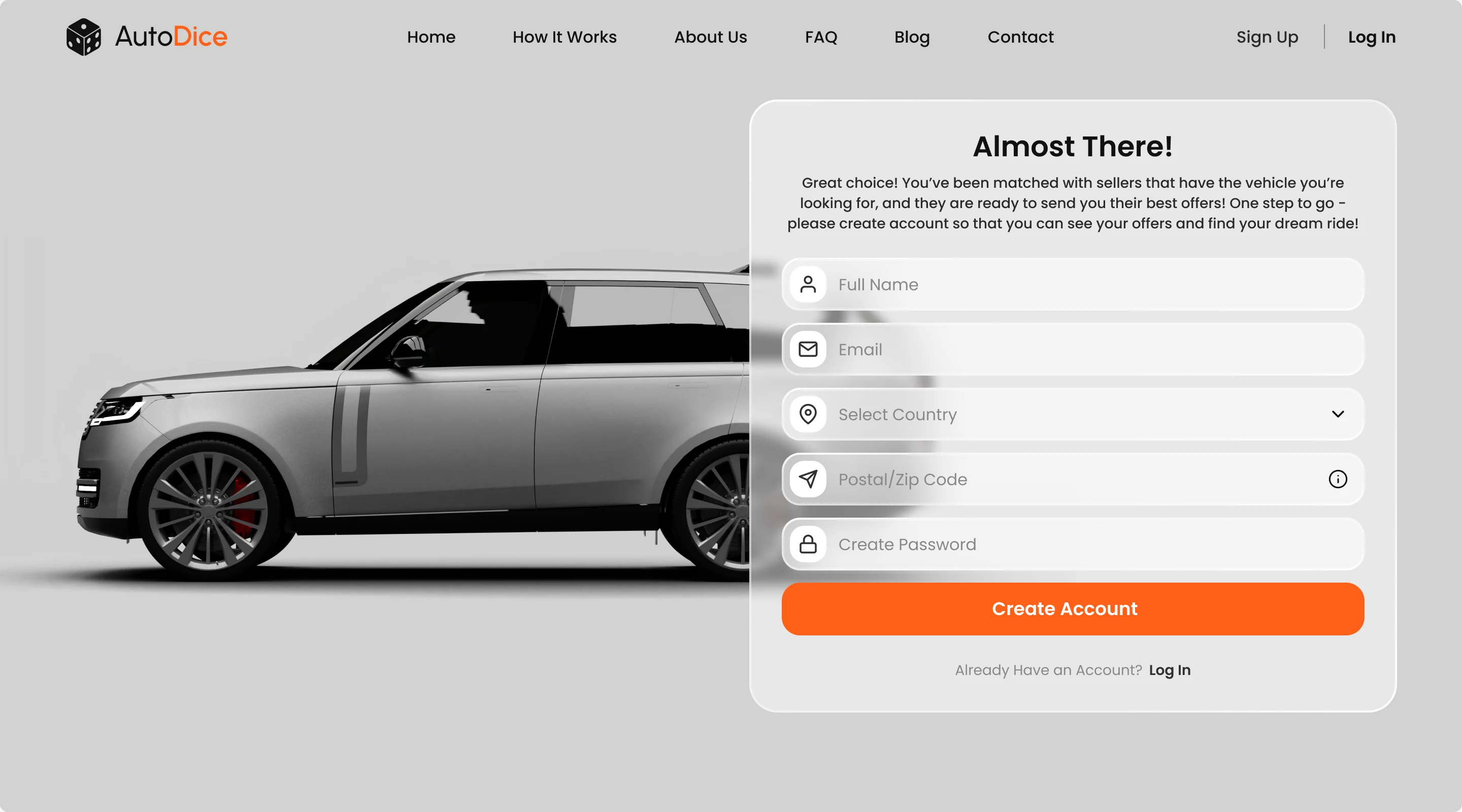
- An account form before any value is shown is the first thing a shopper meets.
- Decided
- Registration appears when a buyer adds a car to the garage, and says why: sellers with that car are ready to send offers.
Selling starts with a VIN
- Found
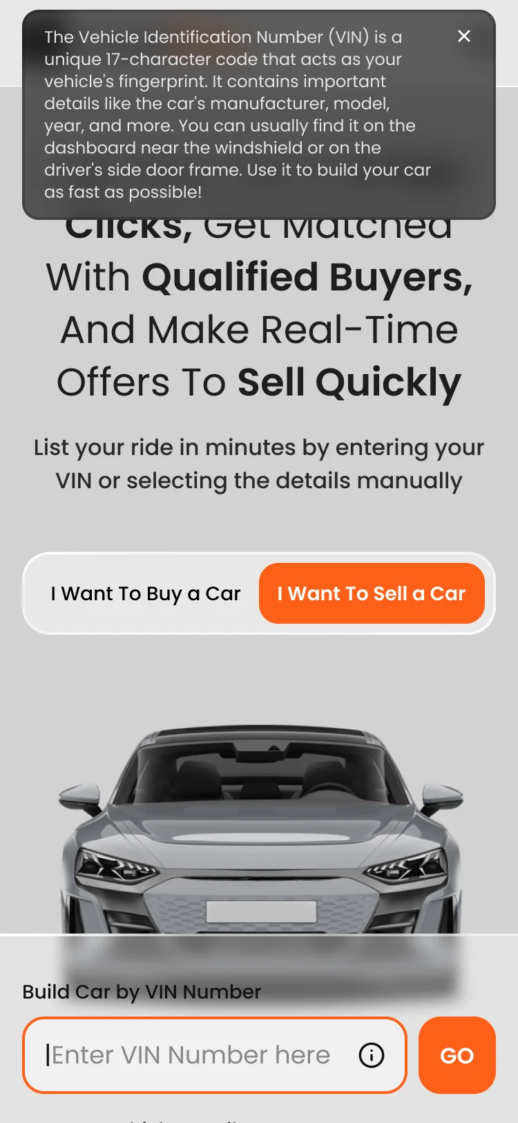
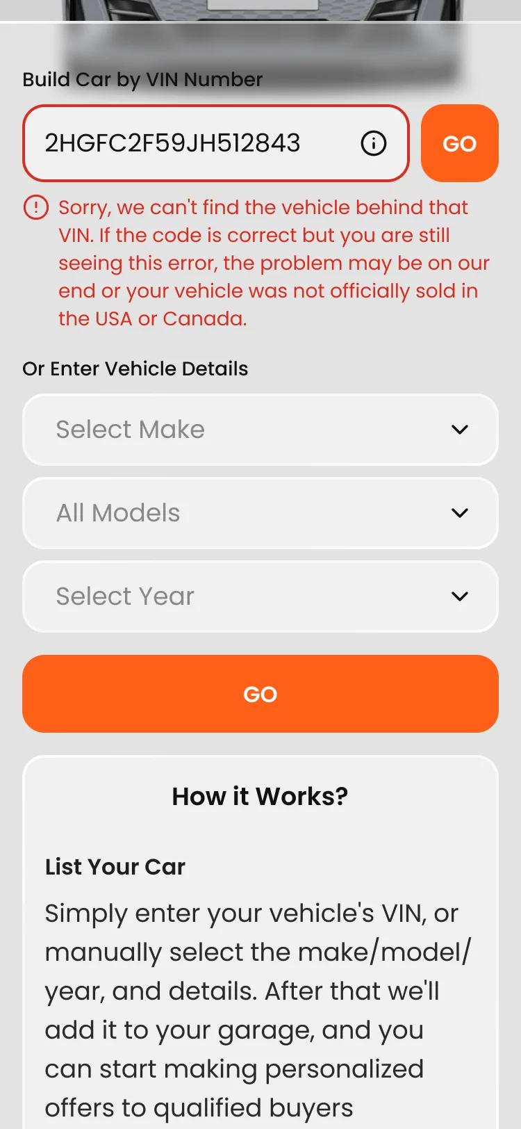
- A seller wants the car listed in minutes, and typing out specs by hand invites mistakes.
- Decided
- The seller side leads with the VIN, explains where to find it, and says plainly when a VIN can’t be found; year, make and model stay as the manual way in.
How it works, in four steps
- Found
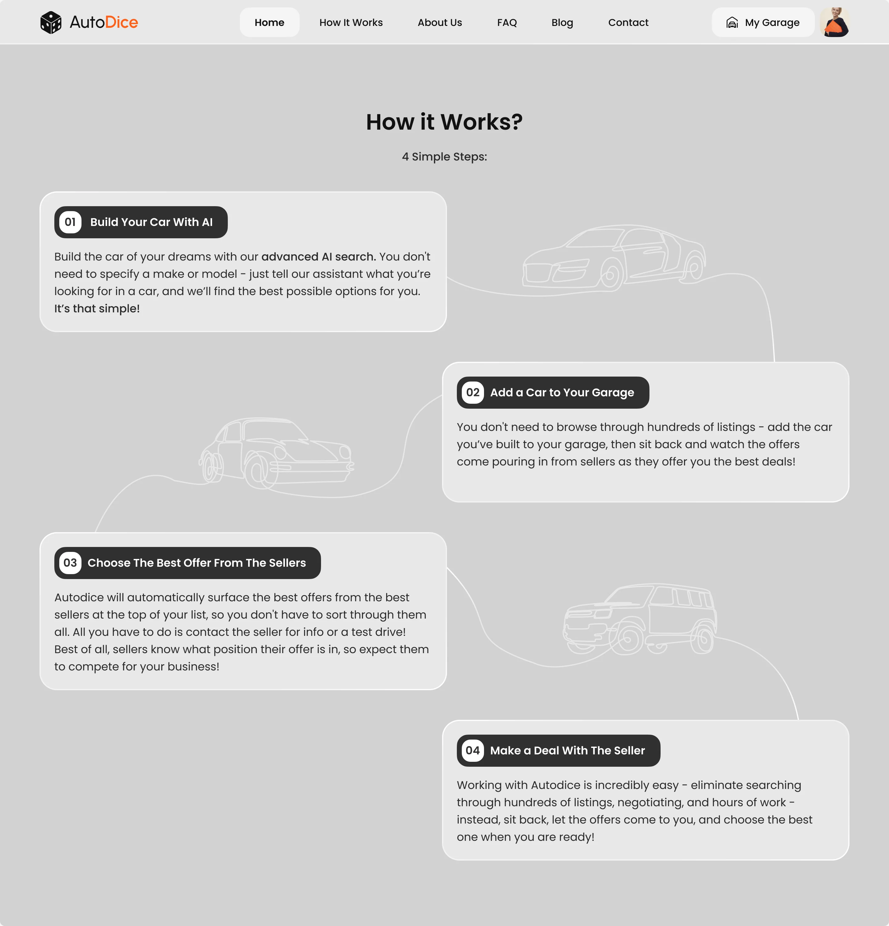
- The model is new: buyers don’t expect sellers to come to them.
- Decided
- Four steps, from building the car with AI to making the deal, drawn as one road down the page.
A logo from the name’s own joke
- Found
- Autodice is a pun on chance, and buying a car is the last place anyone wants to gamble.
- Decided
- The mark was drawn by hand first, with dice, cubes and buy-and-sell faces, then taken into vector, and settled on a die beside a two-tone wordmark.
One kit for three audiences and three screens
- Found
- Buyers, sellers and dealers see the same parts, and every field has a state someone will hit.
- Decided
- A design system and UI kit for the delivered scope: buttons, inputs and result cards, each state drawn once and reused at every size.
One garage action on every card
The same Add to My Garage button sits on result rows, phone cards and category cards, and turns into a confirmation once the car is saved.
-
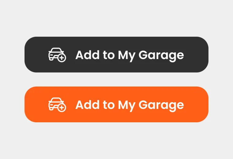
Before the save: dark on every result, orange under the pointer or keyboard focus. -
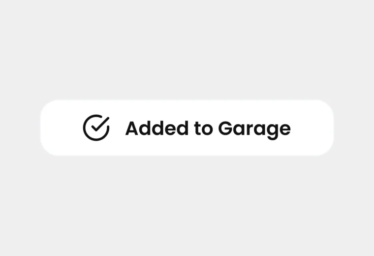
After it: the button becomes the confirmation.
Drawn for every state it can be in
The kit’s result card before and after the buyer asks for similar models.
-
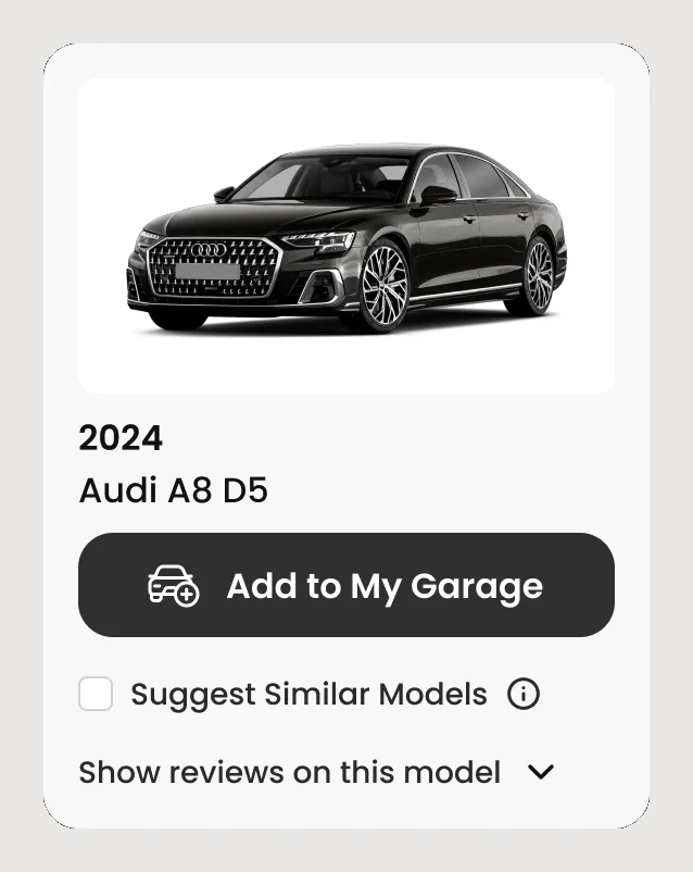
Similar models off -
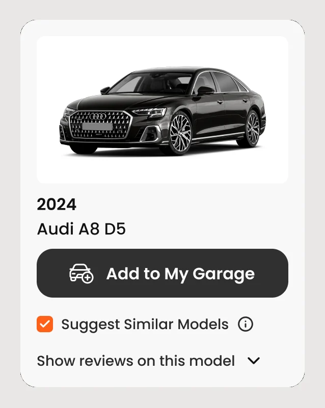
Similar models on
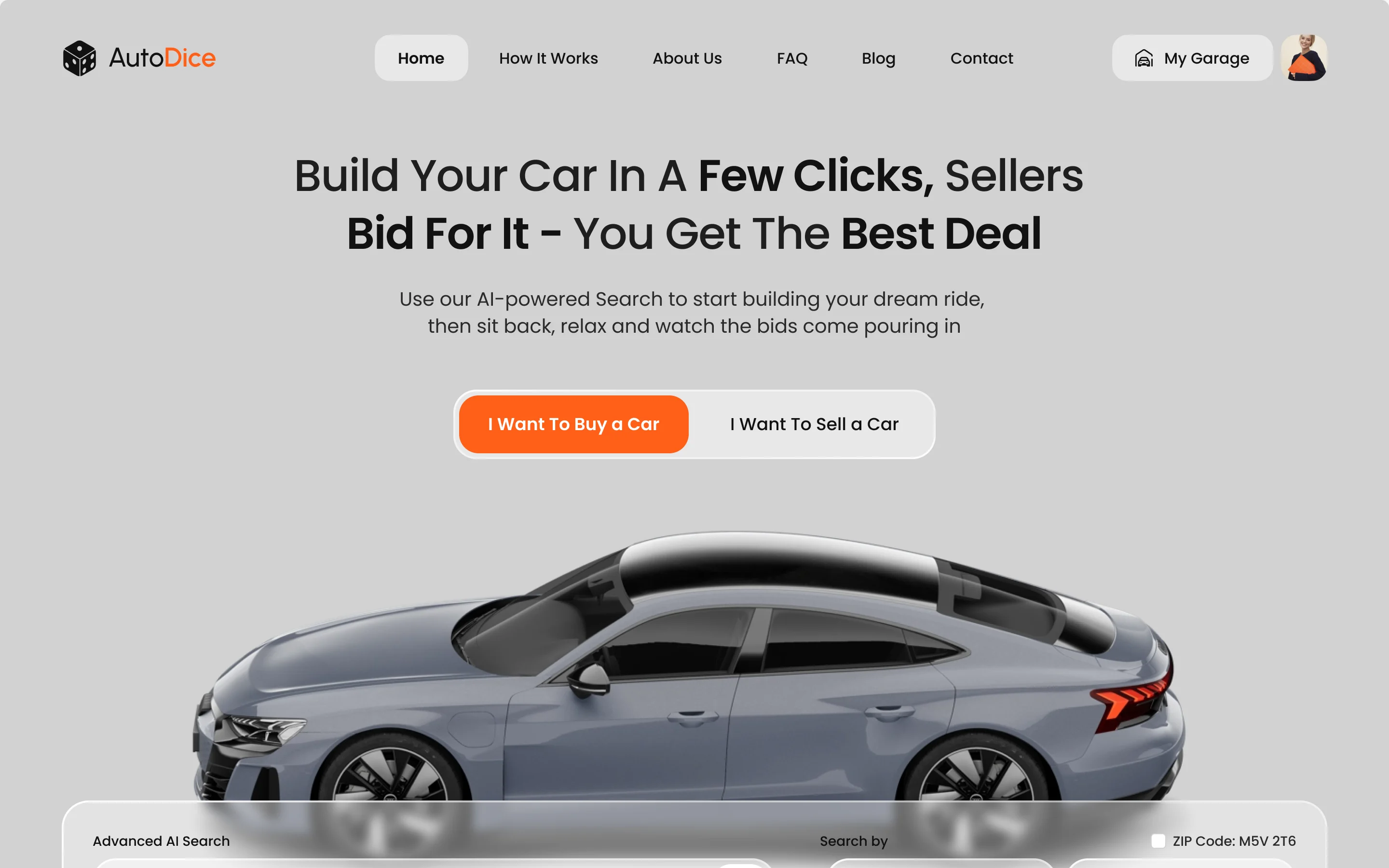
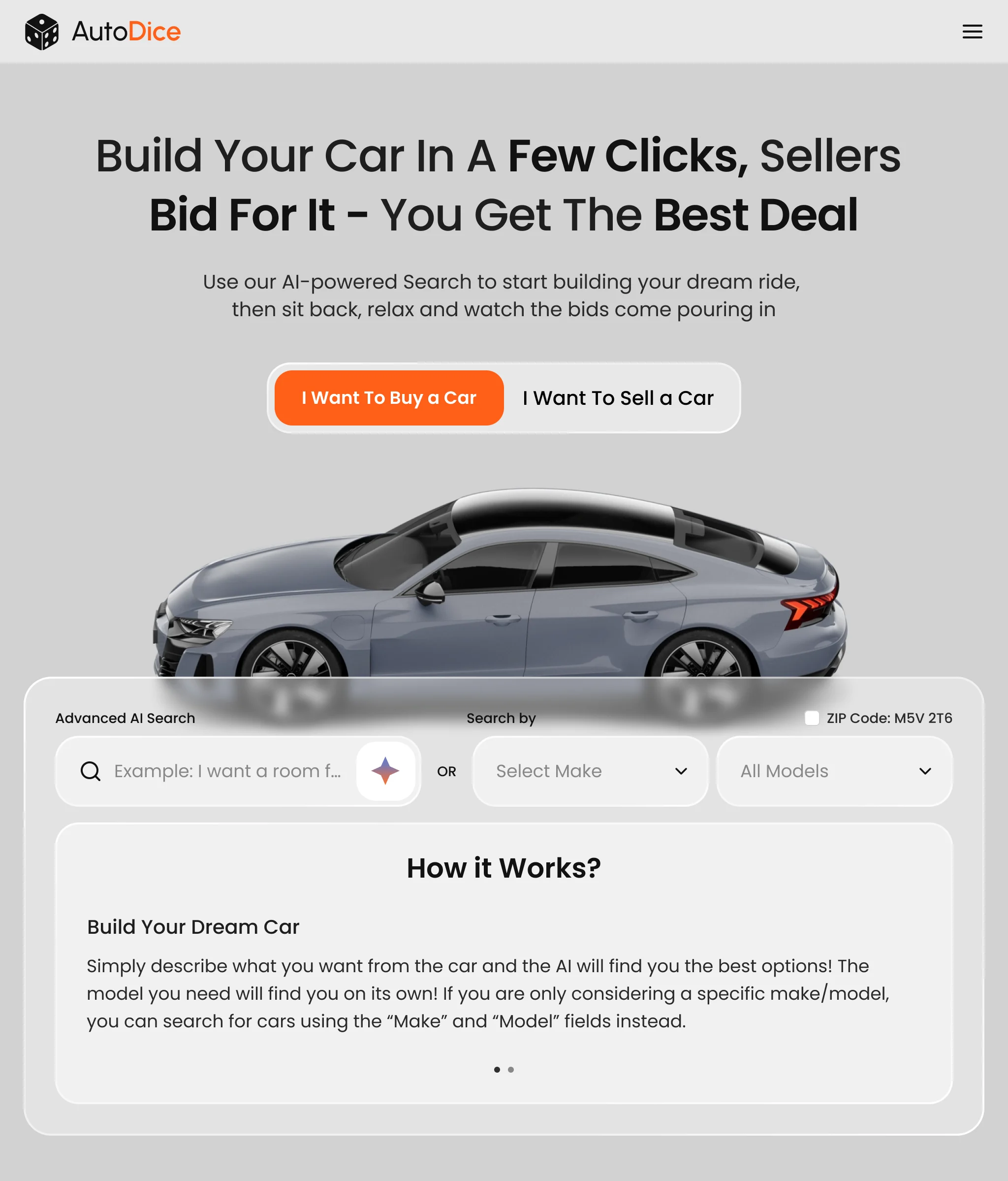
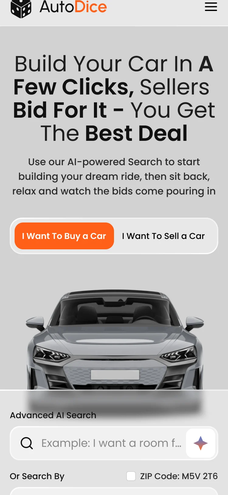
The same first screen on a desk, a tablet and a phone
- Kept
- The promise, the buy and sell switch and both ways to search.
- Changed
- On a tablet the navigation folds into a menu; on a phone make and model drop under the AI search.
What the developers received
One client file per screen size, with every state drawn beside the screen it belongs to.
- Screen maps
- Buyer and seller pages at desktop, tablet and phone sizes, section by section.
- Clickable prototype
- The redesigned homepage and its entry points, clickable for review.
- Design system and UI kit
- Buttons, inputs and result cards with their states.
- Handoff file
- Final UI for every size, the logo work and the two visual directions.
Flows in the handoff
- Wireframes: the homepage section by section, with the AI search and sign-up states
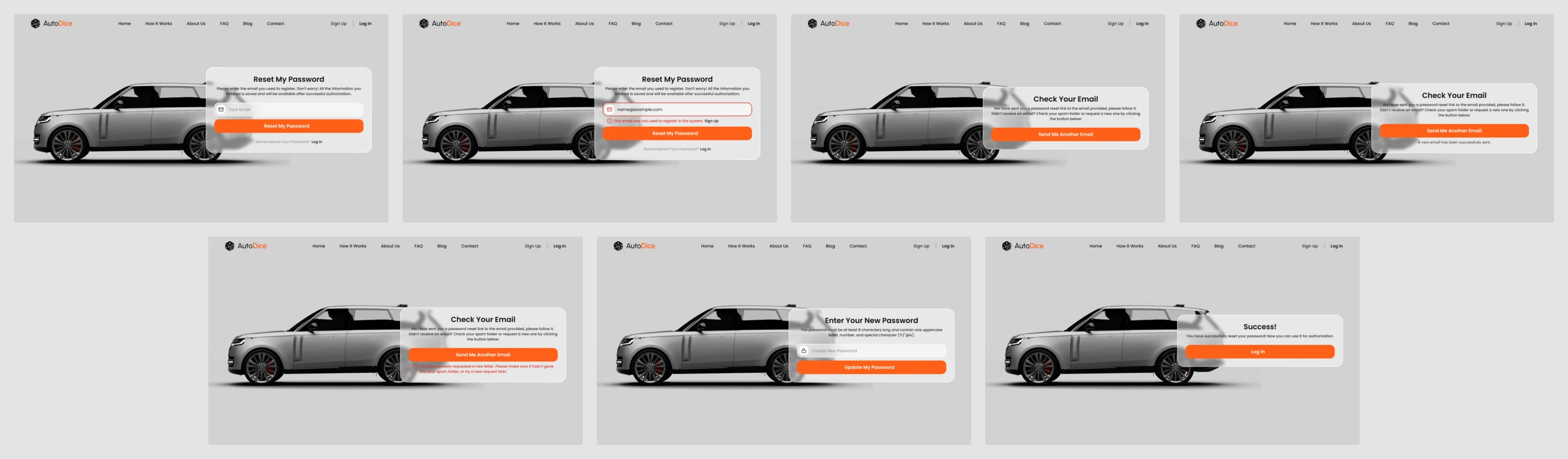
- UI (Desktop): buyer and seller pages, sign-up, log-in, password reset and 404
- UI (Mobile): the same pages and states on a phone, with the VIN variants
- UI (Tablet): the same pages and states on a tablet
- Moodboard and two styles for two sections
- Branding: logo moodboards and hand-drawn sketches

Where the design ended up
A homepage that lets a buyer search, save a car and see why an account is worth it before registering; a seller side that starts from the VIN; a logo; all on desktop, tablet and phone.
The developers got every screen with its states, a clickable prototype and the kit.
- roles served from one homepage
- 3
- ways to search: a sentence or make and model
- 2
- screen sizes, desktop to phone
- 3
In the client's words
ANODA gave the marketplace a clearer design direction, from the first vehicle search to the seller journey. Bringing the identity and interface work together made it easier to review the product as a whole and decide what the development team should build.
Will the build keep the design intact?
At Autodice one kit of components and states had to hold from desktop to phone, so the developers never had to guess at a size. Send us your product, and we’ll show how to hand it over so it holds.
More work like this
Three more products with two sides, a new brand, or a website rebuilt around one action.
-
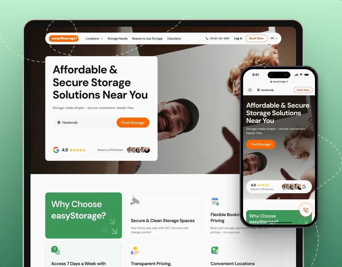
E-commerce · Website
easyStorage Netherlands
Designed and built a self-storage website and redesigned the booking app behind it, from a pin on the map to a booked unit.
- 300+ Screens designed
- 880+ Project hours
-

FoodTech · SaaS
Glimix
Designed a food app for diners and venue owners, with a logo and brand book drawn from scratch.
- 200+ Screens designed
- 5 Experts on the pod
-
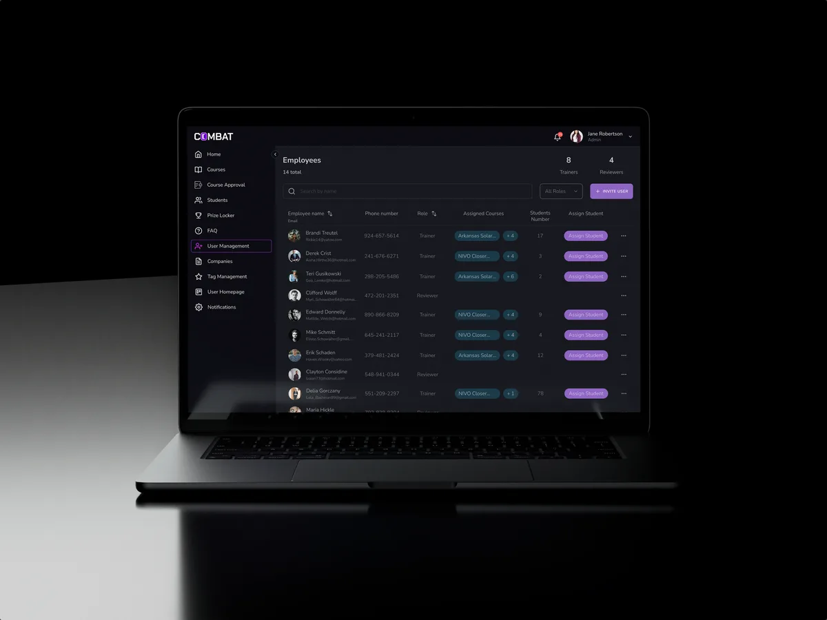
Sales training · Desktop web platform
Combat Sales
Reworked a sales-training platform for five roles, keeping the look its users already knew.
- 80+ Final desktop screens and interaction states
- 5 Roles in one platform