In short
Follow one website promise into the first useful product action. Carry appropriate context, keep terms consistent, explain required data and permissions, and design recovery when the handoff fails.
In this article
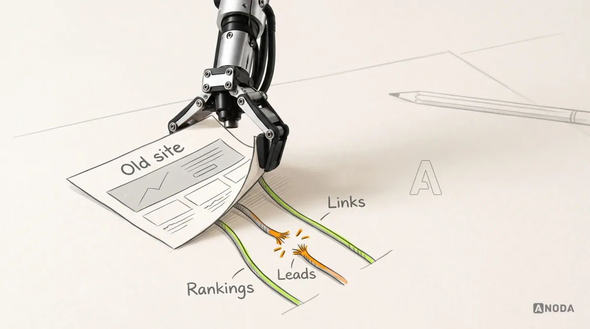
A website promises a result. Product onboarding has to make that result reachable. When the site sells a quick start but the account opens on a blank dashboard, the gap belongs to the journey across both surfaces.
This guide is for teams reviewing that handoff. Start with one audience, one promise and one useful product action. Keep the broader website redesign plan separate from the specific point where an interested visitor becomes a user.
Trace one promise into the product
Choose a page that brings people to a trial, demo or account. Record who it addresses, the result it promises, the action it asks for and the conditions it explains. Then follow the same route into the product with the role and data a real new user has.
A hypothetical inspection product might promise that a field worker can capture a finding and send it for review. An empty organization with no assigned inspection cannot fulfil that promise yet. The first product screen should explain who assigns the work and what can happen in the meantime.
| Website promise | First product dependency | What the handoff must explain |
|---|---|---|
| Start an inspection | An organization, permissions and an assigned job | Who supplies the job and where its status appears |
| Review a team report | An invitation and access to the relevant records | Which organization the invitation opens and what the role can see |
| Try a workspace | Setup or an explicitly labelled example | Which data is illustrative and how to begin real work |
These examples are a review tool. Use the actual product’s rules and dependencies before writing its copy or designing the screens.
Carry context through the call to action
The destination should match the action. A request for a demo needs a clear acknowledgement and next step. A trial needs a defined route into the account. An invitation needs to show the organization and role before someone accepts it.
Preserve appropriate context, such as the selected product or plan, without putting private customer information in a public URL. If the visitor must switch channels or wait for another person, name that dependency. Do not make the product appear ready when access still needs approval.
Review the transition on mobile as well as desktop. A visitor who opens the invitation later should still understand what they are joining, even if they no longer remember the landing page.
Use the same words for the same work
Compare the nouns and actions on the website with navigation, onboarding and help. If the site offers an inspection, the product should not introduce an unexplained audit, task and visit as though they were interchangeable.
Keep a small shared vocabulary with a definition, the roles that use it and an example in context. Product-specific terms can be useful; the handoff must teach them before asking the person to act. The same principle applies to plan names, permissions and status labels.
Design the wait and the failed handoff
Map the cases around successful registration: an expired invitation, a missing integration, an unavailable import, an incorrect email address and a user who already belongs to another account. Each needs an explanation, a next action and a way to preserve completed work.
A generic error message cannot tell someone whether to retry, contact an administrator or wait. Specify who owns the next step and which state the product can actually verify. For more detailed product states, use the SaaS UX workflow guide.
Review connected surfaces in real work
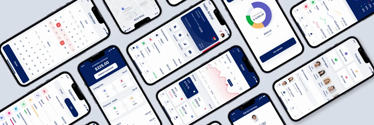
For Qarma, ANODA designed desktop quality-management workflows and a mobile inspection experience, developed the UI kit and style guidance, and created marketing-site visuals explaining the product. These are connected design surfaces: the explanation before purchase and the tools used afterwards.
The case documents that design scope. It does not establish a measured conversion or retention increase. In your own product, test whether a new user can connect the website’s explanation with the task, permissions and information available after sign-in.
Measure the handoff as a sequence
Track the steps separately: eligible visitors reaching the call to action, completed requests or registrations, account access and the first meaningful task. Define the audience, denominator and observation window for each step before comparing versions.
A higher registration count can hide a worse first-use experience. Inspect failed transitions and support questions alongside completed actions. Separate a confusing screen from a legitimate wait for data, access or another person’s review.
A brief for the website and product teams
Bring the landing page, the actual entry route, the primary role, its first useful task, required data and permissions, and the failures already seen in support. Agree who owns each side of the handoff and how both teams will verify the same journey.
ANODA’s product design work connects these decisions through flows, interface states and an engineering handoff. A shared brief should make the promise deliverable before a new campaign sends more people into the account.
Frequently asked questions
What should a website to product handoff preserve?
Preserve the promised task, appropriate product or plan context, consistent terms and an explanation of the role, data and access required to begin.
How should a team measure onboarding after a website redesign?
Separate call-to-action completion, account access and the first meaningful task. Define the audience, denominator and time window, then investigate failures and dependencies at each transition.
Written by