In short
Most real estate apps are built because someone wanted an icon in the store, not because a buyer, renter or agent had a job to do on the phone. An app pays off when a task repeats, needs the phone itself or ties into your systems. Everything else is a responsive site's job. Here is how to tell the difference, what each audience needs, what the app costs after launch, and how to test the narrow version first.
In this article
- What “mobile apps for real estate agents” actually covers
- The only test that matters: a repeated job on the phone
- What a responsive website already does better
- Buyers, renters and agents are three different customers
- Saved searches and alerts: the benefit everyone promises and few design
- Offer and transaction tracking: selling calm during the worst weeks
- Camera, location and offline: when the phone itself is the point
- Agent workflow apps: where the strongest case often hides
- Integration decides whether the app tells the truth
- Website and app together: split the jobs, not the data
- The cost side: acquisition, maintenance and the stores
- Mistakes we keep seeing in real estate app projects
- How to validate the narrow workflow before building a portal
- How we approach real estate app design at ANODA
- The decision rule
A real estate mobile app earns its keep when people do the same job on their phone again and again, when the job needs the phone itself (the camera, the location, work without a signal), or when it connects to the systems that run your agency. If none of that is true, you are not building a product. You are buying a very expensive icon. Saved searches that tell you why a home is worth a look, an offer that does not vanish into silence, showing notes that reach the CRM from a basement with no signal: those are benefits. “Being in the App Store” is not a benefit. It is a line on a slide.
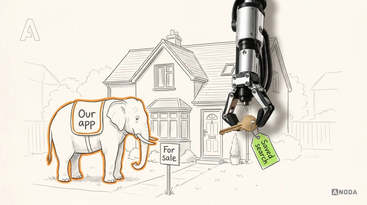
Our experience designing and fixing complex products keeps revealing this pattern, and property is one of the industries where the same request comes back every season in a new outfit. First it was “we need an app like the big portals”. Then “we need an app for every agent”. Now it is “we need an AI app”. The plot never changes, and neither does the mess: an agency wants a presence, pays for a build, launches with a press release, and watches the download chart flatten by the second month. The app becomes a white elephant: expensive to feed, impossible to sell, and too embarrassing to shut down.
Meanwhile the money leaks out in two directions. You paid to acquire every install, through ads, QR codes on yard signs and agents begging clients to download it. Then, in the pattern we keep seeing, people open the app a handful of times, find nothing they could not do on your website, and delete it. You paid for a user who never became one. Then you keep paying every year to keep the app alive for the few who stayed.
This guide is for the people who sign that cheque: agency owners, brokerage product leads, proptech founders and the CTOs who inherit the result. It will not tell you that every agency needs an app. Plenty do not, and we would rather lose a project than build you a white elephant. It will tell you which jobs justify one, which audience you are really building for, what it costs after launch, and how to prove the narrow version works before you pay for the broad one.
What “mobile apps for real estate agents” actually covers
The phrase gets used for at least four different products, and most failed projects start by mixing them up. Before anyone compares features, agree which one you are talking about.
- Off-the-shelf tools agents install. CRMs, e-signature, showing schedulers, mortgage calculators, photo editors. Most “best apps for agents” lists are about these. You do not build them; you choose them. If your problem is solved by a subscription, stop reading and buy the subscription.
- A consumer search app. Buyers and renters browse listings, save searches and get alerts. This is the portal game, and you are competing with national portals that have more listings, more data and a far bigger marketing budget than you.
- A branded client app. An agency’s own app for its clients: saved homes, viewings, offers, documents, messages with the agent. The audience is smaller and warmer: people who already chose you.
- An agent workflow app. An internal tool for your own agents in the field: showing notes, listing intake, photos, follow-ups, all synced to the systems the office uses. Nobody outside the agency ever sees it.
These are as different as a market stall, a department store and a wholesale warehouse. All three sell things. Nobody sane would hire one architect with one brief for all three and expect a good result. Yet we regularly see requests that say “a real estate app for buyers, sellers, renters and agents” in a single sentence, with one budget and one deadline.
The honest version of the question is narrower: which of these four products would pay for itself in your agency, and for whom? The answer is often one, occasionally two, and sometimes none. “None” is a perfectly good answer. It is the cheapest one on this page.
A note on scope. This article is about deciding whether an app is warranted and what it should do. It is not a guide to choosing a vendor or a technology stack, and it is not a marketing plan for an app that already exists. If you already have the app and need people to install it, our guide to real estate app marketing covers that side.
The only test that matters: a repeated job on the phone
Here is the rule we apply before we draw a single screen. A real estate mobile app is justified when at least one of three things is true, and the more of them stack up in the same job, the stronger the case:
- The job repeats. The same person comes back to do the same thing several times a week, for weeks or months. Checking new listings during an active search. Tracking an offer through to closing. An agent logging every showing, every working day.
- The job needs the phone itself. The camera, the location, notifications that arrive when the user is not looking, work that has to continue without a signal. A website can reach some of this, but an app does it more reliably and with fewer steps.
- The job connects to your systems. Listings feed, CRM, calendar, documents, e-signature. The value is not the screen; it is that what the user does on the phone lands where the office can act on it.
Notice what is not on the list. Wanting to look modern. A competitor having one. A board member asking “why don’t we have an app?”. An agency’s logo on someone’s home screen. None of those is a job anybody does.
Think of it the way a hospital decides to open a ward. Nobody opens one because the hospital across town has one. They open it because the beds are full every night and patients are waiting in corridors. A room that is needed one day a year is a room you borrow, not a wing you build.

Run your own list through the same table. Write down every job a buyer, a renter, a seller and an agent does with your agency. For each one, answer three questions honestly: how often, whether it needs the phone itself, and whether it has to reach one of your systems. Most agencies end up with a short list of jobs that pass, and a long list that a good responsive website already handles.
The short list is your product. The long list is what you stop paying to rebuild.
What about “we will get repeat use once people have the app”? That is “if you build it, they will come”, and it only works in films. Repeat use comes from a repeated need. The app can make a repeated job faster. It cannot manufacture the need.
Audit check
List every job each audience does with your agency. Mark how often each one happens, whether it needs the camera, location, notifications or offline work, and which system it has to reach.
Failure evidence
The app brief lists features (“listings, map, calculator, chat”) instead of jobs. Nobody can say which job a user would come back for next week.
Correction pattern
Keep only the jobs that repeat, need the phone or reach your systems. Build for those. Hand the rest to the website.
What a responsive website already does better
Before you pay for an app, be clear about what you would be replacing. A well-built responsive website is not a consolation prize. For several real estate jobs it is simply the better tool.
It is found. People start a property search in a search engine or on a portal, not in an app store. A listing page can rank, be shared in a message and be opened on any device without an install. An app screen can do none of that on its own. Every listing that lives only inside your app is a For Sale sign put up in the living room.
It has no front door fee. A link opens. An app asks the user to go to a store, wait for a download, open it, maybe sign in, maybe allow notifications. Every step loses people. For a one-time visitor, someone checking a single listing a friend sent, that is like asking them to join a gym to use the drinking fountain.
It fits the length of the relationship. Buying a home is intense and short. The National Association of Realtors’ 2025 Profile of Home Buyers and Sellers, published in November 2025, surveyed people who bought between July 2024 and June 2025 and found that the typical buyer searched for 10 weeks. The same report found that sellers had owned their homes for a median of 11 years before selling. Put those two numbers side by side. Your app is useful to a buyer for a couple of months, and then the next time they need you may be a decade away.
That is the part the app pitch usually skips. An agency app on a buyer’s phone is a houseguest: welcome while the search is on, awkward by week eleven, and out the door long before the next move. Paying to acquire that guest makes sense only if the ten weeks produce enough value for you and for them.
It can already do more than people assume. Modern mobile browsers handle a lot: the camera for uploads, location with permission, maps, saved accounts. Since iOS and iPadOS 16.4, which Apple’s WebKit team announced in February 2023, a web app that the user has added to the Home Screen can also receive push notifications on iPhone. In practice few people add a website to their Home Screen, so treat that as a possibility, not a strategy. But it does mean “we need an app for notifications” is no longer automatically true.
Here is where the responsive site honestly falls short, and where an app starts to earn its money:
- Frequent, quick returns where signing in again every time is friction.
- Reliable notifications for a user who did not add anything to their Home Screen.
- Work that must continue without a signal and sync later.
- Heavy camera use: dozens of photos, scanning documents, structured capture.
- Background location, such as noticing that an agent has arrived at a showing.
If your short list of jobs sits mostly in the top half of this section, fix the website first. If it sits in this last list, keep reading.
Every listing that lives only inside your app is a For Sale sign put up in the living room.
Buyers, renters and agents are three different customers
The second most expensive mistake, after building an app nobody needs, is building one app for everybody. Buyers, renters, sellers and agents do not just want different features. They have different journeys, different stakes and different reasons to trust or distrust you.
Designing one experience for all of them is teaching the nursery class, the final-year students and the staff room from the same lesson plan. The nursery is lost by minute two, the final-years are bored, and the teachers go back to their own spreadsheets.
Buyers are on a long, emotional, high-stakes journey. They search for weeks, view several homes, compare, argue with a partner, get outbid, and start again. Their biggest decision is the largest purchase most of them will ever make. What they need from you is signal in the noise: which homes are new, which prices moved, which open houses are this weekend, and what is happening with their offer. The NAR report found that 88% of buyers purchased through an agent or broker, and that half of buyers wanted their agent’s help above all with finding the right home. The agent is the product here. An app that tries to replace the agent is fighting the one thing buyers value most. An app that makes the agent more present and more responsive is on the right side of that number.
Renters move faster and with less money at stake per decision, but with a different fear: being scammed. Deposits sent to fake landlords, listings that do not exist, applications that disappear. Their journey is short and urgent: find, view, apply, pay, move in. What they need is speed and proof: this listing is real, this is the actual agent, this is where your application stands, this is the condition of the flat when you moved in. Their trust need is verification, not inspiration.
Sellers rarely need an app at all. They list once in a decade. What they want is reporting: how many viewings, what feedback, what offers. That is a well-designed update, by email or in a signed-in area of your website, not something they install.
Agents are the only group who might use the product every working day for years. They work in cars, driveways, hallways and basements. They switch between calls, keys, clients and paperwork. Their trust need is simple and brutal: does this tool save me time, or does it give me extra typing? If it gives them extra typing, they will politely nod in the training session and go straight back to WhatsApp and their notes app.
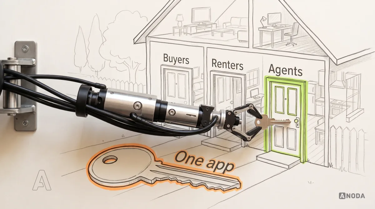
The practical consequence: pick a primary audience and design for it properly. If it is agents, the app is an internal tool and the benefit is measured in hours saved and follow-ups that happen. If it is active buyers in your own client base, the benefit is fewer lost deals and fewer “any news?” calls. If it is the general house-hunting public, you are entering the portal fight, and you should say that out loud in the board meeting before anyone signs a budget.
A second audience can come later, as a separate set of flows, once the first one works. The lazy version, one app with a role switcher on the first screen and every feature visible to everyone, looks efficient on the estimate and is expensive everywhere else: every screen has to satisfy four sets of needs, every change risks breaking three of them, and every user wades through features meant for someone else.
Audit check
For each feature in the brief, name the one audience it serves first and the moment in their journey where they need it.
Failure evidence
Features serve “users” in general. The first screen asks people who they are before showing anything useful. Sellers and agents share navigation with buyers.
Correction pattern
Choose one primary audience, map its journey end to end, and design the app around that journey. Add other roles as separate flows only when there is evidence they need them.
Saved searches and alerts: the benefit everyone promises and few design
Every real estate app pitch lists “saved searches and push notifications” as a key benefit. It is a real one. An active buyer who hears about the right home first has a better chance of viewing it before it goes under offer, and an agency that tells them first is the agency they keep calling. For a buyer in the middle of a 10-week search, this is often the single job that repeats most.
It is also the benefit most often ruined in execution. The typical saved search is a screw-up in slow motion. It sends an alert that says “New homes match your search!” and opens a list of forty results, half of which the buyer has already seen, with a “New” badge on all of them. That is a pupil who raises a hand every five minutes, says “I have a question”, and never asks it. By the third time, the teacher stops looking up. By the third alert, the buyer turns notifications off, and you lose the one channel you built the app for.
The value of an alert is in the reason. What changed, and why it matters to this person:
- New, and matching the rules they care about. Not “new in your area”, but “new, 3 beds, under your limit, with the garden you asked for”.
- A price change on a home they looked at. A drop on a saved home is often more interesting than a brand-new listing.
- A status change. A home they saved went under offer, or came back on the market.
- A time-sensitive event. An open house this weekend, a viewing slot that just opened up.

The difference between the two screens is not visual polish. It is a product decision about what counts as a change, and a data decision about whether your system can tell. If the listings feed cannot tell you that a price dropped or a status changed, no designer can put that reason on the screen. We come back to that in the integration section, because it is where most “smart alerts” quietly turn dumb.
Frequency is the other half. A buyer in a hot market may want every change the moment it happens. A buyer casually watching for next spring wants a weekly summary. Let them choose, per saved search, in plain language: “as it happens”, “once a day at 8 am”, “weekly on Sunday”. Every notification you send that the user did not want is a withdrawal from a small, non-refundable account of patience.
And measure the right thing. The number of alerts sent is a measure of how busy your server was. The number that matters is how many alerts led to a saved home, a viewing request or a message to an agent. Goodhart’s law applies with full force: when “notifications sent” becomes the target, the team will send more of them, and it will stop meaning anything the day it does.
Audit check
Read the last twenty alerts a real saved search produced. For each one, write down what changed and whether the alert said so.
Failure evidence
Alerts that repeat listings the buyer already saw. “New” badges on everything. Notification opt-outs rising after the first week.
Correction pattern
Define which changes deserve an alert, put the reason in the alert itself, let the buyer set frequency per search, and measure alerts by the viewings and messages they lead to.
Offer and transaction tracking: selling calm during the worst weeks
The period between “we made an offer” and “we have the keys” is where buyers are most anxious and agencies are least visible. Offers, counter-offers, inspections, appraisals, financing, closing dates. Every day of silence feels like bad news. Every “any update?” call costs an agent time they could have spent on the next listing.
This job passes every test in our rule. It repeats: the buyer checks daily. It benefits from notifications: the moment the seller responds, they want to know. And it connects to systems: the transaction, the documents, the agent’s calendar. It is one of the strongest arguments for a branded client app, or at least for a signed-in client area built with the same care.
What most agencies ship instead is a status screen that says “Offer submitted” and nothing else. It is a restaurant that takes your order and then gives you no sign it has reached the kitchen. You sit there, you watch other tables get served, and eventually you walk up to the counter to ask. That walk to the counter is the phone call to your agent.

A good tracking flow answers four questions without the buyer having to ask:
- Where is it now? The current step, in the buyer’s words, not the transaction software’s internal status code.
- What happens next, and when? The next step and its deadline, if there is one. “Seller responds by Wednesday, 6 pm” is worth more than any animation.
- Do I need to do anything? Either a clear action (sign this, upload that, book the inspection) or an explicit “nothing needed from you now”. The second one is underrated. It is the sentence that stops the call.
- Who do I talk to? A named agent, one tap away.
The business case is not “nicer UX”. It is fewer anxious calls per transaction, fewer deals that wobble because the buyer lost confidence, and an agent who spends the afternoon on a new listing instead of reassuring the same client three times.
One caution. A timeline is only as honest as the data behind it. If steps are updated by hand once a week, the app will confidently show last week’s status, which is worse than showing nothing. Before you design this screen, find out who updates each step, in which system, and how fast. If the answer is “someone, eventually, in a spreadsheet”, fix that process first. Otherwise you are hanging a beautiful barometer that is glued to “Fair”.
Audit check
Follow one real offer from submission to closing. Record every status change, who made it, in which system, and how long it took to reach the buyer.
Failure evidence
Buyers call the agent to ask about status. Status screens show a stage but no next step, no deadline and no “nothing needed from you”.
Correction pattern
Show the current step, the next step with its deadline, the buyer’s own action or an explicit “nothing needed now”, and a named contact. Automate the updates before you design the timeline.
Camera, location and offline: when the phone itself is the point
Some jobs belong on a phone because they happen in a physical place, with a physical object in front of you. This is where apps have a real, structural advantage over a website, and where the case for building one gets much easier to make.
Camera. Listing intake is photos, lots of them, plus measurements and notes, taken room by room. A renter’s move-in condition report is photos of every wall, appliance and scratch, with a time stamp that will matter in a deposit dispute a year later. An app can guide that capture step by step, keep photos attached to the right room, compress and upload them in the background, and never lose a batch when the user switches to a call. A website can take photos too, and for a once-a-year condition report a well-designed mobile web flow may be enough. For an agent capturing three listings a week, the app wins.
Location. An agent arriving at a showing can have the right listing, the buyer’s name and the lockbox instructions on screen without searching. A buyer walking through a neighbourhood can see what is for sale on the street they are standing on. That second one is a lovely demo and a rare real-world habit. Location, location, location is the oldest rule in property; in product it is “location, if the user does this often enough to grant permission”. Ask for location only at the moment the feature needs it, with the reason on the same screen, never as a pop-up on first launch.
Offline. Viewings happen in basements, in new-build developments before the network is set up, in rural houses with one bar of signal on a good day. An app that loses notes, photos or a half-filled form when the connection drops is not a field tool. It is a liability. Offline work means the app stores everything locally, tells the user plainly that it has done so, and syncs when the connection returns, without duplicates and without conflicts silently overwriting someone’s work.
Documents. Scanning an ID, a proof of income or a signed page, turning it into a clean file and attaching it to the right application. Phones are very good at this now. Whether it belongs in your app or in the e-signature and document tools you already pay for is a real question; the answer is often “link to the tool you have, and design the handover well”.
Each of these is a genuine real estate mobile app benefit. Each also comes with a design burden: permission prompts that explain themselves, clear states for “saved on this phone” and “synced”, recovery when an upload fails. Skip the burden and the benefit turns into support tickets. A camera feature with no upload recovery is a courier who loses the parcel and still marks it delivered: everyone finds out at the worst possible moment.
Audit check
Take the app to a real showing with a weak signal. Capture photos and notes, switch to a phone call, lose the connection, come back. Check what survived and whether the app told you.
Failure evidence
Notes lost after a call. Photos uploaded twice or not at all. Location and camera permissions requested on first launch with no context.
Correction pattern
Store field work locally first, show a clear “saved on this phone” and “synced” state, retry uploads in the background, and ask for each permission at the moment of use, with the reason on screen.
Agent workflow apps: where the strongest case often hides
If you run an agency and want the most reliable return from a mobile app, look inward before you look at the public. Your agents are the one audience that uses a mobile tool every working day, for years, in exactly the field conditions where apps beat websites. And the money involved is not abstract: it is agent hours, and deals that die because a follow-up never happened.
The pattern is depressingly familiar. The agency pays for a solid CRM. The agents use it at the desk, when they remember. In the field they use their phone’s notes app, photos, WhatsApp, voice memos and the back of an envelope. Friday afternoon, someone tries to reconstruct the week in the CRM. Half of it never gets there. The buyer who said “we loved the garden but worry about the damp” never gets the follow-up about the damp survey, and buys through someone else.
It is like keeping two shopping lists, one on the fridge and one on your phone, and then shopping from neither. The CRM is the fridge list: official, complete, never in your pocket when you are in the shop.
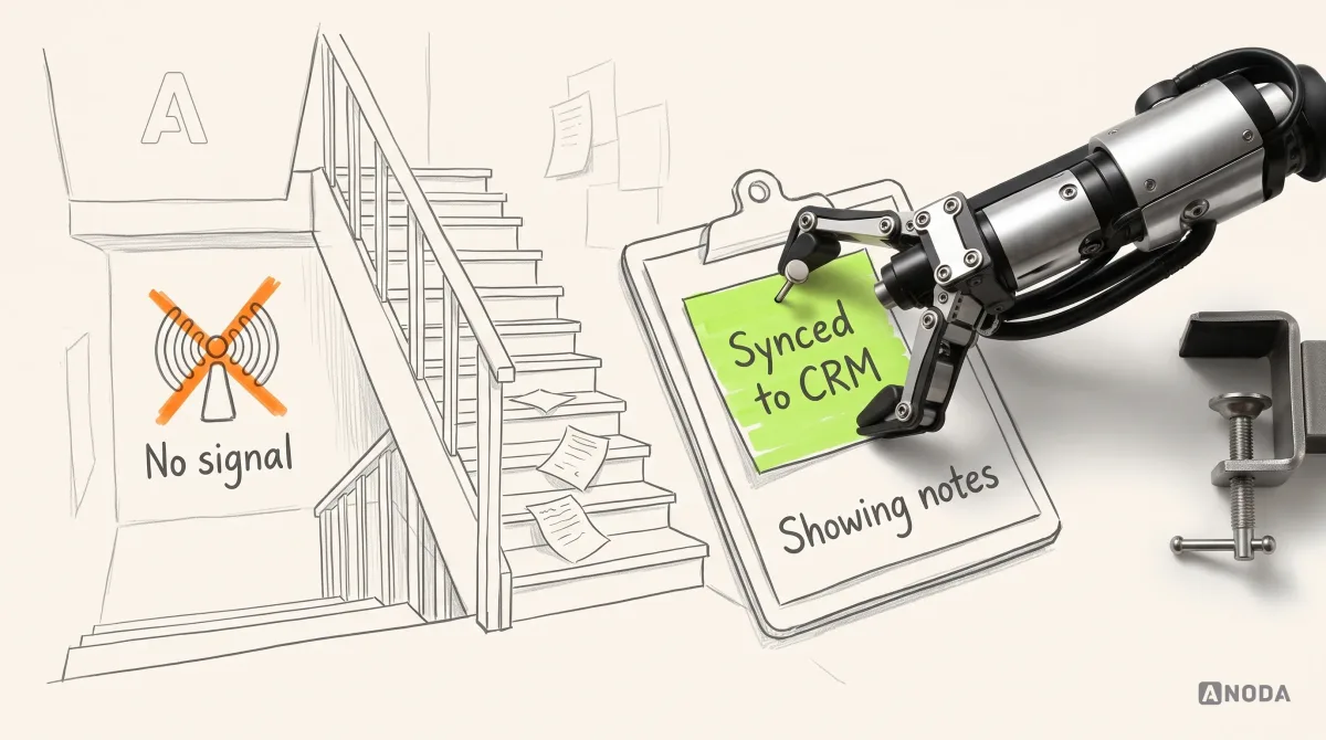
An agent workflow app earns its place by closing that gap. Not by adding features, but by making the field record faster to create than the notes app it replaces:
- Showing notes in a few taps. Buyer interest, concerns, follow-ups, as quick selections with room for free text, attached automatically to the right listing and the right client.
- Photos that know where they belong. Taken inside the showing or listing record, labelled by room, uploaded when there is a connection.
- Follow-ups with dates. “Ask the seller for the roof age, by Thursday” becomes a task the office can see, not a line in someone’s personal notes.
- The day at a glance. Today’s showings in order, with addresses, access instructions and the client’s name.
- Offline by default. Everything above works without a signal and syncs later.

The design test for any agent app is brutal and simple: is it faster than the notes app? If recording a showing takes longer in your tool than in the phone’s own notes, agents will not use it, no matter how many times management mentions it in the Monday meeting. You cannot mandate your way out of friction. You can only design it out.
That means working with agents, not around them. Ride along to showings. Watch what they write down and when. Count the taps. Good agent tools are built from a few hours of watching real agents in real driveways, not from a feature list assembled in a boardroom.
The money logic is cleaner than for any consumer app. You do not have to acquire these users; they are already on the payroll. You do not have to win them back from a competitor; you only have to be faster than their workaround. And every follow-up that happens because the note reached the CRM is a deal that did not slip through the cracks.
Audit check
Shadow three agents for a morning of showings. Count where their notes, photos and follow-ups go, and how much of it reaches the CRM by the end of the week.
Failure evidence
Field notes live in personal apps and chats. The CRM is updated in bulk on Fridays. Follow-ups promised at viewings do not appear as tasks.
Correction pattern
Design the showing record to be faster than the notes app, attach it to the listing and client automatically, work offline, and sync follow-ups as tasks the office can see.
Integration decides whether the app tells the truth
A real estate app is a window onto data it does not own. Listings come from a feed or a listing system. Clients and tasks live in the CRM. Viewings live in calendars. Documents live in signature and storage tools. The app’s job is to show the right slice of all that, to the right person, at the right moment, and to put what they do back in the right place.
When that plumbing is weak, the prettiest interface in the world starts lying. The most common lie in property apps is the stale listing: a home shown as available after it went under offer. The buyer gets excited, requests a viewing, and hears from the agent that it has been off the market since Sunday. It is an airline selling seats on a flight that left yesterday. The passenger does not blame the seat. They stop trusting the airline.

The cost of a stale listing is not one disappointed buyer. It is the next alert they ignore, the next listing they do not believe, and the agent’s time spent apologising instead of selling. Trust in property data is binary. Once a buyer catches your app being wrong, every screen is suspect.
Integration questions to answer before design, not after launch:
- How fresh is each piece of data? Listings, prices, statuses, viewing slots. Minutes, hours or days? The design depends on the answer. If status updates arrive once a day, the screen must say “updated this morning”, not pretend to be live.
- Which system is the source of truth? When the app and the CRM disagree about a client’s phone number, which one wins? If nobody knows, both will be wrong eventually.
- What flows back? Saved homes, viewing requests, showing notes, documents. Where do they land, and who is notified?
- What happens when a connection fails? The listings feed goes down, the CRM changes its fields. Does the app show an honest error, keep the last known data with a date on it, or quietly show nonsense?
This is the part of an app project nobody puts on the brochure, and the part that decides whether the brochure was true. It is also where “we will just wrap our website in an app” falls apart: the wrapper shows the same stale data, only now with a download step in front of it.
We treat integration as a design input. Before a screen shows a status, we want to know where the status comes from, how late it can be, and what the user should see when it is late. Designing the screen first and “connecting the data later” is ordering the furniture before anyone has checked whether the stairs are wide enough to carry it up.
Audit check
For every piece of data on your main screens, write down its source system, how often it updates, and what the screen shows when the update is late or fails.
Failure evidence
Buyers request viewings for homes that are no longer available. Agents see different client details in the app and in the CRM. Screens show no indication of freshness.
Correction pattern
Name a source of truth for each data type, show freshness where it matters, design states for late and failed data, and route everything the user does back to the system that owns it.
Website and app together: split the jobs, not the data
For most agencies that do need an app, the question is not “website or app”. It is which job each one does, and how a person moves from one to the other without starting again. Real estate website development with a mobile app goes wrong when the two are planned by different teams, on different budgets, with different ideas of who the user is.
Think of a theatre. The box office sells tickets to anyone who walks in off the street. The season ticket holders have their own entrance, their own seats and their own schedule. Nobody asks a passer-by to buy a season ticket before they can see what is playing, and nobody makes a season ticket holder queue at the box office every night.
The website is the box office. It is where people find you, search listings, read about an area, share a home with a partner and make first contact. It has to be fast, findable and complete without an install. The app is the season ticket: it picks up when the relationship becomes repeated, after the first saved search, the first viewing or the offer.
Three rules keep the two from fighting each other:
- One account, one source of data. A home saved on the website appears in the app, and the other way round. Two sets of favourites is how you teach users that neither can be trusted.
- Links that land in the right place. A link to a listing in an email or text message opens that listing in the app if it is installed, and on the website if it is not. Never the app’s home screen, never a store page for someone who only wanted to look.
- No install walls. Do not cover listing pages with full-screen “Download our app” banners. You paid to bring that visitor to the page; do not make them fight a pop-up to read it. Offer the app at the moment it helps: “Get alerts for this search on your phone”.
The cost side: acquisition, maintenance and the stores
This is the section app pitches skip, so let us not. A real estate app has three kinds of cost, and only the first appears on the build estimate.
Building it. Discovery, design for each role and every state, development for iOS and Android, connections to your listings feed and CRM, testing, store submission. This is the number everyone argues about. It is also, over the life of the app, usually the smallest of the three.
Getting people to install it and come back. Every install costs something: ad spend, agent time spent persuading clients, QR codes on signs, email campaigns. Then a share of those users open it twice and delete it, and anyone you want back, you pay for again. For a consumer search app, this is a permanent line item, because you are asking people to choose your app over national portals they already use. For a client app, it is cheaper, because the agent can invite a client who already chose you, at the exact moment the app becomes useful: after the first viewing, or the day they make an offer. For an agent app, acquisition is close to zero; your agents are already on the payroll.
That difference alone often decides the case. A consumer search app has to win users from the portals and keep them for a 10-week search. A client app only has to be useful to people who already work with you. An agent app only has to beat the notes app.
Keeping it alive. An app is not a brochure you print once. Every year both mobile operating systems release new versions, and the app needs testing and often fixes. Store accounts cost money: as of September 2026, Apple lists the Apple Developer Program at 99 USD a year, and Google lists a one-time 25 USD registration fee for a Google Play developer account. Those are the smallest numbers on this page. The real recurring costs are the people: someone to maintain the listings and CRM connections when the systems on the other side change, someone to own the alert rules and content, someone to answer “I can’t log in” and “where is my offer?”, and someone to fix what breaks.

Put all three on one sheet before you decide. Here is the illustrative arithmetic we walk clients through, with your own numbers in place of the letters. Say an app costs B to build and M a year to maintain. You expect to acquire N active users a year at a cost of A each, and each active user produces some value V for the agency: a deal you would otherwise have lost, hours saved, a referral. The app pays off only if N × V is comfortably bigger than N × A + M, year after year, with B paid back somewhere along the way. Most white-elephant apps fail this test on the back of an envelope. The ones that pass usually have a small N and a large V: a few hundred agents or active clients, each doing a valuable job several times a week.
There is also the store itself to get past. Apple’s App Store Review Guidelines, as published in September 2026, say in the section on minimum functionality that an app should offer features, content and UI that lift it beyond a repackaged website. The same section says apps built from a commercial template or app generation service are rejected unless the provider of the content submits them itself. Two popular shortcuts in real estate, the website in an app wrapper and the white-label “your own branded app” from a template vendor, run straight into those rules. Check with your vendor how they handle review before you sign, not after the rejection email.
Mobile app design
Not sure the app would pay for itself? That is the first thing we check.
Bring us your jobs list, your audiences and your numbers. We tell you which job, if any, is worth an app, and what the narrow version should look like.
Mistakes we keep seeing in real estate app projects
These are the patterns that sink real estate app projects most often. Most of them are not design problems at the start. They are decisions made before design, and design inherits the damage.
Cloning the national portal
The agency looks at the biggest portal’s app, lists its features and asks for “the same, with our branding”. Map search, filters, mortgage calculator, neighbourhood data, 3D tours, chat. The result is a jack of all trades and master of none: a thinner version of an app the user already has, with a fraction of the listings. It is signing a star striker before you have a goalkeeper. The glamorous features arrive, the basics (fresh data, alerts with reasons, a fast path to a real agent) are left for “phase two”, and phase two never comes because the budget went on the striker.
If you want to compete with portals, compete where they are weak: local knowledge, an agent who answers, a transaction that does not go silent. Those are not features you copy. They are jobs you design for.
A template app for every agent
Some vendors sell “your own branded app” to each agent in a brokerage, built from the same template. It sounds like empowerment. It is a litter of identical puppies, each needing its own name, food, vet and walks: separate store listings, separate updates, separate reviews, separate support. And as we saw above, Apple’s guidelines reject template-built apps unless the content provider submits them itself. Even where the stores allow it, a buyer has no reason to install an app for one agent. One well-designed client app in which each agent’s clients see their own agent achieves the personal touch without the kennel bills.
Asking for an account before showing anything
The app opens, and the first thing it asks for is an email, a password, a phone number and a choice between “buyer”, “seller” and “renter”. Nothing has been shown yet. It is a supermarket that asks for your email before you may pick up a basket. People leave before they see a single home, and every one of them was an install you paid for.
Let people browse first. Ask for an account at the moment it gives them something: saving a home, creating an alert, requesting a viewing. Then the sign-up is a fair trade, not a toll.
Treating notifications as free marketing
Once an app has permission to send notifications, marketing discovers it. “New blog post!”, “Market update!”, “Have you considered selling?” arrive alongside the alerts the user actually asked for. Within weeks, users switch notifications off entirely, including the saved-search alerts that were the reason the app existed. Keep promotional messages out of the alert channel, and give users separate switches for each kind of message.
Wrapping the website and calling it an app
The cheapest route: take the responsive website, put it in an app shell, publish. It inherits every problem of the website plus a download step, which is a lot of crap to put between a buyer and a listing, and the app stores may reject it as a repackaged website anyway. It is serving yesterday’s soup in a fancier bowl and charging for the bowl. If the website is good, promote the website. If the jobs genuinely need an app, design the app for them.
Forgetting the agents in a client app
A client app that lets buyers request viewings and send messages, connected to nothing on the agent side, creates work instead of saving it. Requests arrive in a separate inbox nobody checks. Messages get answered a day late. The buyer concludes the agency is slow, which is worse than having no app at all. Every client action in the app must land somewhere an agent will see it, in the tool they already use, with a clear owner.
Launching broad, measuring downloads
The app launches with every feature for every audience, and success is reported as installs. Installs are the most expensive vanity number in mobile: you paid for each one, and it tells you nothing about whether anyone did the job. Measure the job instead. Viewings requested from alerts. Offers tracked without a phone call. Showings recorded on the day. If those numbers are flat, the download chart is a receipt, not a result.
How to validate the narrow workflow before building a portal
When a job passes the test, the temptation is to build the whole thing at once: the app for buyers, renters, sellers and agents, with every feature on the wishlist. Walk before you run. The cheapest way to find out whether a real estate app will pay for itself is to build the narrowest version that does one repeated job for one audience, and watch whether people come back.
It is pouring the foundation for the one room people will actually live in, instead of the tower block you hope will fill with tenants one day. If the room is used every day, extend. If it stands empty, you have lost a room, not a tower.

This is the order we use:
- Find the repeated job. Read your inquiries, your CRM notes and your agents’ complaints. Shadow agents in the field. Talk to recent buyers and renters about what they checked every day and what they called you about. Output: two or three candidate jobs, each with evidence that it repeats.
- Pick one audience and one job. Compare the candidates on frequency, value to the agency and value to the user. Output: one job, one audience, and a written list of what you are deliberately not building yet.
- Estimate both sides of the sheet. Build cost, maintenance cost, acquisition cost for this audience, and the value of one successful use of the job. Output: a rough break-even that a finance person would not laugh at.
- Check the data. Confirm the listings feed, the CRM and any other system can supply what the job needs, fresh enough to be honest. Output: a list of integration gaps and who fixes them.
- Prototype the flow. Design the job end to end, including the unhappy paths: no signal, stale data, a rejected offer, a failed upload. Test the prototype with five to eight real people from the chosen audience. Output: a flow that people complete without help.
- Ship the narrow version. One audience, one job, done properly. For a client app this can be a small invited group; for an agent app, one office. Output: a real product in real hands.
- Measure the job, not the installs. How many people did the job, how often they came back, what it saved or earned. Output: the evidence to extend, change course or stop.
Two things usually surprise teams here. First, step two is where most of the value is created, because it forces a decision the organisation has been avoiding. Second, “stop” is a legitimate outcome of step seven. Discovering in three months that a job does not repeat is far cheaper than discovering it after a year of maintaining a broad portal.
The narrow version does not need to be ugly or half-finished. It needs to be complete for one job. One room, finished properly, with light switches that work, beats a whole floor of bare concrete.
Audit check
Look at your current app plan and count the audiences and jobs it covers in the first release.
Failure evidence
The first release serves every audience. No single job has a success measure. The plan has no point at which you would decide to stop.
Correction pattern
Cut the first release to one audience and one repeated job, set a success measure for that job, and decide in advance what result would make you extend, change course or stop.
How we approach real estate app design at ANODA
We do not start with screens, and we do not start with the assumption that you need an app. An agency that says every agency needs an app is a doctor who writes the prescription before you sit down. ANODA directs the budget toward the customer journey that earns its place, whether the right first version is a mobile app or a responsive client experience.
When a real estate team comes to us, the work usually runs in this order. We map the jobs each of your audiences does with you, from the first search to the keys and beyond. We find the ones that repeat, need the phone or connect to your systems, and we check whether your data can support them honestly. Then we design the role-specific experience for the audience that matters most: the agent in the driveway, the buyer waiting for an answer on an offer, the renter proving the condition of a flat. We design the unhappy paths as carefully as the happy ones, because in property the unhappy paths are where trust is won or lost.
What you get from our mobile app design work is not a feature list. It is a decision (app, website, or neither), the narrow first version worth building, and designs your engineers can build without guessing what happens when the signal drops or the listing goes under offer. If the answer is an app, it is an app built around a job. If it is not, you have saved the build cost and the years of rent that come after it.
Our Sail mortgage CRM design shows that approach in a neighbouring financial workflow: leads, loan applications, pricing and documents connected through a desktop experience with responsive phone screens. It is CRM design, not a native real-estate app. The relevant lesson is concrete: put the next action, the status and the necessary information into one coherent role-specific journey instead of scattering them across tools.
For a real estate or PropTech product, bring us the search, application or agent handoff that keeps generating calls. We connect the customer’s next step with the owner’s or agent’s working record, so both sides can follow the same deal.
ANODA brings that workflow discipline to your property product. The outcome is a first version built around work customers and agents actually need to finish, with clear states and a handoff that keeps your development team from guessing.
The decision rule
When someone in your agency says “we need an app”, ask these questions in order, and stop at the first one without a clear answer:
- Which audience is this for first: agents, your own clients, or the general public?
- Which job does that audience do on the phone again and again?
- Does that job need the phone itself, or connect to your systems, in a way your website cannot handle well?
- Can your data support the job honestly: fresh listings, real statuses, a CRM that receives what the app sends?
- What will it cost to acquire the users, and to keep the app alive every year, compared with the value of the job?
- What is the narrowest version that proves the job repeats, and how will you know?
If you cannot answer the first three, you do not need an app yet. You need the answers. If you can answer all six, you have the brief for an app that will pay its rent.
Identify the repeated mobile job. Estimate what it costs to acquire the users and keep the app alive. Validate the narrow workflow with real people. Only then build, and build the room people will use every day, not the tower you hope will fill up. For more on product decisions like this one, browse the rest of the ANODA UX blog.

Work with ANODA
Find the one job your real estate app has to do, before you pay for twenty.
We look at your audiences, your data and your numbers, tell you honestly whether an app is warranted, and design the narrow version your team can build and your users will come back to.
Written by