In short
A design system is the shared set of decisions a team uses to design and build its interface: tokens, components, patterns, content and accessibility rules, in design and in code, plus a way to change them. Here is what it contains, which kind your product needs, and how to build one from the product you have instead of a catalogue for features nobody has planned.
In this article
- What a design system is, and what it isn’t
- Public design systems worth studying
- Why products need one, in money terms
- Signs you need a design system now
- The expensive mistake: a catalogue for a product nobody has planned
- How much system you need at each stage
- Which design system do you actually need?
- Start with an inventory of what already exists
- Foundations: tokens first
- Tokens in practice: themes, dark mode and more than one brand
- Components: only what the product uses
- One component from start to finish
- Patterns: where components become solutions
- Where the design system meets the brand
- Content guidelines are part of the system
- One system, several platforms
- Build it or adopt it
- Design and code must be one system
- Design systems and AI
- Test components in real screens
- Accessibility belongs in the system, not after it
- Documentation people actually use
- Who builds and runs a design system
- Governance: how the system changes without falling apart
- A practical order for building a design system
- How to tell whether it’s working
- Moving a live product onto the system
- Common design system mistakes
- What a design system won’t fix
- How we approach design systems
- What changes day to day when a system works
- A short glossary
- The decision rule
A design system is the shared set of decisions a product team uses to design and build its interface: the foundations (colour, type, spacing and other tokens), the components built from them, the patterns that combine components into solutions, the rules for content and accessibility, and the process for changing any of it. It lives in the design library and in code at the same time, and it is only worth having if it makes the real product faster to build and more consistent to use. It is not a giant file of components for features nobody has planned.
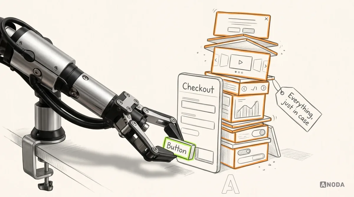
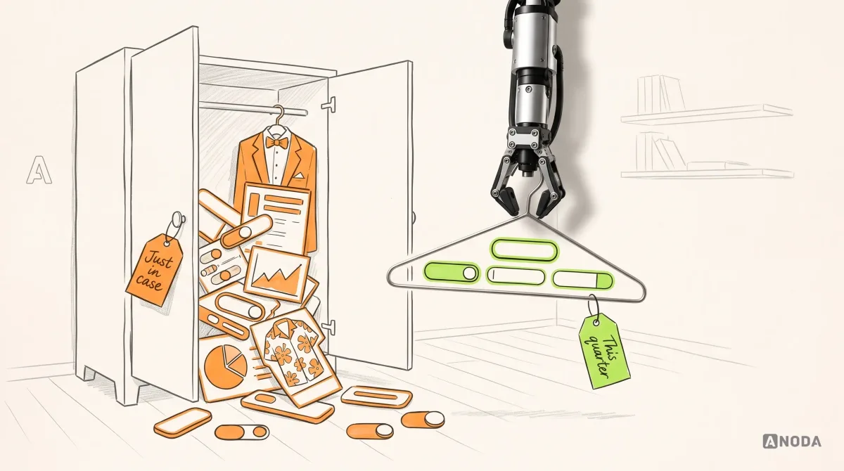
That last sentence is where most of the money goes. Our experience designing products shows the same expensive scene again and again. A team decides it needs a design system. Someone opens a new file and starts drawing components: every button variant anyone could imagine, twelve kinds of card, a data table with thirty options, a carousel, a mega-menu, a wizard, charts the product doesn’t have yet. Months later there is a beautiful library of hundreds, sometimes thousands of pieces. The product still has five button styles in production, the developers never saw most of the library, and the next feature is designed from scratch anyway.
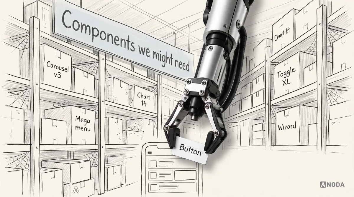
That is not a design system. It is a warehouse of components we might need, and nobody is paying rent on the right shelf.
This guide explains what a design system actually is, what it contains, which kind of system your product needs, and how to build one that earns its keep: starting from the product you have, reusing mature coded components where they fit, and adding only what the product can justify.
ANODA turns the product’s repeated decisions into a system the team can ship from. We find where design and production have drifted, fix the recurring patterns and define the states and guidance the next feature needs. You get faster decisions and a coherent interface instead of a speculative component warehouse.
What a design system is, and what it isn’t
The simplest way to understand a design system is as a language. Tokens are the alphabet. Components are words. Patterns are sentences. The guidelines are the grammar. And like any language, it only works if the people using it agree on the meaning and actually speak it, in design and in code.
A useful design system usually includes:
- Foundations. The basic decisions everything else is made of: colour, typography, spacing, sizing, corner radius, elevation and shadows, motion, iconography, grid and layout. These are usually stored as design tokens, named values that design tools and code can both use.
- Components. Reusable interface building blocks: buttons, inputs, selects, checkboxes, tables, modals, toasts, tabs. Each has defined variants, sizes, states and behaviour.
- Patterns. Proven ways of combining components to solve a recurring problem: a form with validation, an empty state, a filter bar, a confirmation step, onboarding, error recovery.
- Content guidelines. How the product talks: voice, tone, terminology, how to write labels, buttons and error messages.
- Accessibility rules. Contrast, focus, keyboard behaviour, screen-reader labels, target sizes, motion preferences, built into the components rather than bolted on.
- Documentation. Where to find all of this, when to use what, and what not to do.
- Code. The implemented components, which is where the system becomes real for users.
- Governance. Who owns the system, how changes are proposed and approved, how versions are released and old parts retired.

Notice what is missing from that list: size. A design system is not defined by how many components it has. A small product can have a perfectly good design system with a dozen components and a clear set of tokens. A large one can have hundreds of components and still not be a system, because nobody agrees on which to use, and the code does something else.
Design system, UI kit, style guide, pattern library
These terms get mixed up constantly, which is part of why teams buy the wrong thing.
- A style guide describes the visual brand: logo, colours, typefaces, imagery, tone. It tells you what the brand looks like. It doesn’t tell you how a date picker behaves.
- A UI kit is a collection of interface components in a design tool. Useful for drawing screens quickly. On its own, it has no code, no rules and no process for change.
- A component library is a set of implemented components in code. It is where the interface actually runs.
- A pattern library documents how components combine to solve common problems.
- A design system connects all of these with shared foundations, documentation and governance, so design and code describe the same thing and change together.
If what you have is a UI kit in a design file and a separate, different set of components in code, you don’t have a design system. You have two dialects of the same language, drifting further apart with every release.
Public design systems worth studying
Many large organisations publish their design systems, and they are worth reading, not copying. Each was built for a specific set of products, users and constraints, and each teaches something different.
- Material Design (Google). A complete system covering foundations, components and motion across Android and the web. Useful for how thoroughly it documents states, elevation and theming, and for how it treats colour as a set of roles rather than a list of values.
- Apple Human Interface Guidelines. Less a component library than a set of principles and platform conventions for iOS, macOS and Apple’s other platforms. Worth reading for how it explains why a pattern exists, not just what it looks like.
- GOV.UK Design System. Built for public services that everyone has to be able to use. It is unusually strong on content, plain language, forms and accessibility, and on publishing the research behind its patterns.
- Carbon (IBM). A system for complex enterprise products, strong on data-dense interfaces, tables and governance across many teams.
- Polaris (Shopify). Shopify’s current web components help merchant-facing apps fit the admin experience. Study the shared component and page patterns for decisions about consistency across an ecosystem.
- Atlassian Design System. A system shared by several products used by the same people, which makes it a good example of consistency across a product family.
Read them for the decisions and the reasoning: how they name tokens, how they document states, how they write about when not to use a component, how they handle contribution and change. Then ask what your product actually needs.
What you should not do is adopt one wholesale because it looks good. A system designed for a government service, an operating system or an enterprise platform with dozens of teams carries decisions that may be wrong for your product. Borrowing the thinking is cheap. Borrowing somebody else’s constraints is expensive.
Why products need one, in money terms
The case for a design system is usually made in soft words: consistency, harmony, a unified experience. Those matter. But the real argument is about cost, and it is worth being blunt about it.
Without a system, every new screen reopens decisions that were already made. Which blue? Which spacing? What does an error look like? How does this table sort? Each designer answers slightly differently. Each developer implements slightly differently. The product ends up with nine greys, fourteen button styles and six date pickers, and every one of them has to be maintained, tested and fixed separately.
That shows up as:
- Slower delivery. Designers and developers rebuild things that already exist, because finding and trusting the existing version takes longer than making a new one.
- More bugs. Six date pickers means six sets of edge cases, six accessibility audits and six places for the same bug to appear.
- Inconsistent experience. Users learn a pattern on one screen and find it behaves differently on the next. Every inconsistency is a small tax on their trust.
- Expensive redesigns. Changing the brand colour means finding it in hundreds of places instead of changing one token.
- Slow onboarding. New designers and developers take longer to become productive when every decision lives in someone’s head.
A good design system cuts all of that. It makes the obvious choice the easy choice. It lets a team spend its time on what is new about a feature instead of rebuilding the parts that are not.
But the same logic works in reverse. A design system is itself something you build and maintain. Every component in it costs money to design, build, test, document and keep up to date. If it is bigger than the product needs, you have just moved the waste from the product into the system.
Signs you need a design system now
Not every product needs a formal design system on day one. But certain symptoms mean the lack of one is already costing you:
- Designers ask each other which version of a component is “the right one”, and nobody is sure.
- Developers rebuild components that already exist somewhere in the codebase, because finding them takes longer.
- The same bug appears in several places, because the same thing was built several times.
- Design reviews argue about spacing and colours that should have been decided long ago.
- New team members take weeks to learn how the interface is supposed to work.
- A small visual change, like a new brand colour or a rounder corner, turns into a project.
- Accessibility issues keep coming back in new features after being fixed in old ones.
- You are about to add a second product, platform or team, and the first one is already inconsistent.
If three or more of these sound familiar, you are paying for a design system already. You just aren’t getting one.
The expensive mistake: a catalogue for a product nobody has planned
This is the pattern we see most, and it deserves its own section.
A team, often with good intentions and a new design lead, decides to “do it properly”. Instead of starting from the product, they start from a blank library and try to anticipate everything. The logic sounds responsible: if we design every component now, future features will be fast. So the library grows: every size, every state, every variant, components for features that exist only as ideas on a roadmap slide, and some that don’t exist even there.
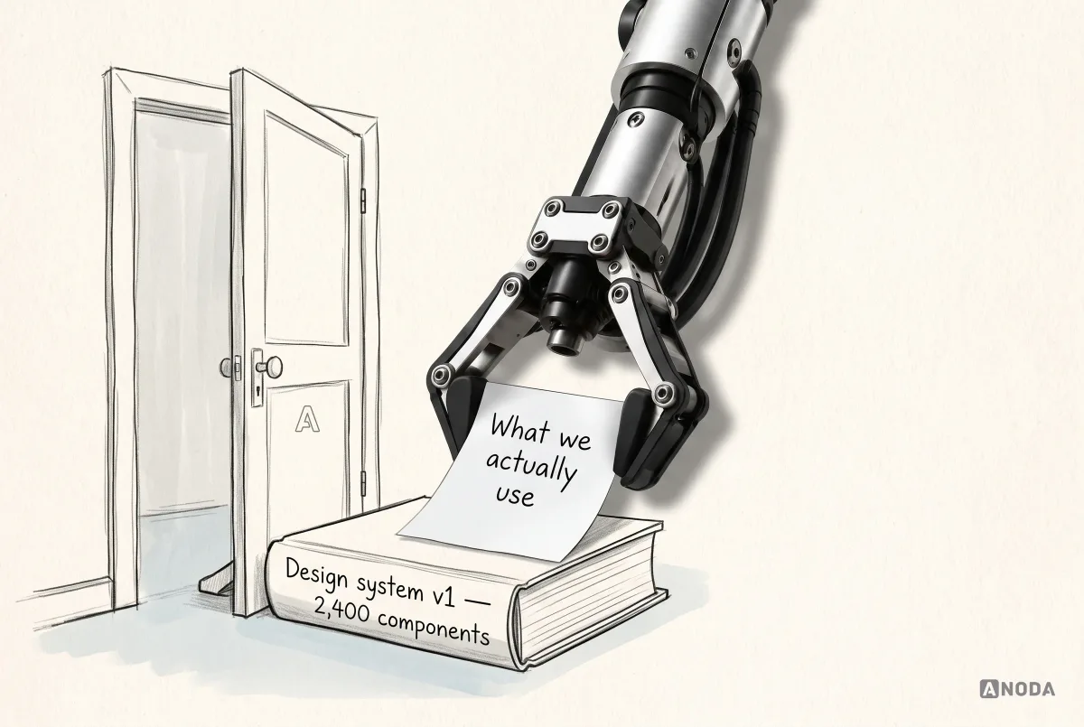
It is packing a twelve-piece suitcase set for a weekend away. Everything is there in case you need it. You carry all of it everywhere, and you wear the same two shirts.
This fails in predictable ways:
- Components are designed without real content or context, so they break the first time they meet a long name, a translated label, an empty value or an error.
- Most of them are never built in code, so the design library and the product drift apart immediately.
- Nobody can find anything, so designers make new components anyway, and the system becomes one more place things are inconsistent.
- The roadmap changes, and half the anticipated components describe features that will never ship.
- The money is spent before any of it is tested against a real screen, a real user or a real developer.
Building thousands of components for unknown future features is not preparation. It is spending money on guesses. The product you have and the roadmap your team can actually explain are the only things worth designing for.
How much system you need at each stage
The right size of design system changes as a product grows. Trying to jump straight to the end is how teams end up with a library bigger than their product.
Before and around launch. Keep it minimal. A small set of tokens, a mature component library as the base, the handful of components your first screens need, and a short list of rules. The priority is shipping and learning, and the system’s job is to stop the interface drifting while you do it.
After launch, while growing. This is when a system starts to pay for itself. More screens, more features, perhaps more designers and developers. Consolidate what has diverged, add the patterns you now meet repeatedly, connect the design library to code properly, and name an owner.
At scale, across products or teams. Now a larger system, with dedicated people, versioning, a contribution process and thorough documentation, is justified. The cost of inconsistency across several teams is higher than the cost of running the system.
At each stage, the test is the same: does the system make the next feature faster and the product more consistent, today? If it mostly produces work for itself, it is too big for where you are.
Which design system do you actually need?
Before anyone opens a design tool, decide what kind of system fits the product and the team. There are broadly three situations.

A small governed foundation. You have one product, one team and an early or growing interface. What you need is a clear set of tokens, the components your product uses today, a few key patterns and a simple rule for adding new ones. This is enough for most startups and many mature single-product companies. It can be built quickly and grow with the product.
Consolidation of what exists. You have a live product, several designers or teams over the years, and an interface that has quietly diverged: many button styles, inconsistent spacing, three kinds of modal, components copied and modified in code. The job here is not to invent a system from scratch. It is to audit what exists, pick the best version of each thing, merge the rest and connect design to code. This is the most common need we see, and the one with the fastest payback.
A full design-system programme. You have several products or platforms, several teams, perhaps several brands, and a roadmap that genuinely requires shared foundations across all of them. Here a larger system with dedicated owners, versioning, contribution processes and documentation is justified. But even here, it should be built from the real products outward, not from a blank page inward.
The risk in all three is the same: overbuilding. A small team that sets up a full programme spends its capacity maintaining the system instead of building the product. A large organisation that treats its system as a side project gets a library nobody trusts. Match the system to the product, the team and the roadmap you actually have.
Start with an inventory of what already exists
If your product is already live, the first step is not design. It is an audit. Take stock of the interface as it really is, across all the screens that matter.
A UI inventory usually means:
- Screenshot every key screen and every state you can find, including empty, loading and error.
- Group what you see by type: all buttons together, all inputs, all tables, all modals, all colours, all text styles, all spacing values.
- Count the variations. How many button styles are really in use? How many greys? How many ways of showing a date?
- Mark the differences that matter and the ones that are accidents. Some variations exist for a reason. Most don’t.
- Check the code as well as the design, because production is the truth. The design file may have three buttons while the code has eleven.

The inventory is often a shock. It is also the most persuasive document you will ever show a stakeholder, because it turns a vague feeling (“things look a bit inconsistent”) into a list with numbers. And it tells you exactly where to start: the components that are duplicated most, used most, and cause the most bugs.
For a new product, the equivalent step is to list the screens and flows you are about to build, and derive the components from them. Not the other way round.
Foundations: tokens first
Everything in a design system sits on its foundations. Get these right and components become much easier. Get them wrong and every component inherits the problem.
The core foundations are:
- Colour: brand colours, neutrals, and colours for meaning (success, warning, error, information), each with enough steps for backgrounds, borders and text.
- Typography: typefaces, a type scale, line heights and weights, and the text styles built from them.
- Spacing and sizing: a consistent scale, usually based on a small unit, used for padding, gaps and layout.
- Radius, borders and elevation: how rounded corners are, how borders look, how layers stack.
- Motion: durations and easing, and how the interface respects people who prefer reduced motion.
- Iconography and layout: icon style and sizes, grids, breakpoints.
These decisions are best stored as design tokens: named values that both the design tool and the code can read. The key idea is layering. A primitive token is a raw value, like a specific blue. A semantic token gives that value a meaning, like “the colour for a primary action”. A component token applies that meaning to a specific part, like “the background of a primary button”.

The layering is what makes a system maintainable. If the brand colour changes, you change one primitive. If you decide primary actions should use a different colour from links, you change one semantic token. You don’t hunt through forty screens and two codebases for every place a hex code was typed.
Two rules save a lot of pain later. Name tokens by meaning, not by appearance: “text.default” survives a rebrand, “dark-grey-text” does not. And check accessibility at the foundation level: if your text and background tokens don’t meet contrast requirements together, every component built on them will fail too.
Tokens in practice: themes, dark mode and more than one brand
The layered token structure pays off most when the product needs more than one look.
Dark mode is the classic example. If components use semantic tokens like “surface.default” and “text.default”, dark mode is mostly a second set of values for those tokens. If components use raw colours, dark mode becomes a hunt through every component for every hard-coded white, and something always gets missed: a white card on a dark background, invisible text, a border that disappears. We have found more dark-mode bugs caused by hard-coded values than by any design decision.
A few rules make themes work:
- Components never use primitive tokens directly. They use semantic or component tokens, so the theme can change the meaning without touching the component.
- Every semantic token has a value in every theme, even if it is the same value.
- Contrast is checked in every theme, not just the default one. Dark themes fail contrast in different places from light ones.
- Images, illustrations and shadows are considered too. A shadow that works on white can vanish on dark grey; an illustration with a white background becomes a glowing rectangle.
More than one brand follows the same logic. A company with several products, or a platform that white-labels its product for clients, can share components and patterns while each brand supplies its own set of token values. The button is the same component. Its colour, radius and type come from the brand’s tokens. That is far cheaper than maintaining a separate component library for each brand, and it keeps behaviour and accessibility identical everywhere.
Density is a quieter case. Data-heavy products often need a compact mode for expert users and a comfortable one for occasional users. Spacing and sizing tokens make that a theme, not a rebuild.
The lesson in all three is the same: decide early which things are allowed to vary, give them tokens, and keep everything else fixed.
Components: only what the product uses
With foundations in place, components are the part everyone thinks of as the design system. The rule here is simple and unpopular: build the components your product uses now, plus the ones your roadmap clearly needs next. Nothing else.
That usually means starting with the high-traffic basics: buttons, text inputs, selects, checkboxes and radios, links, tabs, modals, toasts and alerts, tables or lists, cards, navigation. Then add what your product specifically needs. A logistics product needs a good status timeline. A finance product needs number formatting and data tables that don’t lie. A content product needs rich text.
Each component needs a proper specification, not just a picture:
- Anatomy: the parts it is made of.
- Variants: the different versions and when to use each.
- Sizes.
- States: default, hover, focus, pressed, disabled, loading, error, and whatever else the component can be in.
- Behaviour: what happens on click, keyboard use, overflow, long content, narrow screens.
- Accessibility: focus order, labels, roles, target size, contrast.
- Usage guidance: when to use it, when not to, and one or two clear do and don’t examples.

States are where most component libraries are thinnest and most products break. A button that only exists in its default state is not a component. It is a drawing. The loading state, the disabled state with an explanation, the focus ring someone using a keyboard needs: these are what separate a system that ships from one that decorates.
When the team needs something new, the first question should always be whether existing components can do the job. A “delivery timeline” might be a list with status badges. A “summary card” might be an existing card with different content. New components should be the last resort, not the first instinct.
One component from start to finish
It helps to see what “a component” really involves. Take a select, the dropdown that lets someone pick one option from a list. It sounds like the simplest thing in the world.
Start with the job. Which problem does it solve in this product? Picking a country? Choosing one of three delivery options? Assigning a task to one of two hundred people? Those are different jobs. Three options might be better as radio buttons. Two hundred people need search. A select that tries to do all three becomes a monster.
Then the anatomy and variants. A label, the field, the chosen value, a chevron, the list, each option, perhaps a helper text and an error message. Maybe a variant with search, a variant that allows clearing, a compact size for tables.
Then the states. Default, hover, focus, open, disabled, read-only, with an error, with no options available, loading options from the server, an option that is itself disabled. Each needs a design and a behaviour.
Then the content cases. What if an option’s label is very long? What if it is translated into a language that is twice as long? What if there are no options at all? What if the chosen value no longer exists?
Then keyboard and screen reader behaviour. How does someone open it, move through options, search, select and close it with a keyboard? What does a screen reader announce? This is where many custom selects quietly fail, and where a mature library usually saves weeks.
Then the code and the documentation. The same name and variants in the design library and the code. A page that says when to use a select, when to use radio buttons instead, and one example of each mistake.
Then the real screens. The select inside a form, inside a table cell, inside a modal, on a narrow phone.
That is one component, done properly. Multiply it by every component in a speculative catalogue and it becomes obvious why designing hundreds of them in advance is a poor use of anyone’s money, and why adopting a mature library for the common ones is often the smartest decision a team makes.
Patterns: where components become solutions
Components are the words. Patterns are the sentences people actually need to say. A pattern documents a proven way of combining components to solve a recurring product problem.
Useful patterns for most products include:
- Forms: layout, validation timing, error messages, required and optional fields, saving progress.
- Empty states: what a screen shows before there is data, and the one action that gets the user started.
- Loading and errors: skeletons versus spinners, partial data, retry, what to say when something fails.
- Filtering and search: how filters are shown, combined, saved and cleared.
- Confirmation and destructive actions: when to ask, how to allow undo.
- Onboarding and first use.
- Tables and bulk actions.
Patterns are where a design system saves the most thinking. Without them, every team solves “what does an empty table look like?” from scratch, differently. With them, the answer is already there, tested, accessible and in code.
Where the design system meets the brand
A brand and a design system overlap, but they are not the same thing, and confusing them causes trouble in both directions.
The brand defines who the company is and how it looks and sounds: logo, colours, typefaces, imagery, voice. The design system translates the parts of the brand that apply to the interface into working rules: which brand colours become which tokens, how the typefaces map to a readable type scale, how the voice becomes button labels and error messages.
Two things go wrong often. Brand teams sometimes push visual choices that don’t survive an interface: a beautiful pale colour that fails contrast, a display typeface that is unreadable at small sizes, an illustration style that can’t handle empty states. And product teams sometimes drift away from the brand one pragmatic exception at a time, until the product feels like a different company from the website.
The fix is to let the brand set the direction and the design system make it usable. Brand colours become a palette with accessible steps. Brand type becomes a scale that works at every size. Brand voice becomes content guidelines with real examples. When the brand changes, the tokens change, and the product follows.
Content guidelines are part of the system
A design system that covers every pixel and ignores words is half a system. Labels, buttons, errors, empty states and confirmations shape the experience as much as colour and spacing do.
Good content guidelines cover:
- Voice and tone: how the product sounds, and how that changes in different situations. An error needs a different tone from a success message.
- Terminology: one word for one thing. If it is a “project” on one screen, it isn’t a “workspace” on the next.
- Buttons and links: say what happens. “Save changes”, not “OK”. “Delete project”, not “Confirm”.
- Error messages: what went wrong, whether it was the user’s fault, and what to do next.
- Formatting: dates, times, numbers, currencies, capitalisation.
Put these rules next to the components that use them. A button component that comes with guidance on how to write its label is far more likely to get a good label.
Design systems
Fourteen buttons and a library nobody uses?
We audit the interface you have, define the foundations and components your product actually needs, and connect the design library to your code.
Choosing a component library to adopt
If you decide to adopt a mature library as your base, a few questions help separate a good fit from a future headache:
- Does it work with your stack? The framework, styling approach and build setup your engineers actually use.
- How good is its accessibility? Check keyboard behaviour and screen-reader support yourself on the complex components: menus, dialogs, comboboxes, date pickers.
- Can you theme it with your tokens? You should be able to change colour, type, spacing and radius without fighting the library.
- Is it styled or headless? Styled libraries are faster to start. Headless ones give you full visual control with the behaviour already solved.
- Is it maintained? Look at how recently it was updated, how issues are handled and whether it has a real community or company behind it.
- Does it cover your hard components? Tables, date and time, rich inputs. The simple ones are easy to build; the hard ones are where a library earns its place.
- What happens if you outgrow it? How easy is it to replace one component with your own without breaking the rest?
These are engineering questions as much as design ones, which is exactly why the decision should be made together.
One system, several platforms
Many products live on the web, iOS and Android at once. A design system has to decide what is shared across them and what is allowed to differ.
What usually should be shared:
- Foundations: colours, type scale logic, spacing, radius, iconography. These are what make the product recognisable everywhere.
- Content: terminology, voice, error messages. A “project” is a project on every platform.
- Patterns at the level of the problem: how an empty state works, how a destructive action is confirmed, how errors are recovered.
- Behaviour that users rely on: what happens when they save, share or undo.
What often should differ:
- Platform conventions: navigation, back behaviour, system controls, gestures, sheet and modal styles. Users of each platform have expectations, and fighting them makes the product feel foreign.
- Components that the platform already provides well: date pickers, share sheets, permission dialogs.
- Density and sizing, because a mouse pointer and a thumb are very different tools.
The mistake is forcing a single visual component onto every platform because it looks consistent in a presentation. A web-style dropdown on iOS or a custom back button that ignores the platform’s gesture is consistent with your brand and inconsistent with everything else on the user’s phone. Consistency for users means the product behaves predictably in their context, not that every pixel matches across devices.
In practice, the best multi-platform systems share tokens and patterns, then implement components natively for each platform using those tokens. The result looks like the same product and feels at home on each device.
Build it or adopt it
Here is a question many teams skip: do you need to build your components from scratch at all?
For many products, the answer is no. Mature component libraries, open-source or commercial, already provide well-tested, accessible building blocks for most common needs: buttons, inputs, menus, dialogs, date pickers, tables. They have been through years of bug reports and accessibility work you would otherwise have to repeat. Some are fully styled. Others are “headless”, giving you the behaviour and accessibility while you control the look entirely.
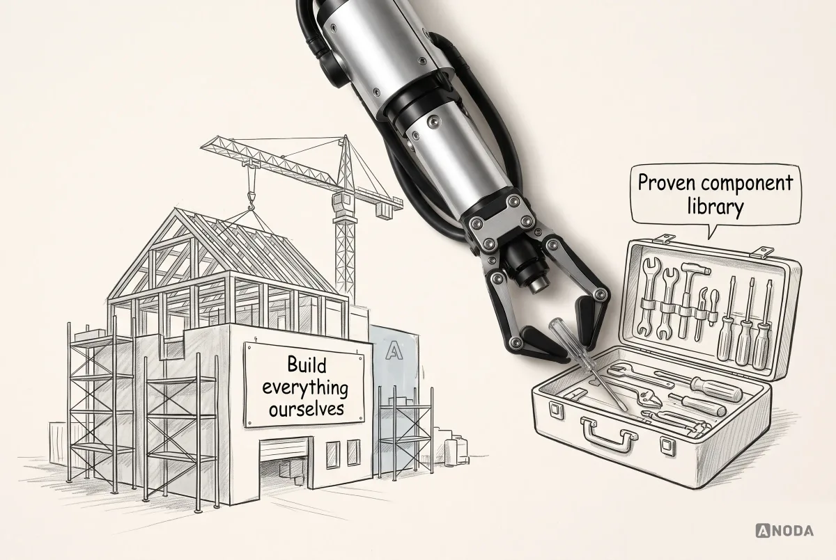
Building everything yourself is reinventing the wheel, and then maintaining the wheel forever. It makes sense in some cases: an unusual interaction model, very specific brand or performance needs, a platform with no good library, or a large organisation that needs full control. For most products, the sensible approach is to adopt a solid base and customise the top: your tokens, your brand, and the components that are genuinely specific to your product.

The decision should be made with engineering in the room, not after. The implementation stack, the team’s skills and the library’s fit with your needs matter as much as how it looks in the design file. A design system designed around components the developers cannot build, or will not use, is a very expensive set of pictures.
Design and code must be one system
The most important thing about a design system is that the design library and the code describe the same thing. When they don’t, the system is a fiction. Designers design with one set of components, developers build with another, and the difference is discovered in production, one bug at a time.
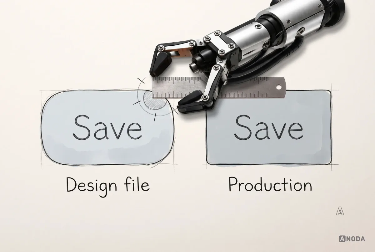
The map is not the territory. The design file is the map. Production is the territory. Users only ever see the territory.
Keeping them aligned takes a few deliberate practices:
- Same names. The button in the design library and the button in code have the same name, the same variants and the same props.
- Same tokens. Design and code read their values from the same token source, so a change in one reaches both.
- A component workshop. Many teams keep an isolated environment where every coded component can be seen and tested in all its states, outside the product. Tools like Storybook are commonly used for this. It becomes the shared reference designers and developers both check.
- One owner per component, responsible for both the design and the code staying in step.
- Regular drift checks, comparing the design library to what is actually in production.

This is also where a design system pays off for AI-assisted development. When the components, tokens and patterns are defined and connected to code, AI tools can generate screens that use the real system instead of inventing new styles. Without that, AI produces yet another set of almost-matching components, faster than any human ever could.
Design systems and AI
AI tools can now generate interface designs and code in seconds. That makes a design system more important, not less.
Without a system, AI has nothing to follow. Ask it for a settings screen and it will produce a plausible one, in its own style, with its own spacing and its own button. Ask again and you get a slightly different one. Across a product, that is the fastest route to exactly the inconsistency a design system exists to prevent.
With a system, the same tools become far more useful. If the tokens, components and patterns are defined, named consistently and available in code, AI can assemble screens from the real parts. The output can use your product’s real components and accessibility foundations; review the assembled flow for focus order, labels and task completion. The system becomes the boundary that keeps generated work coherent.
That only works if the system is real: documented, implemented and connected to code. A design-only library that doesn’t match production gives AI the wrong reference, and it will cheerfully reproduce the drift at scale.
Test components in real screens
A component that looks perfect in isolation can fall apart in a real screen. That is why every component should be tested in the context it will actually be used, with real content, before it is declared done.
Test for:
- Real content lengths: long names, long translations, numbers with many digits, missing values.
- Composition: how the component behaves next to others, inside tables, in narrow columns, in modals.
- All the states, especially the unhappy ones: empty, loading, error, disabled.
- Different screen sizes, from a narrow phone to a wide desktop.
- Keyboard and screen reader use.
- Localisation: right-to-left languages, different date and number formats, if your product needs them.
The best way to do this is to build real screens with the system as you go. The first three or four product screens you build with a new system will reveal more gaps than any amount of reviewing the library on its own.
Accessibility belongs in the system, not after it
A design system is the best place to fix accessibility once instead of on every screen. If the button component has a visible focus state, every button in the product has one. If the colour tokens meet contrast requirements, every component built on them starts from a good place.
The current reference most teams work to is the W3C’s Web Content Accessibility Guidelines, WCAG 2.2, usually at level AA. In practice, for a design system that means:
- Contrast: text and meaningful interface elements that stand out enough from their background, checked at the token level.
- Visible focus: every interactive component shows clearly where keyboard focus is.
- Keyboard support: everything that works with a mouse works with a keyboard, in a sensible order.
- Labels and roles: components expose meaningful names to screen readers.
- Target size: controls large enough to hit, following the WCAG minimum and the larger platform guidance for touch interfaces.
- Motion: animation that respects people’s reduced-motion settings.
- Not colour alone: errors and states marked by more than colour.
Checking these once in the system is far cheaper than finding them one screen at a time in an audit. And it means new features start accessible by default, rather than needing a separate round of fixes.
Documentation people actually use
Documentation is where many design systems go to die. Either there is none, and the system lives in two people’s heads, or there is so much that nobody reads it.
Useful documentation is short, close to the work and focused on decisions:
- When to use each component, and when not to.
- Examples in real contexts, not only the component on a blank background.
- Do and don’t pairs for the mistakes people actually make.
- Code usage, so developers can copy the right thing.
- What changed, in plain release notes.
Put the documentation where people already work: in the design library, next to the components, and in the component workshop next to the code. A separate website nobody visits is a museum, not a tool.
Who builds and runs a design system
A design system is a product with its own users: the designers and developers who build with it. It needs people who treat it that way.
In a small team, that might be one designer and one front-end developer who spend part of their time on the system and the rest on features. That is often the healthiest setup, because the people maintaining the system are also its users and feel every gap immediately.
As the organisation grows, the roles become clearer:
- A system designer who owns the foundations, components and patterns in the design library.
- A system engineer who owns the implemented components, the token pipeline and the component workshop.
- A content designer or writer who owns the content guidelines, at least part-time.
- An accessibility specialist, internal or external, who checks the system rather than each feature.
- Contributors from product teams, who propose new components and patterns based on real features.
What doesn’t work is a design system with no engineering involvement, or one owned by a team so separate from the product that it builds what it finds interesting rather than what product teams need. The fastest way to kill adoption is a system team that never ships features.
Governance: how the system changes without falling apart
A design system is never finished. The product changes, the brand evolves, new features need new patterns. Without a way to handle change, the system either freezes and gets ignored, or grows without control and becomes the mess it was meant to fix.
Governance answers a few questions clearly:
- Who owns the system? In a small team, it might be one designer and one developer part-time. In a large organisation, a dedicated team. Someone must be accountable.
- How are new components proposed? Usually starting with a real need from a real feature.
- How are they reviewed? By design and engineering together, checking whether existing parts could do the job first.
- How are changes released? With versions and release notes, so teams know what changed and can update safely.
- How are old parts retired? Deprecation, with a replacement and a deadline, so the system doesn’t keep every mistake forever.

Keep the process as light as the organisation allows. A two-person team doesn’t need a committee. A fifty-person product organisation does need a clear route, or every team will build its own version and call it an exception.
Rome wasn’t built in a day, and neither is a good design system. It grows with the product, one justified component at a time.
A practical order for building a design system
Whatever the size, the order of work tends to be the same. The scale changes; the sequence doesn’t.
- Inventory. Audit the live product, in design and code, or list the screens and flows of a new one.
- Decide the scope. Small foundation, consolidation or programme, based on the product, team and roadmap.
- Choose the base. Pick a mature component library to adopt, or confirm the case for building your own, with engineering.
- Define the foundations. Tokens for colour, type, spacing, radius, elevation and motion, with accessibility checked.
- Build the core components. The ones the product uses most, with every state specified, in design and code together.
- Test in real screens. Rebuild a few key product screens with the system and fix what they reveal.
- Add the key patterns. Forms, empty states, errors, filters, the problems your product meets most.
- Write the documentation that people will actually use, where they already work.
- Set up governance. Owners, contribution route, versioning, deprecation.
- Roll out and measure. Migrate the product step by step, and track adoption, speed and quality.
Notice that “design every component anyone might need” is not on the list. Components enter the system when a real screen needs them.
How to tell whether it’s working
A design system is an investment, so it should be measured like one. The useful signals are about the product, not the library:
- Adoption: how much of the product’s interface actually uses system components, and how often designers detach or override them.
- Speed: whether new screens and features take less design and development time than before.
- Consistency: whether the number of duplicate components and one-off styles is falling.
- Quality: whether interface bugs and accessibility issues are going down.
- Onboarding: how quickly new designers and developers become productive.
Pick a few, measure them before and after, and look at them honestly. If adoption is low, the system probably doesn’t fit what teams need, or it is too hard to use. That is a signal to fix the system, not to write a stricter rule.
Moving a live product onto the system
For a product that already exists, the hardest part is not building the system. It is moving the product onto it without stopping feature work.
Big-bang migrations, where the whole interface is rebuilt at once, rarely go well. They freeze delivery, surprise users with a completely different product overnight, and usually run out of budget before they are finished. A gradual approach is safer:
- New work uses the system from day one. Every new feature and every redesigned screen is built with system components.
- High-traffic screens move first, because that is where consistency and quality improvements reach the most users.
- Replace duplicates as you touch them. When a team works on a screen for any reason, it swaps old components for system ones in the same change.
- Track what’s left. Keep a simple list of screens and old components still to migrate, and review it regularly.
- Retire old components on a schedule, with a replacement and a date, so the old versions don’t live forever.
This takes longer than a single rebuild on paper. In practice it finishes more often, because the product keeps moving while the system spreads through it.
Common design system mistakes
The same mistakes appear across products of every size:
- Building a speculative catalogue for features nobody has planned.
- Starting from a blank file instead of the product that already exists.
- Design without code, so the library and production drift apart from day one.
- Components without states, designed only in their default, happy version.
- Testing in isolation instead of in real screens with real content.
- Naming by appearance instead of meaning, so the first rebrand breaks everything.
- Accessibility added later instead of built into the foundations.
- Documentation nobody reads, or none at all.
- No owner and no process for change, so the system either freezes or sprawls.
- Rebuilding what mature libraries already do well.
- Treating the system as a project with an end date instead of part of the product.
Each of these costs money twice: once when the system is built, and again every time the product works around it.
What a design system won’t fix
A design system is powerful, and it is often sold as the answer to problems it cannot solve. It is worth being clear about its limits.
It will not fix an unclear product. If nobody has decided what the product is for, who it serves or what the main flows are, a design system will help you build the confusion faster and more consistently. Consistent buttons on a screen that shouldn’t exist are still on a screen that shouldn’t exist.
It will not fix a broken user flow. A beautifully specified form component doesn’t help if the form asks for things the user doesn’t have, at a moment they aren’t ready.
It will not replace product decisions. Which feature matters, what to cut, how to handle an edge case in the business logic: those belong to the product team, not the component library.
It will not fix a team that doesn’t talk. If designers and developers work in separate silos, the system will reflect that, with one version in each.
The order matters. Know what the product needs to do, map the flows, then build a system that makes those flows fast and consistent to design and ship. A design system is a very good kitchen. It doesn’t decide the menu.
How we approach design systems
When we work on a design system, we start from the product, not the library. We audit the interface as it exists, in design and in code, and show where it has diverged and what that costs. We define the foundations and tokens, pick or confirm the component base with the engineering team, and design only the components and patterns the product and its roadmap can justify. We test every component in real screens, with real content and all its states, check accessibility at the foundation and component level, and align the design library with the implemented components and the team’s component workshop so both describe the same system.
The goal is not the biggest library. It is a system the team actually uses, that makes the next feature faster to build and the product more consistent to use, and that can grow as the product grows. Our design systems work covers everything from a small foundation for a single product to consolidating a product that has outgrown its original interface.
In Fusion’s dating-app design, ANODA carried the interface into a documented component library and its states for the client’s development team. That is the practical test: the library belongs to the product’s real screens and gives the next person a clear decision to build from.
For a release sequence and migration plan, use our guide to building a design system; for variants and state specifications, read design system components.
What changes day to day when a system works
It is easy to describe a design system in abstract terms. It is more convincing to describe an ordinary Tuesday with one.
A designer starts a new screen by pulling components from the library, not drawing them. The discussion in review is about the flow and the content, not the shade of grey. A developer picks up the design, finds every component already exists in code with the same name, and spends the day on the logic that is actually new. The accessibility review starts from focus states and contrast already solved in the system, then checks how the new flow uses them. When product asks for a new status badge, the answer is “we already have one, here are the variants”. When the brand refreshes its colours, one pull request changes the tokens and the whole product updates.
None of that is glamorous. That is exactly the point. The system takes the repetitive decisions off the table so the team’s attention goes to the problems that are genuinely new.
A short glossary
- Design token: a named value, such as a colour or spacing size, stored so that design tools and code can share it.
- Primitive token: a raw value, like a specific blue.
- Semantic token: a value with a meaning, like the colour for a primary action or default text.
- Component: a reusable interface element with defined variants, sizes, states and behaviour.
- Variant: a version of a component for a different purpose, such as a primary or secondary button.
- State: how a component looks and behaves in a situation, such as hover, focus, disabled or loading.
- Pattern: a proven combination of components that solves a recurring problem, such as a form or an empty state.
- Component workshop: an isolated environment where coded components are displayed and tested in all their states.
- Drift: the gap that grows when the design library and the code stop describing the same thing.
- Governance: the owners and process that decide how the system changes.
- Deprecation: retiring a component or pattern, with a replacement and a deadline.
The decision rule
Before you start, or restart, a design system, answer these questions in order:
- What does the product look like today, in design and in code? Have we done an inventory?
- Which kind of system do we need: a small foundation, consolidation of what exists, or a full programme?
- Which screens and features exist now, and which are on a roadmap we can actually explain?
- Are our foundations defined as tokens, named by meaning, with accessibility checked?
- Which components does the product use, and which can a mature library provide?
- Does every component we build have its states, behaviour and accessibility specified?
- Are the design library and the code the same system, with the same names and tokens?
- Have we tested components in real screens with real content?
- Who owns the system, and how does a new component get in?
- How will we know it’s working?
Build for the product that exists and the roadmap your team can explain. Start from an inventory, define the foundations, reuse mature coded components where they fit, and add only what the product can justify. Test everything in real screens, connect the design library to the code and its component workshop, and let the system grow with the product instead of ahead of it.

Design systems
A system your team uses, not a library it admires.
We start from your product and your code, consolidate what has diverged, and build the foundations and components you need now, with a clear way to grow.
Written by