In short
A famous logo does not make a design system right for your product, and a consistent library cannot rescue bad product logic. It can make the wrong interaction repeatable everywhere. Here are fifteen design system examples worth studying critically, judged on the same scorecard: production code, accessibility, docs and testing, maintenance and real product fit. Plus which ones we build on, which to learn from, and which to leave on their owners' shelf.
In this article
- What makes a design system worth studying
- The scorecard we use on every example
- Fifteen design system examples on three shelves
- Foundations we would actually build on
- Famous systems to study critically
- Systems to study for how they operate
- What to copy and what to leave on their shelf
- Judge the product, not just the primitives
- Adopt, adapt, study only or reject
- Due diligence before you commit
- The best example is the one that fits
- Choose a foundation that earns its place in your product
The best design system examples are not the most famous ones. They are the ones that hand a team accessible, composable, maintained building blocks in design and in code, and still leave room for the product that team is actually building. A famous system is a study object, not a shopping list. Copy one wholesale and you inherit its legacy decisions, its weight and, occasionally, its worst interaction design, now applied consistently across your product.
Most “best design systems” lists rank systems the same way: by the size of the logo and the polish of the documentation site. That is like choosing a violin by the name of the orchestra that plays it. A Stradivarius will not teach you to play, and Google’s design system will not tell you what your onboarding should do.
A good share of our product design work is cleaning up after a design system choice that looked respectable in a board deck. The team picks a famous system, the designers love the Figma file, and the engineers discover there is no code for half of it, or none for their framework. Two quarters of engineering salaries go into rebuilding components that already exist elsewhere, finished and tested. Meanwhile the users you paid to acquire click through screens that are now perfectly consistent and still confusing.
So this is not a gallery. It is fifteen design system examples judged against one scorecard, with the lesson each one teaches, the limitation it hides, and our call on whether to adopt, adapt, study it or leave it alone.
What makes a design system worth studying
A design system is a set of shared decisions, expressed in design assets and production code, that lets several people build consistent product without re-deciding the same things every week. Tokens hold the raw values: colour, spacing, type, radius. Components turn those values into buttons, fields, tables and dialogs with every state they need. Patterns combine components into answers for recurring jobs: a sign-up form, a filter panel, a confirmation. Content rules decide what the words say. Accessibility rules decide who can use it. Governance decides who is allowed to change any of it, and how.
A complete system has all of that and something the galleries never show: people who use it, maintain it and argue about it. Take away the code and the governance, and what remains is a very nice drawing.
That is the first distinction worth making, because three very different things get sold under the same name:
- An organisational design system belongs to one company and serves its products. Atlassian’s, IBM’s and GitHub’s are examples. You can learn from them, but they were built for someone else’s business.
- A UI kit is a design file of ready-made components. It saves designers time. On its own it saves engineers nothing.
- A code foundation is production code you install, copy or wrap: accessible primitives, styled components, a CLI that drops them into your repo. It is the part that decides how fast your product actually ships.

Oksana Kovalchuk, ANODA’s founder, explains the difference in construction terms:
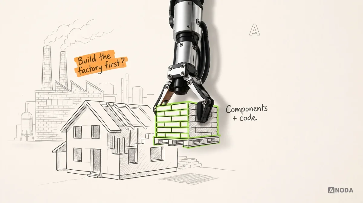
When you build from ready components, you have finished bricks. When you start from design files alone, you first have to build the factory that makes the concrete and the bricks, and only then the house. Agentic development narrows the gap between design and code, but those are still completely different things.
 Oksana KovalchukFounder & CEO, ANODA
Nobody hires a builder to open a brick factory. Yet that is precisely what a team signs up for when it adopts a design-only system and then asks engineering to “just build the components”. For the full build process, from inventory to tokens to governance, see our step-by-step guide to building a design system. This article is about the choice that comes before it: what to learn from, and what to build on.
The scorecard we use on every example
We evaluate every design system the same way, whether it belongs to Google or to a two-person open-source team. The order matters: each step can end the evaluation, and there is no point admiring the component states of a system that ships no code for your stack.
- Product and technology fit. What does the product need: platforms, density, data-heavy tables, forms, a mobile app? Which framework does the engineering team use? A system that fails here fails everywhere else too.
- Design assets and production code. Is there a maintained design library and a maintained code implementation, and do they describe the same component? A Figma kit with no code is a promise. Code with no design library is a guess.
- Accessibility and component states. Keyboard behaviour, focus, screen reader semantics, disabled, loading, error and empty states. Not the claim on the landing page: the behaviour you can test.
- Documentation and testing workflow. Can each component run in Storybook, or an equivalent environment, with its states documented and automated checks attached? This is our practical proof that live code exists and engineers can test it.
- Maintenance and community. Releases, issue responses, migration guides, a responsible maintainer or an active community. A component foundation nobody maintains is a boiler whose maker has stopped selling spare parts. It works fine right up to the first breakdown.
- A real product implementation. What does it look like in a shipped product, under real data, in the flows that matter? Documentation pages are the sales pitch. Products are where the work happens.
- The lesson and the limitation. What is worth borrowing, and what would you be importing along with it?
- The call. Adopt it as a foundation, adapt it, study it only, or reject it for this product.

Oksana’s filter is blunter than any rubric:
I don’t even consider design systems that don’t come with a developer SDK straight away. Sorry, it’s 2026. I don’t have time to assemble and inspect everything by hand. A design system should plug easily into Storybook. Its components should already be checked for accessibility and pre-assembled, so they combine easily into forms, cards and so on, with a sufficient set of all of it. And at the same time it shouldn’t be overloaded, which is actually very hard.
Oksana KovalchukFounder & CEO, ANODA“Checked” is doing careful work in that sentence. Accessible primitives and automated tests reduce risk. They do not make a product accessible. Storybook’s own accessibility documentation, checked on 29 September 2026, says its axe-core checks catch up to 57% of WCAG issues and flags the rest for manual review. That upper-bound figure is not the measured coverage of your product and does not mean exactly 43% of its defects remain. Manual review is still needed for keyboard behaviour, content, composition and complete flows. See Storybook’s accessibility testing documentation.

Fifteen design system examples on three shelves
The fifteen examples below sit on three shelves. The first holds foundations we would actually build a product on. The second holds famous systems that teach important lessons, positive and negative, and that we would not copy wholesale. The third holds organisational and public-sector systems whose real value is in how they operate, not how they look.
The facts about each system come from its owners’ current public documentation, checked between 27 and 29 September 2026. Where an owner describes its own quality (“battle tested”, “largest”, “accessible”), we treat it as a vendor claim until someone tests it. The opinions are ours, and we say so.

Foundations we would actually build on
Untitled UI
Untitled UI is, together with shadcn/ui, one of Oksana’s two strongest current preferences, and the reason is not the looks. It ships both halves. There is a large Figma system with components, variables and light and dark modes, and there is an official React component library that Untitled UI describes as built with React Aria and Tailwind CSS, installed through its own CLI, with a substantial free open-source core under the MIT licence and paid tiers on top.
That combination is the whole point. The designer places a component in Figma, and the engineer installs a matching component in code, built on primitives that handle keyboard and screen reader behaviour. Design and implementation start from the same brick instead of two sketches of a brick.
The lesson. A design system earns its money at the handoff. When the design component and the code component share a name, a structure and a set of states, the handoff stops being a translation job.
The limitation. Scale is not a virtue. Untitled UI markets itself on size, with thousands of components and variants, and every one of them you import is one more thing to theme, update and explain. Its accessibility language is a vendor claim until your team tests the components you actually use, in the flows you actually ship.
Our call. Adopt or adapt for React products that need a polished foundation fast, then prune ruthlessly.

shadcn/ui
shadcn/ui is the other preference, and the one ANODA currently uses for its own internal products, because it makes development fast. It is also the most misunderstood entry on any list like this.
By its own documentation, it is “not a component library”. It describes itself as a way to build your component library: open code that the CLI copies into your repository, a flat-file registry format for distributing components, composable interfaces and deliberately good defaults. You do not install it and hope the maintainers agree with you. You own the code from the first command.
That ownership changes the economics. There is no black-box dependency to fight when the product needs a table that behaves differently, and no waiting for a pull request upstream. The changelog also shows why owned code matters. In July 2026, shadcn/ui made Base UI its default primitive layer, while still offering Radix and React Aria versions. Teams that own their component code decide when, and whether, to follow.
The lesson. Distribution is part of the design system. A registry and a CLI that put tested components into every product’s repository do more for consistency than a documentation site ever will.
The limitation. It is a foundation, not an organisational design system. It will not decide your patterns, your content rules or who approves a new component. Owning the code also means owning its maintenance. Copy fifty components, change forty of them, and the upgrade path is now yours alone.
Our call. Adopt as the code foundation for React and Next.js products, then build your own system on top of it: your tokens, your patterns, your governance.

A design-only system is a brochure for bricks. You still have to build the factory before you can build the house.
React Aria
React Aria is Adobe’s library of unstyled, behaviour-first components and hooks. Adobe describes it as style-free out of the box, implementing semantics and keyboard behaviour according to the W3C ARIA Authoring Practices Guide, and extensively tested with popular screen readers and devices. It is also the layer Untitled UI says its React components are built on.
Nobody puts React Aria on a mood board. That is exactly why it belongs on this list. The hardest, most expensive part of a component is not its colour. It is what happens when a keyboard user opens a combo box, types three letters, presses the down arrow and hits Escape. Rebuilding that behaviour yourself is how a two-day component becomes a two-sprint component, with bugs discovered by the users you can least afford to lose.
The lesson. Behaviour is the expensive part. Buy it, borrow it or inherit it from a maintained primitive layer, and spend your own budget on the product.
The limitation. Accessible primitives are not an accessible product. Wrong labels, broken focus order between components and a flow that traps the user will all survive the best primitives on the market.
Our call. Adopt as the behaviour layer under your own styled components, directly or through a foundation built on it.

Radix Primitives
Radix Primitives are unstyled React components that, in their own words, follow the WAI-ARIA design patterns where possible and handle ARIA attributes, focus management and keyboard navigation, with granular access to each component part. Until July 2026 they were the default engine under shadcn/ui, so plenty of teams run Radix without ever having chosen it.
The lesson. Headless primitives separate what a component does from what it looks like. That separation is what lets a brand keep its identity without paying to reinvent a dialog.
The limitation. Primitives are the plumbing, not the house. You still need tokens, styled components, patterns and documentation on top, and the primitive layer itself is a dependency to watch.
Our call. Adapt: a sound primitive layer to build on, ideally behind your own component API so that swapping it later is a refactor, not a rewrite.
Base UI
Base UI describes itself as an unstyled component library for building accessible user interfaces. It is MIT-licensed, built by a team that includes creators of Radix, Floating UI and Material UI, and since July 2026 it is the default primitive layer under shadcn/ui.
The lesson. Composable parts beat configurable monoliths. A select assembled from parts can take the shape your product needs without a new prop for every edge case.
The limitation. Unstyled means unfinished: everything the user sees is still your team’s work, and a younger library has a shorter production track record than the older ones on this shelf.
Our call. Adopt as a primitive layer, ideally through a foundation such as shadcn/ui that already styles it.
Famous systems to study critically
This is the shelf where most lists stop being useful. Big brands built these systems for their own products, platforms and legacy. Some of their decisions are brilliant. Some have aged. Oksana does not soften her view:
Honestly, among the few sane design systems are Untitled UI and shadcn/ui. That’s it. Everything else, I’m really sorry, but no. Material is morally outdated. They keep inventing controls. Their time picker still gives me goosebumps, because it’s something truly scary. The floating action button was a cool invention, but it outlived itself a long time ago.
Oksana KovalchukFounder & CEO, ANODAOksana’s critique puts product fit ahead of brand reputation. The useful question is never “is Material good?” It is “which of Material’s decisions fits the job my user is doing?”
Material Design 3
Material is Google’s design system and, for Android products, the native visual language. It is thorough: foundations, tokens, components, motion, guidance for large screens. Its current time picker page, checked on 29 September 2026, documents two types of time picker, dial and input.
The dial is where Oksana’s goosebumps come from. Picking a time by dragging a hand around a clock face is a charming idea for setting an alarm. For a scheduling task where someone already knows the time, direct entry is a useful alternative to test alongside the dial. Google’s Compose documentation provides both dial and keyboard-input variants. Choose the control around the scheduling task and supported input methods. The lesson is not “Material is bad”. It is that a design system’s most iconic control can be the wrong one for your user’s job, and a team copying the system copies the icon first.
The floating action button tells the same story. It was a clever answer to “what is the one main action on this screen?” Plenty of current products do not have one main action, and a round button floating over the content is then solving a problem the screen does not have, while covering the last row of data.
The lesson. Material is a superb reference for how to document foundations, tokens and component behaviour in depth.
The limitation. It carries a specific visual and interaction language, some of it dated, and it is built around Google’s platforms. Using it on a non-Android product means translating it, and adopting its iconic controls without checking the job is how products end up with clock faces for typing times.
Our call. Study. Use it where the platform expects it, and on Android follow the platform. Everywhere else, borrow the documentation discipline and check every signature control against the task.


Apple Human Interface Guidelines
Apple’s Human Interface Guidelines are not a component library. They are guidance for Apple’s platforms, with the actual components living in Apple’s frameworks. That makes them the right reference for native Apple behaviour and the wrong thing to “adopt” for a web product.
They also carry one of the most quoted numbers in interface design. Apple’s accessibility guidance, rechecked on 5 October 2026, lists a default control size of 44×44 points on iOS and iPadOS and a minimum of 28×28 points, with different values for macOS, tvOS, visionOS and watchOS, and recommends generous padding between controls.
Oksana’s standing test is to take a guideline’s own numbers and measure the product with them, including products made by the guideline’s author. A published rule is a claim. A measured target on a real screen is evidence. It is easy to quote 44 points on a principles page and still ship a 24-point close icon in the corner of a sheet, because the smaller one looked tidier. The ruler catches it. The principles page never will.
The lesson. Native controls provide platform behaviour and accessibility integration that teams can build on. Custom controls can also use platform APIs, but their sizing, labels, gestures, Dynamic Type support and focus behaviour need explicit implementation and testing.
The limitation. Guidance is not enforcement. The guidelines tell you what good looks like. Only measurement tells you whether your screens, or anybody else’s, got there.
Our call. Study, and follow it for native Apple products. Measure your own targets instead of trusting any screenshot, Apple’s included.

Atlassian Design System
Atlassian’s design system powers Jira, Confluence and the rest of its apps. Its current site presents foundations such as colour, typography and accessibility, a mature set of design tokens with semantic names, components, and AI interaction patterns for its Rovo assistant. It also states plainly that it is “for Atlassian apps”. That honesty is useful: it is a system built for one company’s product family.
The token work is genuinely worth studying. Semantic names such as a surface elevation token or an accent text colour say what a value is for, not what it looks like, which is what makes theming and dark mode possible without repainting every screen.
The product experience is another story, and here we are firmly in opinion territory. Oksana has used Jira for around twenty years. Speaking strictly as a user, she rates its last five to seven years as the worst design she has seen. That is one expert’s subjective experience, not a usability finding, and it is not the design system’s fault on its own. But it leads to the most important lesson on this list:
A design system is not to blame for your bad UX. But it can make it worse. It can be a partner in crime to bad UX, and in the end nothing helps your design: the design system is crap and the UX is crap. So try to make sure at least one of them is decent.
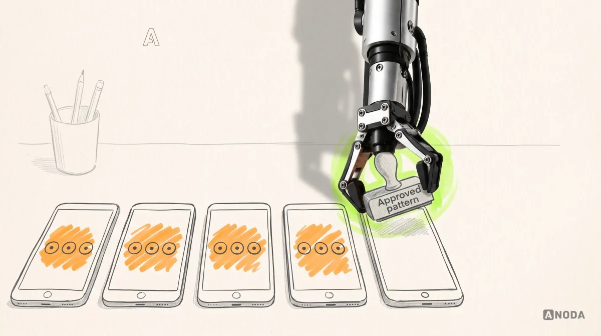
Oksana KovalchukFounder & CEO, ANODAA design system is a copying machine. Feed it a good decision and every team repeats the good decision. Feed it a confusing modal, an ambiguous icon button or a settings page that hides the one setting people need, and every team repeats that too, faster and more consistently than any single designer ever could. Consistency is an amplifier. It does not check what it is amplifying.
The lesson. Token architecture and semantic naming at the scale of a product family.
The limitation. Its components and patterns encode one company’s product decisions. Copying them imports those decisions, good and bad, into a product that has different users and different jobs.
Our call. Study the tokens and the governance. Do not copy the product patterns.

UX audit
Consistent, and still confusing?
We find out whether the problem is the system, the workflow or the product logic underneath, before anyone commits to a rebuild.
Systems to study for how they operate
The third shelf holds systems that are rarely a good foundation for someone else’s product and still worth reading closely. Their value is operational: tokens across platforms, two code bases kept in step, contribution, documentation engineers actually use. Studying them is like watching a Champions League side train. You learn a great deal. You do not hand their playbook to your Sunday league team and expect the same results.
IBM Carbon
Carbon is IBM’s open-source design system, licensed under Apache 2.0, with React components, standards-based web components, Sass styles, design tokens, icons and pictograms maintained in one public monorepo. It is designed for dense, data-heavy enterprise products: tables, dashboards, complex forms.
The lesson. Maintaining React and web components side by side, from one set of tokens, shows what it takes to serve teams on different stacks without letting them drift apart.
The limitation. It looks and feels like IBM, and it is built for enterprise density. On a consumer product or a young startup, it is a lot of system to carry for a few screens.
Our call. Study, or adapt for enterprise data products whose teams are comfortable with its visual language.

Microsoft Fluent 2
Fluent 2 is Microsoft’s design system, with components for web in React, iOS, Android and Windows, Figma UI kits and accessibility tooling such as contrast checkers and focus-order annotations. Microsoft’s own site presents Teams as a product built on Fluent 2.
The lesson. Cross-platform consistency is a matter of shared decisions, not identical pixels. A menu on Windows and a menu on iOS can be the same component in spirit and follow each platform’s conventions in detail.
The limitation. Outside the Microsoft ecosystem, it makes your product look like a Microsoft product, which is a brand decision, not a neutral one.
Our call. Adopt if you build inside Microsoft 365, such as apps for Teams, where users expect it. Study otherwise.
GitHub Primer
Primer is GitHub’s design system, with design tokens, Octicons, design resources and Primer React. Its Rails implementation, Primer ViewComponents, has been in maintenance mode since February 2026: no new features or components, with security updates, dependency updates and critical fixes continuing. GitHub encourages its internal consumers to migrate to React; external consumers are advised to consider maintaining a fork. Its documentation also has accessibility guidance for teams building GitHub.
The lesson. Multiple implementations need an explicit support and migration policy. Primer’s maintenance-mode decision shows why a team must check which implementation receives new work before treating two libraries as equivalent foundations. For a product that maintains two stacks, track the states and behaviours each implementation supports.
The limitation. It is designed for GitHub’s dense, text-heavy, developer-focused interface. That is exactly right for GitHub and rarely right for your onboarding flow.
Our call. Study, especially the parity discipline, if your product runs more than one front-end stack.

Salesforce Lightning Design System 2
Salesforce’s Lightning Design System is one of the oldest public enterprise systems still in active use. Salesforce’s Trailhead material describes SLDS 2 as built on a new CSS framework that separates structure from theme using styling hooks, which it calls an evolution of SLDS 1 design tokens, with Cosmos as a prebuilt theme.
The lesson. Even a system this mature had to rebuild how its values reach components in order to support real theming. Token architecture is not a one-off decision you make in week one and forget. Name your values by purpose, keep structure separate from appearance, and assume that one day you will need to theme the whole product without touching every component.
The limitation. It is built for the Salesforce platform and Lightning Web Components. Outside that platform it is reading material, not a foundation. Salesforce’s styling-hook documentation distinguishes global hooks from component-level hooks and warns that custom styling can behave differently under Cosmos. Verify the hooks supported by your target release and test custom components before changing themes.
Our call. Adopt if you build on Salesforce. Study the token-to-styling-hook migration if you plan to theme.

Shopify Polaris
Polaris is Shopify’s design system, and its current documentation describes it as Shopify’s unified UI framework built on web components, used across the surfaces where apps extend Shopify: the app home, the admin, checkout, customer accounts and point of sale. The Polaris reference makes an important distinction: each surface has its own APIs and subset of components. Do not assume a component available in App Home is available in checkout or POS.
The lesson. A design system for a platform is a contract with third-party developers. Polaris exists so that thousands of apps built by other companies still feel like one Shopify, which is a harder governance problem than anything most product companies face.
The limitation. It is designed for building inside Shopify. Outside Shopify, you would be borrowing the look of a platform your users are not on.
Our call. Adopt if you build Shopify apps. Study its content guidance and platform thinking otherwise.
Ant Design
Ant Design is an enterprise-class React UI library, written in TypeScript, with a very large set of components, internationalisation support for dozens of languages and extensive theme customisation. For internal tools and admin products that need every table, tree, cascader and transfer list on day one, it is hard to beat for coverage.
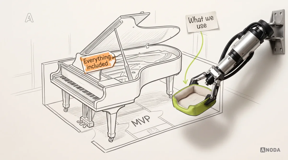
It is also the clearest example of weight. Adopting Ant Design for a lean product is squeezing a grand piano into a studio flat. Magnificent animal. Takes up the whole room, and you still walk it twice a day: theming, upgrading, overriding defaults that do not match your brand.
The lesson. Coverage has a price, paid in bundle size, theming effort and the number of components your team has to understand.
The limitation. A strong, recognisable default look and a very broad surface. Teams should assess the components they import, their bundle output and the cost of custom overrides; a large catalogue does not mean every component ships in the product.
Our call. Adapt for internal and admin tools where coverage beats identity. Reject for a lean consumer product.
GOV.UK Design System
The GOV.UK Design System helps UK government teams build services with shared styles, components and patterns for common tasks: entering names and addresses, filling in forms, creating accounts. Its code ships as GOV.UK Frontend, and the system is backed by the research and experience of service teams across government, with a community that contributes through discussions and co-design.
It also contains the most honest sentence in any design system documentation we have read. Its accessibility page states that using the GOV.UK Design System in a service does not immediately make that service accessible, and that teams still need research, design, development and testing work.
Having sterile instruments does not make the surgery a success. Accessible components are the instruments. The service is the operation: the order of questions, the error messages, the timeouts, what happens when someone gets stuck on step four.
The lesson. Patterns backed by research on real users beat components backed by taste. And a system that states its own limits earns more trust than one that promises everything.
The limitation. It is designed for UK government services and their visual identity, and its patterns are tuned for public services that everyone must be able to complete.
Our call. Adopt for UK public-sector services. Study the patterns and the research practice for any product with forms that people must finish.

What to copy and what to leave on their shelf
Copying a famous design system wholesale is tracing someone else’s floor plan, damp patches included. The top student had different questions, a different teacher and a different exam. You get their answers, their crossings-out and the one sum they got wrong, and you hand it in with your name on it.
Monkey see, monkey do is not a design strategy. The useful move is to borrow specific, tested bricks and operating lessons, matched to your team’s stage:
- A startup with one product and one front-end stack. Start from a code foundation such as shadcn/ui or Untitled UI, on top of accessible primitives. Define a small set of tokens, cover the components your core flows repeat, and resist importing anything “just in case”. Borrow documentation habits from Material and research habits from GOV.UK, and nothing else.
- A scale-up with several teams on one product. Your problem is now drift and contribution, not coverage. Study Atlassian’s token naming and Carbon’s contribution model. Put your components in Storybook with their states and checks, and make adding a component a reviewed decision.
- A company with several products or platforms. Study Fluent 2 for cross-platform decisions, Primer for keeping two code bases in step, and Carbon for tokens feeding several outputs. Your system needs an owner, a release process and a changelog, not a bigger component count.
- An enterprise or a platform with outside developers. Study Polaris and Lightning for how a system becomes a contract, and GOV.UK for how patterns get validated with real users before they spread.
The right system depends on your product, not on the ranking. What a platform for thousands of third-party apps needs would crush a seven-person startup.

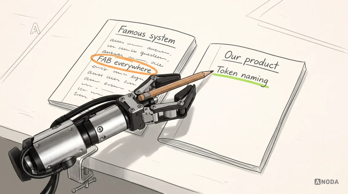
Don’t bin the whole system either. Rejecting Material because its time picker annoys you would cost you one of the best references on documenting component behaviour. Study famous systems warts and all, and take only what earns its place in your product.
Judge the product, not just the primitives
The foundation and the final product are two different things, and they deserve two different verdicts.
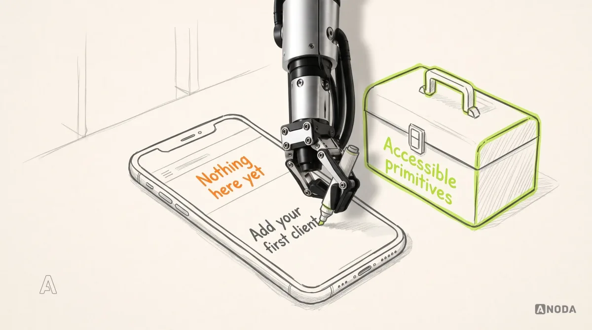
Oksana makes this point about a product she considers among the most promising she uses: convenient overall, with placeholder and empty-state decisions she does not like. Her conclusion is not that its components are bad. It is that the weak spots come from how the product’s own designers and developers implemented them. The underlying foundation can be perfectly sound and the empty state can still say nothing useful.
That distinction saves money in both directions. If you cannot tell which of the two you are looking at, a UX audit that separates system problems from product problems will tell you before you pay for a rebuild. A team that blames the foundation for every product problem will rebuild a perfectly good component library and ship the same confusing flows on top of it. A team that trusts the foundation to guarantee good UX will skip the work that actually decides whether users succeed: what the first screen says to a new account, what a placeholder is allowed to replace, what happens when a list is empty, how an error explains itself.
The empty state is the classic case. The component foundation gives you a well-built container. It does not know that a brand-new account in your product needs one clear first action, not an illustration of a cactus and the words “Nothing here yet”.

Adopt, adapt, study only or reject
Every example above ends with one of four calls. Here is how we make it for a specific product, rather than for the internet at large.
- Adopt when the system matches your platform and stack, ships maintained code, covers most of what your core flows repeat and does not fight your brand. You use it close to how it comes and spend your budget on the product.
- Adapt when the foundation is right and the surface is not. You keep the code and the behaviour, apply your own tokens, add the patterns your product needs and put the result under your own governance.
- Study only when the system teaches something valuable but was built for someone else’s platform, brand or scale. You borrow the lesson, the documentation structure or the token naming, and install nothing.
- Reject when there is no maintained code for your stack, the weight far exceeds your needs, or its signature interactions contradict your users’ tasks. A famous name is not a counter-argument.
For most growing products the honest answer is adapt, and that is the work our design system design and repair service does: foundation, tokens, components, patterns and governance, matched to your product and codebase. The decision needs a bounded pilot sized to the product, integration risks and team availability. Check the stack and the code first, because that is where most candidates fall out. Then states and accessibility, then maintenance, then a pilot in a real flow. A system that survives all of that has earned the conversation about how it looks.

Due diligence before you commit
Choosing a foundation is a multi-year commitment made in a few meetings. Kick the tyres properly. This is the check we run before recommending one to a client, and it fits into a short pilot:
- Install it. Put five components your core flows repeat into a branch of the real product. Not the documentation examples: your forms, your table, your dialog.
- Run it in Storybook or an equivalent. Document each component’s states, attach the automated accessibility checks, and see how much of the setup the foundation gives you and how much you build yourself.
- Test with a keyboard and a screen reader. On a full flow, not a single component. This is where the checks you cannot automate show up.
- Read the repository, not the landing page. Release history, open issues, response times, migration guides, the licence. Fair-weather friends are easy to find, so look at how the maintainers behaved during their last breaking change.
- Theme it with your tokens. If rebranding a button means overriding eleven style rules, you have found your future maintenance cost.
- Build one real screen with real data. Long names, empty lists, errors, the lot. Then decide.

Open code and an active community spare your team two expensive jobs: inventing behaviour and discovering bugs alone. Choose the right foundation, then spend that saved attention on the product instead of rebuilding the basics. If you want to go deeper on which components to standardise first and how to keep them governed once the foundation is in, our guide to design system components and UI strategy picks up exactly where this pilot ends.

The best example is the one that fits
The best design system example is not the one with the most components or the most famous owner. It is the one that gives your team suitable, accessible, composable and maintained building blocks in design and in code, works with the way your team already ships, and leaves enough room for the product you are actually building.
Use public systems as a source of tested bricks and operating lessons. Learn token naming from Atlassian, documentation from Material, parity from Primer, platform contracts from Polaris and research discipline from GOV.UK. Build on foundations with real code, such as Untitled UI, shadcn/ui and the accessible primitives underneath them. And do not copy anybody’s house plan until you understand your own house.
A design system will not fix bad product logic. It will make whatever logic you give it faster, more consistent and harder to escape. Give it good logic.

Design systems
Studied the famous ones? Now build the one your product needs.
We review the foundation, define tokens, components and recurring patterns, and agree on documentation, ownership and adoption. A coded component library and engineering implementation are scoped separately.
Choose a foundation that earns its place in your product
The cost of the wrong system arrives after the polished demo: duplicated work, awkward overrides and familiar confusion on every screen. ANODA chooses the foundation around your product, then shapes the tokens, components, patterns and ownership that make it useful. Our Fusion redesign shows a component library built around compatibility and profile decisions. Build your design system with ANODA and give your team reusable decisions instead of another library to work around.
Written by