
Stock research app on a phone screen
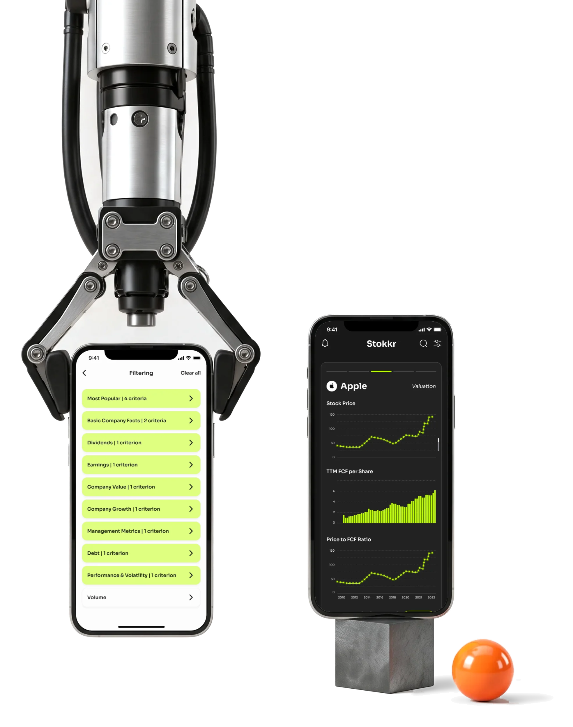
Stokkr helps self-directed investors find stocks fast and then look closely.We designed it from wireframes to a light and dark mobile UI.

- 2
- modes every gain, loss and selected filter readable in both
- 3
- visual directions tried on the same screens, then one chosen
- Prototype
- and screen map handed to the developers with the design export
Project summary
We designed Stokkr’s mobile stock-research product to connect quick card-based screening with the detail behind an investment decision. Screening, company fundamentals and watchlists have clear paths between them, rather than competing for one screen. Light and dark UI share one design system , delivered with maps, a prototype and design exports for the client’s developers.
How we worked together
- Client
- Nicholas and Michael Ricciardella
- Our part
- Wireframes and clickable wireframes, a moodboard and three visual directions, the light and dark UI, a design system, a screen map, a clickable prototype and the design export
- Their part
- Data, the app’s code and whether and when to build it
- Rhythm
- An initial engagement, then design releases, each one extending the product
- Tools
- Figma, Avocode
From a quick look to a close one
An investor narrows many stocks down to one, then keeps a shortlist. Each step needed its own depth:
-
Start
- Account and sign-in
- A few profile questions
-
Screen
- Search
- Filters by sector and metric
-
Study
- Fundamentals
- Charts and ratios
-
Keep
- Several watchlists
- Move, copy, remove
-
Account
- Settings
- Notifications and help
- Quick triage and Deep analysis
- One product for both: the fast view leads into the detail instead of replacing it.
- Many filters and A small screen
- Every filter family shows what’s selected and can be undone.
- Light and Dark
- Gains, losses, selected states and warnings mean the same thing in both modes.
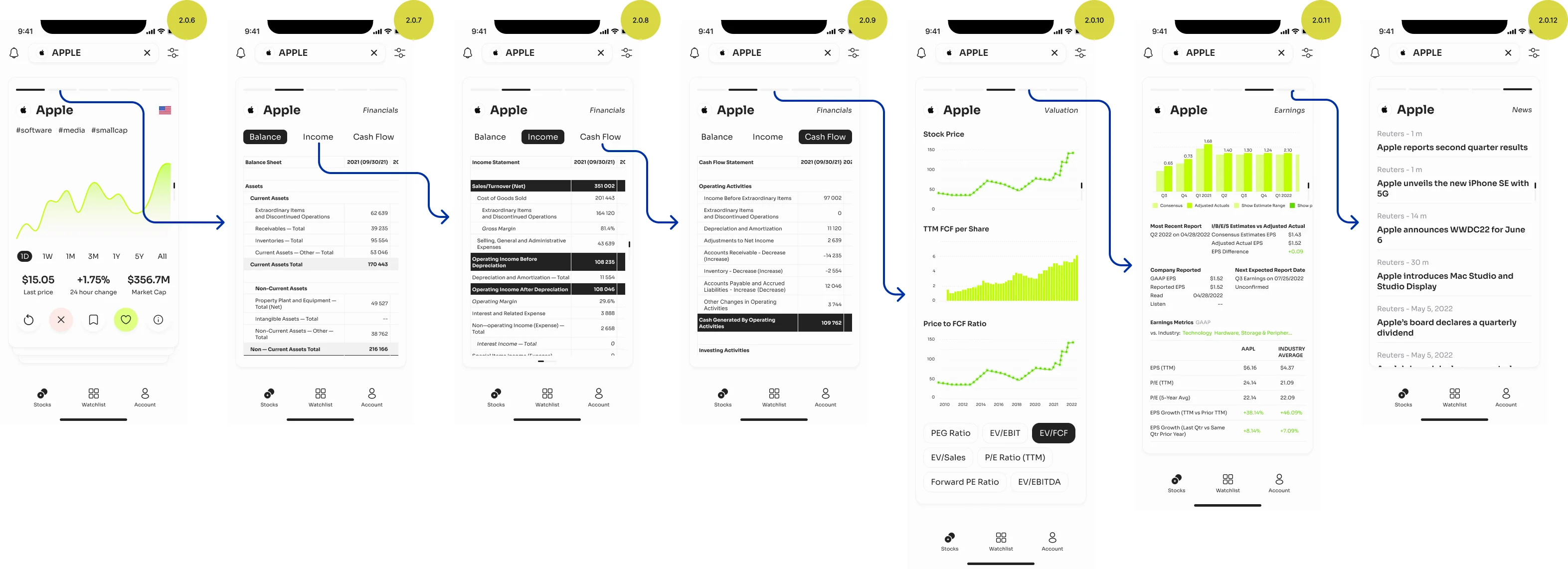
A company on one screen, without a spreadsheet
- Found
- Valuation, cash flow, earnings and growth all compete for a narrow column, and the numbers a serious investor needs are long.
- Decided
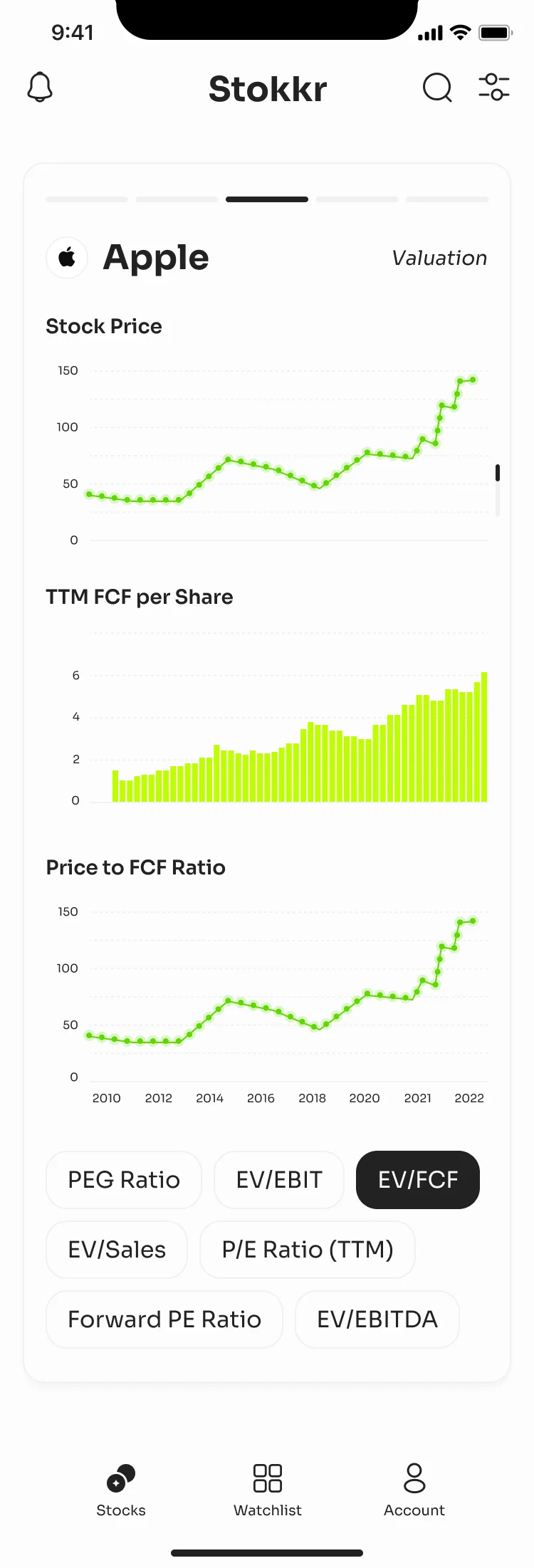
- One company and one view at a time: the name and the view on top, the charts for that view, then chips that switch the metric without leaving the page.
- For the user
- An investor compares a company’s valuation over twelve years without a single table to scroll sideways.
-
Which company, which view
The company and the part of its analysis you’re in, with the other views one swipe away.
-
The charts
Only the charts for this view, each on its own axis.
-
The metric switch
Chips change the ratio without leaving the page.
How the work progressed
Structure first, then style, then the product in both modes, release after release.
-
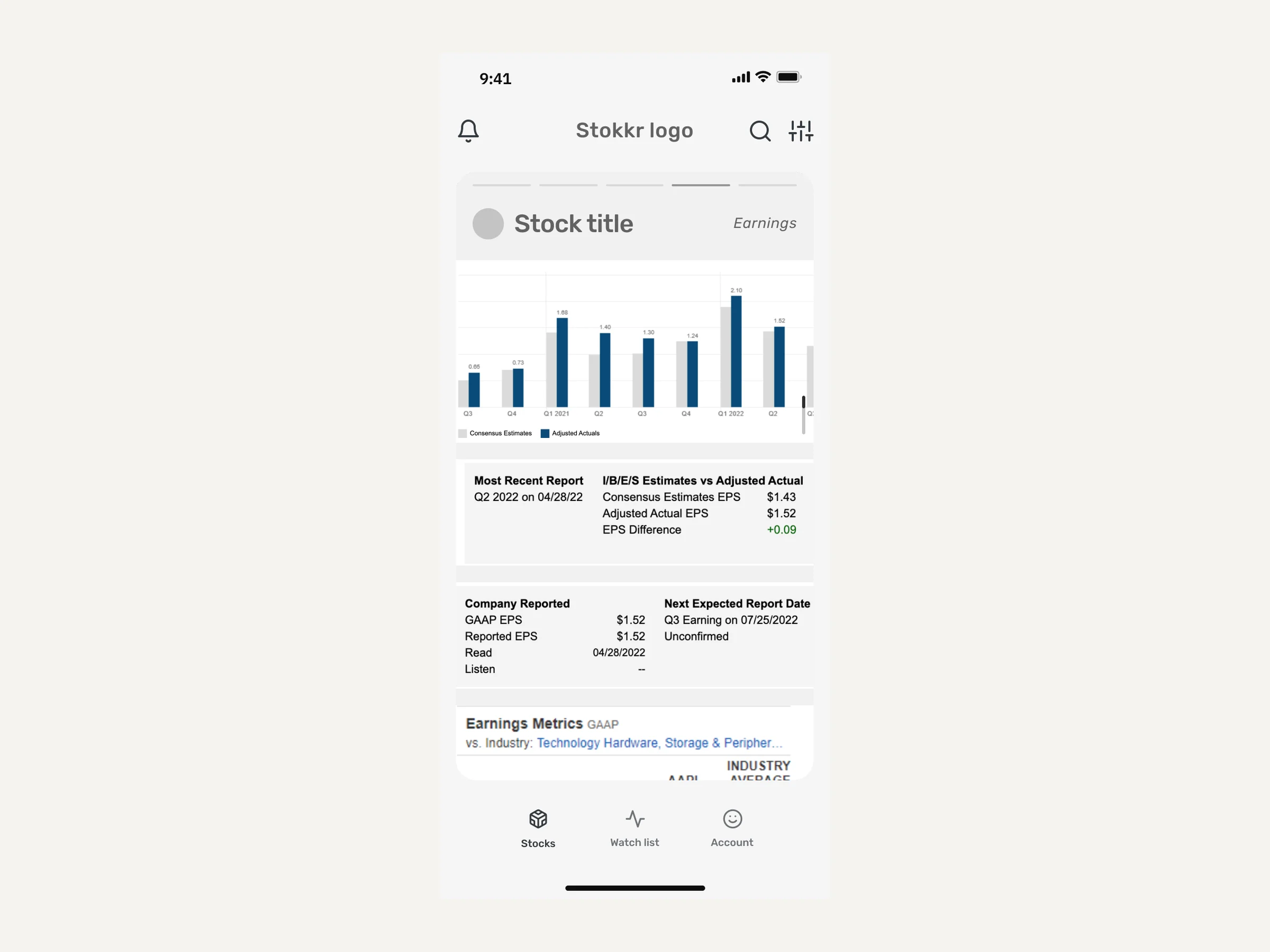
Wireframes
What each card and table holds, and how screening leads into analysis
Artifact Wireframes and clickable wireframes
-
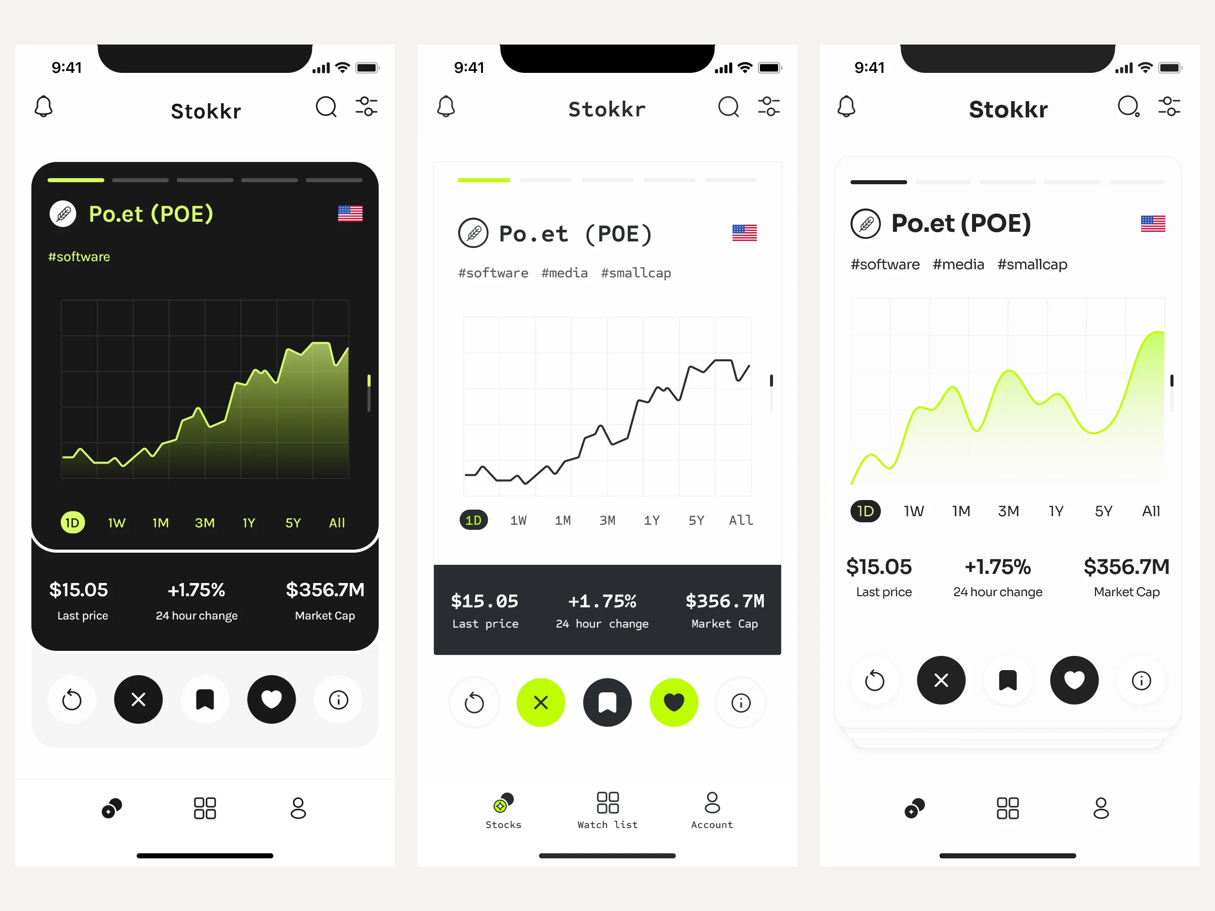
Visual direction
How Stokkr looks, chosen from three directions on the same screens
Artifact A moodboard and three visual directions
-
UI
Every flow in light and dark, tables and charts included
Artifact The high-fidelity mobile UI in both modes
-
Prototype and screen map
How the screens connect, before a line of code
Artifact A clickable prototype and a screen map
-
Design system and handoff
What engineering needs to build it without guessing
Artifact The design system, UI kit and component library, exported for the developers
Screen, study, keep
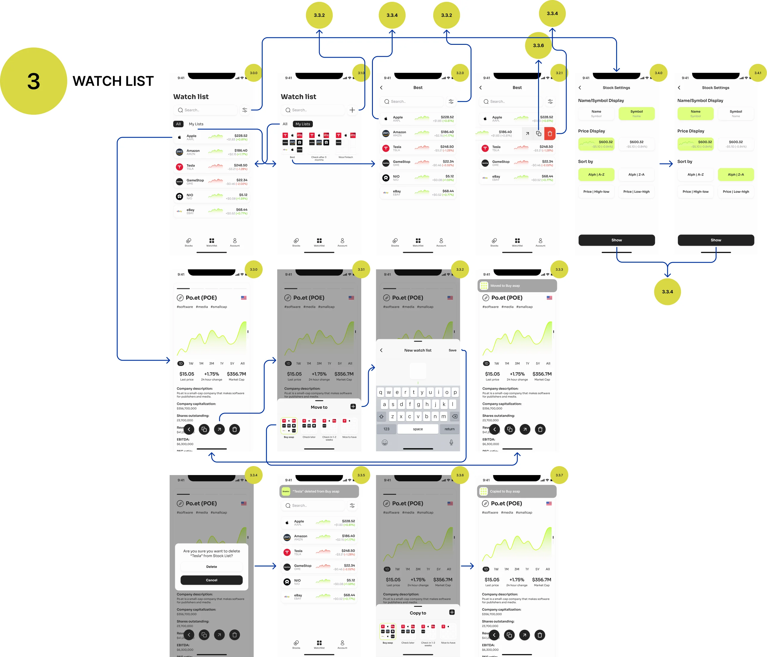
- Found
- Screening, analysis and watchlists each pull an investor in a different direction.
- Decided
- Three places with a clear path between them: find stocks, study one, keep the ones worth watching. One tab bar for all three.
-
Screen
From the list of criteria into one filter and back, with the match count on Apply.
Open the full map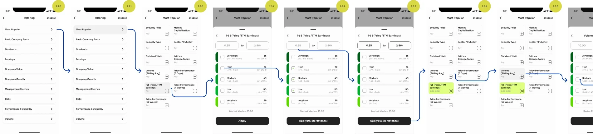
-
-

What an investor does in Stokkr
In the order they meet it.
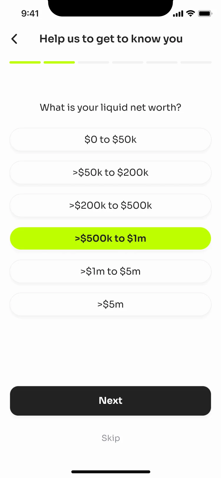
Onboarding that asks with care
- Found
- Asking about someone’s net worth before they’ve seen any value feels invasive, and can sound like an eligibility check.
- Decided
- Short profile questions, one per screen, with ranges to pick from instead of a number to type, and a way to skip.
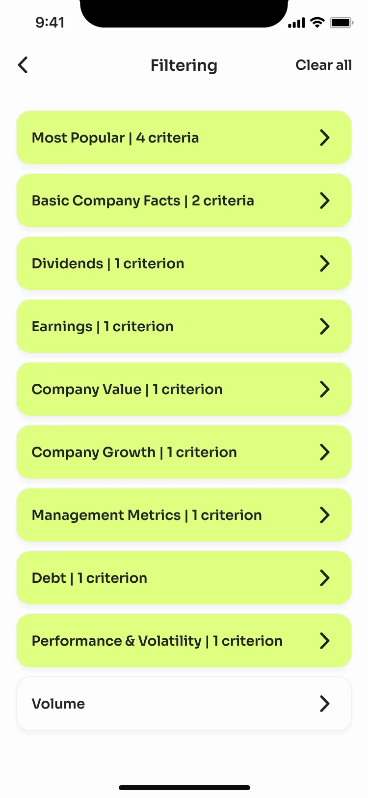
Filters you can undo
- Found
- Dozens of criteria in many families are easy to lose track of on a small screen.
- Decided
- Criteria grouped into families, each showing how many are active, with Clear all always in reach.
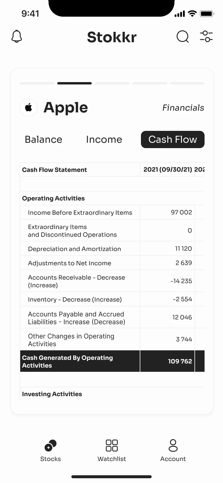
Fundamentals, table by table
- Found
- Balance sheets and cash flow statements are long, dense and full of negative numbers.
- Decided
- One statement at a time behind three tabs, with labels that wrap and totals that stand out.
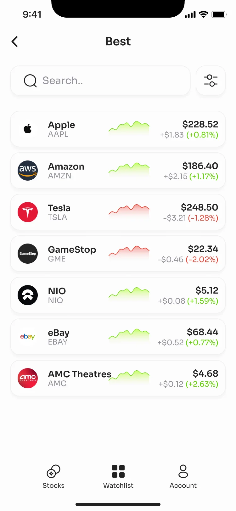
Watchlists
- Found
- Investors keep several shortlists and move stocks between them.
- Decided
- Several named lists, each stock with its trend, price and day’s change, and a stock can be moved, copied or removed.
One system, two modes, the same signals
- Found
- Dark mode is easy to treat as a recolour, until a loss and a selected filter look alike.
- Decided
- Components defined for both modes from the start, so every filter, gain, loss and warning keeps its meaning.
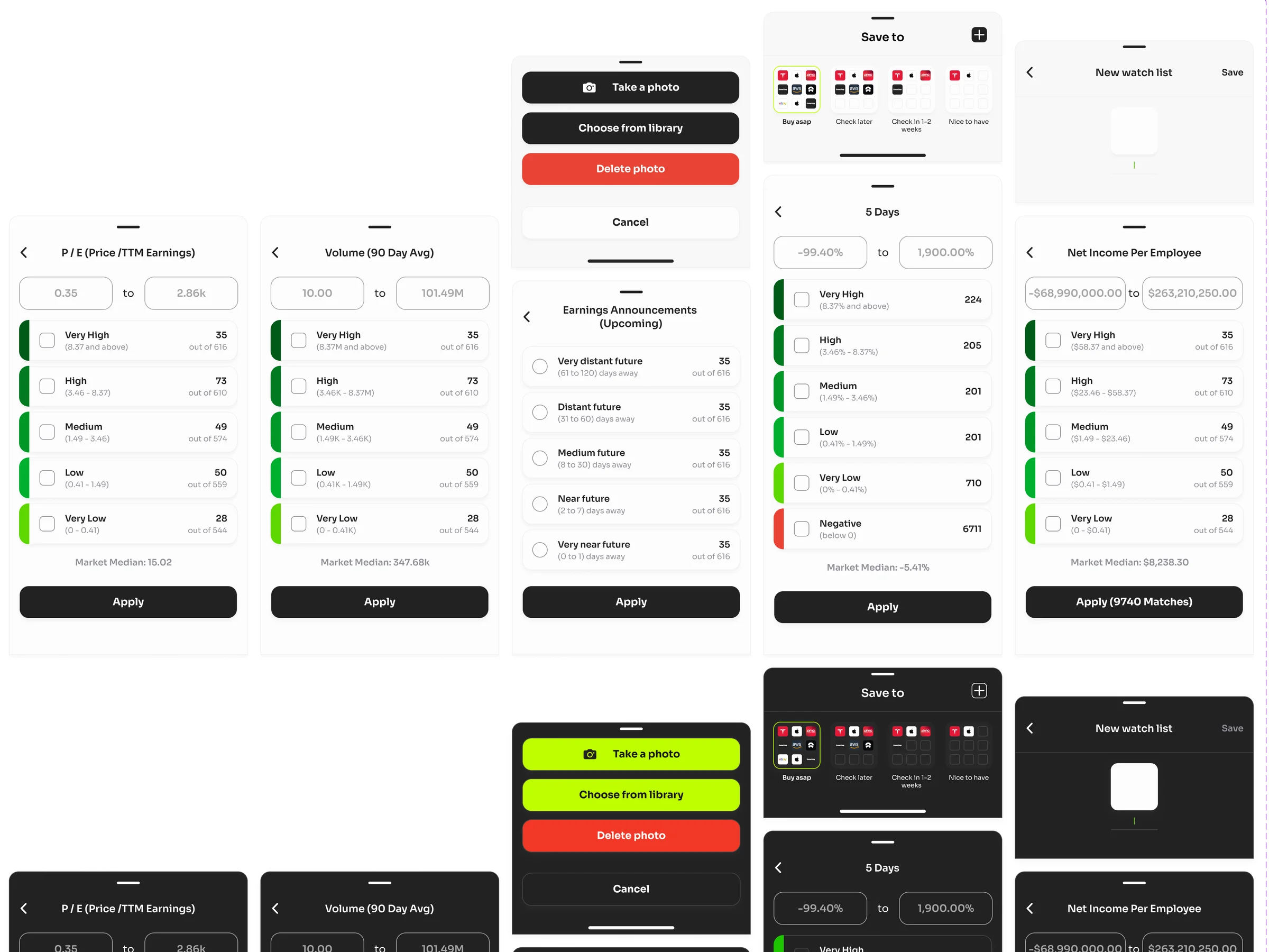
The same filter sheet for every criterion
A range, five buckets with their counts, the market median, Apply.
-
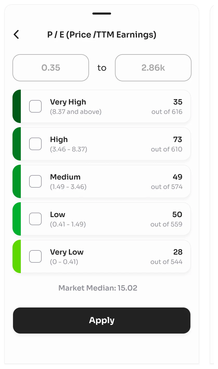
P/E ratio: Buckets from very high to very low. -
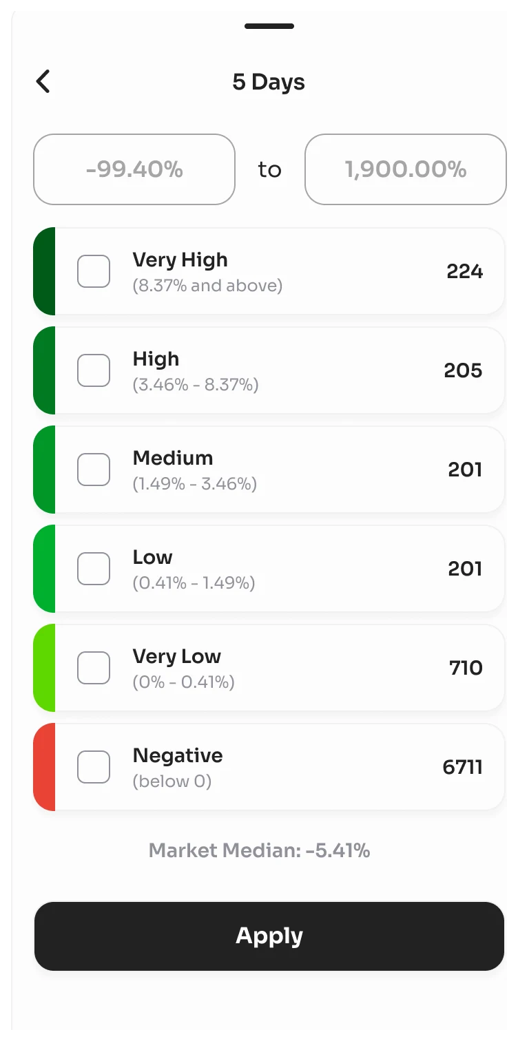
5-day change: The same sheet, with a bucket for losses.
Asked before it happens
Removing a stock and turning on Face ID are confirmed first, in both modes.
-
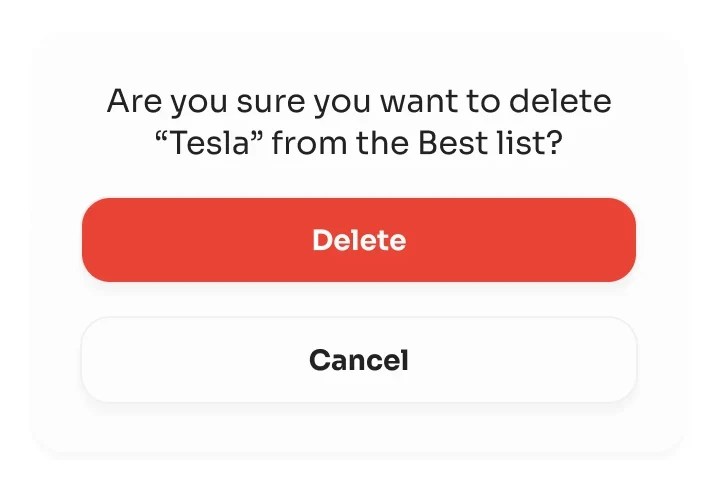
Remove from a list -
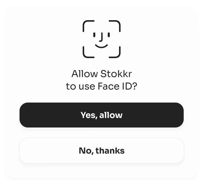
Face ID, light -
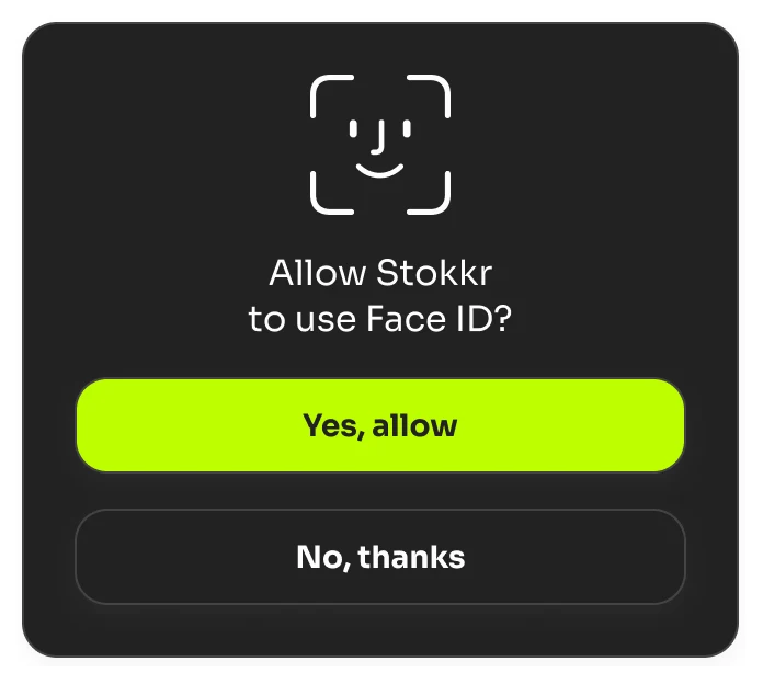
Face ID, dark
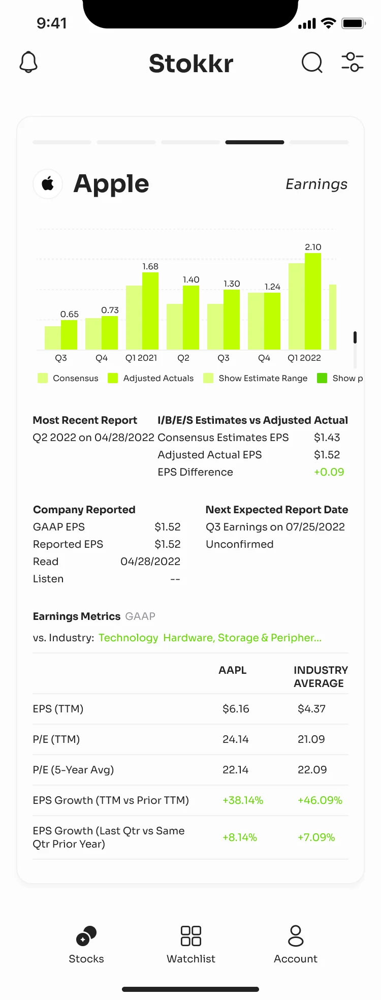
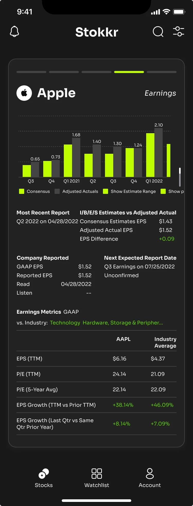
The same screen, light and dark
Apple’s earnings: the bars, the estimates and the industry comparison read the same in both.
Where the product ended up
A mobile stock-research app designed end to end: onboarding, screening and filters, company fundamentals and charts, and watchlists, in light and dark mode, on one design system, with a screen map, a clickable prototype and the design export for the developers.
- modes, light and dark, across the product
- 2
- visual directions tried on the same screens
- 3

Will your screener survive a real balance sheet?
A swipe looks great in a demo. Then someone opens a company with negative cash flow, a long name and three years of history. Send us your screens; we’ll show you where the data breaks and the decision gets harder.
More work like this
Proposed: more products where money and dense data meet a small screen.
-
FinTech · Web + Mobile
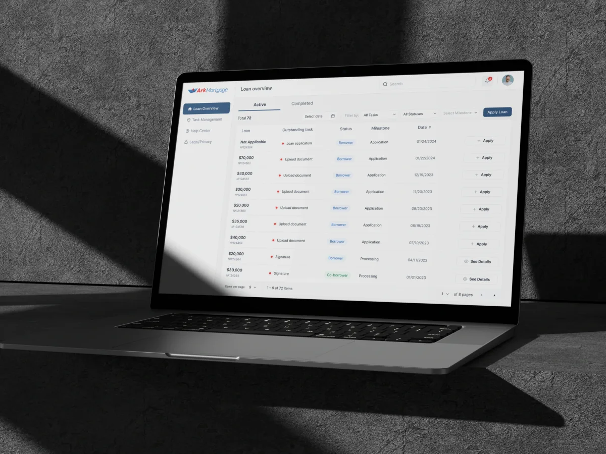
Ark Mortgage
Designed the portal homebuyers apply in and return to, on the web and on a phone, from a seven-step application to every loan’s next task.
- 100 Unique screens
- 3 Designers & PM on the team
-
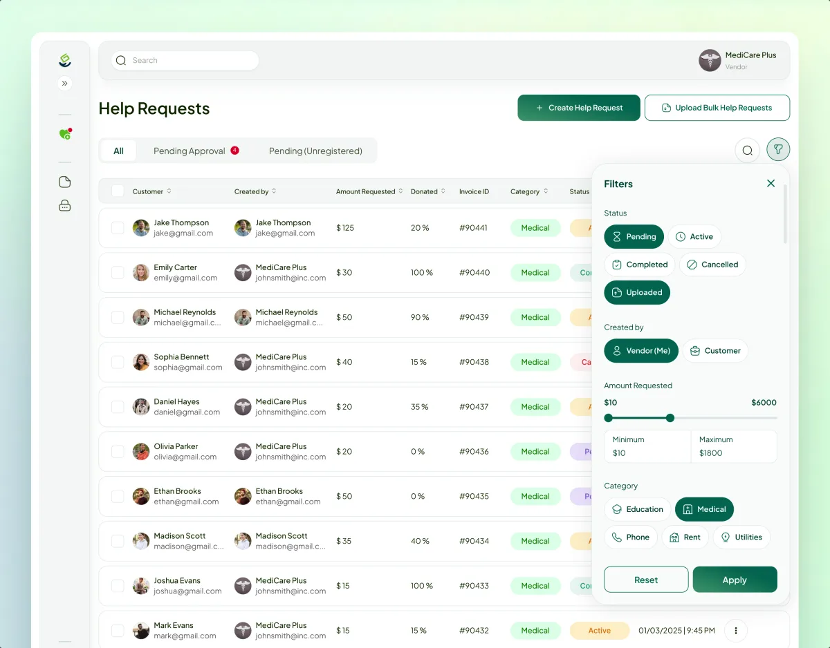
FinTech · Charity · Web platform
Payyro
Audited, redesigned and now builds a four-role platform that pays a family’s overdue bill straight to whoever sent it.
- 400+ Unique screens
- 5 Experts on the team
-
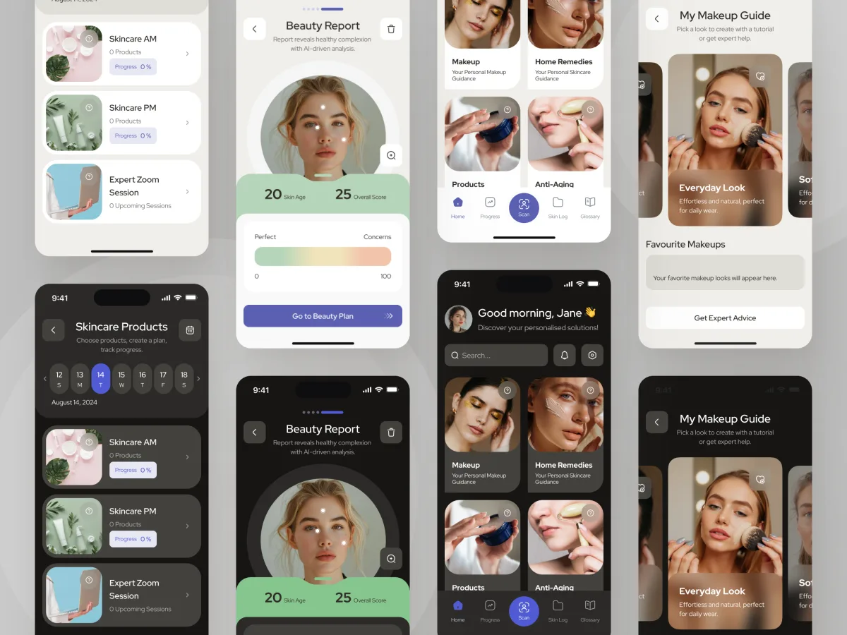
Beauty · Wellness · Mobile app
Forever Beauty
Audited and redesigned a live AI skincare app end to end, from the face scan to makeup steps on the camera.
- AR Live-camera makeup steps
- 3 Visual styles explored