In short
An SEO tool pays for itself when a beginner can find one problem, fix it in their site editor and see whether the fix worked. That needs a finding with evidence, not just a score; guidance that stays beside the editor; an honest “edited, not yet checked” state; and fresh-check results that tell resolved, still present, blocked and failed apart. One fictional example, followed from the first finding to the handoff.
In this article
An SEO tool earns its subscription at one moment: when a person who has never heard the word “canonical” finds one problem, fixes it in their site editor and can tell whether the fix worked. Everything before that moment is a report. Good SEO tool UX design treats a finding as a short trip with states (found, edited, checked) and refuses to call anything fixed until a fresh check says so.
Most SEO tools stop at the report. The crawl runs, a score lands and a list of problems longer than the page itself unrolls down the screen. It is a vet handing a new puppy owner a list of every disease a dog can catch. Accurate, thorough, and the owner walks out more frightened than they walked in, with no idea what to do on Monday.
Picture a beginner who reads three items they don’t understand and closes the tab. That beginner was a paid acquisition. Nobody files a bug report about a closed tab. If they don’t renew, you pay to replace them.
In products we audit, the data can be right and the people still get lost. SEO software is no exception. The crawler may be fine and users still get lost. The weak spot is the road from a finding to a verified next step.
This article follows one finding along that road. The site, the page, the times and the states are an illustrative example, not a record of any client’s product.
Begin with the page and the person fixing it
An SEO tool usually serves two very different people.
The first is a site owner fixing their own pages: someone running a small shop on Squarespace, doing SEO for the first time, between packing orders. One site, a handful of pages that matter, zero patience for vocabulary. Their question is plain: what is wrong with this page, and what do I do about it?
The second is a specialist or an agency managing many client sites. They want every row, filters, exports, history, and the evidence straight from the horse’s mouth: which URL, which element, which check, when. They forgive density. They never forgive vagueness.
Design only for the owner of one cat and you can’t run the kennel. Design only for the kennel and the cat owner disappears under the clipboards.
The answer is not two products. It is one finding in layers: plain language on top, evidence one step down, the specialist’s detail behind that. This article follows the beginner, because that is where most tools lose people, and keeps the expert detail within reach.
Start at the page, not the dashboard. The beginner doesn’t think “my site has dozens of issues”. They think “my gallery page”.
The anatomy of one useful finding
Here is the illustrative example. An owner checks their Gallery page. The tool finds an informative product image, blue-vase.jpg, with no alt attribute. Alternative text gives screen-reader users a description when the picture carries information. Decorative images are different: they should usually have an empty alt attribute (alt=“”) so assistive technology skips them. The tool must distinguish a missing attribute from an intentionally empty one and ask the user about image purpose; a blank description alone does not prove an error.
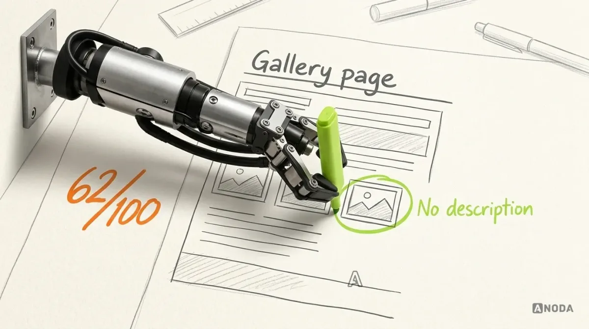
A useless finding reads: “Missing alt attributes (1). Severity: medium.” That is a homework page with “62” in the margin and nothing circled. The pupil knows points were lost. They have no idea where.
A useful finding answers six questions, in this order:
| Part | What it says (illustrative) | Why it is there |
|---|---|---|
| Affected page and element | Gallery page, third image, “blue-vase.jpg” | The user finds it without hunting |
| Observation in plain words | This image has no description | States what was seen, not a rule number |
| Source and time | Page check, today 09:14 | Shows how fresh the evidence is |
| Why inspect it | Screen-reader users and search engines get no useful description of the picture | A reason to care, without a ranking promise |
| Suggested next action | Open the image settings and describe what the picture shows | One step, in the user’s words |
| Uncertainty | The check sees a missing alt attribute. It cannot decide image purpose or whether your description is appropriate | Honest expectations before the fix |
Keep the score out of the evidence. A page score is a summary. It answers “how am I doing?” and is useless for “what do I do now?”. Put the score inside the finding (“fix this for +4 points”) and users can start fixing the number instead of the page. Congratulations: you have taught your customers to game your own tool. Score at the page level, evidence at the finding level, and neither pretends to be the other.
The uncertainty row is the one teams skip. Imply the check understands images, and the first owner who types “image1”, gets a green tick and later hears the page is still a mess stops believing anything your tool says.
Audit check
Open five findings as a first-time user. For each, find the page, the element, the check time, the next step and what the check cannot know.
Failure evidence
Rule names instead of observations. Severity labels without a reason. No timestamp. The score sitting where the evidence should be.
Correction pattern
Rewrite each finding as page, element, plain observation, source and time, reason, next action and limits, with the specialist detail one click down.
Keep the finding open while the user works in the editor
The fix does not happen in your tool. It happens in the site builder’s editor, and that is where most SEO tools quietly drop the user.
The classic pattern: the user reads the finding in a web app, switches to the editor, finds the page, finds the image, and by then has forgotten which image it was. It is homework where the questions are pinned up in the classroom and the exercise book is at home. Nobody finishes that homework. They call it “I’ll do it later”, and later never comes.
A browser extension or side panel next to the editor removes the distance. It also brings a new way to fail: covering the work. A panel that slides over the image you are trying to fix is a tutor leaning so far over the desk that the pupil can’t see the page.
Three rules for this moment:
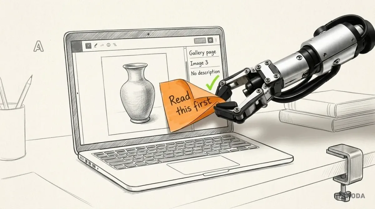
- Keep the page and the selected finding visible. When the editor opens, the panel still says “Gallery page, third image, no description”, and where the platform allows it, points at the element.
- Put the instruction beside the work, not on top of it. One short step in the panel, next to the editor. Not a modal, not a product tour, not a tooltip that hides the field it explains.
- Survive interruptions. The user opens another page, the session times out, the courier rings. When they come back, the same finding is still selected and its progress is still there. Starting over is how a five-minute fix becomes never.
This is the territory of our SEOSpace case study. For SEOSpace, an SEO tool for Squarespace users, ANODA designed a Chrome extension that audits pages inside the Squarespace editor, a web app for the deeper work and the public landing page, on one shared component set. The side panel was settled in wireframes as a compact overlay that doesn’t fight the editor for space. The work ran from seven UX usability reviews of the existing product to a prototype, a screen map and handoff to SEOSpace’s developers. Our contribution was design; the crawler, the data and the scoring were theirs. The walkthrough in this article is fictional, not a record of their product.
A saved edit is not a resolved finding
Back to the example. The owner opens the image settings, types “Blue glazed vase on a wooden shelf” and saves. Plenty of tools flash a green tick right now. They shouldn’t.
Nothing has been checked. The tool saw a click. Calling the finding “Fixed” at this point is a teacher giving full marks because the homework was handed in, without reading it. The save might have failed. The owner might have edited the wrong image. The change might not be published yet. The tick is a guess wearing a result’s uniform.
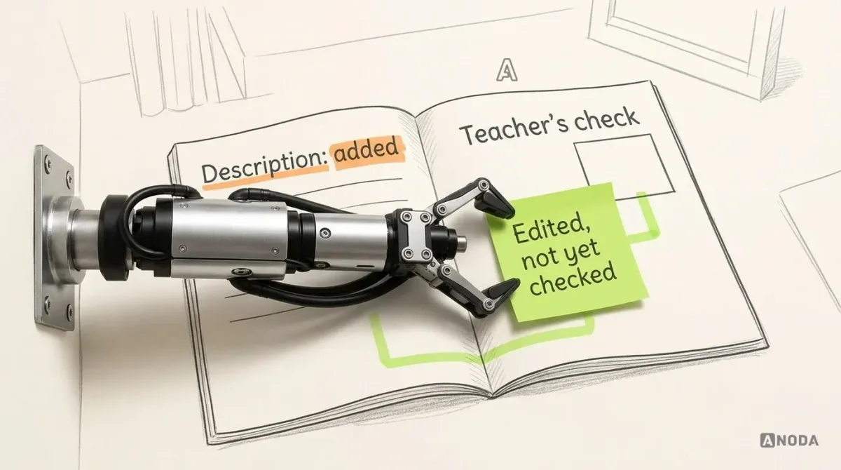
The honest state is Edited, not yet checked. It says three things: you did something, we haven’t verified it, and here is how to verify it. That state needs:
- a label that looks clearly different from both “Open” and “Resolved”;
- a button that requests a fresh check of this page, so the user decides when, instead of waiting for a nightly crawl they can’t see;
- one sentence on what the check will inspect: “We’ll re-check this image on the published Gallery page for the missing alt attribute.” Not “We’ll analyse your SEO.”
Pressing that button isn’t success either. It starts a check. While it runs, the finding reads Check pending, with the time it started. A spinner with no timestamp is a dog staring at the front door: something is apparently coming, and nobody knows when.
Why fuss over three labels? Because your support queue fills up in the gap between them. “I fixed it and it still says broken” and “it says fixed but my agency says it isn’t” are the same ticket: the interface claimed a state the system never confirmed. One costs support time. The other costs credibility. So design the check as part of the product, not as an afterthought.
SEO software design
Want to see the extension and web app as one product?
The SEOSpace case shows how an audit of a live tool became an editor panel, a web app and a landing page on one component set.
Read the fresh check for what it actually says
The check comes back. There are more outcomes than pass and fail, and lumping them together is how tools lie by accident.
| Result (illustrative) | What the user sees | What stays on screen |
|---|---|---|
| Not detected under this check | “This image now has a description. Checked 09:31.” | The original finding and its 09:14 time, marked resolved |
| Still present | “This image still has no description. Checked 09:31.” Plus the likeliest reasons: another image was edited, the change wasn’t saved, or it isn’t published yet | The original evidence and the new check |
| Check pending | “Checking the Gallery page, started 09:30.” | The last known result, labelled as last known |
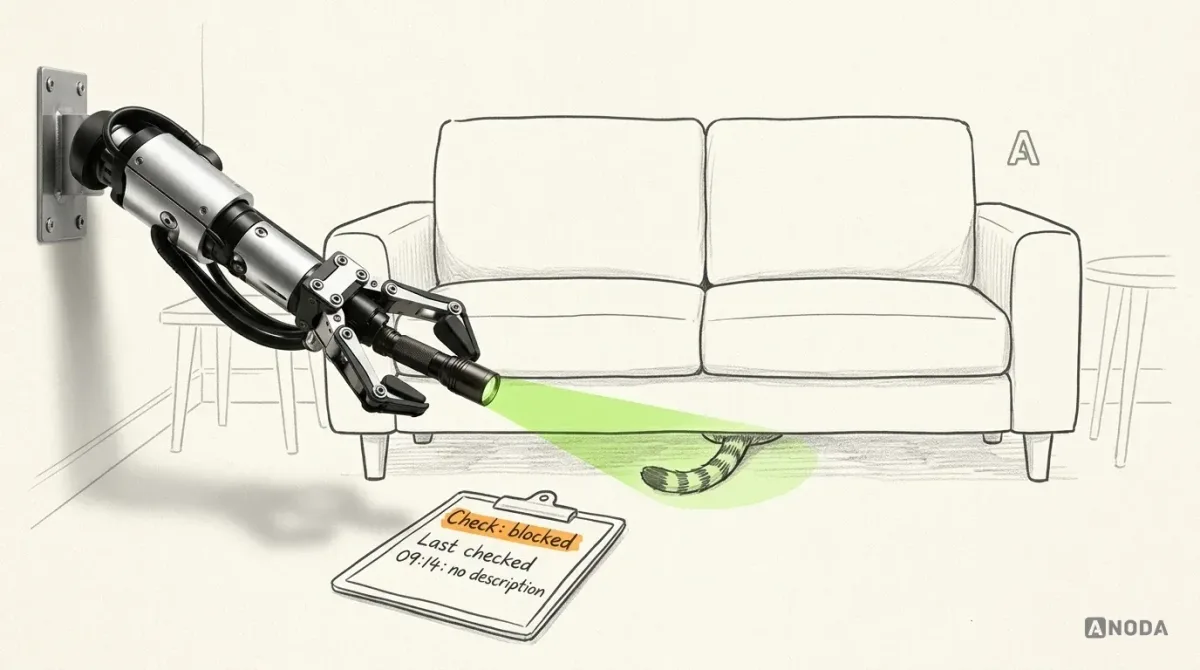
| Page unsupported or blocked | “We couldn’t check this page”, with the reason when known: password-protected, not published, not reachable by the checker | The 09:14 evidence, labelled “last checked 09:14” |
| Checker or data provider failed | “The check didn’t run. The problem is on our side.” Retry offered | The 09:14 evidence, unchanged |
| No findings | “No missing alt attributes detected under this check. Checked 09:31.” | The inspected page, check coverage and limits; decorative empty alternatives are not automatically errors |
Three of these are easy to confuse and expensive to get wrong.
Blocked is not clean. If the checker couldn’t reach the page, it saw nothing. An empty list here is a vet declaring the cat healthy because it spent the whole examination under the sofa. Say the page wasn’t examined, and keep the last evidence in view.
A provider failure is not the user’s fault. When a data source times out, say the problem is on your side. Otherwise the owner rewrites a perfectly good description to fix something that lives in your infrastructure.
Resolved means resolved under this check. “No longer detected” is accurate. “Your page is now accessible” is a promise one automated check can’t make, and a single check is not an accessibility certification. A resolved finding isn’t a ranking gain either. No tool can honestly tie one image description to a change in position, and a tool that tries is barking up the wrong tree.
When fresh evidence is unavailable, never blank the old evidence. A finding with no evidence and no date isn’t a finding. It’s a rumour.
From one page to a practical work queue
The beginner fixed one image. Now scale it. The same owner has twelve product pages with the same missing descriptions, and an agency has the same problem across forty client sites. A flat list of every occurrence is a dog’s breakfast.
Group repeated findings by the job that fixes them (“Missing alt attributes: 5 pages”) and by affected page. But never let the group swallow the evidence. Every row inside still carries its page, element and check time. Think of a teacher who finds the same mistake in thirty essays: one explanation on the board for the class, and every essay still marked on its own. Otherwise the pupil who made a different mistake never hears about it.
Agencies need two more rules before any bulk action:
- Make the client and site unmistakable. The site and client name sit on every queue, every finding and every bulk confirmation. Applying a change to the wrong client’s site is giving one dog in the kennel another dog’s medicine: a mistake you make once and explain for a long time.
- Make roles and permissions explicit. Who can ignore a finding, re-check a whole site or spend the plan’s check allowance? A junior who re-checks every client site in one go is a reasonable person in a badly designed permission model.
This is still not a dashboard. “How are all my clients doing this quarter?” is a portfolio overview, a separate job: that is dashboard design territory, covered in our guide to dashboard UI design best practices. The work queue answers a narrower, more profitable question: what should I fix next, and where?
Test and hand off the complete loop
Every state above is cheap to change in a prototype. Once the extension ships through a browser store, every change is a release and a support note. Test the loop, not the screens. Four illustrative tasks we would put in front of real users:
- A first-time site owner follows one finding from the page into the editor, fixes it and requests a check. Can they say what changed and what is still unverified?
- A specialist drills from a grouped finding into the evidence for one element. Do they find the source and check time without help?
- A user edits, gets interrupted and comes back without requesting a fresh check. Does the finding still read “Edited, not yet checked”, or did it quietly turn green?
- A check comes back blocked. Does the user understand the page wasn’t examined, and can they still see the earlier evidence?
If task three turns green, better you see it in a test session than in a customer’s support ticket.
Then hand engineering what it needs to build the loop correctly, not just the polished screens:
- every state of a finding and the transitions between them, with who or what triggers each one;
- what the check can and cannot inspect, written with the people who own the crawler, in words the interface can reuse;
- plan-limit rules: how many checks, on which pages, and what the user sees when the limit is reached halfway through a fix;
- role permissions for bulk actions, ignores and re-checks;
- ownership, stated plainly.
That last item is not small print. The client’s engineering team owns the crawler, the ranking data and the scoring logic. The design documents what the user sees when those systems answer, run late or fail. A design team that invents scoring rules is guessing, with nice typography. Our job is to make the interface truthful about what the system knows. Yours is to make the system know it.
One finding, followed honestly from the page to a fresh check, gives the beginner something to finish, which a chart of scores doesn’t. Get that loop right for the beginner, keep the evidence one click away for the specialist, and the rest of the product has something to stand on.

SEO software design
Your users find the problems. Do they ever finish fixing one?
Bring us the finding where people stall, the extension or the web app. We design the evidence, the editor guidance and the check states your engineers can build on, and leave the crawler and the scoring to you.
Written by