In short
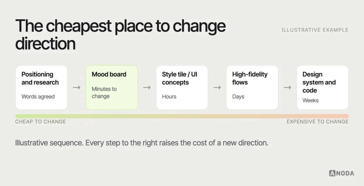
A mood board is a collection of visual references — colours, type, imagery, textures, interface examples — arranged to show the intended look and feel before anyone designs real screens. For product teams it's a cheap decision tool, not a collage of things stakeholders like: every reference should be annotated with what to borrow, what to avoid and why it fits the audience and positioning. Disagree on the board, where changes cost minutes, not in high-fidelity UI, where they cost weeks.
In this article
- What a mood board is — and what it isn’t
- When product teams use one
- Physical or digital?
- Start from inputs, not from images
- From adjectives to visual attributes
- What to put on the board
- Annotate every reference
- Source references responsibly
- Explore two or three distinct directions
- Check accessibility on the board
- Show it to users, carefully
- Review and approve the direction
- Turn the board into principles and prohibitions
- How to make a mood board, step by step
- Running a mood board workshop
- Mood boards for existing products
- Mood board, style tile, brand board, UI kit, design system
- What comes after approval
- An illustrative example
- Common mood board mistakes
- Where shared taste isn’t enough
- Decide the direction while it’s cheap
A mood board is a curated collection of visual references — colours, typography, photography and illustration, textures, layouts and interface examples — arranged to communicate the intended look and feel of a product or brand before detailed design begins. In product work, a mood board is a low-cost alignment tool: it helps a team agree on a visual direction, surface disagreements early and turn vague adjectives such as “modern” or “trustworthy” into explicit visual principles that guide later UI decisions.
Ask five stakeholders what “clean and modern” looks like and you’ll get five different pictures. One imagines lots of white space and thin type. Another imagines dark mode and neon gradients. A third means “like Apple”, a fourth “like our competitor, but better”, and the fifth isn’t sure but will know it when they see it. If the team discovers this after three weeks of high-fidelity screens, it’s an expensive discovery.
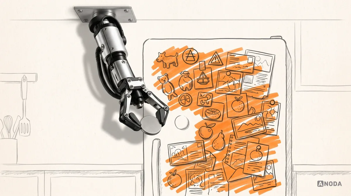
That’s the job a mood board does: it makes the pictures in people’s heads visible, while changing them still costs minutes. It’s also where many teams go wrong, because a mood board is easy to make badly. Pin up forty images everyone likes, call it a direction, and you’ve created a very attractive argument that will resurface later in the design reviews.
We’ve run visual-direction work for brands and products for 15 years. The mood boards that help are not the prettiest ones. They’re the ones where every image has a reason next to it — and where the team has written down what it will not do.
What a mood board is — and what it isn’t
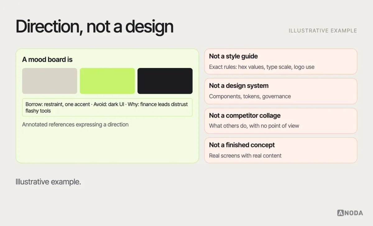
A mood board shows direction, not a design. It answers “what should this feel like, and what visual language gets us there?” — not “what does the settings page look like?”
It is:
- a set of references chosen and arranged to express a visual direction;
- a conversation tool for aligning a team and stakeholders;
- an early decision artefact that guides later design work.
It isn’t:
- a style guide, which documents specific rules — exact colours, type scales, logo usage;
- a design system, which provides reusable components, tokens and governance;
- a competitor collage, which shows what others do without saying what you’ll do;
- a finished concept, which applies the direction to real screens and content.
When product teams use one
Mood boards are useful whenever a team needs to agree on a visual direction before investing in detailed design:
- A new product or brand, when there’s no visual language yet.
- A redesign, when the current look needs to change and people disagree on how.
- A new market or audience, when the existing style may not fit.
- A new product line or sub-brand, when it must relate to the parent brand without copying it.
- A campaign or feature launch with its own visual moment inside an existing system.
They’re less useful when the product already has a mature design system and the work is a new screen inside it — then the system is the direction.
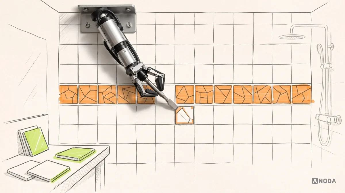
Disagreeing about direction on a mood board is like choosing tiles at the showroom: you can swap a sample in seconds. Disagreeing after the UI is built is chiselling tiles off a finished wall.
Physical or digital?
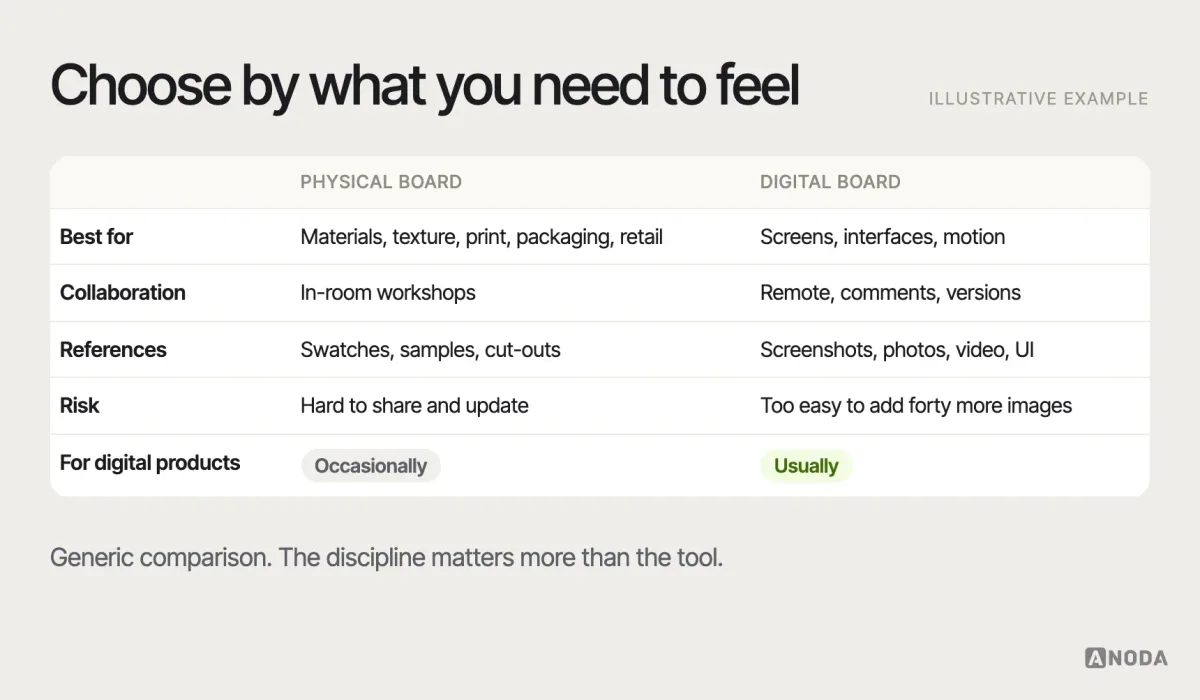
Mood boards started as physical boards — cut-outs, fabric swatches and paint chips pinned to foam board — and physical boards are still valuable when texture and materials matter, such as packaging, retail or print. For digital products, most teams use digital boards in collaborative design and whiteboard tools, because the references are digital, the team is often remote and the board needs to be shared, commented on and revisited.
The tool matters less than the discipline. A digital board makes it very easy to add another forty images. The best boards are edited hard. Whatever the format, keep the board in one shared place, with its version and date, so the team always discusses the same thing.
Start from inputs, not from images
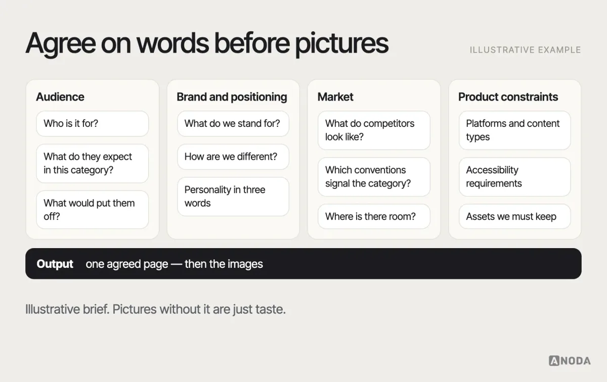
A mood board built from a blank page and a search engine reflects whoever did the searching. A useful board starts from inputs the team has already agreed on:
- Audience: who the product is for, what they expect from products in this category, and what would put them off.
- Brand and positioning: what the product stands for, how it differs, and its personality — in words, before pictures.
- Market: what competitors look like, which visual conventions signal “this is a bank” or “this is a game”, and where there’s room to stand out.
- Product constraints: platforms, accessibility requirements, content types, data density, existing brand assets that must be kept.
If the positioning isn’t clear yet, the mood board will expose that — which is useful, but it’s not the mood board’s job to decide it. That’s brand strategy, and it comes first. Our branding work starts there.
From adjectives to visual attributes
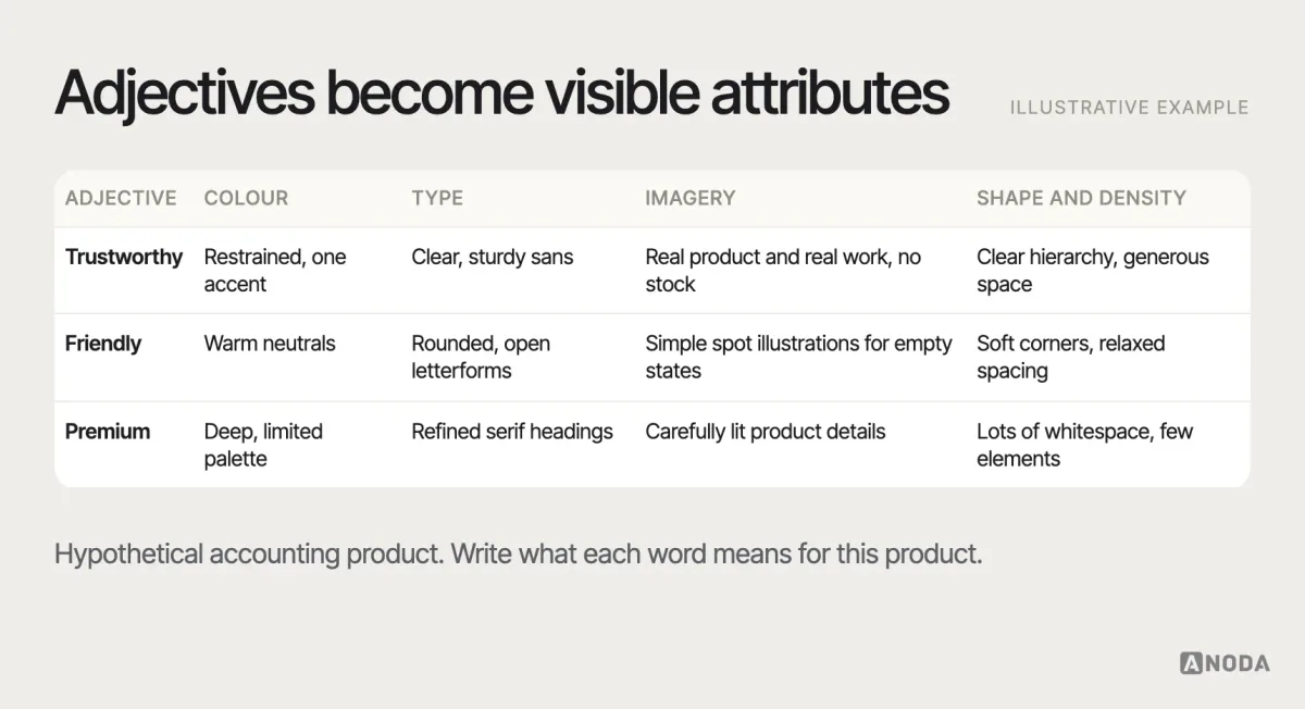
Most briefs describe the desired feel in adjectives: modern, premium, friendly, trustworthy, bold. Adjectives are a start, but they mean different things to different people. The most valuable thing a mood board can do is translate each adjective into specific, visible attributes.
“Trustworthy” for a bank might mean restrained colour, generous whitespace, clear hierarchy, real photography of real people and plain language. “Trustworthy” for a health app might mean soft colour, rounded shapes, calm illustration and no stock photos. Same word, different picture. The board is where the team picks one.
On Jenny M., a landing concept for a digital boutique, there was no visual language to inherit — only a personality to translate, and the whole job was deciding what premium looks like for this particular brand. Modern elegance on its own reads cold in beauty, so the direction had to stay approachable without giving up the premium register. The answer ended up very specific: a tonal palette of blush and near-black, wide editorial capitals and generous margins, delivered with the palette and type rules that keep the next page consistent.
What to put on the board
A product mood board usually covers several layers of the visual language. Not every board needs all of them, but most need more than photos.
- Colour: palettes, not just single colours — and how much of each.
- Typography: type styles and pairings that carry the personality.
- Imagery: photography style, illustration style, iconography.
- Shape and texture: corner radius, line weight, depth, materials.
- Layout and density: how much whitespace, how much content per screen.
- Interface references: real product screens that show the direction applied — navigation, cards, forms, data.
- Motion: how things move, if motion is part of the personality.
- Words: tone-of-voice examples, because visual and verbal personality should match.
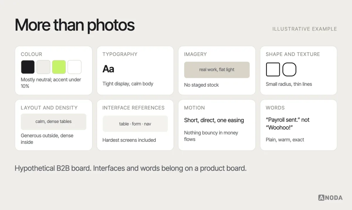
For digital products, include interface references early. A direction that looks great as brand photography can fall apart on a data-dense settings page. Include the hardest screens you have — a dense table, a long form, an error state — alongside the marketing moments. If the direction only works for the hero section, it isn’t a product direction yet.
Annotate every reference
This is the step that separates a decision tool from a collage. Next to each reference, write three things:
- What to borrow: the specific quality you want — “the restrained use of one accent colour”, “the large, confident headings”, “the density of the table”.
- What to avoid: the part you don’t want — “but not the dark background”, “not the illustration style”.
- Why it fits: the connection to audience or positioning — “our users are finance leads who distrust anything playful”.
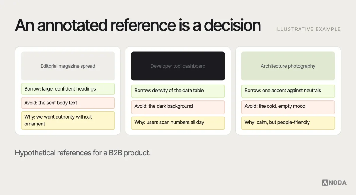
Annotation also protects you from copying. A reference is there for a quality, not to be reproduced. If the team can’t say what it’s borrowing, the reference probably shouldn’t be there.
Source references responsibly
References come from everywhere: other products, photography, architecture, print, packaging, art. A few rules keep the board useful and fair:
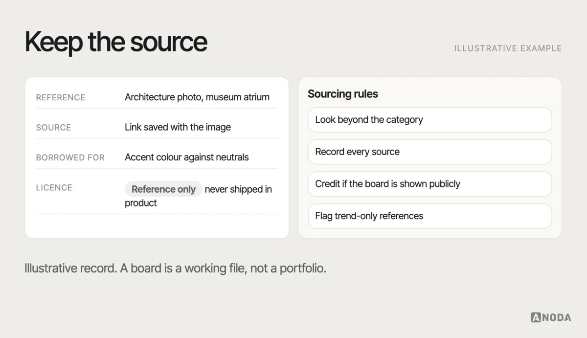
- Look beyond your category. A board made only of competitors’ screens produces a product that looks like competitors. The most distinctive directions often borrow from outside the industry.
- Record the source. Keep a link or credit for each image, so the team can find it again and so nothing is later mistaken for your own work.
- Don’t publish other people’s work as yours. Mood boards are internal working documents. If a board is shown publicly, credit the sources — and never ship a reference image in the product without a licence.
- Be careful with trends. A board full of this year’s fashionable effects will look dated next year. Ask which references express the brand and which are just current.
Explore two or three distinct directions
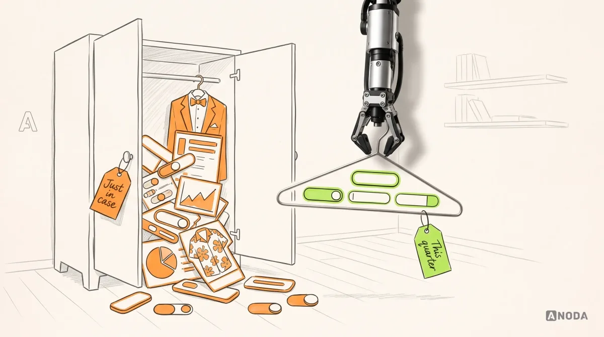
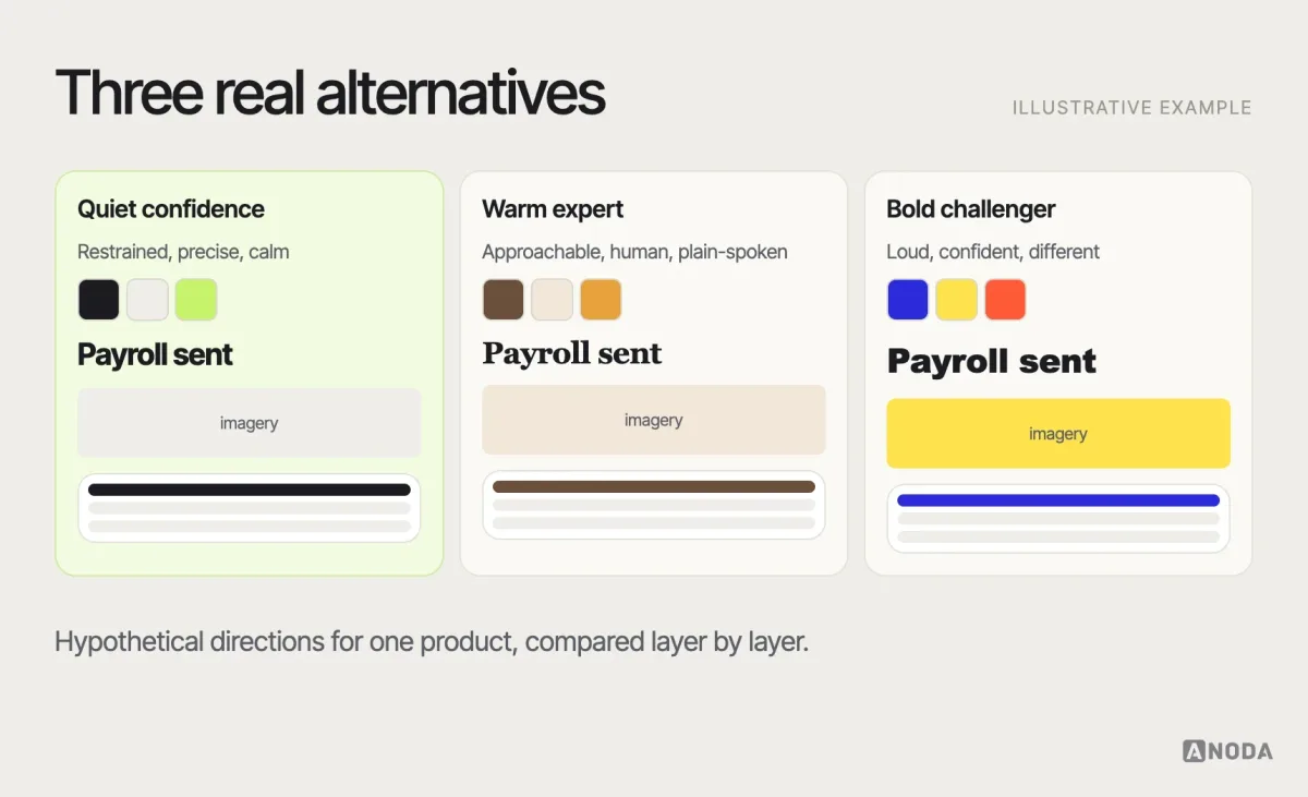
One board invites approval of whatever’s on it. Two or three genuinely different directions invite a real decision. They should differ in meaningful ways — restrained versus expressive, warm versus technical — not be three shades of the same idea.
For each direction, give it a short name, a one-line description of the personality, and the same set of layers, so people compare like with like. Include at least one direction that stretches the brief a little; it helps the team discover where its boundaries really are.
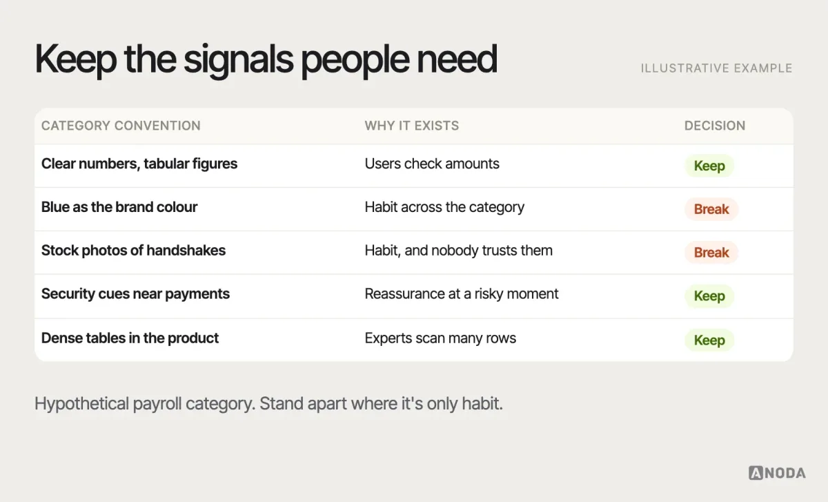
Where your product sits against its category matters too. Some conventions exist for good reasons — a banking app that looks like a game will struggle to win trust — while others are just habit. The board is a good place to decide which category signals to keep and where to stand apart.
Check accessibility on the board
Accessibility problems are cheapest to catch at the direction stage. Check the palette for contrast before anyone falls in love with it: a pale grey on white or a mid-tone brand colour behind white text may be beautiful on a board and fail on a real screen. Look at type choices at small sizes and on low-quality screens, not only in large headlines. Make sure the direction doesn’t rely on colour alone to carry meaning, and that motion references can be toned down for people who prefer reduced motion. A direction that needs to be rescued later for accessibility was never fully approved.
Show it to users, carefully
A mood board is mainly an internal alignment tool, but it can be useful to show directions to a few people from the target audience — not to vote on which they like, but to hear what each direction says to them. Ask what kind of product they’d expect behind it, who they think it’s for, and whether it feels trustworthy for the task. If a direction meant to feel “expert” reads as “expensive and not for me”, that’s worth knowing before it’s built. Treat the answers as signals about perception, not as a design decision by committee.
Review and approve the direction
The review is where a mood board earns its keep. A few practices make it productive:
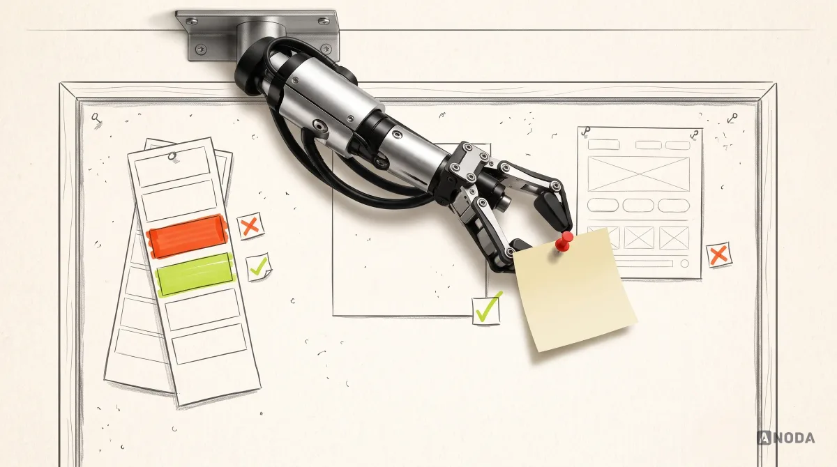
- Review against the inputs, not taste. Start by restating the audience and positioning, then ask which direction serves them best. “I like it” is not a criterion.
- Name the decision-maker. Everyone can comment; one person or a small group decides. Without that, the loudest opinion wins, or the board becomes a compromise nobody believes in.
- Surface disagreements explicitly. If sales wants “bold” and the founder wants “calm”, write that down and resolve it now. It will not resolve itself in the UI.
- Ask what’s missing and what should never appear. Prohibitions are as useful as preferences.
- Test with real content. Put a real screen of your product — its actual data, labels and length — into the direction before approving it.
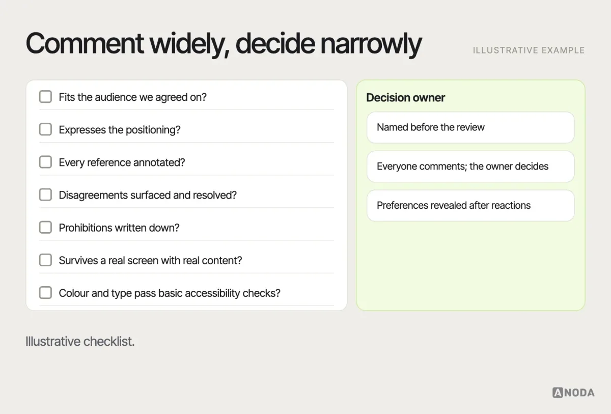
Approve a mood board only when it expresses the intended audience, personality, category signals and boundaries clearly enough that a designer who wasn’t in the room could use it to make decisions. When you present the directions, present them in the same format, in the same order of layers, with the same real screen applied to each. Don’t reveal which one the team prefers until everyone has reacted, or the first opinion in the room will anchor the rest.
Turn the board into principles and prohibitions
The approved board is not the end product. Summarise it in a short set of visual principles and prohibitions that can govern later work:
- Principles: “One accent colour per screen.” “Photography of real work environments, never staged stock.” “Generous whitespace on marketing pages; dense but calm in the product.”
- Prohibitions: “No gradients.” “No illustrations of people.” “No playful animation in financial flows.”
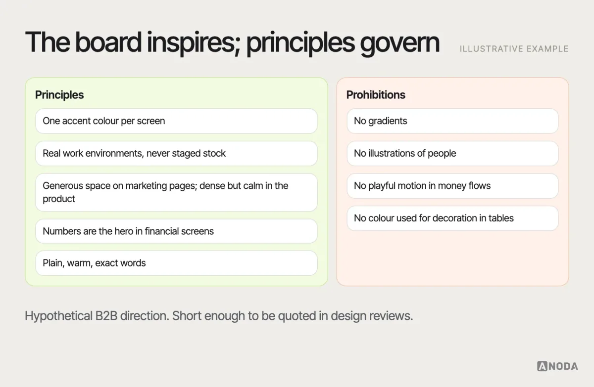
This page is what designers refer to when the board itself is long forgotten. It’s also what turns a shared taste into something that can be checked: does this screen follow the principles or not? Keep the list short — five to ten principles and a handful of prohibitions. A long list gets ignored; a short one gets quoted in design reviews, which is exactly where it’s needed.
How to make a mood board, step by step
Putting it all together, here’s a practical sequence for a product mood board, as a recommendation:
- Collect the inputs. One page with the audience, positioning, personality in words, market conventions and product constraints. Get it agreed before gathering any images.
- Translate adjectives into attributes. For each personality word, write what it means visually for this product.
- Gather widely, alone. Each contributor collects references — from inside and outside the category — with a note on why each one was chosen.
- Curate hard. Remove duplicates, anything nobody can explain, and anything that only expresses a trend. A good board is usually smaller than people expect.
- Group into two or three directions. Give each a name and a one-line personality, and cover the same layers in each.
- Annotate. Borrow, avoid, why — for every reference that stays.
- Apply to a real screen. Sketch one real product screen in each direction, with actual content.
- Review and decide. Against the inputs, with a named decision-maker, surfacing disagreements explicitly.
- Write the principles and prohibitions. The one page that will govern the work that follows.
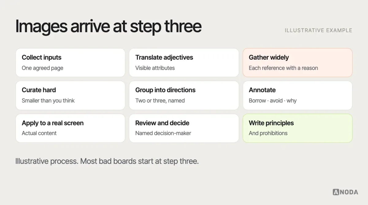
For most products, this is days of work, not weeks. The goal is a confident direction, not a perfect artefact; the board’s value is in the decisions it forces, and those should happen quickly.
Running a mood board workshop
Mood boards work best when the people who will approve the direction help shape it. A short workshop is often the fastest way to get there. Before it, share the inputs page and ask each participant to bring a handful of references with one sentence on why. In the session, restate the audience and positioning, let each person present their references briefly, then group them together into emerging directions. Spend most of the time on disagreements: when two people bring opposite references for the same adjective, that’s the conversation the project needs to have.
End with clear next steps: who will turn the groupings into two or three proper directions, and when the decision meeting is. A workshop that ends with a wall of images and no owner has produced a nicer version of the fridge door.
Mood boards for existing products
A redesign or a brand refresh needs a slightly different board. Start by capturing what exists: the current visual language, what users recognise and value, and what’s genuinely broken. Some elements carry equity — a colour, a logo shape, a way of speaking — that users rely on to know they’re in the right place. Changing them has a cost.
For these projects, a useful board shows three things side by side: what we keep, what we evolve and what we drop. It makes the scale of change visible and gives stakeholders a way to discuss it concretely, rather than choosing between “the same as now” and “completely new”.
Mood board, style tile, brand board, UI kit, design system
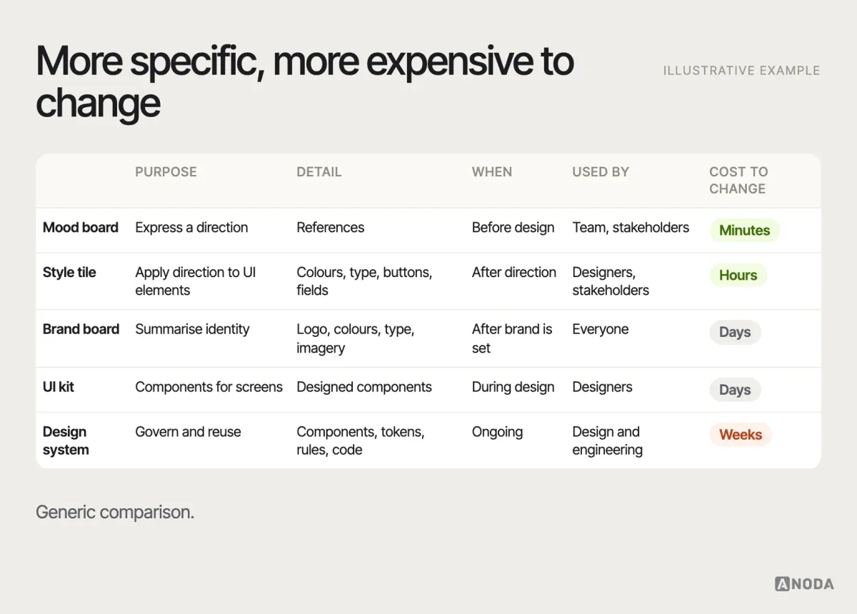
The terms overlap, so here is how they differ in practice:
- Mood board: references expressing a direction. Early, exploratory, cheap to change.
- Style tile: a single page applying the chosen direction to actual interface elements — colours, type, buttons, form fields — without designing full screens.
- Brand board: a summary of the brand’s core identity — logo, colours, type, imagery — often used as a quick reference.
- UI kit: a collection of designed interface components ready to use in screens.
- Design system: the governed, documented set of components, tokens, patterns and rules used across the product, in design and code.
What comes after approval
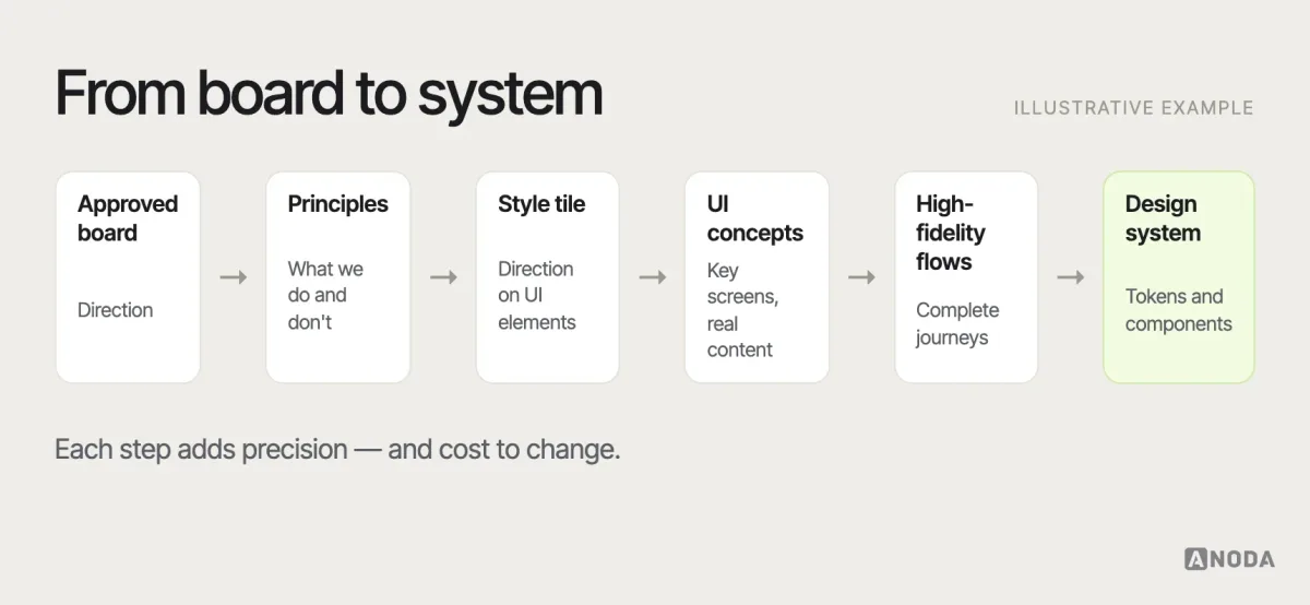
After the direction is approved, the typical path is: visual principles, then a style tile or a small set of UI concepts applying the direction to real screens, then high-fidelity design of the key flows, then the design system that makes the direction reusable. How the approved direction becomes a coherent brand system is covered in our guide to a cohesive brand system, and turning it into reusable components and tokens is the work of a design system.
UI/UX design
Have a direction, need a product?
We translate an approved visual direction into coherent, usable product flows and interfaces — tested with real content, not just references.
An illustrative example
Here is how the process works in an illustrative example, not a specific client. A B2B payroll product is redesigning its interface. The brief says “modern, friendly and trustworthy”. Stakeholders’ first references include a consumer banking app, a playful project-management tool and two competitors.
The team translates the adjectives: for payroll managers who process salaries every month and are anxious about mistakes, “trustworthy” means calm colour, clear numbers and no surprises; “friendly” means plain language and helpful empty states, not illustrations or jokes; “modern” means current typography and generous spacing, not trend effects. Three directions are built and applied to the real payroll-run screen with actual figures. The playful direction collapses on that screen — cheerful illustration next to a salary total reads as careless. The decision goes to the calmer direction, with one principle carried over from the friendlier one: plain, warm microcopy. The prohibitions page says no illustrations in financial flows and no colour used for decoration in tables.
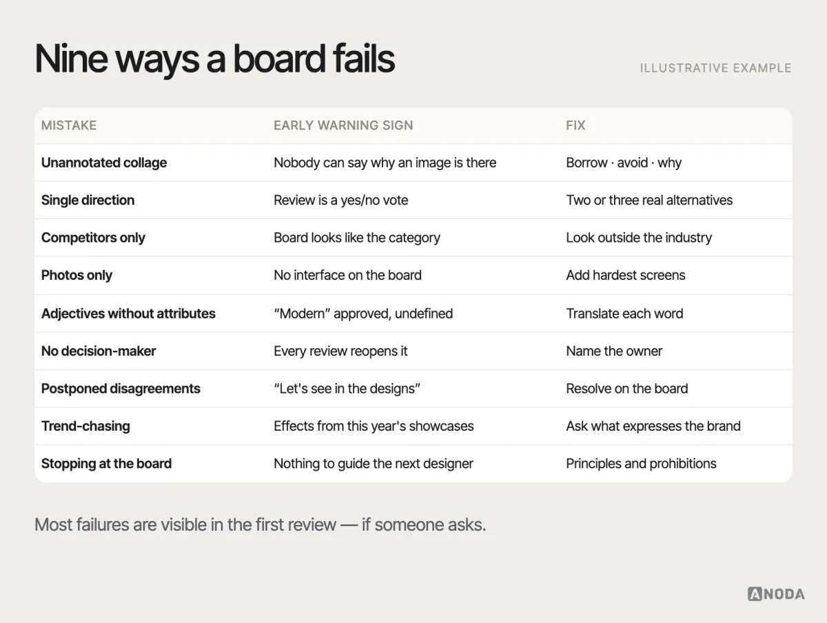
Common mood board mistakes
- A collage of things people like. Forty images, no annotations, no decision.
- Only one direction. Nothing to compare, so approval means little.
- Only competitors. The result looks like the category, not like you.
- Only photography. A direction that works for marketing but has never met a data table.
- Adjectives without attributes. “Modern” approved; nobody knows what it means.
- No decision-maker. Every review reopens the direction.
- Disagreements postponed. They reappear in high-fidelity reviews at ten times the cost.
- Trend-chasing. Effects that will date faster than the product.
- Stopping at the board. No principles, no prohibitions, nothing to guide the next designer.
Where shared taste isn’t enough
A mood board can align a team, but shared taste alone doesn’t create a coherent brand or a usable product. The board needs clear positioning behind it and disciplined design work after it. That’s where we usually help: facilitating the direction, connecting it to positioning and turning it into an actionable visual system and product interface. We can’t promise that a team with shared taste will end up with a coherent brand. What a well-run direction phase does is make the choices explicit, so the brand and product that follow are built on decisions rather than on whoever had the strongest opinion in the room.

Branding
Need the positioning behind the board?
We define the brand principles that make a mood board useful rather than decorative — and carry the chosen direction into a visual identity that can govern product work.
Decide the direction while it’s cheap
A mood board is worth making because it moves the most subjective, argument-prone decision in a project to the moment when it’s cheapest to change. Start from audience, positioning, market and constraints; translate adjectives into attributes; annotate every reference; explore real alternatives; review against the inputs with a named decision-maker; and turn the result into principles and prohibitions that can govern brand and product work.
Frequently asked questions
What is a mood board?
A mood board is a curated collection of visual references — colours, typography, imagery, textures, layouts and interface examples — arranged to communicate the intended look and feel of a product or brand before detailed design begins.
What should a mood board include for a digital product?
Colour palettes, typography, photography and illustration style, shape and texture, layout and density, real interface references, motion if relevant, and tone-of-voice examples — each annotated with what to borrow, what to avoid and why it fits the audience and positioning.
How many mood board directions should you create?
As a recommendation, two or three genuinely different directions, each covering the same layers so they can be compared. One board invites approval of whatever is on it; several real alternatives invite a decision.
What is the difference between a mood board and a style guide?
A mood board expresses a direction through references and is cheap to change. A style guide documents specific rules — exact colours, type scales, logo usage — once the direction is decided. A design system goes further, with reusable components, tokens and governance.
What comes after a mood board is approved?
A short set of visual principles and prohibitions, then a style tile or UI concepts applying the direction to real screens, high-fidelity design of key flows, and finally the design system that makes the direction reusable.
Written by