In short
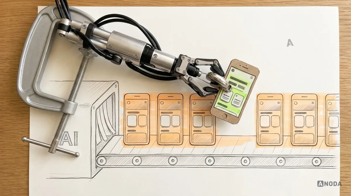
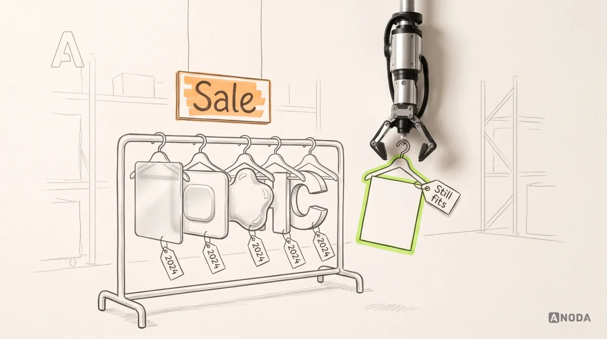
A UI trend list is a fashion magazine for software: it tells you what everyone is wearing this season and nothing about whether it fits your product. We read the 2024 lists from 2026, sorted what lasted from what quietly left, looked at what AI changed, and wrote down the filter we run before any trend touches a client's interface: what job it does, what it costs and which rule it will live under.
In this article
- What counts as a UI design trend, and why most of them expire
- The 2024 trend lists, read two years later
- Glass and translucency: pretty until someone has to read it
- Neumorphism: the button nobody could find
- Bold type and giant headlines: loud is not the same as clear
- Motion and micro-interactions: a waiter, not a dancer
- D and immersive scenes: a spoiler on a delivery van
- AI personalisation and adaptive layouts: the seating plan that changes every morning
- Dark mode: an umbrella, not a forecast
- AI made generic UI cheap. Art direction got expensive.
- Brand language: the Ship of Theseus problem
- The mistakes we see when teams chase trends
- The trend filter we run before anything touches a product
- How we bring a trend into a product without paying for it twice
- The decision rule
A UI trend list is a fashion magazine for software. It tells you what everyone is wearing this season and says nothing about whether it fits your product, your users or your budget for taking it off again next year. And you will take it off. UI fashion expires. The decisions underneath it outlive every yearly list: a clear hierarchy, readable type, motion that means something, contrast people can actually read, states that never lie, and a brand you would recognise with the logo covered.
At ANODA, we fix interfaces around the work people need to finish. We watched skeuomorphism, flat design, neumorphism and glassmorphism each arrive as the future. The products that kept making money through all of them got the boring parts right. The ones that jumped on every bandwagon paid for a redesign every time the bandwagon changed direction, and paid again for the users who got lost in the move.
So here is the 2024 trend list, read from 2026 with the receipts in hand: what earned a permanent place, what turned out to be a flash in the pan, what AI actually changed, and the filter we run before any trend gets near a client’s product.
What counts as a UI design trend, and why most of them expire
A UI design trend is a visual or interaction pattern that spreads because it looks current. That is the whole definition, and it is the whole problem. “Looks current” is a property of the calendar, not of your product.
Trend lists mix three different things into one roundup, and treating them as equal is how teams spend money in the wrong place:
- Fashion. A change to the surface: glass, soft shadows, gradients, oversized type, bento grids. Cheap to add, expensive to maintain, guaranteed to date.
- Technology shifts. A change to what an interface can do or where it runs: AI generation, spatial headsets, new operating-system materials, variable fonts. These change your options, and usually your constraints.
- Baseline. What users and regulators already expect: accessible contrast, dark mode, fast response, layouts that work on any screen. Calling these trends is like calling wheels a car trend.
Think of a building. The cladding gets replaced every couple of decades and nobody minds. The load-bearing walls stay exactly where they are, and anyone who “refreshes” them because the neighbours did brings the house down. Most UI trends are cladding. Hierarchy, type, contrast, states and brand language are the load-bearing walls.
The money part is simple. Every fashion you adopt is a fashion you will pay to remove. It goes into components, marketing pages, app store screenshots and the design system; two years later it comes out of all of them, on engineering time you could have spent on the product. Nobody writes “undo last year’s trend” on the roadmap. Somebody always pays for it anyway.
The 2024 trend lists, read two years later
The 2024 roundups that still rank for “UX design trends 2024” read like a time capsule. The usual suspects: 3D everything, neumorphism, glassmorphism, micro-interactions, adaptive and AI-driven hyper-personalisation, voice interfaces and augmented reality in everyday apps. Apple Vision Pro went on sale in the US on 2 February 2024 (Apple Newsroom), and for a while every list grew a spatial section.
Trend lists have a long shelf life of their own. As of September 2026, one of the 2026 UX trend articles ranking for this very search (Wix’s) still lists the metaverse. Nobody told the list.

What follows is our verdict on each, with the reasoning rather than just the grade. Our verdict comes from the products we audit and redesign, and each one ends in the same place: the rule that outlived the effect.
Glass and translucency: pretty until someone has to read it
Glassmorphism was a 2024 favourite. Then it got the biggest endorsement a visual fashion can get. On 9 June 2025, Apple introduced Liquid Glass across iOS 26, iPadOS 26, macOS Tahoe 26, watchOS 26 and tvOS 26, a translucent material that, in Apple’s words, reflects and refracts its surroundings (Apple Newsroom). A few months later, iOS 26.1 added a setting that lets people pick a tinted look which, according to Apple’s own release notes, increases the opacity of the material. The company that shipped the glass also shipped a way to frost it.
Text on glass is a frosted bathroom window. It is brilliant at its actual job, which is hiding what is behind it. It is terrible at letting anyone read what is written on it. The contrast between the words and their background changes with whatever scrolls underneath: a white photo, a busy map, somebody’s wallpaper. Your designer checked it over the calm hero image. Your users meet it over a snowy photo at noon, at a bus stop.
WCAG 2.2, the W3C accessibility standard, sets a minimum contrast of 4.5:1 for normal text, 3:1 for large text, and 3:1 for the visual information that identifies interface components and their states. Translucent surfaces turn those numbers into a moving target. The European Accessibility Act came into effect in June 2025 (European Commission), covering services such as e-commerce and banking across the EU, so “moving target” is not a phrase you want to use in a compliance conversation.

Glass earns its place on chrome that floats over content, such as a tab bar, a toolbar or the edge of a sheet, where a hint of what is underneath helps people stay oriented and nothing important is printed on the glass itself. It does not belong under body text, prices, form labels or anything someone has to act on.
One more thing. Copying Apple’s material into your own brand surfaces is buying a star striker’s boots. You get the boots. You do not get the left foot, the engineers tuning real-time rendering for their own hardware, or the operating system that makes it feel native. On the web and on Android, hand-rolled glass is usually a blur filter that costs frames on a mid-range phone, which is the phone a good share of your paid traffic is holding.
Audit check
Screenshot every translucent surface over its worst real background: the brightest photo, the busiest map, a user’s wallpaper, in light and dark mode. Measure text contrast at the worst spot, not the average.
Failure evidence
Text that passes in the design file and fails over real content. Reviews and tickets that say “can’t read it outside”.
Correction pattern
Keep glass on navigation chrome, put text on solid or tinted surfaces that hold 4.5:1 in the worst case, and honour the system’s reduce-transparency setting.
Neumorphism: the button nobody could find
Neumorphism, with its soft shapes that look moulded out of the background, had its moment years earlier and still turned up on 2024 lists. Its problem was never taste. A button made from the same material as its background, with a shadow as the only clue, does not look like a button.
It is the hidden door in a boutique hotel corridor: flush with the wallpaper, no handle, very photogenic. Guests love it until they need the bathroom at 3 a.m. and end up patting the wall in the dark. In a product, patting the wall is a missed tap, a support ticket, or a new user who decides your app is “confusing” and never activates. That user cost exactly as much to acquire as the ones who stayed.
The durable decision underneath is affordance and stable states. A control looks like a control, and its default, pressed, disabled, loading, error and success states look visibly different. WCAG’s 3:1 minimum for whatever identifies a control and its state is not a style preference. It is the line between “subtle” and “invisible”.
What survived: a softer, more physical feel where it helps, such as a toggle that looks toggleable or a card that lifts when it can be dragged. What died, deservedly: soft shadows as the only difference between “you can press this” and “you can’t”.
Bold type and giant headlines: loud is not the same as clear
Oversized headlines, condensed display faces and kinetic type are everywhere, and on a marketing page they can work. The trouble starts when the same volume moves into the product.
Picture an exam paper with the instructions printed in 72-point bold and the questions in 8-point grey. Every pupil reads the instructions beautifully and fails the test. That is a dashboard with a hero-sized “Good morning, Alex” and the overdue invoices in small pale print underneath.
Readable type is a set of boring decisions that pay forever: body text at a comfortable size, lines short enough that the eye does not have to travel across a whole monitor, a type scale with a few clear steps instead of twelve, weights that mean something, and enough contrast to read on a cheap phone in sunlight. Variable fonts are the genuine technology shift here: one font file carries many weights and widths, so you get range without a pile of separate files. That is a good reason to use them. “It looks like a fashion magazine” is not.
Hierarchy is the load-bearing wall. If the eye does not know where to go first, the user has to work it out, and every second spent working it out comes out of an activation budget you already paid for with ads.
Bento grids fail the same way. A bento box works because the cook decided what goes in each compartment and how much of it. A bento grid where every tile has the same size, weight and colour is a lunchbox of twelve identical rice balls: tidy, photogenic, and no clue which one is the main course. If one tile matters more, make it bigger, put it first and let the others step back. That is hierarchy again, wearing a 2024 haircut.
Motion and micro-interactions: a waiter, not a dancer
Micro-interactions were on nearly every 2024 list, and they are on the 2026 lists too. This is a trend that became a baseline, with a catch: only the meaningful half survived.
Motion that confirms is a waiter who says “coming right up” and brings the plate. Motion that decorates is a waiter who does a pirouette before every course. Charming at the starter. By dessert you want the bill, and so do your users. Motion earns its keep when it explains a change the user caused: an item flying into the basket, a row sliding away after delete, a sheet rising from the button that was tapped. It turns into a tax when it plays on every scroll, delays content or loops on something people are trying to read.
Two external facts make this more than a matter of taste. WCAG 2.2 includes a criterion, 2.3.3 at level AAA, that motion animation triggered by interaction can be disabled unless it is essential, and browsers pass on the user’s “reduce motion” preference so a product can honour it. And since 12 March 2024, Interaction to Next Paint has been one of Google’s Core Web Vitals, with web.dev defining a good score as 200 milliseconds or less. An animation that holds the interface hostage until it finishes is not delight. It is a slower product with better lighting.

3D and immersive scenes: a spoiler on a delivery van
3D hero objects, scroll-driven scenes and spatial layouts were the headline act of 2024. Vision Pro gave spatial design a real platform, and for products built for that platform, thinking in space is a genuine technology shift.
For everyone else, a 3D hero on a SaaS landing page or inside a banking app is a spoiler on a delivery van. It looks fast in the brochure. It carries no more parcels, it burns more fuel, and the driver still sits in the same traffic. The fuel here is page weight and processing time. A heavy scene on a mid-range Android phone over a patchy connection means the first thing a paid visitor sees is an empty frame and a progress bar. Some of them wait. You paid for all of them.
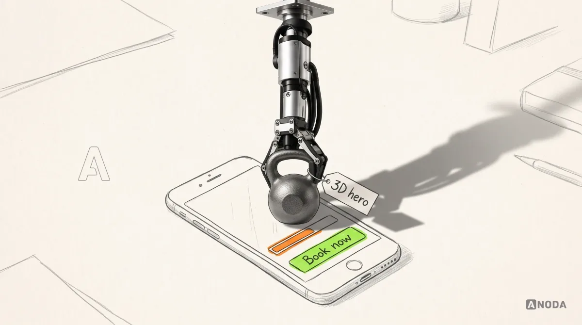
Keep 3D where the object is the point: configuring a product, showing a device, explaining a space. Load it on demand, give it a still fallback, and never put it between the user and the first action.
AI personalisation and adaptive layouts: the seating plan that changes every morning
Hyper-personalisation was the AI promise of 2024: interfaces that rearrange themselves for every user. Some of it aged well. Most of it created a brand-new problem.
Imagine a school where an algorithm redraws the seating plan every morning based on yesterday’s marks. Optimal on paper. In practice the teacher cannot find anyone, the pupils cannot find their desks, and the first twenty minutes of every lesson go on looking. An interface that moves its navigation, reshuffles its menu or swaps its home layout based on behaviour does the same thing to your users’ muscle memory. Adaptive content (the right invoice, the next step, a relevant template) is useful. An adaptive layout is a tax on every returning user, and returning users are the ones already paying you.
The durable decision is a stable map: the structure stays put and personalisation lives inside predictable slots. Users should be able to find the main actions with their eyes half closed. If they cannot, you have traded habit, the thing that brings people back, for novelty.
Voice and everyday AR followed the same curve. Where hands or physical space are the job, such as driving, cooking, or checking whether a sofa fits the room, they earn their place. Bolted onto a settings screen to tick a box on a trend list, they become features nobody opens twice.
Dark mode: an umbrella, not a forecast
Dark mode still appears on trend lists in 2026. It is not a trend. It is an umbrella: people expect one the moment it rains, and nobody compliments you for owning it.
The work is not “invert the colours”. It is a second palette with its own contrast checks, images that do not glow like a torch at night, charts that stay legible and states that can still be told apart. Most dark themes we audit were built in one sprint by flipping tokens, and it shows: grey text on slightly less grey cards, error states you cannot see and product photos stuck in bright white boxes. If you support it, support it properly. Every ticket that starts with “I can’t see the button at night” is a customer you are paying to keep while the product pushes them away. Half a dark mode is a screw-up with a toggle.
AI made generic UI cheap. Art direction got expensive.
Here is the technology shift that matters most in 2026, and it is not a visual style. AI tools now generate a competent interface in minutes: a dashboard, a landing page, a settings screen, responsive and neatly organised. The cost of generic execution has fallen through the floor.
When everyone owns a karaoke machine, everyone can sing the hit, in tune and in the same key. Nobody buys a concert ticket to hear it. AI-generated UI learns from what already exists, so it lands on the average: the same rounded cards, the same gradient hero, the same icon set, the same “Build faster” headline. Your competitor’s machine sings the same song. Ship it unedited and your product becomes interchangeable, and interchangeable products end up competing on price.
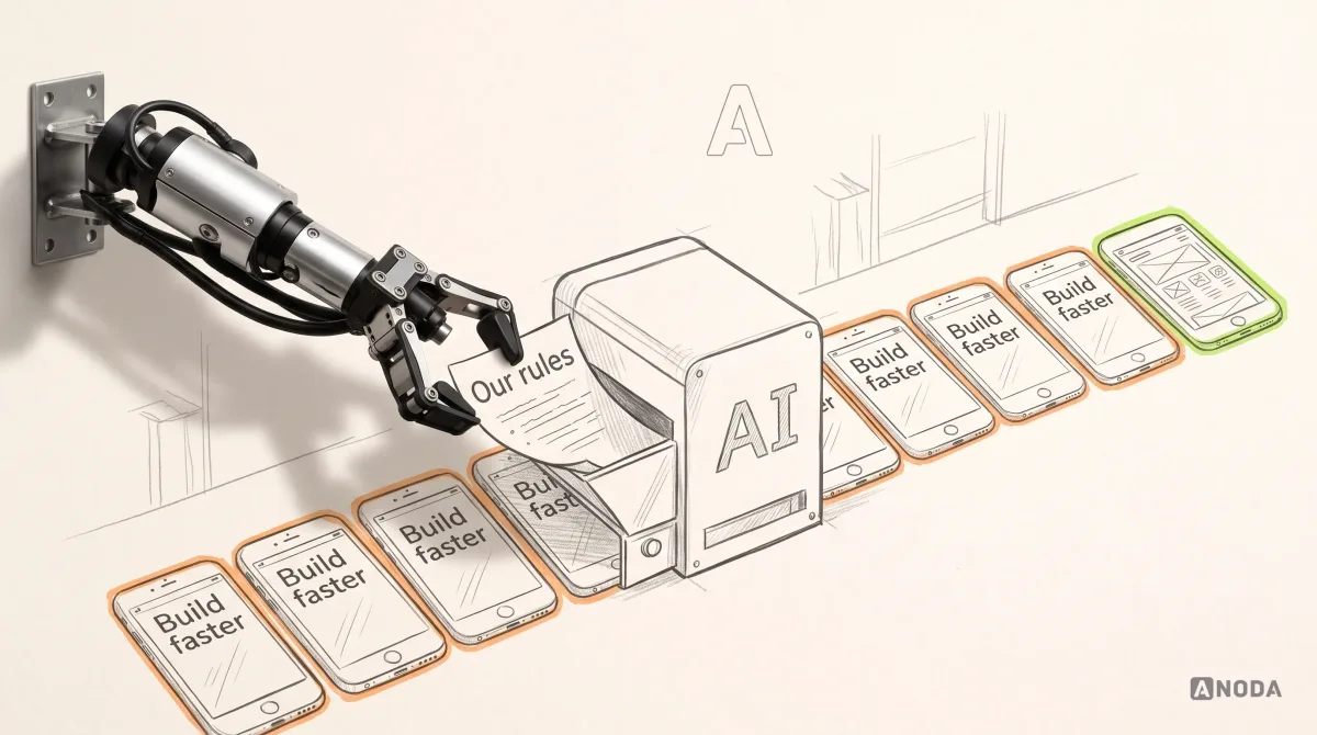
What got more valuable is exactly what the machine cannot average: art direction and explicit constraints. AI is a tireless bricklayer with no drawings. Point it anywhere and it lays a fast, straight wall in the same brick as the house next door. The drawings are your job: who the product is for, how the brand looks and sounds, which trends are allowed and which are banned, the type scale, the contrast floor, the motion rules, the states every component must have. Give the bricklayer those and speed becomes an asset. Skip them and you get a very quick mess that looks like everyone else’s very quick mess.
We use AI in production work every day. It does not impress us and it does not scare us. It is a faster pair of hands, and the old question has not moved an inch: who decides what good looks like for this product?
Brand language: the Ship of Theseus problem
A product that swaps its look for every trend becomes the Ship of Theseus: every plank replaced, and nobody quite sure it is the same boat. Least of all your customers.
Recognisable brand language is a durable decision in its own right: a colour logic, a type voice, an illustration style, the way components behave, copy that sounds like one company. It is what makes a screenshot of your product recognisable with the logo cropped out. Trends that dilute it cost you twice: once for the redesign, and again in recognition you spent years buying through marketing.
The test is harsh and simple. Put your screens next to three competitors’ with the logos removed and show them to someone outside the company. If they cannot tell which one is yours, the trend did not make you modern. It made you anonymous, and you are paying a brand budget for a template.
The mistakes we see when teams chase trends
We see the same handful in almost every product we audit after a trend-led redesign:
- Designing for the portfolio shot. The screen looks perfect with three short names and round numbers. Real life brings long names, empty states, 47 unread items and the German translation, and the trend dies on contact.
- A fresh coat on an old flow. New glass and gradients on a checkout that still asks for the same details twice. Mutton dressed as lamb: the customer still has to chew through it.
- Copying the platform. Borrowing an operating-system material or a competitor’s flourish without the conditions that made it work there.
- Testing on the designer’s monitor. A high-end display, a calm wallpaper, fast office Wi-Fi. Your users have a cracked Android phone, bright sun and a train going into a tunnel.
- No rule, so every squad invents its own. Three blurs, four shadows, five easing curves. Within a year the design system is an archaeological dig.
- Judging by the founder’s first reaction. “Feels modern” is a reaction, not a result. Everyone nods at the emperor’s new clothes in the review meeting; users vote with their thumbs a week later.
Each of these burns the same money twice. First the redesign budget, then the activation you lose while people relearn the product or give up on it.
The trend filter we run before anything touches a product
Five questions, in this order. Stop at the first honest “no”.
- What user job does it help? Name the task and the screen. “Looks fresh” is not a job.
- What does it cost? Page weight, response time, contrast, battery, plus the build and maintenance hours.
- Does it survive the worst case? Bright sun, an old phone, a slow network, reduce motion switched on, text at 200%, the longest translation, the empty state and the error state.
- Does it strengthen the brand or blur it? Run the logo-cover test.
- Can we write it down as a rule? If nobody can say when to use it, when not to, and what replaces it under constraint, nobody can govern it, and every squad will reinvent it.
Keep what passes all five. Everything else is flavour of the month, and you already know what happens to the flavour of the month.
UI/UX design
Holding a trend you’re not sure about?
Bring us the screens and the direction you’re considering. We’ll tell you which parts serve your users and which ones just cost you, and turn the rest into a plan your team can build.
A trend has to survive the whole product
A new surface style becomes expensive when the dashboard, the extension and the error states start telling different stories. Another visual refresh will only give the disagreement a new colour. ANODA connects art direction to the task, component rules and release handoff, so the product stays recognisable while people can still do their work.
SEOSpace shows that discipline across a web app and Chrome extension: consistent scores and task priorities, onboarding states, Figma handoff, Loom walkthroughs and release design QA. These decisions keep a visual update useful after launch. Explore the SEOSpace redesign and plan your visual system with ANODA.
How we bring a trend into a product without paying for it twice
When a trend does pass the filter, we do not paste it in. We move it through the same order every time, because each step catches a different way to lose money:
- Start from the job and the evidence. Analytics, session recordings, support tickets and the places users stall. The trend has to solve something that shows up there.
- Prototype on real content, worst case first. Real names, real numbers, empty and error states, the longest language you ship.
- Measure the cost before shipping. Contrast at the worst spot, the performance budget, and behaviour with accessibility settings switched on.
- Write the rule into the design system. What it is for, where it is banned, the tokens, the fallback and who owns it.
- Ship it on one surface and watch the numbers that pay the bills. Task completion, activation and support contacts, not compliments in the team channel.
- Review it once a year. Retire whatever no longer serves a rule, before it becomes next year’s cleanup project.
That is the work behind our UI/UX design services: taking a trend that fits your audience and turning it into a governed visual system, without trading away usability, performance or the brand you already paid to build.
The decision rule
UI fashion expires. Keep a trend only when it supports your audience, your product’s job and your brand. Write down the rule it serves before it ships. Reject every effect that adds load, latency or novelty for its own sake.
Everything you do not decide, the trend list decides for you, and it will change its mind next year. More guides written in the same spirit, fewer trend lists, live on the ANODA UX blog.
Work with ANODA
Want the new look without paying for it twice?
We sort the trends that serve your users from the ones that only serve the mood board, and turn the keepers into a visual system with rules your team can hold to next year.
Written by