In this article
- How to use inspiration responsibly
- Idea 1: progressive onboarding
- Idea 2: contextual navigation
- Idea 3: camera, voice or multimodal input
- Idea 4: AI assistance with control
- Idea 5: data summaries with drill-down
- Idea 6: collaborative presence and conflict
- Idea 7: commerce and checkout clarity
- Idea 8: meaningful motion
- Idea 9: adaptive phone, tablet and foldable layout
- From reference to hypothesis and prototype
- Inspiration review checklist
Useful mobile app design ideas solve a task under real constraints. A screenshot supplies a reference; the design work is deciding who needs the pattern, what changes when they act, and what happens when the device, connection or assumption fails.
A beautiful reference can still become an expensive mistake: the copied screen hides the reason customers abandon setup, the states developers must improvise and the task that should earn the next purchase. More trends will not repair that journey. ANODA turns inspiration into a coherent mobile product, connecting research, flows and visual design to the moment your customer gets value.
Use this guide to turn inspiration into a product decision. Start with a repeated task, choose a pattern that removes a specific obstacle, and test its difficult states before polishing the happy path. A flower shop, banking product and music app may share a component without sharing the same workflow. Borrow the logic that fits your product rather than the entire screen.
How to use inspiration responsibly
Save the reason behind a reference with the image. Record its audience, task, entry point, device and useful outcome. Ask what you cannot see: whether the list is empty, whether the user has permission, what the previous screen explained and how failure appears. Those questions distinguish a usable product pattern from an attractive composition.
A reference can suggest clearer hierarchy or an easier comparison. It cannot establish that a new feature belongs in your roadmap. If the existing flow already works, state the problem you expect the new pattern to solve before replacing it. For platform behavior and a broader review sequence, use our mobile app design guidelines.
Idea 1: progressive onboarding
Purpose: get people to the first useful result while collecting information when it becomes necessary. Replace a single large questionnaire with small decisions that have an obvious effect on the experience.
In Runners High, setup questions lead to a first music set. The Library then offers genre, effort and cadence as distinct ways to choose. That is a concrete relationship between setup and the product, rather than a tour of features. A question that has no effect on the next useful result needs a different place in the journey.
Constraints: some products need an account, eligibility check or permission before an action is allowed. Progressive onboarding changes the sequence where the product permits it; it does not remove requirements. Tell people what is mandatory, what can wait and what their answer changes.
Failure states: unanswered optional questions, interrupted setup, invalid input, an expired session and a return on another device. Preserve completed work and give people a clear next step. Test whether someone can describe why the product asks each question without help.
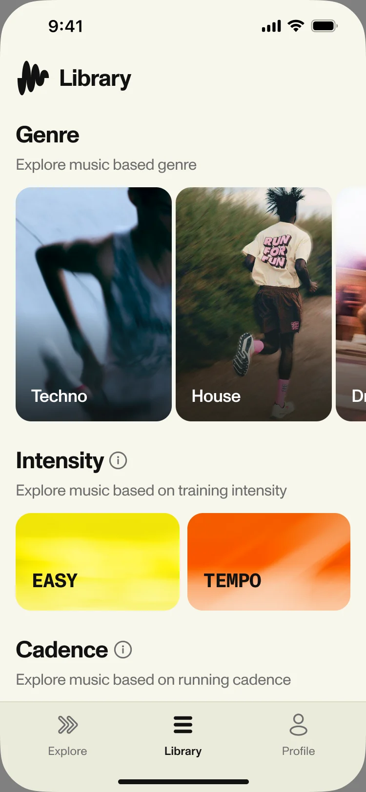
The actual Library design makes three selection methods readable in one screen. The case explains the surrounding setup and playback journey.
Idea 2: contextual navigation
Purpose: put stable destinations in a stable place and show task-specific actions inside the task. A tab bar answers where the user is; an action menu answers what they can do here. Combining both into a long menu makes orientation harder.
Runners High uses Explore to play, Library to choose and Profile for personal settings. Those labels reflect different jobs. A product with bookings, payments and messages needs its own task model rather than the same three tabs with new icons.
Constraints: changing destinations by role may be necessary, but the structure should remain predictable within a role. Keep the current destination visible, use labels people recognize and give deeper screens a clear return path. Do not hide the primary task solely to produce a cleaner screenshot.
Failure states: a destination with no content, inaccessible sections, deep links arriving without context, back navigation after filters change and a keyboard covering controls. Test a round trip: enter a detail screen, change something and return. People should know what was preserved and where they are.
Idea 3: camera, voice or multimodal input
Purpose: use the phone’s capabilities when they remove work. A document capture flow can replace typing; voice can help when hands are occupied; a photo can describe an object better than a long form. Offer the mode because it fits the task, rather than because a camera button looks modern.
Constraints: consider surroundings, privacy, consent, lighting, background noise and whether the user can speak comfortably. Keep a manual alternative where the workflow allows it. Explain the permission at the moment someone chooses the feature, and show what will happen to captured content.
Failure states: denied permissions, an unreadable photo, partial recognition, interrupted recording and a mistaken interpretation. Let users review and correct the result before it becomes a submission. A useful prototype includes the wrong result: can someone recover without repeating everything?
A voice interface should also show that it is listening, when capture stops and whether a result is ready. Silence after the user speaks is an ambiguous state, not a minimalist interface.
Idea 4: AI assistance with control
Purpose: help someone produce, find or understand something while preserving their ability to decide. A draft, explanation or suggestion is a different interaction from an action that changes a record or sends a message.
Constraints: describe what the assistant receives, what it can change and what still needs confirmation. Keep its response connected to the user’s original task. For generated text, offer editing and comparison with the existing version; for suggested actions, show the affected items before execution.
Failure states: an irrelevant answer, missing context, unavailable sources, a timeout and a result that conflicts with the user’s instructions. Give a route back to the ordinary interface. Do not make an assistant the only way to complete a predictable task.
Test the control boundary explicitly: ask a participant to reject a suggestion, correct an assumption and continue manually. A polished chat bubble cannot compensate for an unclear action boundary. Use those recovery paths to keep assistance useful when the suggestion is wrong.
Idea 5: data summaries with drill-down
Purpose: help people understand their current situation and reach the detail needed for a decision. Put the summary close to the action it supports. A large number with no definition, period or freshness indication is decoration.
Blackstar’s investment app includes GHS and USD wallets, funding through mobile money or bank transfer, and Active or Auto Invest journeys. The useful lesson is to keep currency, funding and investment choices understandable as separate parts of the product. Adapt the hierarchy to the financial decision your own customer needs to make.
Constraints: identify the unit, time range, source and meaning of each value. Separate unavailable data from a genuine zero. Give people a route from the summary to the records behind it and preserve the selected period on return.
Failure states: stale information, mixed currencies, partial loading, empty accounts and figures that disagree with the detail view. Ask a participant to explain what a number means and where they would verify it before relying on its visual prominence.
Idea 6: collaborative presence and conflict
Purpose: make shared work understandable when several people can change the same item. Presence shows who is there; a permission model defines what they can do; conflict handling decides what happens when changes collide. These are separate problems.
Constraints: a visible avatar does not mean someone is editing. Distinguish viewing, editing and saved changes where it matters. Show access restrictions in the task rather than letting users discover them after completing a form. Consider whether collaboration really needs live updates or whether a clear activity history is enough.
Failure states: simultaneous edits, a permission change during work, a removed collaborator, an offline draft and a comment attached to obsolete content. Preserve recoverable work and make the conflicting versions understandable. Do not silently overwrite an edit to maintain the appearance of speed.
Prototype a collision: two users change the same field, and one returns after being offline. The decision to test is how they recover and understand the result, not whether an avatar animates smoothly.
Idea 7: commerce and checkout clarity
Purpose: show what someone receives, what it costs and what happens after they commit. The important design ideas often appear in the review, error and confirmation states rather than the payment button.
For a subscription, show the plan’s access and renewal terms at the decision point. For a purchase, keep quantity, total, delivery or availability and any change to the order visible. The mobile app monetization guide explains how different revenue models change the experience.
Constraints: separate an editable selection from a committed transaction. Keep the payment action recognizable and make an abandoned checkout recoverable where appropriate. A visually shorter flow can still demand more effort if users must hunt for details across screens.
Failure states: payment rejected, payment processing, changed availability, expired promotion and a retry after a connection interruption. Explain whether the previous attempt completed before offering another submission. Test the confirmation as carefully as the purchase: users should know what they now have and what they can do next.
Idea 8: meaningful motion
Purpose: explain a state change, spatial relationship or completed action. Motion can show where an item moved, what expanded or whether a request is still running. It earns its place when it clarifies the interaction.
Constraints: keep important information readable while elements move. Avoid making a transition the only explanation of what happened. Provide a reduced-motion experience and make sure the static version still communicates the same result. Animation duration belongs to the interaction being tested, not a universal style rule.
Failure states: repeated loading loops, interruption halfway through a transition, motion that hides an error and controls that cannot be used until decoration ends. Test on a slower device and after repeated actions. An animation that feels delightful once may become friction on a frequent task.
Use a short storyboard with before, during and after states. If the motion does not explain anything those states cannot communicate, reconsider the animation’s purpose before adding it to the design system.
Idea 9: adaptive phone, tablet and foldable layout
Purpose: let the task benefit from available space without changing its meaning. A larger screen may support a list beside its detail, more readable comparisons or controls next to the content they affect. Enlarging a phone screenshot rarely achieves that.
Clearwater’s connected wellness app is a relevant case for connected-product controls and adaptive use. Its tablet home keeps SnowCap and Sauna session actions alongside statistics, challenges and discovery. The extra space supports the connected-wellness task instead of simply stretching a phone screen.
Constraints: keep the same selection, progress and task state when the layout changes. Check portrait, landscape, larger text, keyboard appearance and the smallest supported viewport. A foldable layout should follow the product’s actual device requirements rather than introducing an unsupported feature promise.
Failure states: rotating during input, a detail panel losing its selection, important controls moving outside reach and disconnected device information appearing current. Prototype the transition during an unfinished task. People should be able to continue rather than start again.
From reference to hypothesis and prototype
Turn each selected idea into a short test card:
| Field | Example for a music-selection task |
|---|---|
| Current obstacle | People do not know whether to choose by genre or workout effort |
| Pattern | Separate selection methods with labels and short explanations |
| Hypothesis | People can find an appropriate set without learning every category first |
| Prototype | Library, chosen category, empty result and return to Library |
| Test task | Choose music for an easy run, then change the choice |
| Observe | Wrong turns, requested explanations, successful selection and preserved state |
| Decision | Keep, revise or reject the hierarchy based on the observed task |
Use the card to make the decision behind each reference explicit. Include representative content and at least one difficult state. Run the same task against the current design when one exists, so the comparison addresses the problem that motivated the change.
Inspiration review checklist
Before moving a pattern into the product, check that:
- The task and audience are named, and the pattern supports a specific decision.
- Required data and permissions have a reason at this point in the journey.
- Loading, empty, error, interrupted and returning-user states exist.
- Users can identify where they are and recover from a wrong choice.
- Text, focus, contrast and reduced-motion behavior remain usable.
- Device changes preserve progress and selection.
- A prototype test can decide whether to keep or revise the idea.
When you need to connect these patterns into one coherent journey, our mobile app design service covers research, flows, interface decisions and handoff. Our Runners High work connects setup to a first music set and a Library organised by genre, effort and cadence; those are connected product decisions, not isolated screen styles. Get the same clarity for your app: discuss your mobile app design with ANODA and turn the references into a journey customers can understand and return to.
Frequently asked questions
Where can designers find useful mobile app inspiration?
Use real products and case studies, recording the task and state behind each reference.
How do you use app design ideas without copying?
Adapt the pattern to your own audience, content, constraints and failure states.
Which mobile patterns are worth testing in 2026?
Test patterns that solve an observed task problem; progressive onboarding, clear navigation and controlled assistance are candidates, not universal requirements.
How should AI appear in a mobile app interface?
Show what it receives and changes, allow correction and preserve manual control.
When does a mobile app need an adaptive layout?
When the task benefits from extra space or must continue across supported device sizes.
How do you validate an inspiration-driven design idea?
Write a hypothesis, prototype the complete task and observe representative users.
Written by