In short
In 2026, AI can generate a competent-looking interface in seconds, so looking modern is no longer a differentiator. What lasts is art direction, clear hierarchy, accessibility, stable states, meaningful motion and a governed design system. This guide sorts current UI design trends into useful, risky and already dated, explains the test behind each verdict, and shows how to adopt a trend without turning fashion into product strategy.
In this article
- Why 2026 UI trends look different
- What held up from 2024
- How to judge a UI trend: useful, risky or dated
- Useful: trends worth adopting
- Risky: trends that need constraints
- Already dated: trends to retire
- Who should own trend decisions
- Trends by surface
- A worked example: refreshing one screen
- Brand memory in an AI-generated world
- Why ANODA can make your product distinctive
- Signs your UI is dated for the wrong reasons
- What AI changes for designers’ work
- Presenting trend decisions to stakeholders
- How to adopt a UI trend without chasing fashion
- How often to revisit trends
- The mistakes teams make with UI trends
Your interface can look current and still cost you customers: a landing page that blends into every competitor, a dashboard people hesitate to use, and inconsistent states your developers keep rebuilding. Buying another template or generating more screens makes the product bigger without giving it a stronger identity. ANODA connects art direction, task hierarchy and a reusable UI system so the refresh earns its place in your business, not just in a screenshot.
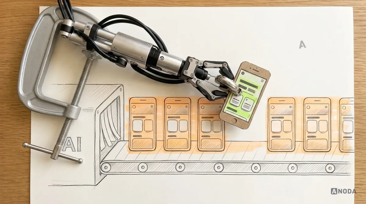
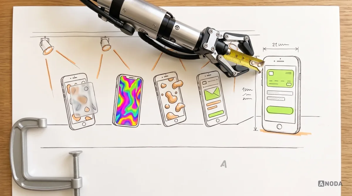
UI design trends in 2026 are shaped by one fact: an average-looking interface is now almost free. AI tools generate clean layouts, tidy cards, soft gradients and plausible illustrations in seconds. When everyone can produce the same competent screen, looking modern stops being an advantage. What still sets a product apart is the part AI doesn’t decide for you.
That changes how to read any trend list, including this one. A trend is not useful because it’s new. It’s useful if it makes the interface easier to understand, easier to trust, easier to use for more people, or easier to remember. If it adds latency, visual noise or cognitive load without doing any of that, it’s already dated, whatever year it appeared.
This guide sorts the UI design trends shaping digital products right now into three groups: useful, risky and already dated. For each, it explains why, and how to test it in your own product. If you’re looking for product-level patterns such as AI features, passkeys or personalisation, our guide to app design trends covers those. This one stays on the interface itself.
Why 2026 UI trends look different
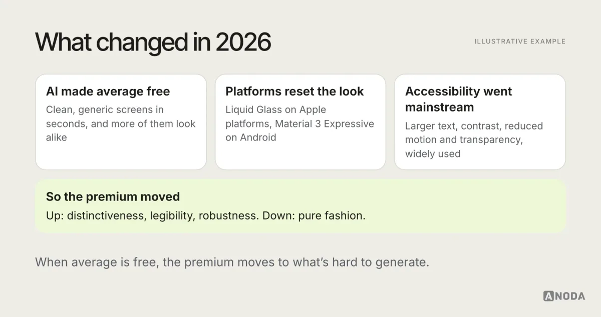
Three shifts explain most of what’s happening in interface design this year.
AI made generic execution abundant. Tools can now generate full screens, component sets, icons and illustrations from a sentence. The results are often competent and almost always similar, because they are trained on what already exists. The average interface got better, and much more alike.
The platforms reset their visual language. In 2025 Apple introduced Liquid Glass across its operating systems, and Google introduced Material 3 Expressive for Android. Millions of people now see translucent, layered and more animated interfaces every day, and their expectations are shifting with them.
Accessibility settings went mainstream. Larger text, higher contrast, reduced motion and reduced transparency are easier to find and more widely used. Any visual trend now meets a large audience that has changed the defaults it was designed for.
Put together, those shifts reward interfaces that are distinctive, legible and robust, and punish the ones that are merely fashionable.
What held up from 2024
This page used to be a 2024 trend list, and it’s worth being honest about what happened to those trends. The ones that held up changed how interfaces work: dark mode done properly, accessible type scales, clearer motion, design systems built on tokens, and modular layouts on marketing pages where they suit the content. The ones that faded were surface effects: heavy glassmorphism, neumorphic controls, gradient-blob branding and decorative 3D on product screens.
The pattern is the same every year. Trends that solve an interface problem become part of the baseline. Trends that only solve “looking current” get replaced by the next thing that looks current. It’s a useful lens for reading the 2026 list below: ask which of these you’d still want in two years.
How to judge a UI trend: useful, risky or dated
Before any trend goes into a product, put it through five checks. They are simple enough to run in a design review.
- Comprehension. Does it make hierarchy, status or the next action clearer?
- Accessibility. Does it hold up with large text, high contrast, reduced motion, screen readers and bright sunlight?
- Performance. Does it add loading time, battery use or jank on mid-range devices?
- Stability. Does it behave well in every state: loading, empty, error, long content, translations?
- Brand memory. Does it make the product more recognisable, or more like everyone else?
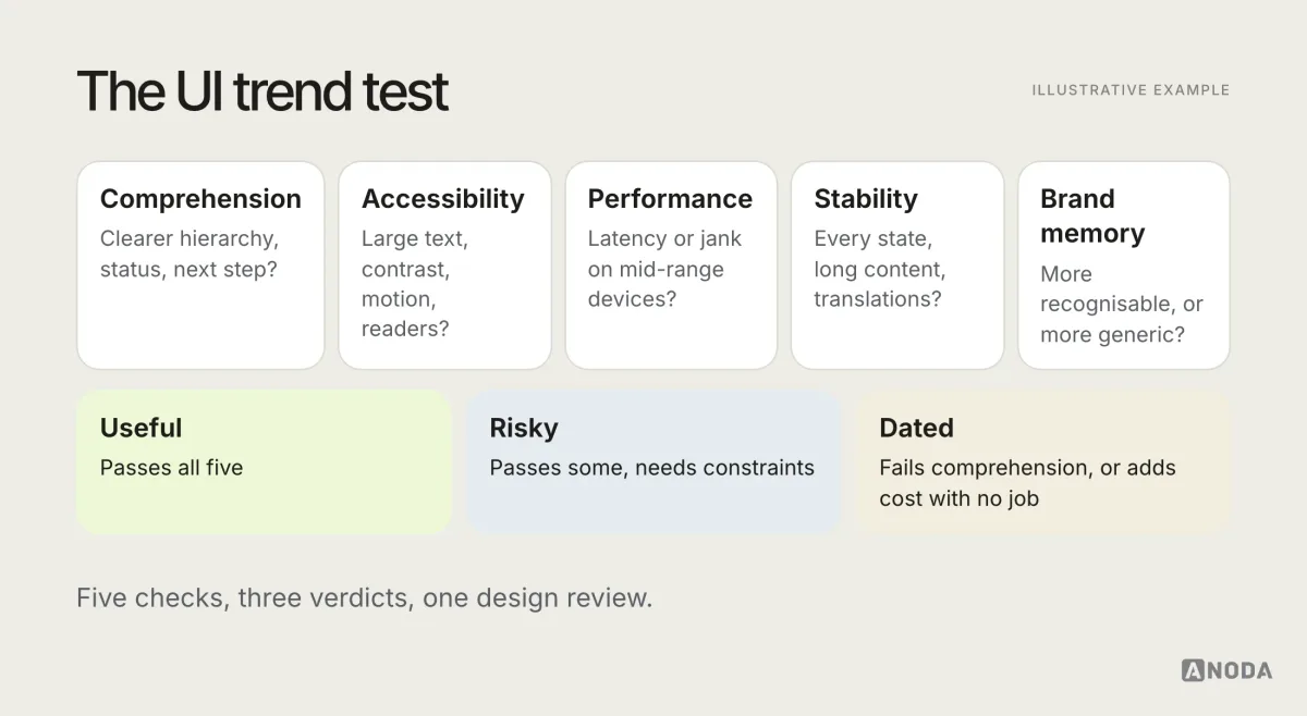
A trend that passes all five is useful. One that passes some but needs strict constraints is risky. One that fails comprehension, or adds cost without a user job, is already dated.
Useful: trends worth adopting
Art direction over templates
This is the biggest shift, and the least visible in screenshot roundups. When anyone can generate a clean interface, the products people remember are the ones with a point of view: a consistent typographic voice, a colour system with intent, an illustration or photography style that belongs to them, a motion character that feels like the brand.
Art direction is not decoration. It’s a set of decisions that make every screen feel like the same product, and make that product recognisable in a crowded category. It works best when it’s written down in the design system: what the brand does, what it never does, and why.
- Why it’s useful: it builds brand memory, which generic generated interfaces can’t.
- How to test it: show five screens from your product and five from competitors with logos removed. Can people tell which are yours?
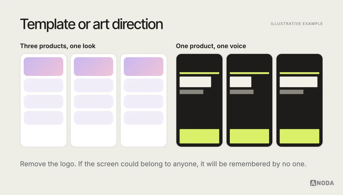
Art direction also gives a team a way to say no. When a new trend arrives, the question isn’t “is this fashionable?” but “does this fit what we’ve decided our product looks and feels like?”. Teams without a written art direction tend to absorb every trend they see, one screen at a time, until the product looks like a scrapbook of the last three years.
Expressive typography that still carries hierarchy
Type has become louder: larger display sizes, variable fonts, tighter headings, more contrast between levels. Done well, it makes hierarchy obvious at a glance and gives the brand a voice without extra decoration.
The risk is expression without structure: headings so large that content falls below the fold, too many weights competing, display fonts used for body text. Expressive type is useful when it clarifies what’s most important, and dated when it’s just big.
- Why it’s useful: clear hierarchy with less visual clutter.
- How to test it: check the largest accessibility text size and the longest translation. Does the hierarchy survive?
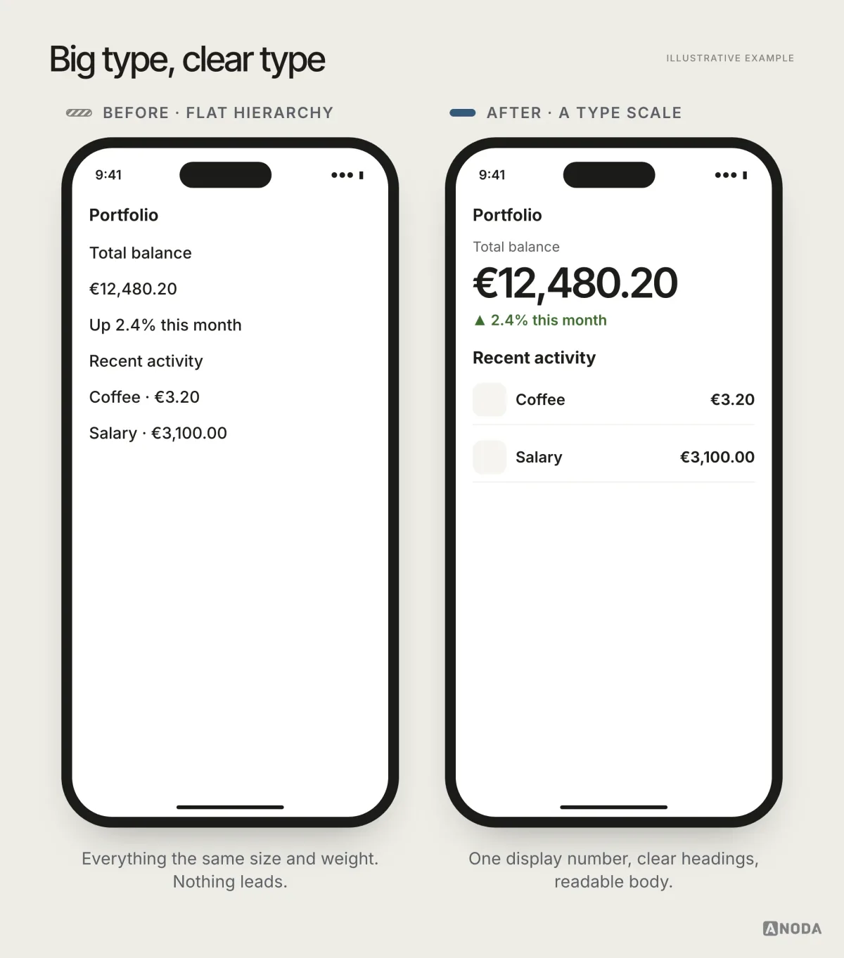
A good type system for 2026 usually has fewer styles than teams expect: a display size or two for moments that deserve emphasis, a small set of heading levels, one comfortable body size, and a caption size that still passes legibility. Variable fonts make it easier to fine-tune weight and width without loading many files, which helps performance as well as expression.
Platform materials, applied with legibility first
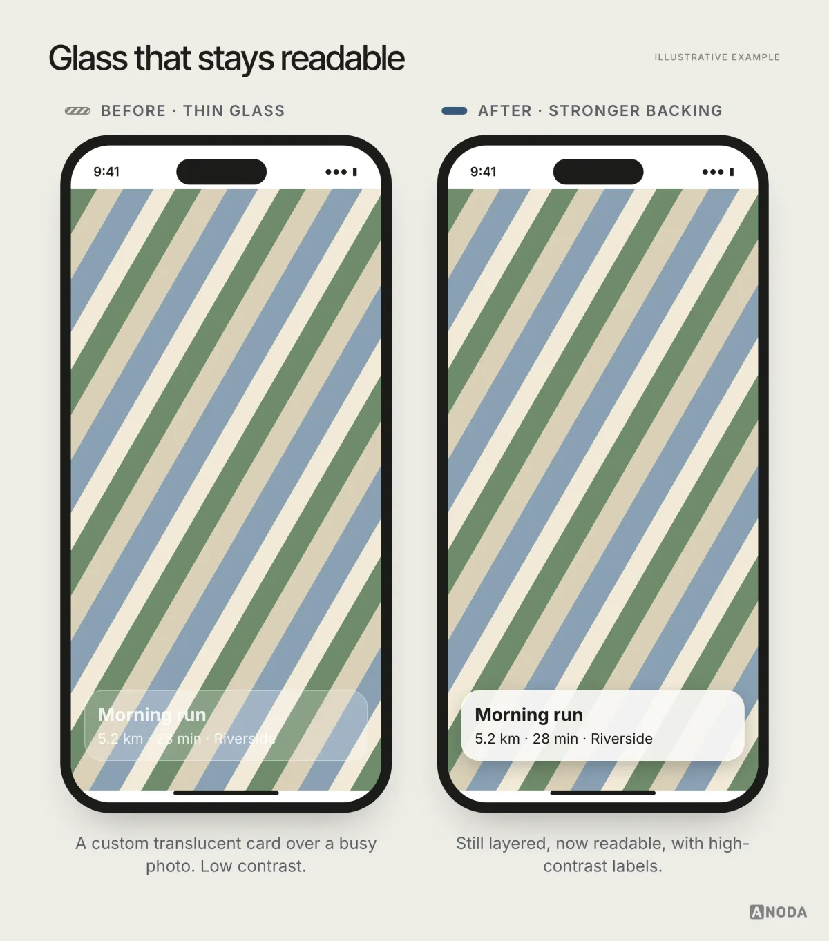
Apple’s Liquid Glass and Google’s Material 3 Expressive brought new materials, shapes and motion to their platform experiences in 2025. Adoption depends on the platform, supported components and implementation; a custom interface needs its own design decisions.
Use the supported platform components as the starting point, then design legibility over your actual content, including reduced transparency and motion preferences. Recreating translucent effects on custom components over busy images can make text hard to read. Clear hierarchy and accessible contrast make the material work for your product.
- Why it’s useful: the product feels native and current, and gets platform improvements for free.
- How to test it: check critical screens over real content, in light and dark, with transparency reduced and increased contrast on.
Meaningful motion
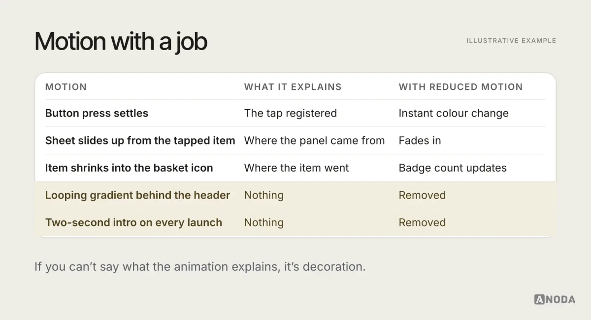
Both major platforms moved towards richer, more physical motion: elements that respond to drag, springy transitions, feedback that feels tactile. Motion is useful when it explains something: where an element came from, what changed, that an action worked.
The rule of thumb: frequent actions get short, quiet motion; rare, important moments can be more expressive. And everything must respect the reduced motion setting, with nothing essential depending on animation.
- Why it’s useful: it makes state changes understandable and interfaces feel responsive.
- How to test it: use the product with reduced motion on, and time how long users wait for animations on frequent actions.
Stable states, designed on purpose
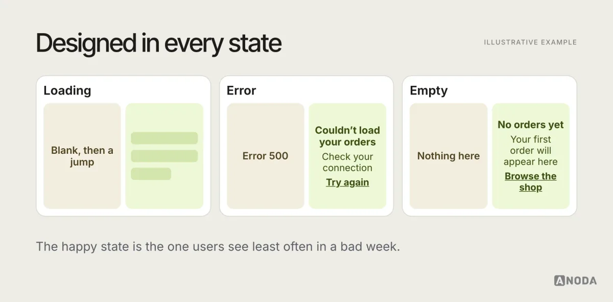
A quiet but important trend: interfaces that look designed in every state, not just the happy one. Skeleton screens that match the final layout, empty states that tell people what to do, errors in plain language, content that doesn’t jump when it loads.
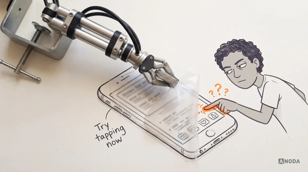
This matters more as interfaces get more dynamic and AI features introduce new waiting and failure states. A beautiful default screen with a blank white loading state and a generic error is a demo, not a product.
- Why it’s useful: trust. Interfaces that behave predictably feel reliable.
- How to test it: walk every screen in its loading, empty, error, offline and long-content states.
Adaptive colour and theming
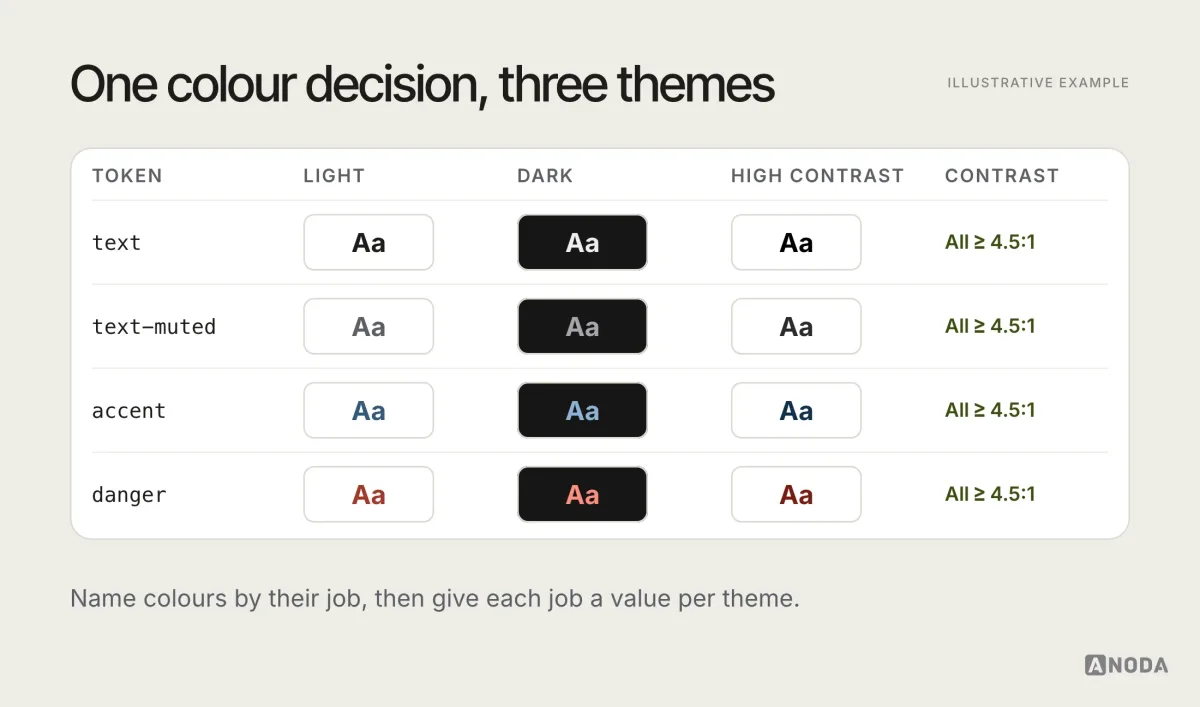
Dark mode is standard, and platforms increasingly support dynamic colour and user-chosen themes. The useful trend is colour systems built on tokens, so light, dark, high-contrast and brand themes all come from one set of decisions, with contrast checked in each.
The risk is theming as an afterthought: brand colours that fail contrast in dark mode, images that glow, and forgotten white screens deep in the product.
- Why it’s useful: comfort, accessibility, and a brand that holds up in every mode.
- How to test it: switch themes in the middle of each critical flow, and check contrast for every text and icon colour in each theme.
A practical detail that separates good theming from average: dark mode is not an inverted light mode. Surfaces need several levels of darkness to show depth, pure black is often too harsh for long reading, brand colours usually need lighter variants to keep contrast, and shadows mostly stop working, so elevation has to come from surface colour instead. All of that belongs in tokens, decided once.
Accessibility as part of the visual system
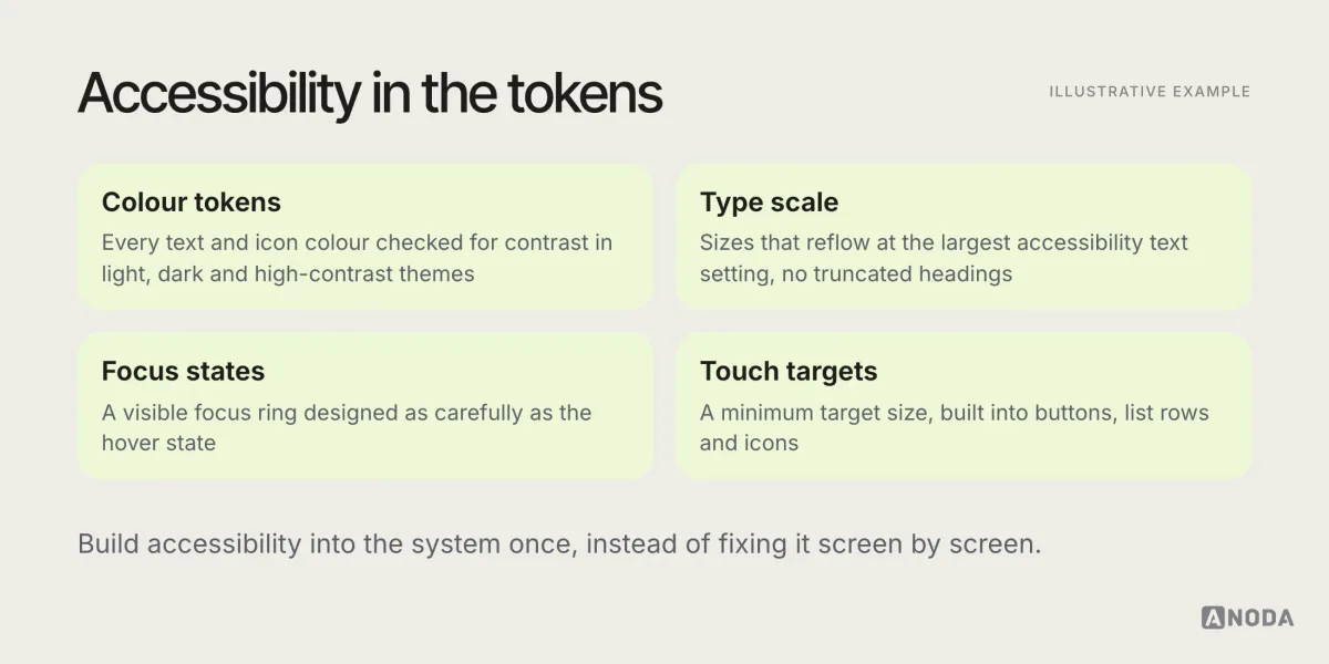
Accessibility used to appear on trend lists as an extra. In 2026 it is part of the visual system itself: contrast built into the colour tokens, type scales that reflow at large sizes, focus states designed as carefully as hover states, touch targets sized for real fingers.
- Why it’s useful: more people can use the product, and the interface is usually clearer for everyone.
- How to test it: our accessibility guide covers a full checklist. At minimum, test critical flows with the largest text, a screen reader and increased contrast.
Interface writing as part of the design
A trend that doesn’t show up in screenshots: product teams treating interface copy as design material, not filler. Short, specific labels. Errors that say what happened and what to do. Empty states that invite the next action. A consistent voice across the product.
It matters more now because AI-generated interfaces often come with generic copy: “Get started”, “Something went wrong”, “Explore features”. Replacing that with language that fits your users and your product is one of the cheapest ways to make an interface feel considered and recognisably yours.
- Why it’s useful: clearer actions, fewer support questions, a stronger brand voice.
- How to test it: read every button, error and empty state aloud. Would a user know exactly what happens next?
Labelled icons and honest affordances
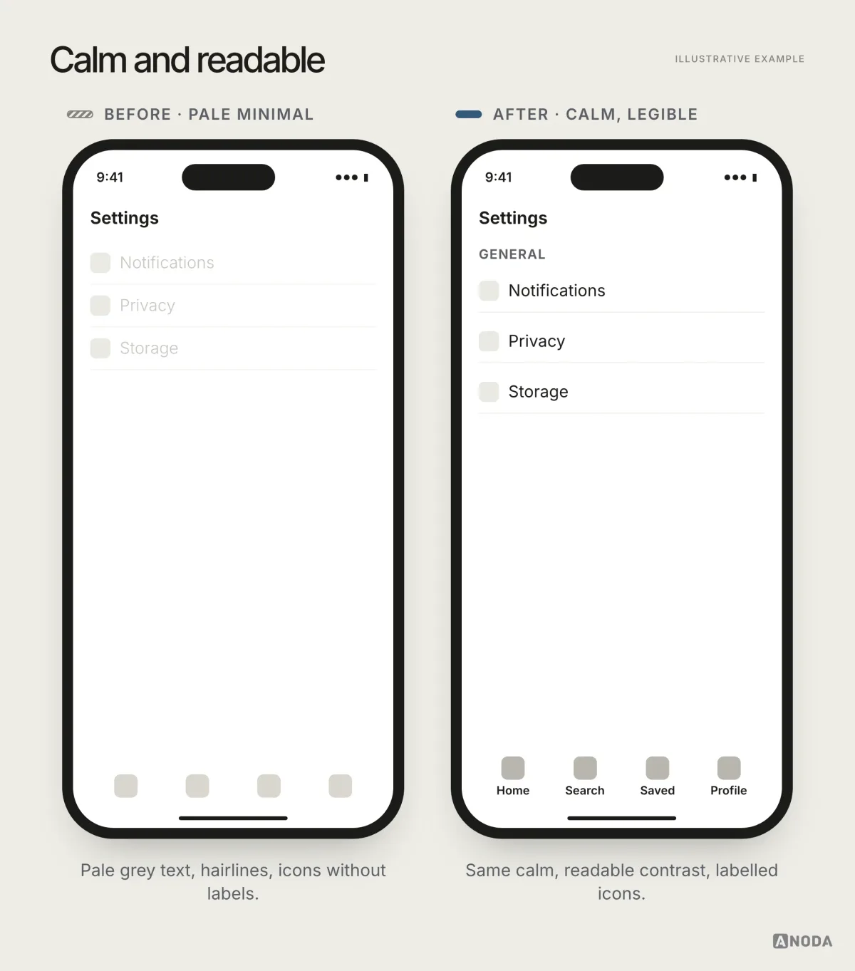
Icon-only interfaces are fashionable and frequently confusing. Beyond a handful of universal symbols, such as search, close and back, most icons need a label to be understood reliably, especially by new users and in products with many features. The trend worth following is the quiet return of labels in navigation and toolbars, and of controls that look like controls.
- Why it’s useful: fewer mis-taps and less guessing, particularly for occasional users.
- How to test it: show the icons without labels to people who haven’t used the product and ask what each does.
Microinteractions and haptics
Small responses to user actions, such as a button that depresses, a toggle that settles, a light haptic tap when something is saved, make an interface feel solid. The platforms have made richer haptics and responsive feedback easier to use, and users notice when an app feels unresponsive by comparison.
The same rule as motion applies: feedback should confirm something, be quick, and never be the only signal. A haptic tap without a visible change fails for people who have haptics off.
- Why it’s useful: confidence that an action worked, without extra screens or messages.
- How to test it: turn haptics and sound off. Is every action still clearly confirmed?
Clear data visualisation
More products show data: dashboards, finance, health, analytics inside every SaaS tool. The useful trend is restraint: fewer chart types, clear labels, colour used to mean something, and the key number stated in words next to the chart.
- Why it’s useful: people make decisions from these screens.
- How to test it: ask someone what the chart says in five seconds. If they can’t, the chart is decoration.
Design systems built on tokens and variables
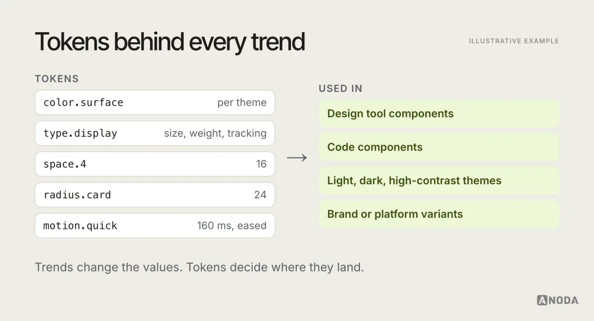
Behind the visible trends is a structural one: design systems built on tokens and variables that exist in both design tools and code. Colours, type, spacing, radius and motion are named by their job and resolved per theme, platform or brand.
It’s not glamorous, but it’s what makes every other useful trend sustainable. Themes, dark mode, accessibility contrast, platform materials and even AI-generated screens become manageable when they draw from one governed set of decisions. Without it, every trend is implemented differently on every screen.
- Why it’s useful: consistency, faster change and fewer visual bugs.
- How to test it: change one colour or spacing token and see how many places update correctly, and how many don’t.
Risky: trends that need constraints
AI-generated visual sameness
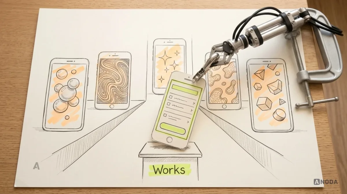
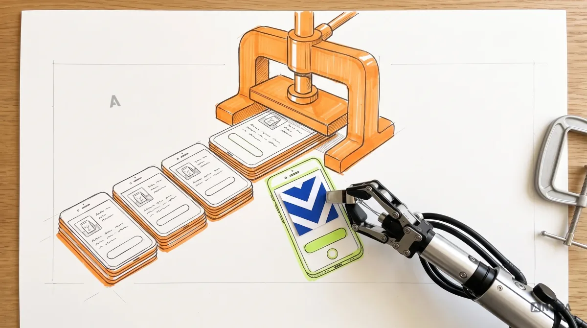
Generated layouts, icons and illustrations are fast and often good enough for a draft. The risk is shipping them unedited. Products start to share the same soft gradients, the same rounded cards, the same slightly uncanny illustrations, and brand memory quietly disappears.
Use generation for exploration and drafts. Then apply art direction, cut what doesn’t belong, and make sure the result looks like your product, not like the model’s average.
A safer way to use these trends is to confine them. Give heavy visuals a clear home, such as a landing page hero, an onboarding moment or a celebration after a milestone, and keep the everyday task screens fast and plain. Load effects after the content, not before it, and make sure the page works completely without them.
Heavy 3D and effects on product screens
3D objects, WebGL scenes and elaborate effects can work on marketing pages and in onboarding moments. On screens people use every day, they cost loading time, battery and attention, and they often fight the content for focus.
Keep heavy visuals for moments that deserve them, measure their performance on mid-range devices, and always provide a fast, lightweight path to the task.
Bento grids everywhere
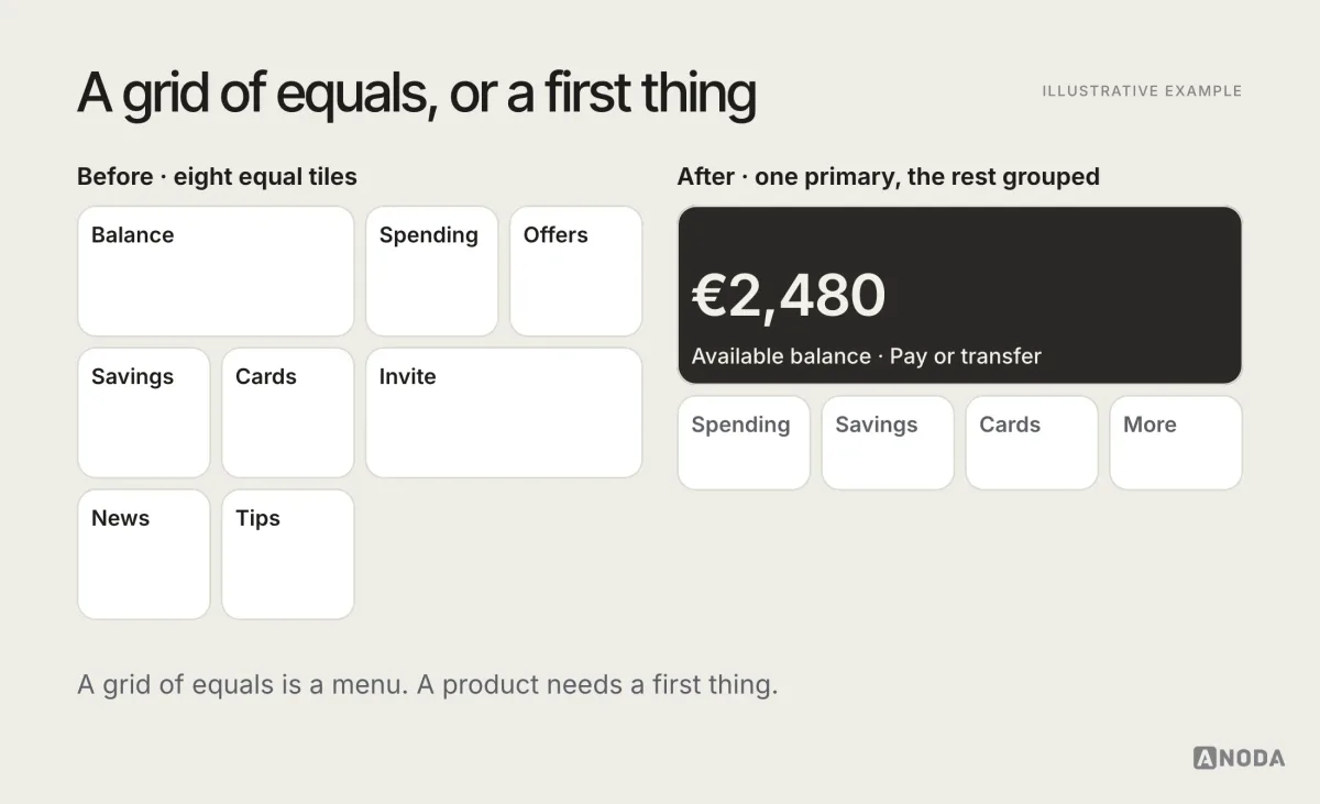
Modular “bento” layouts, where content sits in a grid of rounded tiles of different sizes, became a signature of product marketing pages and are spreading into dashboards and home screens. On a landing page they can present several ideas at once. In a product, they often turn into a mosaic where every tile has the same visual weight and nothing tells the user what matters most.
Use modular layouts when the tiles are genuinely parallel, such as a set of features or widgets the user arranges. Avoid them when there is a clear primary task or number, which deserves more space and emphasis than a tile.
Low-contrast minimalism
Pale grey text on white, thin weights, icons without labels: it looks refined in a presentation and fails in daylight, for older users, and for anyone skimming. Minimalism is useful when it removes clutter, risky when it removes legibility.
The same goes for decorative effects in general: grain textures, animated gradients, glowing borders. A little can add character to a brand moment. Spread across every card and button, they add visual noise, cost performance and make the interface harder to scan. Treat them like a strong spice: a pinch in the right dish, never in every dish.
Scroll-driven and kinetic everything
Scroll-triggered animations, kinetic type and parallax can make a story page memorable. In a product interface, they slow people down, break scroll expectations and can cause discomfort for people sensitive to motion. Use them sparingly, never on task screens, and always with a reduced-motion alternative.
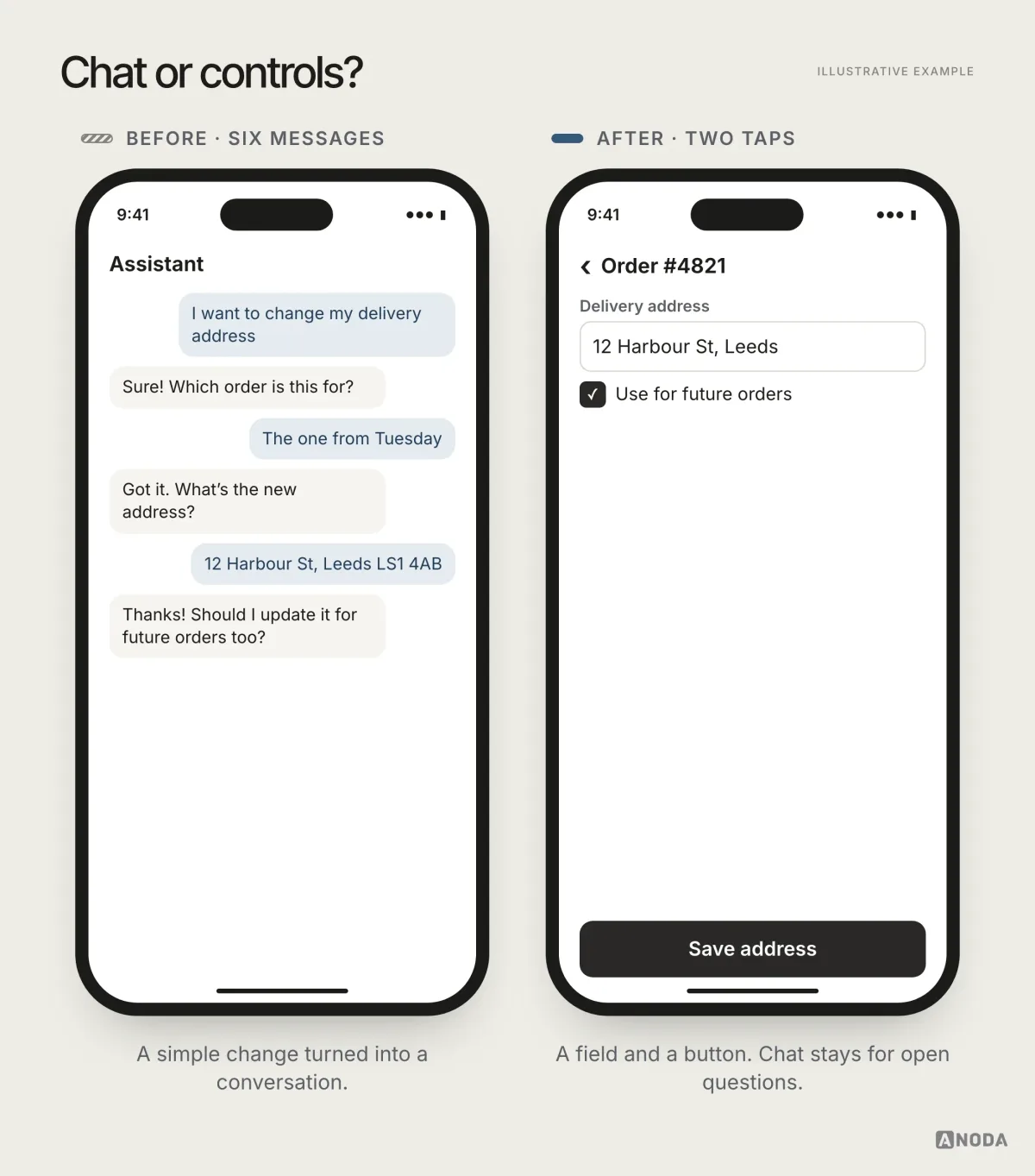
Chat as the whole interface
Conversational interfaces are useful for some tasks: open-ended questions, drafting, support. As a replacement for buttons, forms and lists, they usually make simple tasks slower and harder to scan. The risky trend is turning every feature into a chat window because AI made it easy.
Already dated: trends to retire
Some styles still appear in trend lists and generated templates, but they have already aged in products people use daily:
- Neumorphism. Soft, extruded shapes with low contrast. Hard to read, hard to tell what’s clickable.
- Glass for its own sake. Frosted panels everywhere, now that the platforms do it properly and with accessibility options.
- Gradient blobs as the brand. Recognisable as a trend, not as a company.
- Sparkle icons on everything AI. The sparkle stopped meaning anything when every product used it.
- Portfolio dashboards. Beautiful charts with fake data that fall apart with real numbers and long labels.
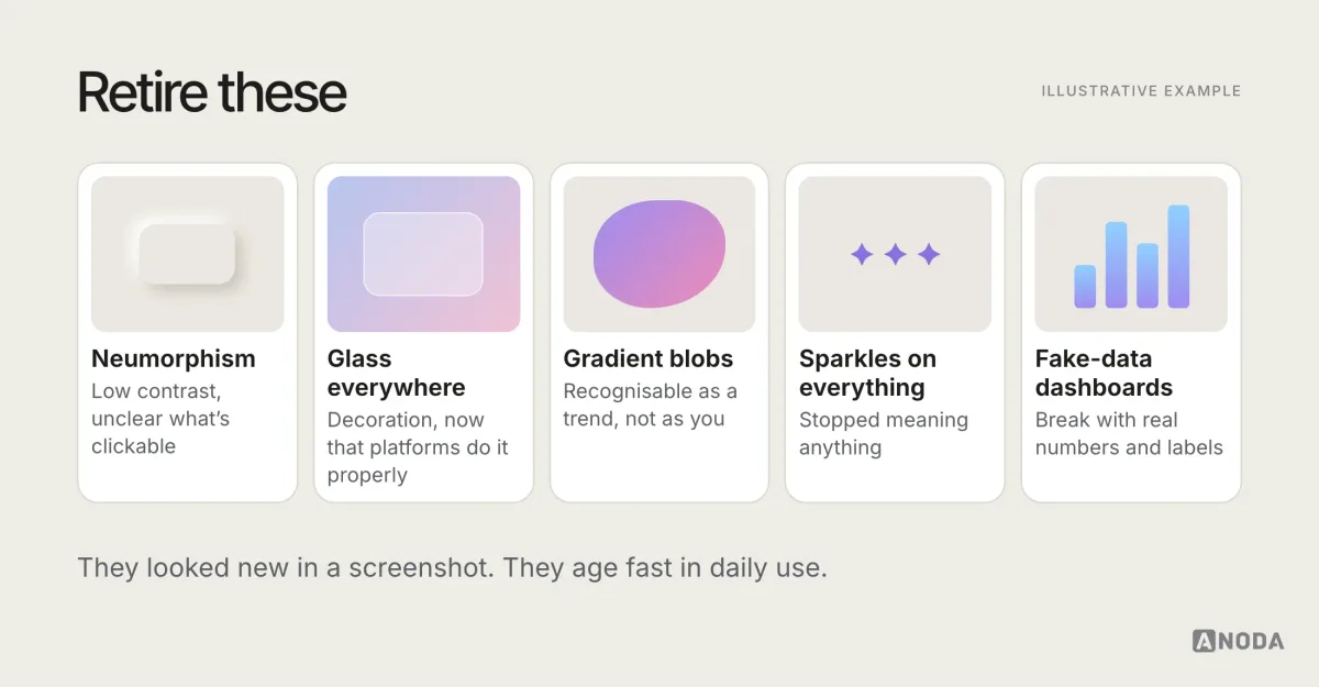
None of these is forbidden. Each can work in a specific, considered context. As defaults, they make a product look like a template from a particular year, which is the opposite of what a trend was supposed to do.
Who should own trend decisions
On most teams, the visual direction belongs to design, with a design lead or brand owner as the final call on art direction. Engineering has a veto on performance and feasibility. Product decides whether a change is worth the effort now. Accessibility is everyone’s responsibility, and shouldn’t be traded away for style. Writing this down avoids the familiar situation where a trend enters the product because the loudest person in the review liked it.
Trends by surface
The same trend behaves differently depending on where it lands. A rough guide:
Marketing sites. The place for expressive type, art direction, bolder layouts and, used carefully, 3D and scroll-driven storytelling. People visit once or twice, and memorability matters. Performance still counts, especially on mobile.
Mobile apps. Platform conventions and materials matter most, because users compare your app with the system every day. Motion, haptics and theming should feel native. Heavy effects cost battery and patience.
Web applications and SaaS. Density, hierarchy and stable states matter more than novelty. People spend hours in these screens. Trends that add visual noise or slow interaction wear thin quickly. Tokens and theming pay off most here.
Dashboards and data products. Restraint wins. Clear charts, labelled numbers, colour with meaning, and layouts that make the most important figure obvious. Decorative trends mostly get in the way.
AI features inside products. Clear states for thinking, streaming, partial results and failure. Honest labelling of generated content. Controls to edit, retry and undo. Visual flourishes around AI, such as glows and sparkles, add little and date quickly.
A worked example: refreshing one screen
Here is how the checks work on a single illustrative screen: the home screen of a personal finance app that the team feels “looks dated”.
The request is to make it more modern, with glass cards, a 3D illustration and a bento grid of widgets.
The five checks tell a different story. Comprehension: the most important number, the available balance, currently competes with six promotional tiles. Accessibility: several labels fail contrast in dark mode. Performance: the screen already loads slowly on older phones. Stability: the loading state is a blank screen that jumps when data arrives. Brand memory: the illustrations are stock and look like every other finance app.
The decisions follow from that. The balance gets a clear typographic lead, with expressive type used for the number. Secondary tiles are grouped and reduced. The platform’s standard materials are adopted for the navigation bar, with a solid backing behind the balance. A skeleton that matches the final layout replaces the blank loading state. The 3D illustration is dropped from the home screen and moved to onboarding. The colour tokens are fixed so every theme passes contrast. A distinct illustration style is commissioned to replace the stock images.
The result looks more current than the glass-and-bento version would have, and it’s faster, clearer and recognisably the product’s own. That’s what a trend review should produce.
Brand memory in an AI-generated world
When generation makes average screens abundant, brand memory becomes the scarce resource. It comes from a small number of consistent choices repeated across the whole product:
- A typographic voice: one or two families, used with a clear scale.
- A colour system with meaning: colours that signal something, not just decorate.
- An image style: photography, illustration or iconography that belongs to you.
- A motion character: how things move, consistently.
- A writing voice: how the interface talks, in labels, errors and empty states.
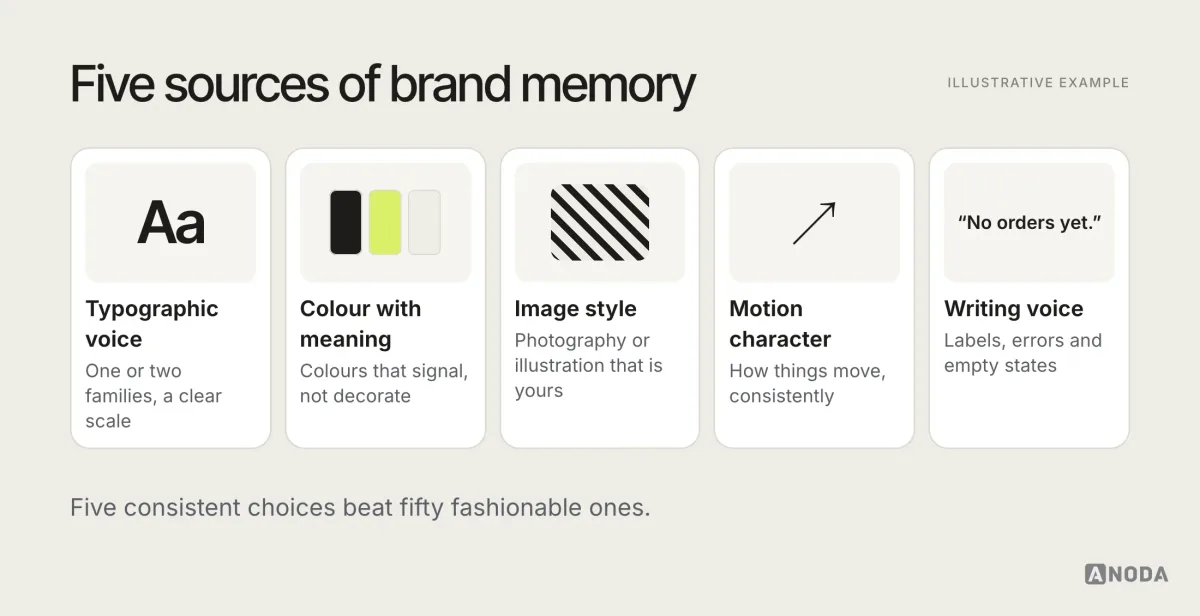
A good design system turns these into rules the whole team, and the AI tools the team uses, can follow. Without that system, every new screen drifts towards the generated average.
Why ANODA can make your product distinctive
In Glimix, ANODA brought the diner and restaurant-owner experiences together with a visual identity, product UI, UI kit and responsive landing-page design. The brand was expressed through colour, typography, icons and imagery across the places where customers discovered and used the product.
That is the difference between a fashionable screen and a product people recognise. We turn your brand into interface rules, settle the loading, empty and error states, and give engineering components it can reuse. You get a recognisable experience with a clear path to implementation instead of another collection of one-off mockups.
Signs your UI is dated for the wrong reasons
Sometimes an interface feels dated, and the cause isn’t style at all. Before reaching for this year’s look, check for these:
- Inconsistency. Five button styles, three greys, spacing that changes from screen to screen. Nothing ages an interface faster than drift.
- Old components. Controls that don’t match the platform anymore, such as old pickers, sheets or navigation patterns.
- Unfinished states. Blank loading, generic errors, empty screens with no guidance.
- Poor type hierarchy. Everything the same size, or too many sizes with no system.
- Slow interaction. Laggy scrolling and delayed feedback feel old regardless of the visual style.
Fixing these usually does more for the “modern” feeling than any visual trend, and it lasts longer, because it isn’t a trend.
Audit check
Take ten screens from your product. Remove the logo. Show them to someone outside the team next to ten competitor screens.
Failure evidence
Nobody can tell which are yours, text fails contrast in one of the themes, loading and error states look unfinished, animations delay frequent actions, and trend effects appear on screens where they add nothing.
Correction pattern
Define art direction in the design system, put every trend through the five checks, design every state, build accessibility into the tokens and retire decorative effects that don’t have a job.
UI/UX design
Look like your product, not like this year.
We interpret current UI trends for your product and build a distinct, governed design system, so the interface stays recognisable, accessible and consistent as the team grows.
What AI changes for designers’ work
AI hasn’t only changed what interfaces look like. It has changed how they are made, and that affects which trends spread and how fast.
- Exploration got cheaper. Designers can see dozens of layout and style variations in minutes. That’s useful early on, as long as someone chooses deliberately.
- Convergence got faster. When many teams generate from similar tools and prompts, visual sameness spreads quicker than any trend list could spread it.
- Systems became more important. Generated screens are only as consistent as the design system they’re asked to follow. Teams with strong tokens and components get useful output. Teams without them get a new style on every screen.
- Judgment became the bottleneck. Deciding which variation is right for this product, this audience and this brand is now the scarce part of the work.
The practical consequence for trends: anything that can be generated with a short prompt will be everywhere within months. Anything that depends on a product-specific system, a considered art direction or a deep understanding of users will stay distinctive much longer.
For designers, this shifts the job towards the parts that were always the hardest: understanding the problem, setting the constraints, and making the choices that give a product its character. Tools can propose. Someone still has to decide, and to explain why.
Presenting trend decisions to stakeholders
UI trend conversations often start with a screenshot of a competitor or a platform keynote. A few ways to keep them productive:
- Separate taste from evidence. “I like it” is valid input for art direction. It isn’t evidence that users will complete tasks faster.
- Show the five checks. A simple table of comprehension, accessibility, performance, stability and brand memory for each proposed trend turns a debate into a decision.
- Prototype, don’t describe. A quick prototype with real content ends most arguments about glass, motion or density faster than any slide.
- Say what you’re retiring. Adopting a new style is also a decision to stop using an old one. Plan the migration, or the product ends up with both.
How to adopt a UI trend without chasing fashion
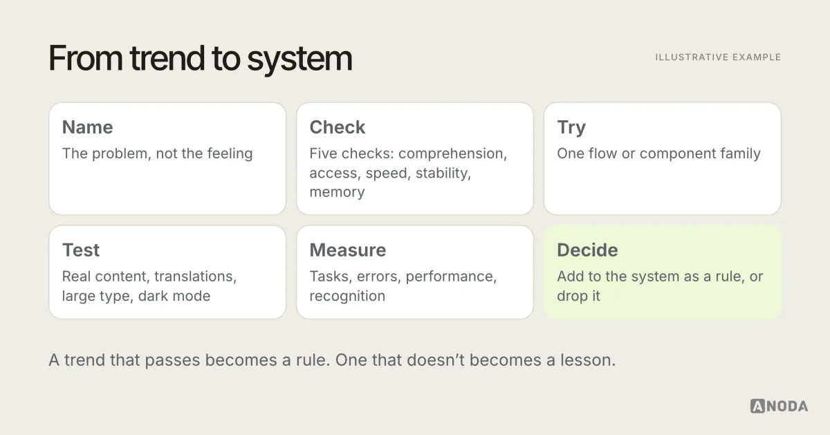
- Name the problem. “Our hierarchy is weak on dense screens” is a problem. “We look dated” needs translating into one first.
- Run the five checks. Comprehension, accessibility, performance, stability, brand memory.
- Try it on one area. A single flow or component family, not the whole product.
- Test with real content and settings. Long text, translations, large type, dark mode, reduced motion.
- Measure. Task completion, errors, performance, and whether people recognise the product.
- Add it to the system, or drop it. Anything that stays becomes a documented rule. Anything that doesn’t pass gets retired.
How often to revisit trends
Once or twice a year is usually enough for a trend review, plus whenever the platforms ship a major design update. More often than that, and the team spends its time chasing surface changes. Less often, and the product slowly drifts out of step with the operating systems around it. Keep the review short: what changed on the platforms, what users and support are saying, what the five checks say about each candidate, and what gets added to or retired from the design system.
The mistakes teams make with UI trends
- Redesigning to look new without a problem to solve.
- Copying a platform’s showcase without its content, testing or accessibility work.
- Shipping generated visuals unedited, and slowly losing the brand.
- Testing trends on perfect content, with short names, English text and default settings.
- Adding effects to task screens that belong, at most, on a landing page.
- Following every trend at once, until nothing in the interface stands out.
Separate durable shifts from temporary styling, verify every current example against your own product and users, and adopt only the patterns that make the interface easier to understand and the brand easier to remember. Everything else will look dated soon enough without your help. For more on designing products that last, browse the ANODA UX blog.
Make the refresh work beyond the first screenshot
Show ANODA the screens that feel generic or inconsistent. We will connect a distinctive visual direction with readable task flows, complete states and a UI system your team can build.
Frequently asked questions
What are the main UI design trends in 2026?
The useful ones are expressive typography that still carries hierarchy, distinct art direction, platform materials such as Apple's Liquid Glass and Google's Material 3 Expressive used with legibility in mind, meaningful motion, stable loading and error states, adaptive colour and theming, and accessibility built into the visual system. The risky ones add latency or cognitive load, and the dated ones are purely decorative.
Should product teams follow UI design trends?
Only where a trend makes the interface easier to understand or the brand easier to remember. Test each one against legibility, accessibility, performance and the product's audience. A trend that adds visual noise or slows the interface without a user job is already dated, however new it is.
How is AI changing UI design?
AI makes generic visual execution cheap and fast: layouts, illustrations and whole screens can be generated in seconds. That makes average-looking interfaces abundant. Value moves to what AI doesn't decide for you: art direction, clear hierarchy, accessible contrast, stable states, meaningful motion and the constraints of a well-governed design system.
Which UI trends are already dated?
Neumorphism, glass effects used everywhere for decoration, gradient blobs as the entire brand, sparkle icons attached to every AI feature, and portfolio-style dashboards filled with fake data. They look current in a screenshot and age quickly in a product people use every day.
Written by