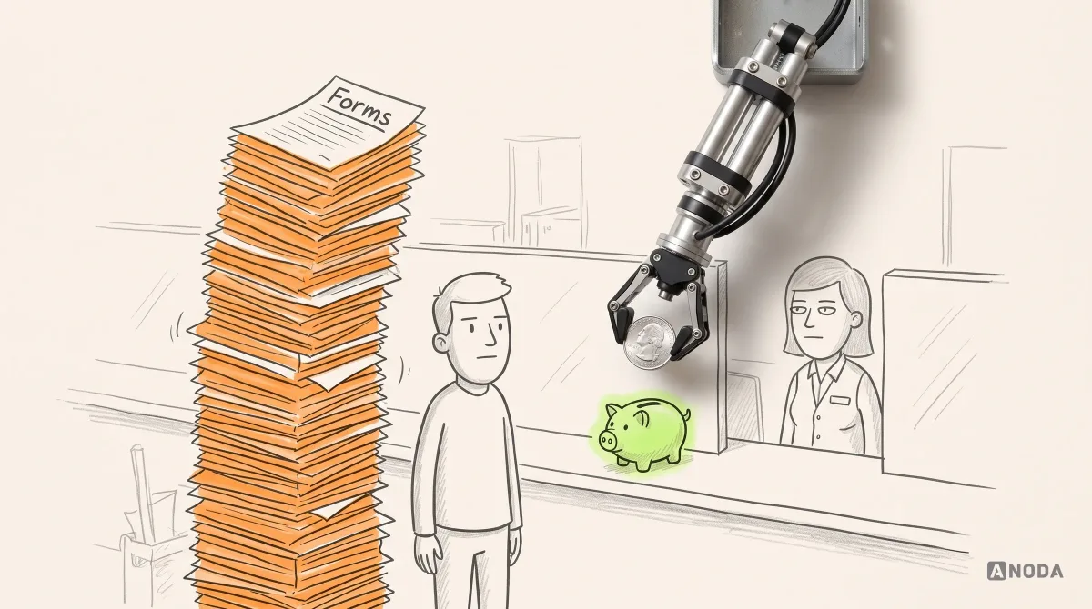
In short
App store ranking is the visible result of your product, not a keyword trick. The store has to see you as relevant, people have to choose you, and the app has to keep them. Here is how to read your reviews like a diagnosis, fix crashes and support, make the icon and screenshots honest, ask for ratings without breaking the rules, and pick what to fix when the budget is two weeks.
In this article
- How app store ranking actually works
- Start with what your users are actually complaining about
- Price complaints: resistance you accept, value you failed to show
- Crashes are ranking problems, not bug-tracker trivia
- Make it easy to reach a human
- The icon has a few pixels to explain your app
- Screenshots are a promise, so show the app you ship
- Relevance: metadata that describes the app, not the dictionary
- Match the listing to where people come from
- Measure install conversion before blaming the algorithm
- The first minute after install
- Subscription value and honest cancellations
- Ask for ratings at the right moment, and never rig the prompt
- Measure which layer needs the next improvement
- Why ANODA connects the store promise to the product
- Decide what to fix first
- When the budget is two weeks, not two quarters
- The decision rule
To improve your App Store ranking, you have to win three things at once: the store has to see your listing as relevant to the right searches, the people who see it have to choose to install, and the app they install has to be good enough that they keep it, rate it and tell nobody to avoid it. Most advice covers the first one. Keywords, subtitle, category. It helps. It is also the cheapest part of the problem, which is exactly why everybody starts there.
We have been designing and fixing mobile products for 15 years, and the pattern is always the same. A team sees a flat download curve, opens an ASO checklist, rewrites the subtitle and waits. Nothing happens, because the listing was never the bottleneck. The app crashes on older phones, the paywall arrives before anyone understands what they are paying for, and the reviews say so in capital letters. Nobody on the team reads them.
That is money leaking at both ends. You pay to bring people to the store page, through ads, content or sheer effort, and then lose them to a promise the product doesn’t keep. Every uninstall is a user you acquired and failed to keep. Every one-star review is a sign on the shop door for the next thousand visitors.
This guide is the order we use to fix app store ranking in real products: what Apple and Google actually say they measure, how to read your reviews like a diagnosis, how to make the listing honest and clear, how to fix the first minute after install, when and how to ask for ratings, and what to do when the budget is two weeks, not two quarters.
How app store ranking actually works
Nobody outside Apple and Google knows the exact formula, and anybody who sells you one is guessing. What the stores do publish is enough to plan with.
Apple says App Store search results depend on text relevance, meaning matches in your app’s name, subtitle, keywords field and primary category, and on user behaviour, including downloads, ratings and reviews. Apple also says both the primary and optional secondary category are indexed. Promotional text, by Apple’s own statement, does not affect search ranking.
Google Play describes its ranking as a mix of relevance to what the user is looking for, app quality, editorial curation and personalisation. Quality includes the listing itself, but also how the app behaves: stability, performance, responsiveness. Google is unusually direct here: if an app exceeds its Android vitals bad-behaviour thresholds for crashes or freezes, Play may reduce the app’s visibility and show users a warning on the store listing.

Think of it as a school report. The grade is not only the exam. Attendance counts, behaviour counts, and the teacher remembers who handed in homework that was copied from the internet. You can revise brilliantly for the exam, meaning the metadata, and still get a bad report because you keep setting the chemistry lab on fire, meaning the crashes.
In practice, three layers stack on top of each other:
- Found. The store believes your app is relevant to a search or a category. This is metadata, category, language and market.
- Chosen. People who see the listing decide to install. This is the icon, the first screenshots, the rating, the promise.
- Kept. People who installed get value, stay, and do not uninstall or leave a furious review. This is the product.

The third layer feeds the first two. Ratings and downloads are outputs of the product. That is why a listing makeover without product work behaves like a sugar rush: a short spike, then back where you started, sometimes lower, because more people installed the thing that disappoints.
Start with what your users are actually complaining about
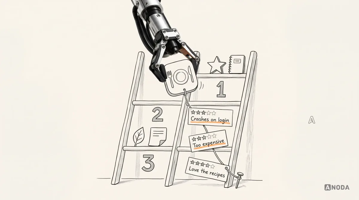
Before keywords, before a redesign, before anyone opens Figma, read your reviews. All of them, for the last few months. Your users have already written you a free audit. Most teams treat it like junk mail.
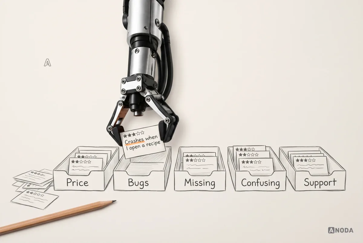
Reviews are not reputation debris to hide. They are a live research stream, and they tell you which of your problems is the real one. The trick is to stop reading them as “good” and “bad” and start sorting them by cause. Five buckets cover almost everything:
- Price and value. “Too expensive.” “Why is everything behind a paywall?” Sometimes unavoidable, sometimes a sign you never showed the value. More on that below.
- Bugs and crashes. “Crashes when I open a recipe.” “Won’t load since the update.” These are engineering tickets, not UX debates.
- Missing capability. “Wish it could export to PDF.” “No dark mode.” A product backlog signal, weighed by how often it comes up.
- Confusing UX. “Can’t find where to change my plan.” “Took me ten minutes to figure out how to add something.” Design work.
- Support. “Emailed three times, nobody answered.” “Charged twice, no reply.” The fastest ratings you will ever lose.

Once reviews are sorted, the diagnosis writes itself. If half the one-star reviews are crashes, no subtitle rewrite will help. If most complaints are about price, the problem is either your pricing or, more often, the moment you ask for money. If people say they cannot find things, you have a design problem the listing cannot solve.
One uncomfortable rule applies. When users say a feature does not work and the team is sure it works, the team is usually wrong. Confidence is not evidence. Somebody should reproduce it on the device and version the reviewer mentioned before anyone replies “works for us”.
That is the first step of a longer sequence. The full order we follow looks like this:

It is deliberately boring. Define which market and searches you care about. Get a baseline of impressions and search terms. Check metadata and category. Check the icon, screenshots and promise. Look at install conversion. Classify reviews. Check crashes and quality. Look at activation, retention, cancellations and uninstalls. Take stock of budget and capacity. Pick the one constraint that limits everything else. Test and monitor. Skipping to the fun part is how teams spend a quarter fixing the wrong thing.
Price complaints: resistance you accept, value you failed to show
In most paid and subscription apps, a big share of negative reviews complain about the price. Some of that you have to live with. Nobody likes paying, and some people will always leave a one-star review because a free trial ended exactly when it said it would.
But price complaints are also a symptom. People pay without much fuss when the need is strong and the value is obvious.
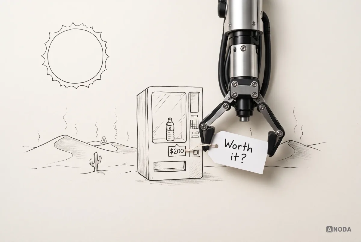
Oksana Kovalchuk, ANODA’s founder, puts it with her usual subtlety:
If you’re dying of thirst in the desert, you’ll calmly pay 200 dollars for a bottle of water. It won’t be a problem, because you have a need. In an app store you have lots of competitors, so you have to do something noticeably better than them, at least in the eyes of this particular user.
 Oksana KovalchukFounder & CEO, ANODA
Your users are rarely in the desert. They have alternatives, often free ones. So the job is to show the value at the moment the need is strongest, before the wallet question arrives. In practice that usually means two changes.
First, move the paywall to after the first win. A meal-planning app that shows “Start your free trial” before the user has planned a single dinner is asking for money for a promise. The same app that lets people plan their first week, then offers to keep planning, is asking for money for something they just experienced.

Second, make the paywall say what it costs and what happens next. “Go Premium! Unlock everything” with the price in small grey text is how you get “scam” in the reviews. A clear list of benefits, the real price, the trial end date, a reminder before it ends and an obvious way to cancel will lose you a few impulse sign-ups. It will also stop the angriest reviews you are currently collecting.

You can ignore “too expensive” feedback right up until those users cancel next month. After that, it is not feedback. It is churn with a written explanation.
There are gentler ways to let people taste the product before paying, too: a genuinely useful free tier, a sample plan, a preview of the premium feature with real data, a trial that starts after the first success instead of at install. None of these is a trick. Each one gives the user a reason to pay that they discovered themselves, which is the only kind of reason that survives the first renewal.
Crashes are ranking problems, not bug-tracker trivia
Here is the review nobody wants: “Opened it, crashed. Opened it again, crashed. Deleted.” Nobody gives an app a fourth chance. It is a kettle that trips the fuse every morning. You don’t file a ticket. You buy another kettle.
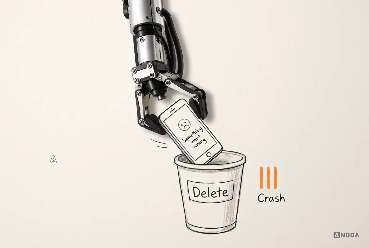
Crashes hurt ranking twice. Directly, on Google Play, where exceeding the Android vitals thresholds can reduce your visibility and add a warning to your listing. Indirectly, everywhere, through uninstalls and one-star reviews. At the time of writing, Google’s bad-behaviour thresholds are a user-perceived crash rate of 1.09% and a user-perceived ANR (app not responding) rate of 0.47% across all devices, with separate per-device limits.

A useful attitude comes from one of our clients, Shipmate, a social network for cruise passengers. The founder treated every crash as an emergency. The team ran crash reporting, and any crash that appeared was chased down until it was gone. At their scale, even a tiny share of affected sessions meant a lot of real people. That is the right instinct: a crash is not a statistic, it is a person who just decided whether to keep your app.
What that looks like as a process:
- Collect crashes automatically. A crash reporting tool, with app version, device and OS attached. If you are not collecting crashes, you are not fixing them. You are hoping.
- Alert the team where it works. Not a weekly email nobody opens. A channel where new crash types and spikes appear the day they happen.
- Turn them into tickets with owners. Version, device, steps if known, how many users affected.
- Close the loop in public. When the fix ships, say so in the release notes, and reply to the reviews that reported it.

UX cannot fix a crash. A beautifully designed error screen on top of a broken feature is still a broken feature. But UX can make sure the user knows what happened, that they did not lose their work, and what to do next. That is often the difference between “crashed, deleted” and “crashed once, fixed quickly, still use it”.
If crashes, responsiveness or release quality are what limit your app, that is engineering work first. Our mobile app development team turns quality findings into a stable implementation plan.
Make it easy to reach a human
Look at how most apps handle a problem. Settings, “Contact us”, which opens an email to noreply@company. Or a support bot that says “An agent will be with you shortly” and never is. It is a letterbox with a bricked-up slot. The customer can write all they like.
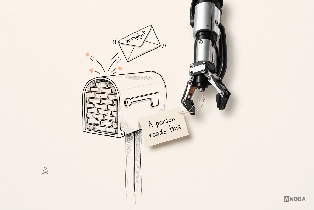
When there is no way to reach you, unhappy users go to the only place that always accepts complaints: your public store page. Every missing support path turns a private problem into a public rating.
The fix is cheap. An in-app “Report a problem” screen with a few categories, an option to attach a screenshot and the app version, and a clear promise about when a person will reply. It takes a couple of days to build properly. It routes bugs to engineering with the details engineers actually need, and it gives angry users somewhere to go that is not the store.

Then connect the reviews to the same process. Store reviews can flow into a team channel automatically. A simple classifier, human or AI, tags each by theme, and each theme goes to its owner: bugs to engineering, account and billing issues to support, feature requests to the product backlog with a running count.

Reply to reviews, especially the low ones. Both stores let developers respond publicly, and Apple suggests prioritising reviews with the lowest ratings or those that mention technical issues. A good reply is specific, human and useful. It admits the problem, says what you did about it, and tells the person what to do if it happens again. A bad reply thanks them for their valuable feedback and points them to an address that doesn’t answer. Even automated support needs a human voice. “Operator 4 will be with you shortly” followed by silence is worse than no chat at all, because it makes a promise and breaks it in the same breath.

At Shipmate, the founder also personally got in touch with people who left fewer than five stars when he had a legitimate way to reach them. No instant promises, just “I’m sorry, tell me what happened”. Most founders would not have the time. All of them have the time to write a real reply under a public review.
One boundary matters here. Only contact a reviewer through a channel they gave you or would reasonably expect, such as the store’s reply feature or a support conversation they started. Digging up someone’s email from a public username to message them is not customer care. It is creepy, and in many countries it is also a legal problem.
The icon has a few pixels to explain your app
Your icon appears at tiny sizes in search results, on the home screen and in lists. At that size it has one job: tell someone what the app is for, and make them want to look closer.
Two kinds of icons fail at this. The first is a lone letter, the initial of a brand nobody knows yet. A road sign that shows only the letter “L” tells a driver nothing. The second is a decorative logo: a colourful gradient creature that looks great on the company T-shirt and says nothing at 40 pixels. Both are fine for brands people already know. For everyone else, the icon is the first line of the sales pitch, and a mystery is a poor opener.
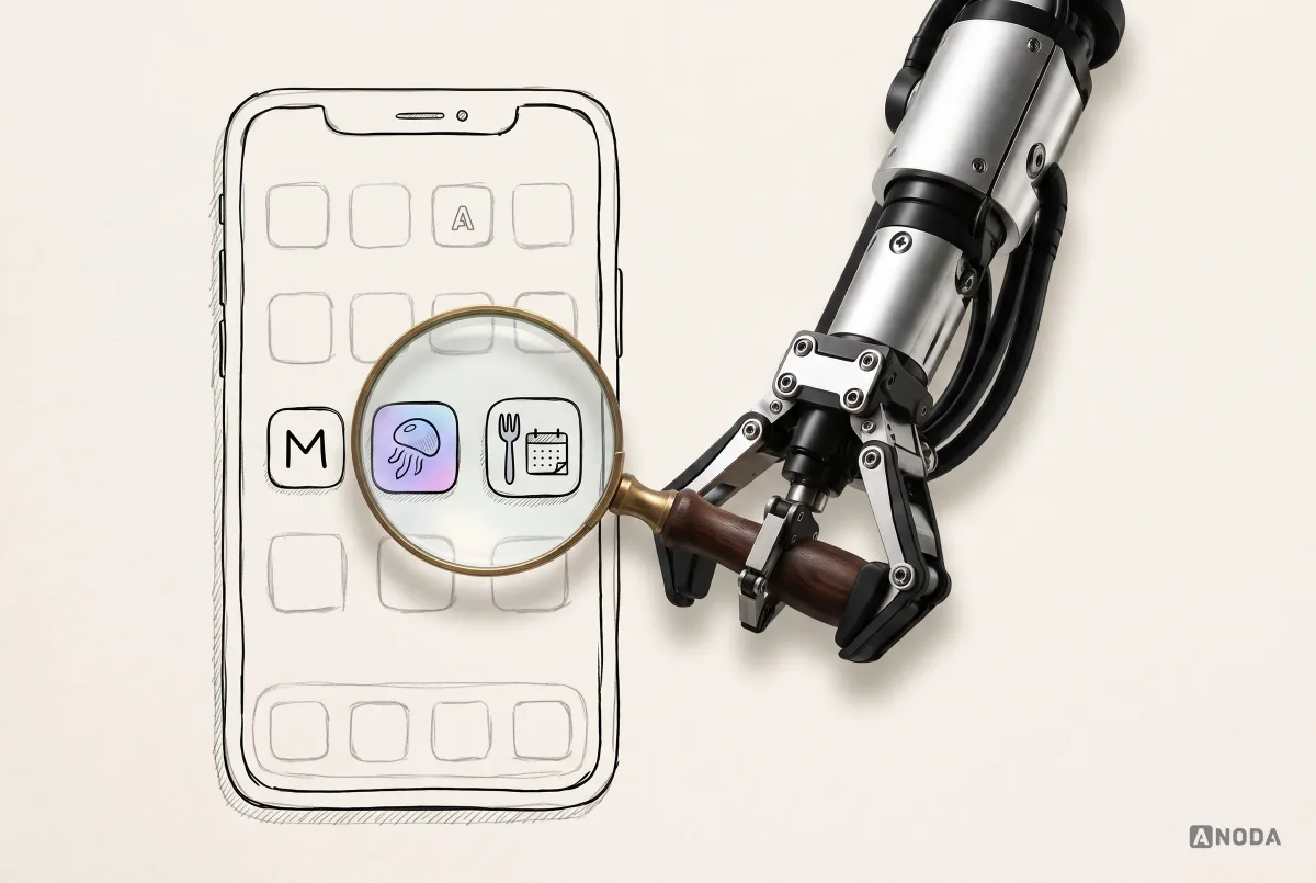
Test your icon the way users see it: at real sizes, next to competitors, on light and dark backgrounds. If someone who has never heard of you cannot guess the category, it is not doing its job. Apple’s own advice points the same way: avoid unnecessary visual detail, because it disappears at small sizes.

Screenshots are a promise, so show the app you ship
The screenshots are the store page’s promise. They are what people look at before they read a word, and Apple notes that the first one to three screenshots can appear right in search results when there is no preview video. That is prime real estate, and many apps fill it with something that is not the app.
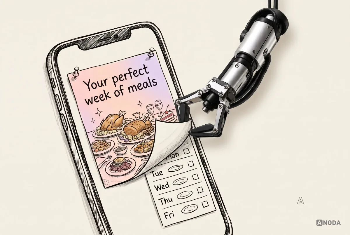
It is the burger in the advert. Glossy, tall, perfectly lit. Then the real one arrives, flattened, in a paper wrapper. Everyone knows the advert was styled. Nobody expects it to be a different burger.
When the screenshots show a heavily styled experience that does not exist in the installed app, the product feels like a scam from the first screen, and trust drops before the user has done anything. Apple’s review guidelines are explicit that screenshots should show the app in use, not just title art or a splash screen, and Google’s quality guidance warns that any gap between what the marketing promises and what the app delivers damages its core value.

Honest does not mean dull. Use the real interface, crop to the part that matters, add a short caption that says what the user gets, and put the strongest real moment first. Make every screenshot answer “what can I do with this?” If a screen cannot answer that, it does not belong in the first five.

Relevance: metadata that describes the app, not the dictionary
Now the part most guides start with. Metadata matters, and it is worth doing properly, but it only works when the rest of the listing and the product can back it up.
Start from the words, not the fields. Look at what your users actually search for: App Store Connect shows which sources bring downloads, including App Store search, and Google Play Console reports the search terms that lead to your listing. Read your reviews again, too. Users describe the app in their own words, and those words are usually better keywords than the ones in your pitch deck. A meal planner’s users say “weekly dinners” and “shopping list”, not “AI-powered culinary optimisation”.
On the App Store, the fields that count for search are the app name, the subtitle, the keywords field and indexed categories. The name and subtitle can be up to 30 characters each. The keywords field is not shown to users and allows 100 characters. Separate keyword terms with commas and no spaces after the commas; spaces can appear within a keyword phrase. Promotional text, up to 170 characters, does not affect search ranking, so use it for what’s new rather than for keywords. The description is read by people, and Apple notes that the first sentence matters most because it is what users see without tapping “more”.

On Google Play, the title can be up to 30 characters, the short description up to 80 and the full description up to 4,000. Google’s metadata policy bans ranking or performance claims like “#1”, “Best” or “Top” in the title and icon, promotional text like discounts, emoji, repeated special characters and all caps unless it is your brand name. It also bans keyword stuffing and unattributed testimonials in the description.

The rules differ, but the principle is the same. Describe the app accurately, in the words your users actually search for, and do not stuff. A title or subtitle crammed with every keyword is a CV that lists “Excel, leadership, blockchain, cooking, synergy”. It might get past a filter. No human wants to hire it.

Choose the primary category honestly. It is indexed, and it decides who browses past you. A misleading category might bring a few extra impressions from people who were looking for something else. They will not install, or worse, they will install and leave a confused review.
Localise the listing for each market you serve: name, subtitle, keywords, description and screenshots. Translation is the start, not the finish. Check that the screenshots still make sense, that currencies and food, dates and examples feel local, and that the promise reads naturally in that language.

Match the listing to where people come from
If you run campaigns, one generic store page for all of them is a waste. The person who clicked an ad about quick recipes and the person who clicked an ad about saving on groceries want different first screenshots.
Both stores let you do something about this. On the App Store, custom product pages let you create extra versions of your listing with different screenshots, previews and promotional text, each with its own URL for a specific campaign. Product page optimisation lets you test alternative icons, screenshots and previews against your default page. Google Play offers custom store listings for different audiences and store listing experiments for testing.

The point is continuity. The ad makes a promise, the store page repeats it, and the first screen after install keeps it. If any of the three breaks the chain, the user feels a small bait-and-switch, and small bait-and-switches add up to low conversion and cautious reviews.
Measure install conversion before blaming the algorithm
When downloads are low, teams blame the algorithm. Often the algorithm is doing fine. It is showing the app to people, and people are saying no.
Both stores give you the numbers to check. App Store Connect shows impressions, product page views, conversion rate and downloads, and lets you filter by source, including App Store search. Google Play Console shows store listing visitors, acquisitions and conversion, with breakdowns by traffic source and country.

Read the funnel in order. If impressions are low, the problem is relevance or demand: metadata, category, market or a search term nobody uses. If impressions are high but few people open the page, the icon, name and first screenshots are not earning the tap. If people open the page but do not install, the screenshots, rating, reviews or price are putting them off.
Compare like with like when you read it. A meal planner converts differently in January, when everyone has resolutions, than in August. Compare the same weeks year on year, the same market and the same traffic source, or you will celebrate the calendar and blame the icon.
This is the cheapest diagnosis you will ever get. It is already in your console.
Activation Audit
Installs are fine. People just don’t stay?
We find where the journey from install to first value breaks, and which few changes are most likely to keep people using the app.
The first minute after install
Ranking depends on what happens after the install, and the first minute decides most of it. Google’s core quality guidance says it plainly: an app has to deliver value on first use and over time, and no amount of polish elsewhere makes up for failing at that.
Three things ruin the first minute more often than anything else.
Long onboarding before any value. Seven screens of goals, preferences, allergies, notifications and an account before the user sees a single thing the app does. Each screen is a chance to leave. Ask for the minimum needed to show value, show it, and ask for the rest once people care.

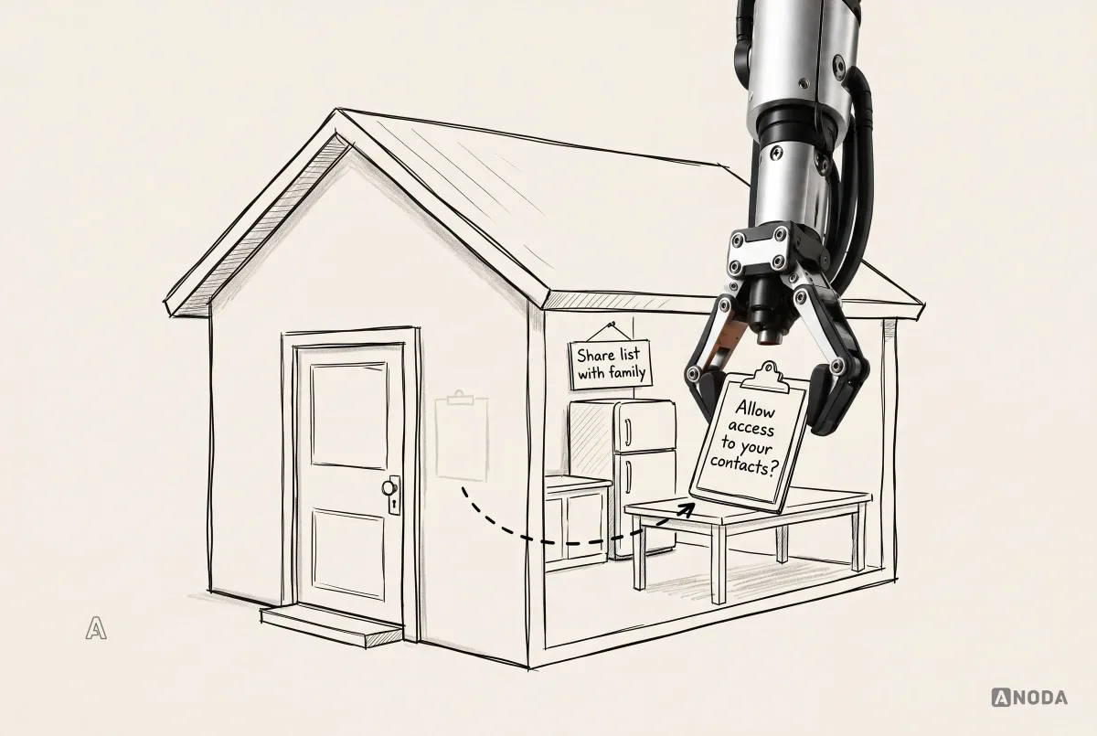
Permissions with no context. The app has not even loaded and it already wants access to your contacts. That is a stranger on your doorstep asking for your address book before telling you his name. Most people shut the door. Ask for a permission at the moment the feature needs it, after explaining in the app’s own words what it is for. The system dialog then confirms a decision the user has already made.

Notifications with nothing to say. “We miss you! Come back!” is not a reason to open an app. It is a reason to turn notifications off, and many people will uninstall instead. A notification should carry something the user wants: tonight’s recipe, the list they need at the shop, a reminder that the trial ends in two days.

Two more things belong in the first minute, and both are easy to postpone forever. Performance: a first screen that takes eight seconds to appear on a mid-range phone is a first impression, just not the one you designed. Test on the devices your users actually own, not on the team’s newest phones. Accessibility: text that can be enlarged, controls large enough to hit, labels a screen reader can announce and contrast that works outdoors. People who cannot use the app do not write detailed accessibility reports. They uninstall and leave two stars.
If your first-use experience is where people drop, we cover how first steps shape trust in more detail in our guide to financial app onboarding. The examples come from finance, but the principle of value before commitment applies to almost any app.
Subscription value and honest cancellations
For subscription apps, ranking pressure often shows up at renewal. People forget why they subscribed, feel tricked by the trial ending, try to cancel and cannot find how. Then they leave a review.
A cancel flow that hides the button behind four screens and a phone number is the classic dark pattern. It keeps a few subscribers for another month and turns every one of them into a hostile reviewer. It may also break consumer protection rules in your market. An honest flow lets people cancel in a few taps from Settings, asks one optional question about why, offers a pause if that genuinely helps, and says clearly when access ends.

That optional reason is valuable research. “Too expensive”, “didn’t use it enough”, “missing a feature”, “something didn’t work” map straight back onto your review buckets and tell you which problem to fix before next month’s renewals.
Ask for ratings at the right moment, and never rig the prompt
Asking for a rating is fine. Asking at the wrong moment is how you collect the ratings you deserve.
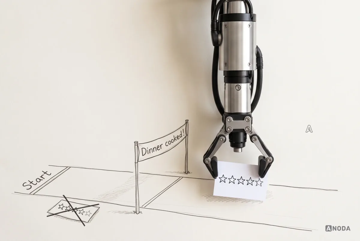
The right moment is after a success: a task finished, a goal reached, the third dinner cooked from the plan. Apple’s guidance is to ask when people are most likely to feel satisfied, such as after completing an action, and not to interrupt what they are doing. The system prompt shows at most three times in 365 days, so each one matters. Google says to trigger its in-app review flow after the user has experienced enough of the app to give useful feedback, not to prompt excessively, and warns that a quota applies and the card may not appear.
It is the waiter who asks for a tip before the food arrives. You might tip. You won’t tip well.

Now the part many ASO articles get wrong. A popular trick is to ask “Do you enjoy the app?” first, send happy users to the store prompt and unhappy ones to a private form. It sounds clever. It is not allowed. Google’s in-app review guidelines explicitly say not to ask any questions before or while showing the review card, including “Do you like the app?”. Apple requires apps to use its built-in review prompt, and says it may remove developers who try to manipulate ratings with paid, incentivised, filtered or fake feedback. Filtered feedback is exactly what that trick produces.

Oksana has a good instinct about the private path, and it survives the rule change intact. Make feedback as quick as leaving a tip after a taxi ride: a couple of taps to say “it crashed”, “it’s confusing”, “it’s too expensive” or “something else”. Keep that path available all the time, in Settings and after an error, not as a filter in front of the store prompt. Show the system rating prompt separately, at a success moment. You get honest public ratings and a private stream of problems to fix, and nobody gets banned.
On the App Store, you can also reset your summary rating when you release a new version. Apple recommends doing it sparingly: a listing with very few ratings can put people off, and resetting the score does not remove the written reviews. It is a tool for a genuinely different app, not a way to hide a bad month.
Never buy, incentivise or fake reviews, and never promise rewards for ratings. It breaks both stores’ rules, it gets caught, and when it does, the damage is much bigger than a few stars.
Measure which layer needs the next improvement
Improving ranking is an ongoing loop, not a project with a launch date, so you need numbers that separate the layers. Keep them on one screen, reviewed together:
- Visibility: impressions and search terms, by market.
- Store page: product page views or store listing visitors, conversion to install.
- Reputation: average rating over the last 90 days, number of new ratings, top review themes by bucket.
- Quality: crash rate and ANR rate, by version and device.
- Product: activation, day-1, day-7 and day-30 retention, trial-to-paid, cancellations and uninstalls.

Then be honest about cause and effect. If you ship a new icon, new screenshots and a crash fix in the same week and your ranking improves, you do not know which one did it. Maybe all three. Maybe it was a competitor’s bad update. Maybe the season. It is changing three medicines at once and then crediting the one you liked best.
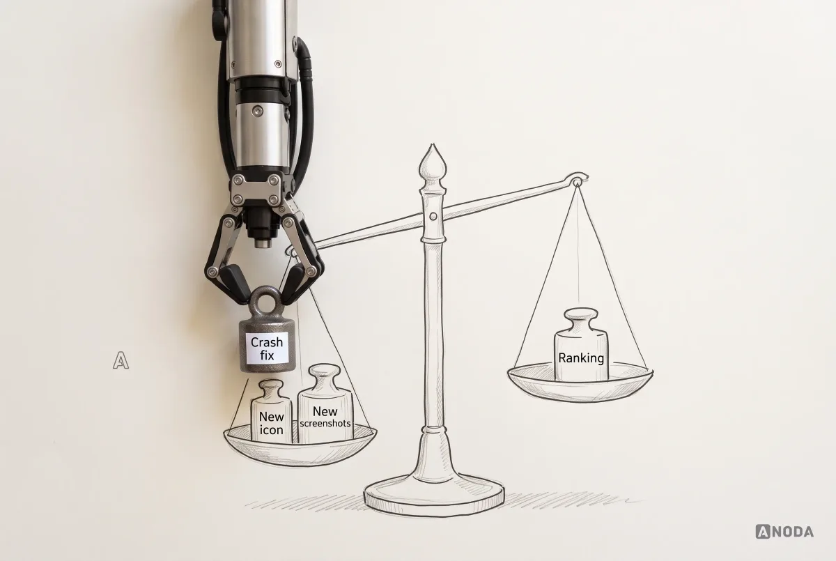
Where you can, change one thing at a time, or use the stores’ own experiments: product page optimisation on the App Store, store listing experiments on Google Play. Where you can’t, record what changed and when, and treat conclusions as working hypotheses, not facts. A ranking that moved is not proof that your favourite change worked.
Why ANODA connects the store promise to the product
Buying more installs while the first session disappoints only sends more people to the same dead end. A keyword rewrite cannot explain an early paywall, and a screenshot refresh cannot repair confused onboarding. ANODA follows the whole path: what the listing promises, what the user sees after install and which action makes the product worth keeping.
Our Glimix work brought the mobile product, brand, app icon and landing-page design into one direction for diners and venue owners. We mapped both roles, designed the journeys and delivered clickable prototypes with a UI kit to the client’s developers. The product and its front door were planned together.
That is the advantage ANODA brings to your app: the acquisition promise and the first-use experience are designed as one journey. We identify where your budget is leaking and give the team a focused route to a product users understand, choose and return to.
Decide what to fix first
Every app has more problems than budget. The question is which one is limiting everything else right now. These six situations cover most of what we see:
- High impressions, weak install conversion. People see you and don’t install. Fix the store page promise: icon, first screenshots, the first line of copy, the rating people see.
- Weak impressions, strong conversion. The people who find you like what they see, there just aren’t many of them. Work on relevance and demand: metadata, category, localisation, the queries you target.
- Strong installs, weak activation or retention. The listing works, the product doesn’t keep people. Fix first-use value, onboarding, permissions and the paywall.
- A poor rating driven by one recurring failure. Fix the failure first. A rating campaign on top of a known bug just collects more one-star reviews.
- Crash or ANR rates above the threshold. Stability comes first. On Google Play it can directly limit visibility.
- A market or query mismatch. You are ranking for searches your users don’t make, or targeting a market that doesn’t need you. Rethink who you are for before tuning anything else.

If you cannot tell which row you are in, you need a diagnosis across the whole journey, not an ASO-only checklist. That is what a UX audit is for: evidence from the store page to the product, and a prioritised list of what to fix first.
When the budget is two weeks, not two quarters
Most teams do not need a total redesign. They need to be honest about how much they can spend and pick the fixes that matter most within it.
Here is where many projects go wrong before they start. The team is asked about budget and goes vague: “we need to think about it”, “it depends on the proposal”. The result is a plan sized for a company ten times bigger that never gets funded, while the one-star reviews keep arriving.
Be direct instead. If you have money for two weeks of work, say so. Two weeks is enough to make a real difference if you choose well: read and tag the last few hundred reviews, fix the top crash, add an in-app problem report, replace the first three screenshots with the real app, add a proper explanation before the permission prompt, then release, reply to the affected reviews and set a baseline for the numbers.
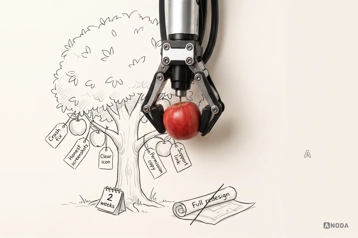

That is low-hanging fruit, and there is no shame in picking it first. The shame is in leaving it on the tree while you wait for a budget for the whole orchard.
Once the first round is done, the work does not end. It becomes a process: reviews flowing to the right owners, crashes treated as emergencies, support that answers, a listing that matches the app, and a few numbers reviewed every month. That process is what keeps a ranking up long after any single fix has been forgotten.
The decision rule
Before you touch your keywords, answer these questions in order. Stop at the first one without a clear answer and fix that first.
- Have we read and sorted the last few months of reviews, and do we know the top reason for low ratings?
- Are crash and ANR rates under control, and does every new crash reach an owner quickly?
- Can an unhappy user reach a human inside the app, and do we reply to reviews?
- Does the icon explain the app at small size, and do the first screenshots show the app we actually ship?
- Does the first minute after install deliver value before asking for anything?
- Do we ask for ratings after a success, with the system prompt, and never gate it?
- Do we know whether our bottleneck is visibility, install conversion or what happens after the install?
- Have we said out loud what we can spend, and picked the fixes that fit?
App store ranking is the visible result of a product system. The listing makes the app recognisable and promises only what the app delivers. The app justifies its price when the need is strongest. Crashes and unexplained permissions are treated as trust failures, not backlog items. Ratings feed a real response loop instead of disappearing into a no-reply address. A rating prompt cannot rescue an app that crashes or feels deceptive, and a beautiful listing cannot hold a ranking when disappointed users uninstall. Fix the product the reviews are describing, and the ranking has something to stand on.

Mobile app design
Your reviews already told you what’s wrong. Let’s fix it.
We read the reviews, the crash data and the numbers, find the constraint that holds your app back, and redesign the product and first-use journey around the promise that brought users in. ANODA gives you a clear diagnosis and a focused design plan that fits your budget, so the next release strengthens the product users came for.
Written by